Built with Framer
Website Experience Enhancement for Diva Clinic
Muhammad Salman
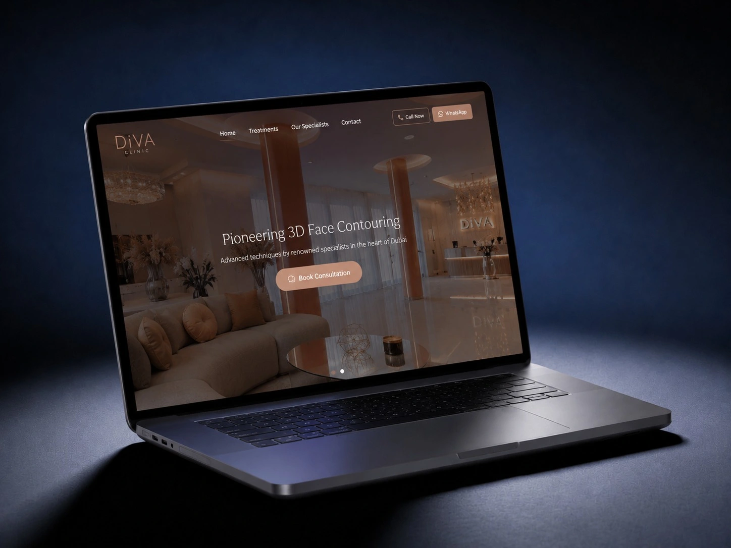
Improving the Website Experience for Diva Clinic
When I reviewed the website for Diva Clinic, one thing stood out immediately the clinic had strong real-world credibility, but the website wasn’t fully supporting that trust in the digital space.
In healthcare, especially dental and aesthetic services, users don’t just “browse” they decide. And that decision is usually made within seconds of landing on the website.
The challenge
The main issue wasn’t the design itself, but how the information was structured and experienced by the user.
A few key gaps were noticeable:
Visitors weren’t naturally guided toward booking or consultation
The flow between services, trust elements, and actions felt slightly disconnected
Call-to-action points weren’t consistently visible or persuasive enough
Mobile users had to put extra effort into finding key information
The overall structure didn’t fully support a conversion-focused journey
In short, the website was informing users but not actively helping them decide.
What I focused on
Instead of changing things visually for the sake of it, I focused on how users actually move through a healthcare website and what makes them take action.
Improving the structure and flow
I reorganized the layout in a way that makes the journey more natural:
Clear introduction of services upfront
Trust elements placed where users actually pause and read
Logical progression from awareness → interest → action
This reduced the mental effort needed to understand the clinic’s offering.
Making actions easier to take
One of the key improvements was around how users book or contact the clinic.
Repositioned and clarified booking actions
Made CTAs easier to spot without being intrusive
Reduced unnecessary distractions that slowed decision-making
The goal was simple no confusion when someone is ready to take the next step.
Mobile experience refinement
Most users in this niche browse on mobile, so I paid close attention to:
Cleaner spacing for readability
Easier scrolling and scanning of content
More accessible touch points for actions
This helped make the experience faster and more intuitive on smaller screens.
Strengthening trust through structure
For a clinic, trust is everything. I worked on improving how that trust is communicated:
Better content hierarchy
More structured service presentation
Cleaner visual flow that feels professional and calm
It’s not about adding more content it’s about presenting it in a way that feels reliable.
Outcome
After refining the structure and user flow, the website started to feel more purposeful:
Users could understand services faster
Navigation became more intuitive
Booking actions became easier to reach
Overall experience felt more aligned with a premium healthcare brand
Final thoughts
The biggest shift in this project wasn’t visual it was strategic.
A good clinic website doesn’t just show information. It quietly guides people toward trust and decision without friction.
That was the main focus here making sure Diva Clinic’s digital presence feels as strong as its real-world reputation.
Like this project
Posted May 22, 2026
Conversion-focused healthcare website for Diva Clinic, improving UX, mobile experience, and CTAs to create a seamless patient booking journey.