UI/UX Design for Nuvance Fintech Platform

Muhammad Tahir A


Case Study:
Nuvance — Smarter Financial Decisions, Powered by AI
UI/UX Strategies & Design Principles Followed
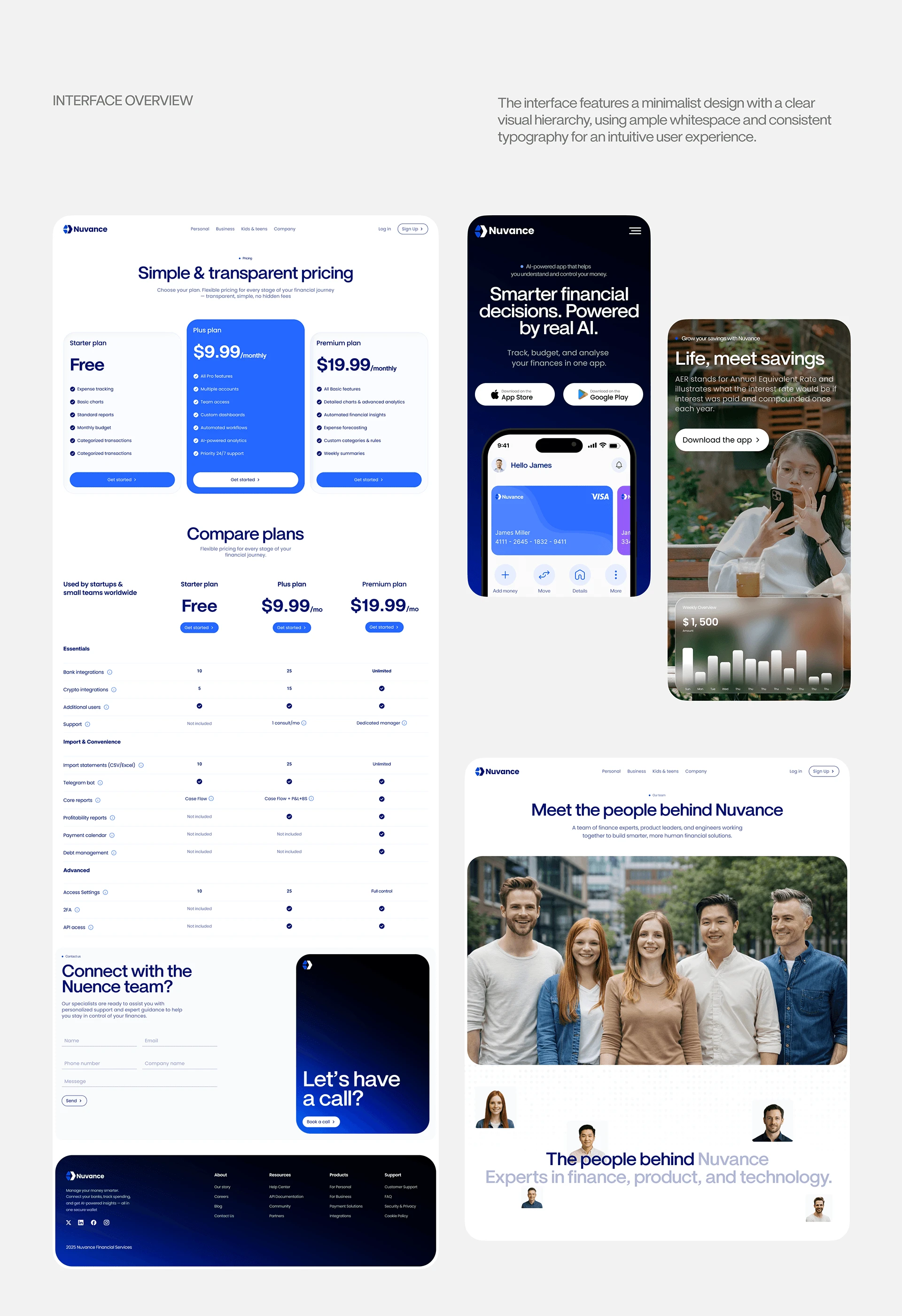
The design language for Nuvance leans heavily on high-end, minimalist aesthetic principles reminiscent of premium modern tech platforms. It prioritizes clarity, spacious layouts, and intentional typography.
Scannability & Data Density Management: Fintech interfaces are notoriously prone to information overload. The dashboard utilizes clean container blocks, crisp line dividers, and high-contrast numerical highlights to isolate transaction tracking, budgeting data, and receipt management cleanly.
Structured Visual Hierarchy: Essential interactive elements—such as "Get Started" calls to action—are mapped in a vibrant primary blue (
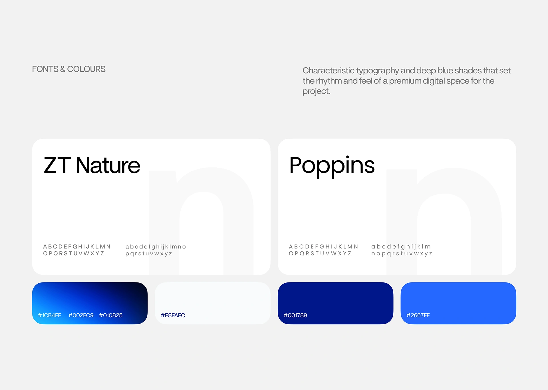
#2667FF), pulling the eye immediately to key conversion zones against deep, premium backdrops.Rigid Layout Proportioning: The desktop web experience strictly adheres to a structured 8-column grid system with 40px outer margins, 153px column widths, and 20px gutters. This ensures pixel-perfect content alignments across disparate blocks like pricing grids and comparative tables.
Intentional Type Scaling: Pairing a highly stylistic geometric display typeface (ZT Nature) for main messaging headings with a highly legible, geometrically stable sans-serif (Poppins) for technical UI metrics balances premium branding with functional utility.
Accessibility in Dark/Light Interfaces: The color space intentionally relies on depth and luminance shifts (transitioning from
#010825 to #1CB4FF) ensuring contrast guidelines are met for numbers, dates, status badges, and transaction text elements.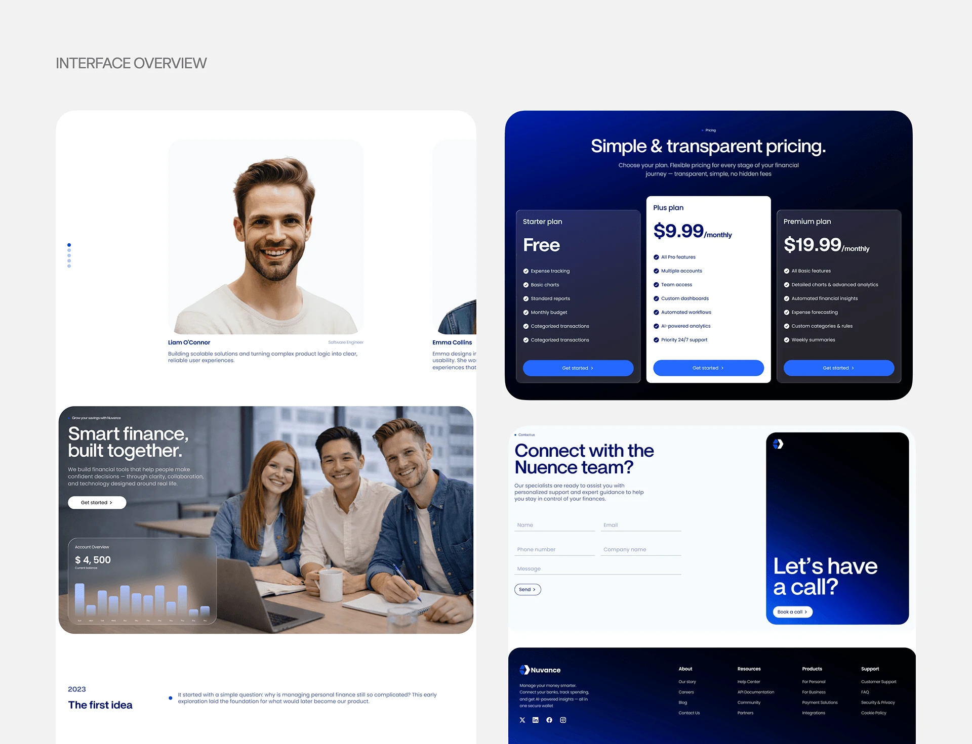
1. Essential Design & Creative Tools
To craft this precise visual standard, a designer utilizes a dedicated ecosystem for vector work, layout systems, and real-world brand testing:
Figma (Core UI/UX & Layout): Used to build the high-fidelity app interfaces, interactive prototypes, and the strict 8-column grid layout. Figma’s Variables and Component Properties are utilized to lock in responsive spacing, typography scales, and seamless light/dark mode switching.
Adobe Illustrator (Brand & Asset Architecture): Used to construct the sharp, geometric Nuvance logomark. Vector paths must be perfectly balanced to maintain clarity when scaled down to an iOS app icon grid or scaled up for offline media.
Adobe Photoshop or Cinema 4D / Blender (Visual Identity & Mockups): Used to generate the premium contextual presentation materials—such as embedding the interface onto realistic device screens, creating the offline merchandise mockups (e.g., the branded cap), and rendering the dark, high-end exhibition/showroom presentation wall.
2. Brand & Visual Identity Strategy
The visual identity of Nuvance is engineered to convey trust, high performance, and cutting-edge intelligence—the three pillars of a modern premium fintech platform.
Color Psychology (Trust & Depth):
The Deep Blues (
#010825, #001789): Establish stability, professional security, and a premium "digital space" aesthetic.The Electric Accents (
#2667FF, #1CB4FF): Injects energy and draws instant visual focus to critical user actions, automated financial metrics, and interactive triggers.The Clean Off-White (
#F8FAFC): Acts as a neutral canvas for data-heavy sections (like pricing tables and feature blocks), giving the interface room to breathe.Typography Hierarchy:
Display Text (ZT Nature): A highly characteristic, geometric serif/display face that gives Nuvance an editorial, elite brand presence.
Interface Text (Poppins): A clean, geometric sans-serif that ensures absolute readability at tiny sizes for numbers, currency signs, transaction descriptions, and status badges.
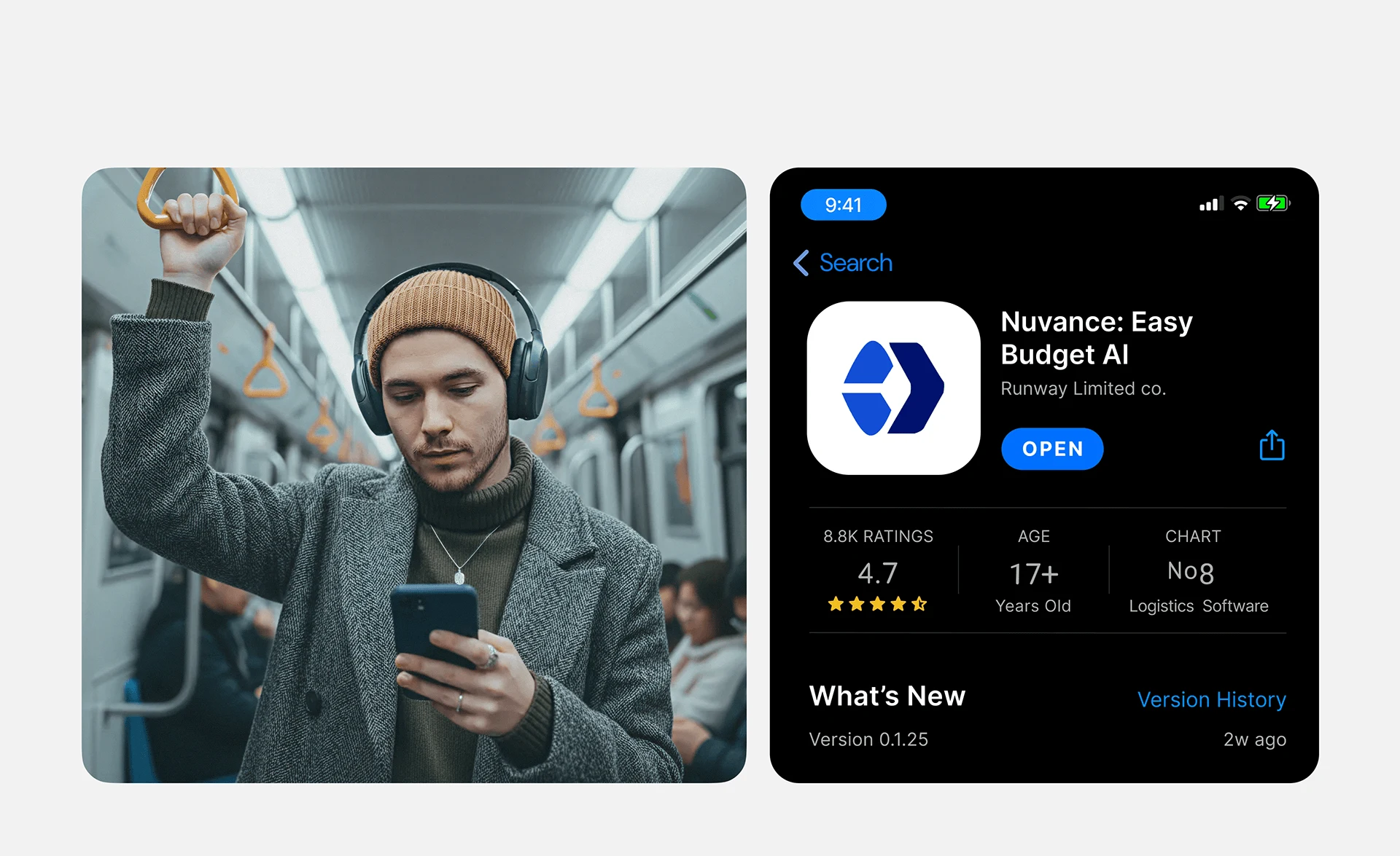
Identity Adaptation: The minimalist logomark is built with a dual-polygon structure, making it highly versatile for digital environments (SVG app navigation headers, favicon scales) and physical brand touchpoints.
3. UI/UX Design Principles Applied
The user experience strategy centers on a minimalist, high-end philosophy that takes inspiration from class-leading, user-centric product designs:
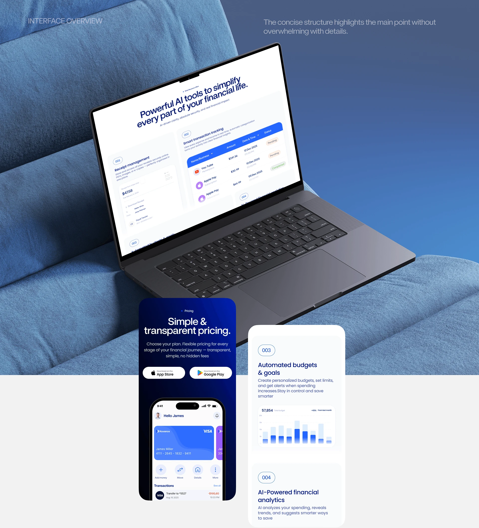
Information Chunking & Card Architecture: Financial data can easily overwhelm users. By grouping related information—such as separating "Receipt Management" from "Smart Transaction Tracking"—into cleanly defined, rounded container cards, cognitive load is drastically reduced.
Whitespace Maximization: Generous micro and macro-whitespace around elements gives the app a premium, deliberate feel. It prevents visual crowding and lets the user focus on one financial insight at a time.
Contextual Visual Clues: Using simple, universally understood iconography (e.g., plus signs for "Add Money", arrows for "Move") and clear colored status indicators (such as muted green/orange capsules for transaction statuses) ensures intuitive navigation without requiring explicit instructions.
Like this project
Posted Jul 10, 2026
Developed UI/UX design for Nuvance's fintech app, focusing on minimalism and clarity.
Likes
0
Views
19