Fleur Perfume Brand Identity
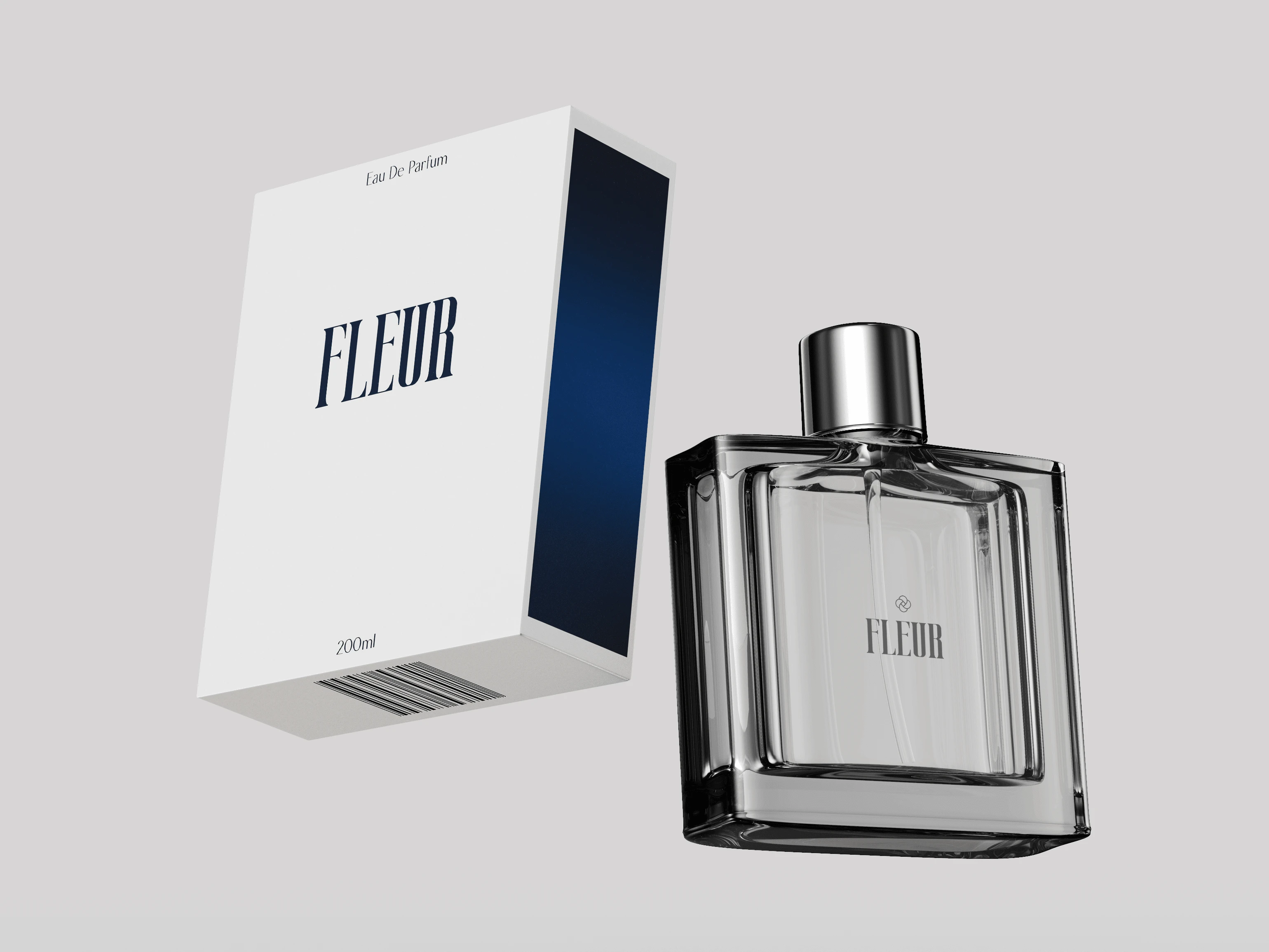
Fleur is a women's perfume brand specially curated for those who have decided to ditch the stereotypes and want to create their future. Fleur is a women's perfume brand specially curated for those who have decided
lo ditch the stereotypes and want to create their future. The rich, sensual scent of this perfume is sure lo make you stand apart from the crowd. Designed for women who are independent and strong, this fragrance is perfect for any working woman on the go. This perfume is designed in the image of a successful businesswoman. It has a bold and strong top note but is still feminine enough to wear through out the day.
Target Audience
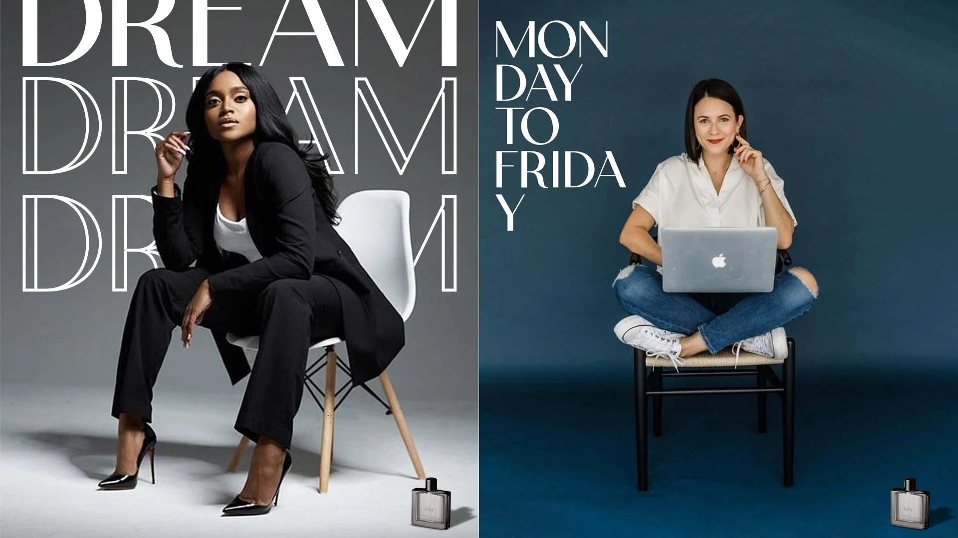
The target audience are those women who are at a decision making roles, be it CEO, Managers, small business Owners or freelancers.
Brand Keywords
Elegant
Bold
Authority
Feminine
Direction
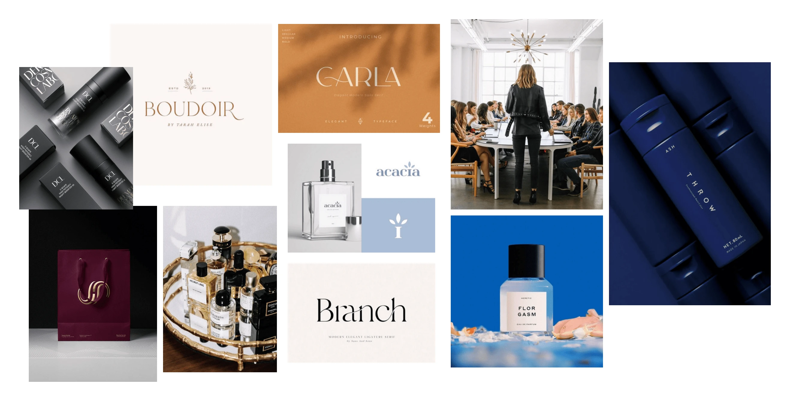
Show the elegant side of the brand. Minimalist packaging. The typography would include Light or medium typeface. Serif and sans serif fonts will create good sense of femininity.
Logo design
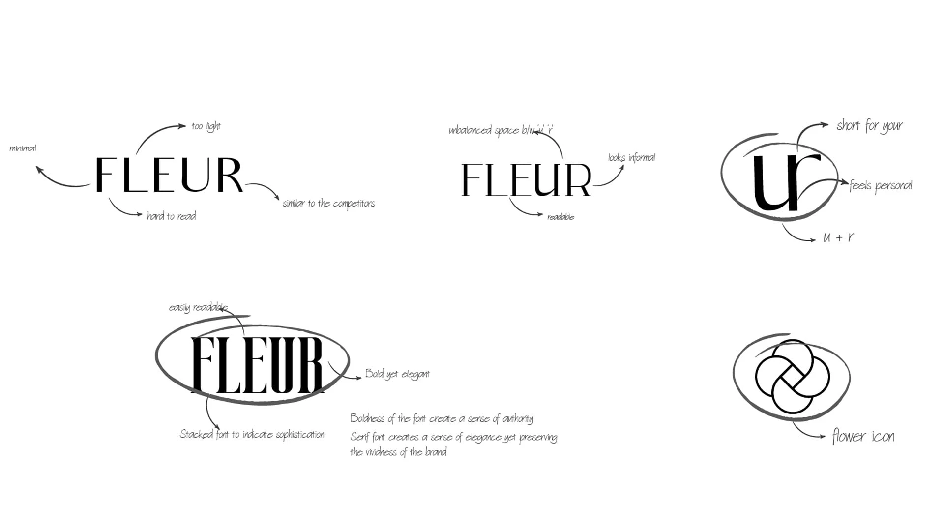
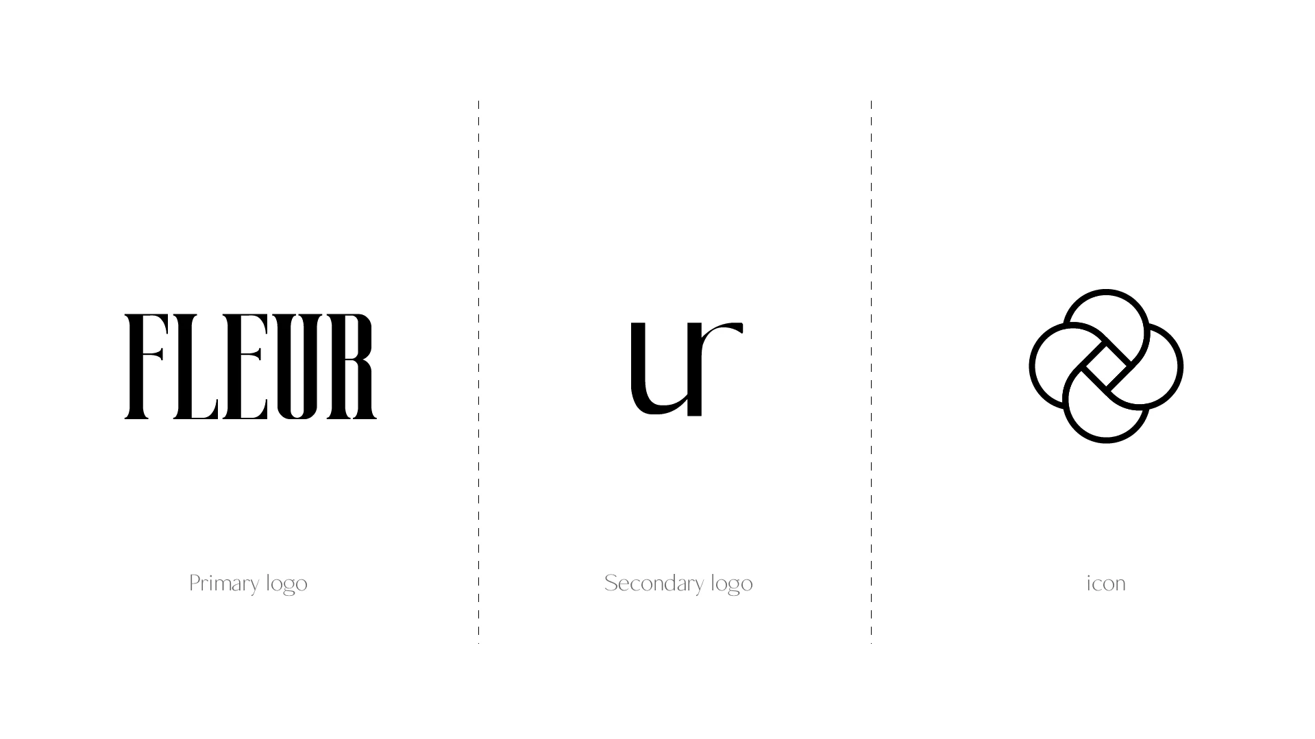
Generally, The logo of such perfume brands use light typeface sans serif fonts, which leans towards a more elegant vibe, but I decide to use a bold serif font for the main logo to give off a bold/courageous vibe still having a equal amount of elegance in it.
The secondary logo was rather a monogram using the last letters of the brand name "FLEUR" and create an abbreviated form of the word “your,” meaning something belongs to you.
Lastly, I also designed a small flower icon as FLEUR is French for flower, It can we used in various places with compact space as an insignia or an icon.
Colour palette
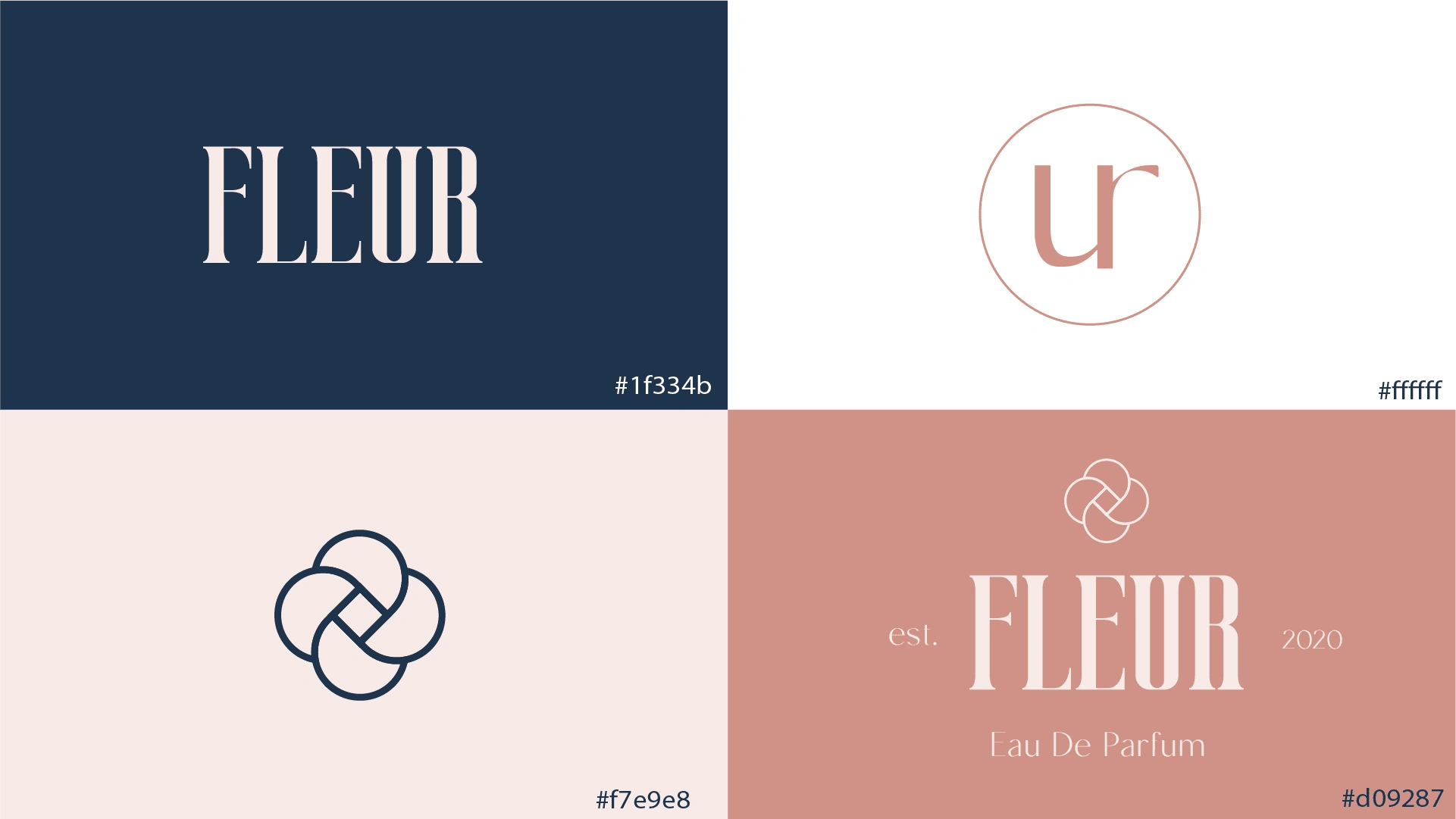
This colour palette describes the overall feel I wanted to give the brand,
Blue (Space Cadet) colour depicts being bold, glamorous, graceful.
The pink shades depicts kindness, and femininity
The white colour is their to bring the balance between the other colours.
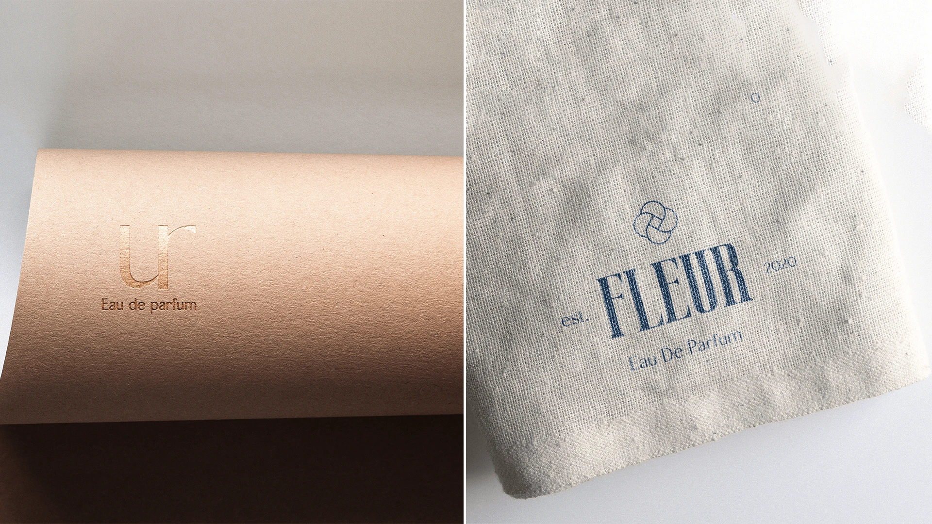
a depiction of logo in use.
Packaging
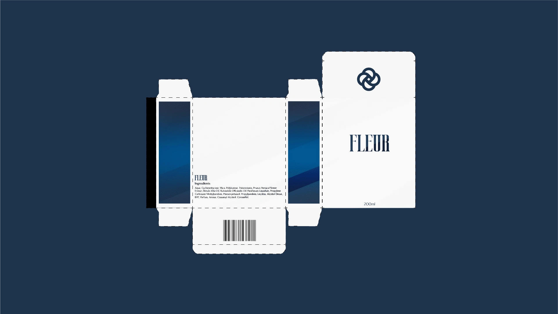
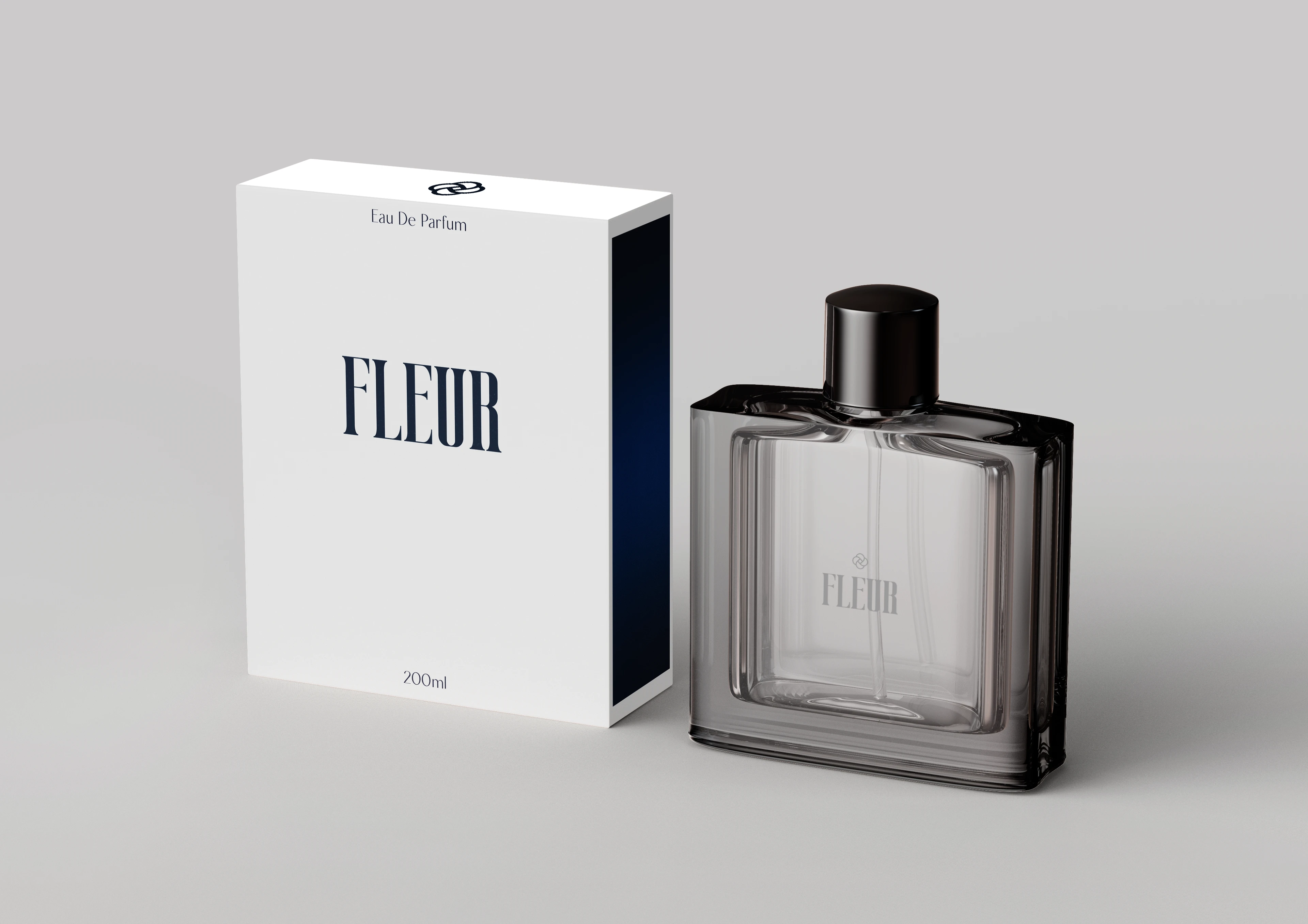
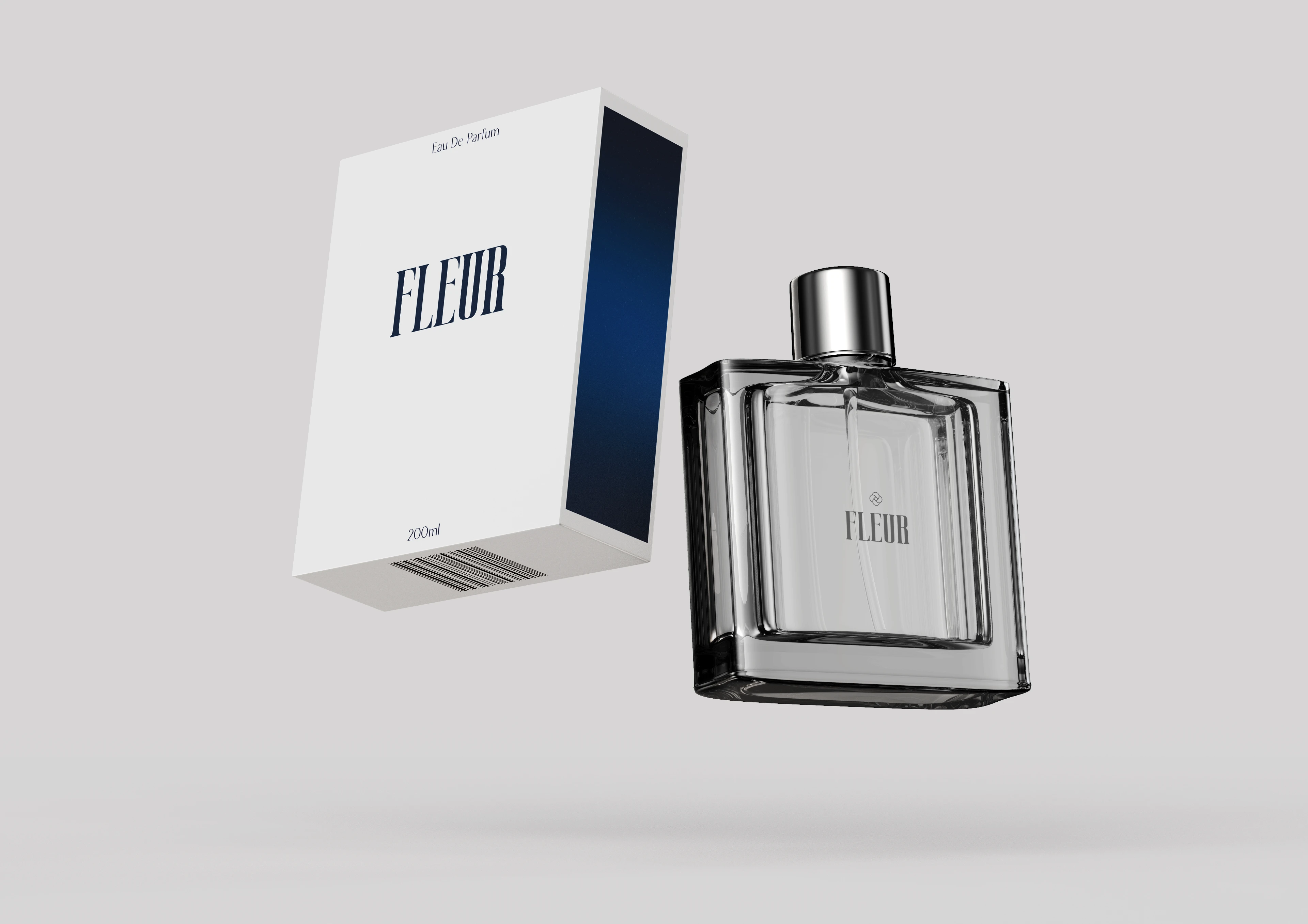
The white packaging is designed to stand out in an aisle where most of the perfume brands use dark colour packaging. White with blue also gives a premium look to the brand and minimalist design makes it more eye catching and elegant.
Billboard Ads
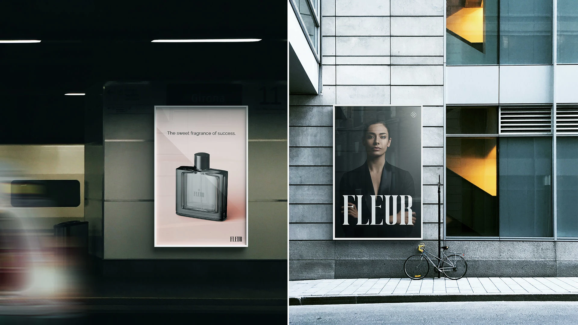
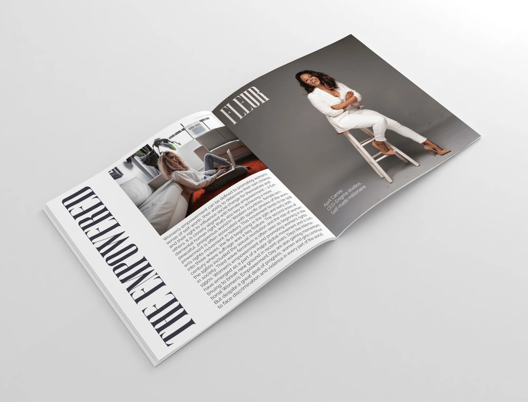
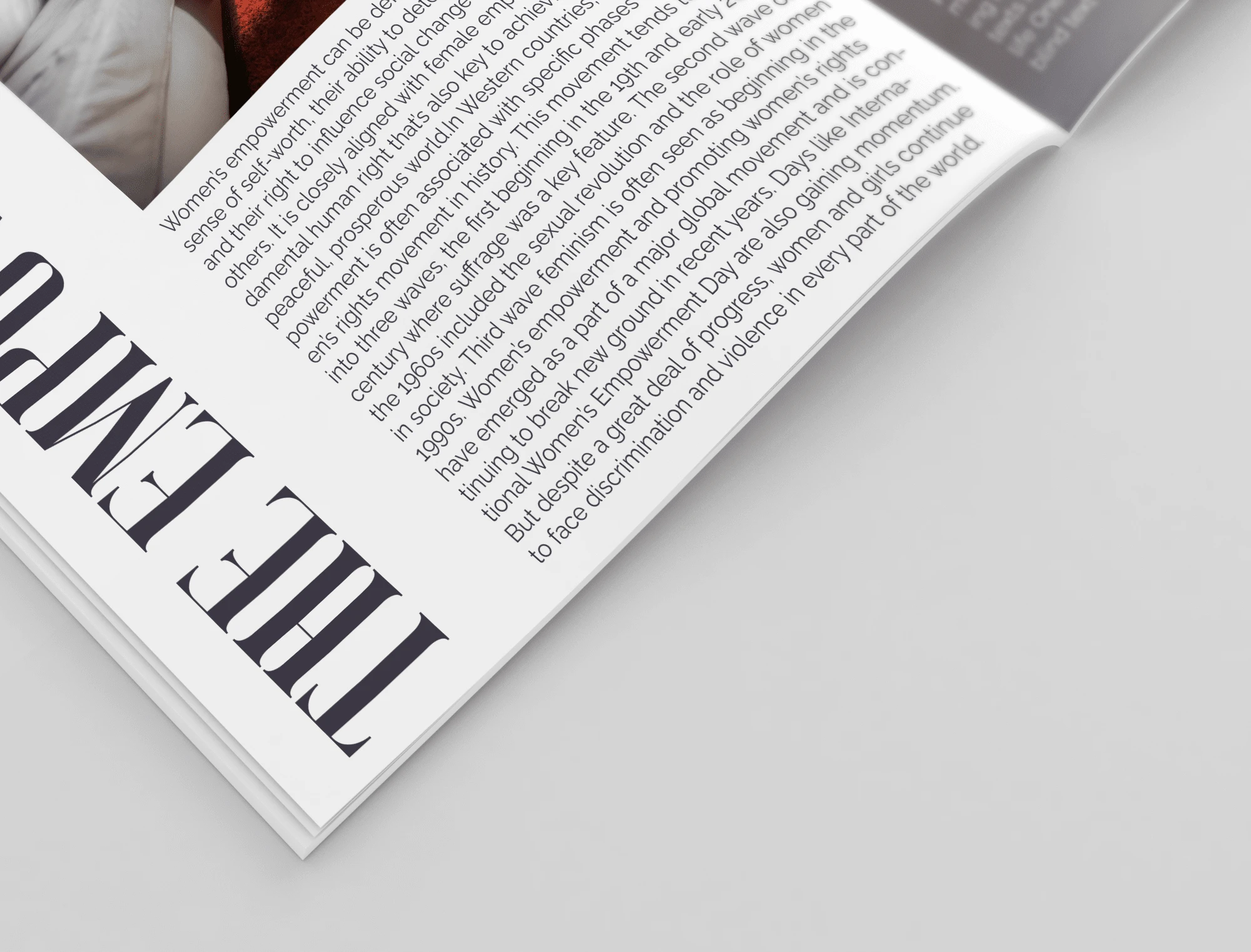
Magazine mockup
Like this project
Posted Jun 14, 2022
Fleur is a women's perfume brand specially curated for those who have decided to ditch the stereotypes and want to create their future.

