Funnel Building of Nutrafol
✨Project Overview
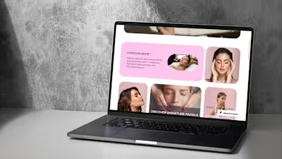
I helped Nutrafol visualize its sales funnel on Figma, improving its brand identity and correcting its ads, website visuals, and overall funnel format, so their team could analyze and further improve the flow of customer experience.
✦ The Process
✧ I noticed that the navbar of Nutrafol was like every other website, I gave it a look it was impeccable withholding its brand identity!
✧ The color scheme of the website was not coherent I made it look more seamless by using colors on the 70 30 10 rule!
✧ The brand format of telling the benefits of its product on the website was also a bit inconvenient, I made the stats and figures more visible which increases the authenticity of the product.
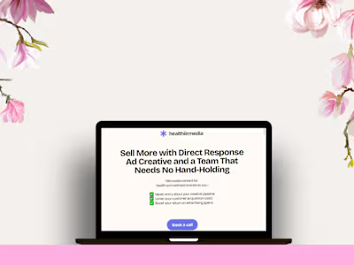
✧ The ad format also did not show the benefits more clearly I suggested good alternative ad sets creatives that aligned with their website and were more eye-catching.
✧ In the end, I made a detailed analogy of their funnel so that their team could visualize the streamflow of product customers buying.
✦ Work View
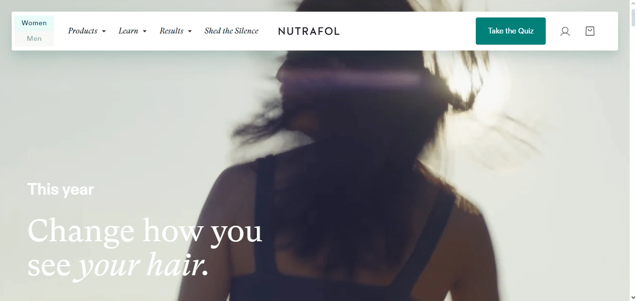
Navbar Design
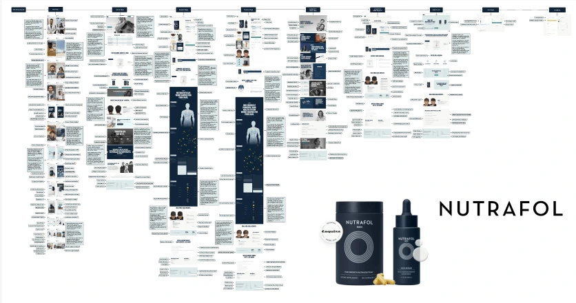
Figma Funnel Breakdown
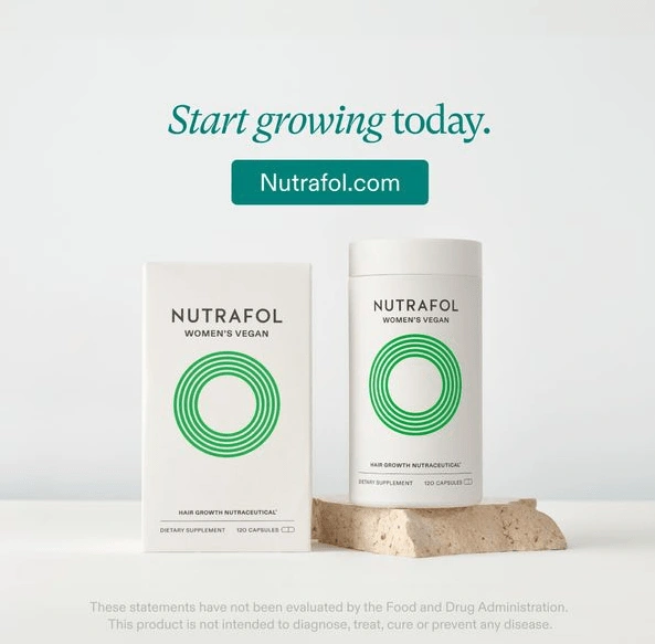
Facebook Ad Creatives Design

Facebook Ad Creative designed
📊 The Stats
✦ Timeline: 15- 20 days
✦ Number of components covered: 50+
✦ Number of components fixed : 20+
✦ Deliverables: A detailed funnel breakdown with Facebook ads creatives and a website navbar.
Like this project
Posted Jan 25, 2024
I designed the navbar, Facebook creatives, and overall funnel breakdown of Nutrafol to make it more authentic and customer-friendly.
Likes
0
Views
14
Clients

Nutrafol


