Revamping nonprofit's website with consistent branding
Introduction
The Great North West Kansas Community Foundations (GNWKCF) plays a critical role in providing administrative support to community foundations across Kansas. When they approached us for a website redesign, they were looking for something more than just a fresh coat of paint. They needed the website to resonate with their newly designed logo and reposition their brand focus.
We knew this project required a meticulous understanding of their logo's intentions, the new direction of the brand, and, above all, an effective way to connect with their growing network of affiliates and foundations they support. The goal was to craft a digital platform that tells the story of GNWKCF in an engaging and authentic way.
Decoding the Logo
The logo was ready to go, but it was our responsibility to interpret it into a larger brand experience. A logo that doesn't scale well might lead to inconsistencies across various platforms.
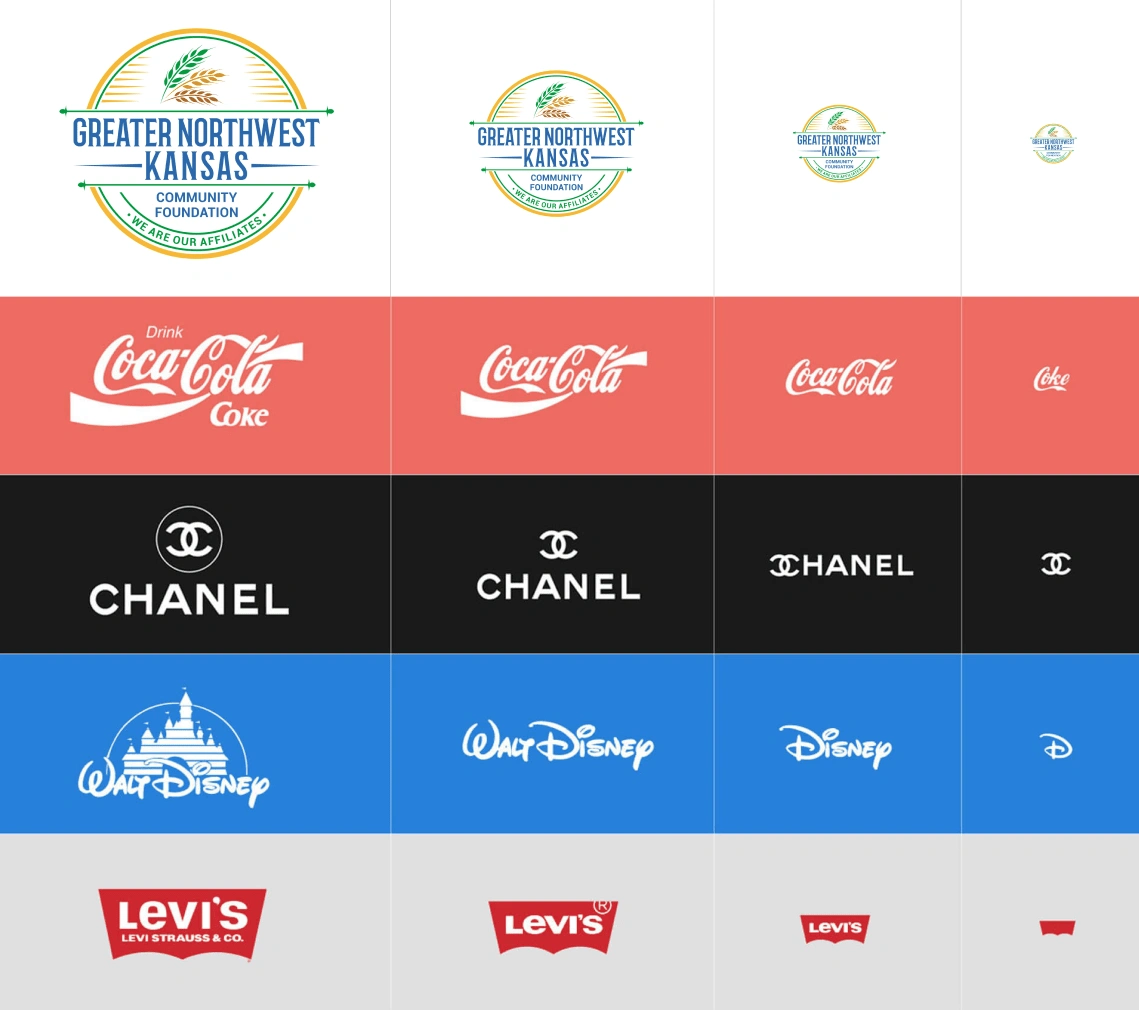
GNWKCF's logo didn't scale well across different sizes
We engaged with GNWKCF and their logo designer to create variations of the logo that maintained its core essence while providing the flexibility needed for scaling across various mediums.

After the revision, the logo scaled much better
Working with the Colors
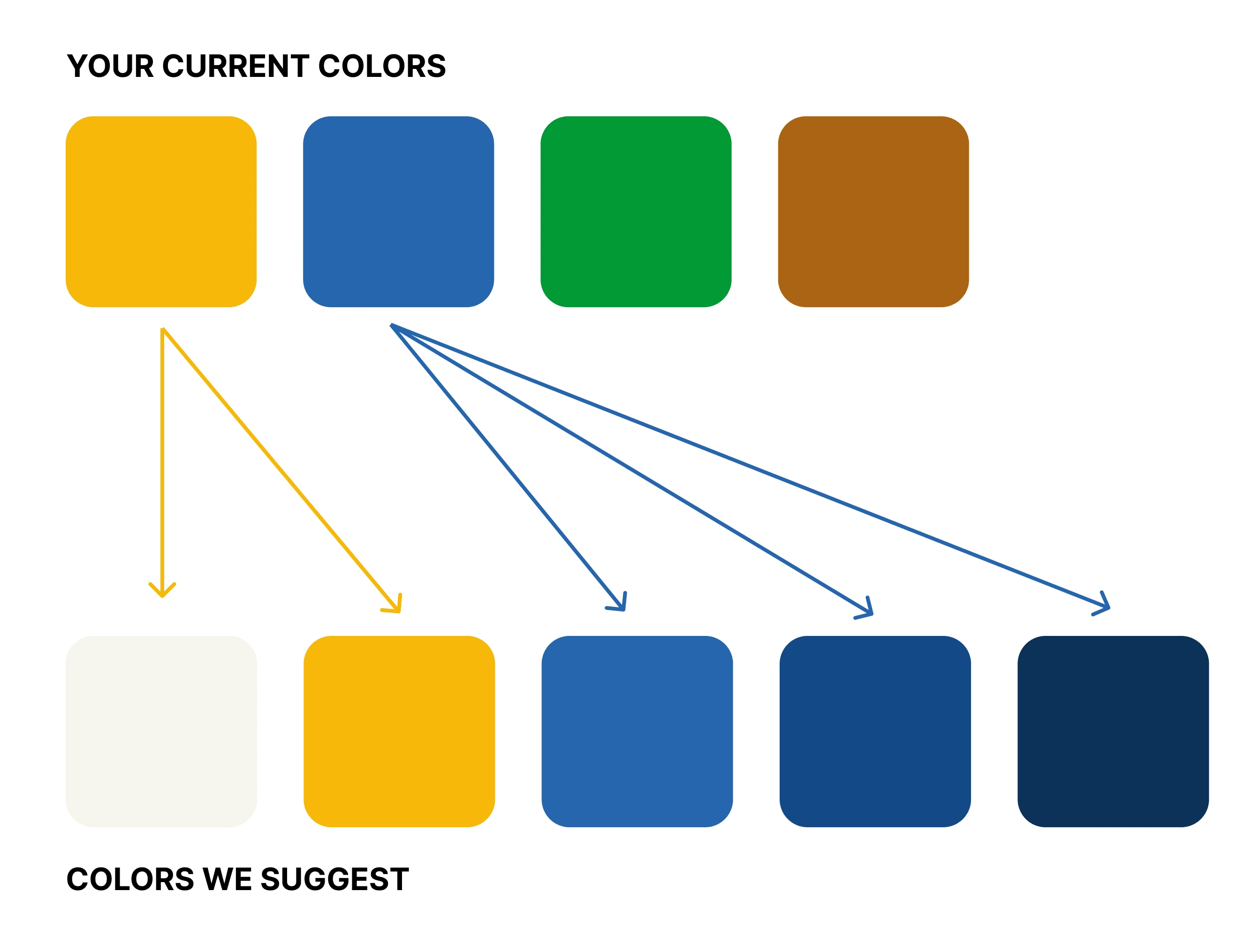
During the initial design exploration, we encountered a challenge with the color scheme. GNWKCF's new logo introduced several vibrant hues, presenting a potential risk of a visually cluttered and inconsistent brand presentation. Too many colors might have led to a conflicting and confusing user experience. Recognizing this, we focused our attention on distilling the color palette down to the strongest two colors that embodied GNWKCF's mission and values. By adopting a more coherent color palette, we ensured that the website conveyed a visually harmonious, brand-consistent experience. The deliberate choice of colors not only amplified the visual appeal but also contributed to a clear and focused narrative, allowing the brand's essence to shine through.
Redesign
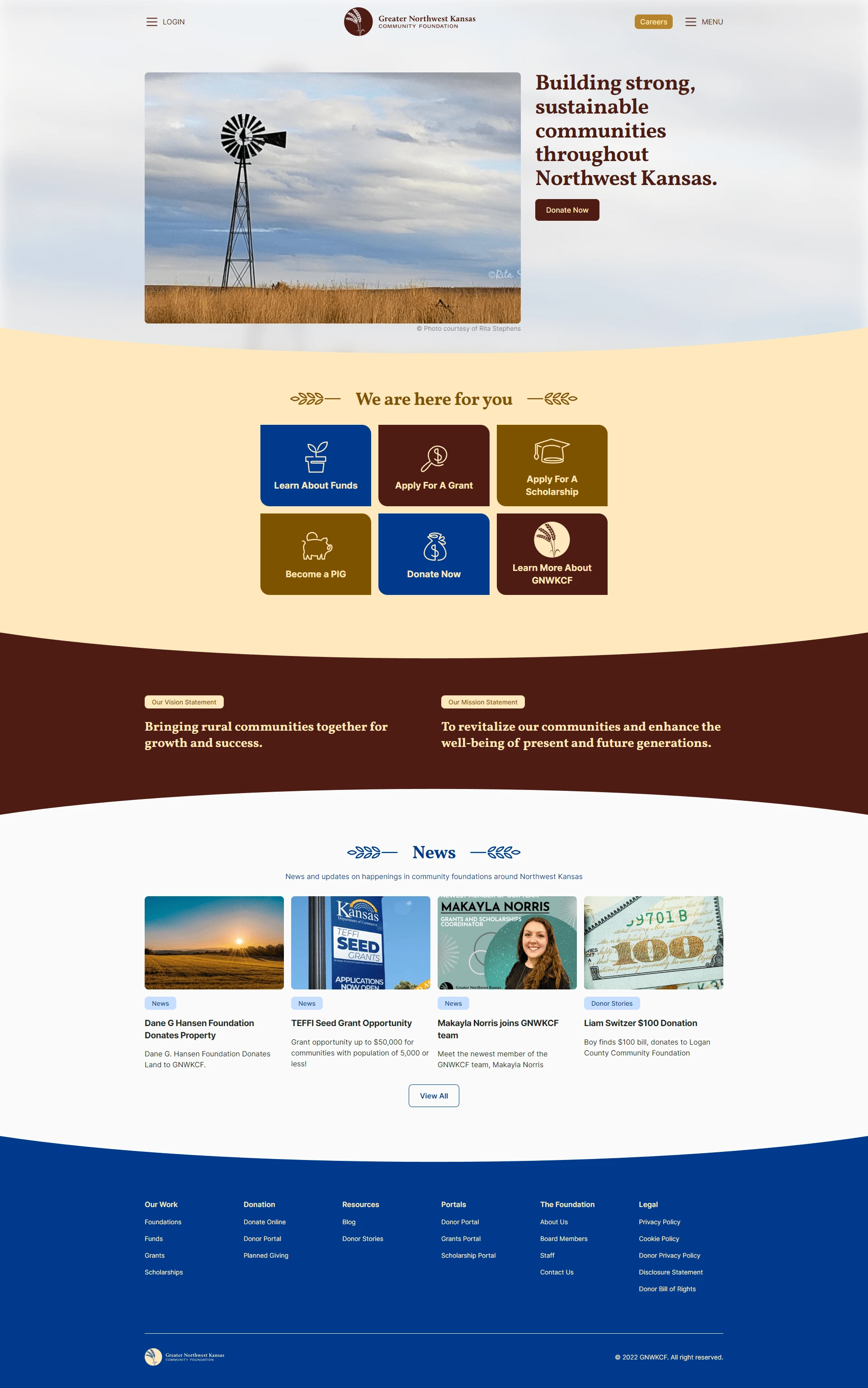
The new design had to not only align with the logo but also shift the focus towards the affiliates and the various foundations GNWKCF supports. The content needed to be engaging and communicate a clear narrative.
The old website's homepage
We embarked on a creative journey that involved:
Understanding the affiliates: A deep dive into the foundations and affiliates GNWKCF supports helped us design a user interface that genuinely speaks to their roles and contributions.
Brand Storytelling: By crafting a visual and textual narrative that aligns with the new logo's intent, we created a brand-consistent experience that underscores GNWKCF's mission.
User Experience (UX) Focus: Ensuring an intuitive navigation system helped users effortlessly explore the website, learning about GNWKCF's role, affiliates, and community impact.
Mobile Optimization: The website was designed to look and perform seamlessly across different devices, making sure it's accessible to as wide an audience as possible.
The revitalized website has not only brought a cohesive brand image but has also led to an increase in user engagement, connecting GNWKCF with more community foundations. By making the brand focus evident, we've helped GNWKCF emphasize their critical role in supporting communities across Kansas.

Redesigned page
Improving navigation
The existing navigation system on GNWKCF's website was cluttered and lacked a clear pathway for users to explore the different sections. A streamlined navigation experience was needed to guide visitors through the website effectively.
We embarked on a mission to redefine the website's navigation:
User-Centric Analysis: We conducted an analysis of the users' flow, identifying their needs and the common paths they would likely follow on the site.
Simplified Menu Structure: By reducing the number of menu options and categorizing them more logically, we made it easier for users to find what they were looking for without feeling overwhelmed.
Intuitive Layout: We designed the navigation to be intuitive, placing essential elements where users would expect to find them. This included clear call-to-action buttons and concise labeling.
Responsive Design: Ensuring the navigation worked smoothly across various devices, we implemented a responsive design that adapts to different screen sizes.
The new navigation design significantly enhanced the user experience, enabling visitors to explore the site effortlessly. Bounce rates were reduced, and the time spent on the site increased, reflecting a more engaging and user-friendly platform.
By thoughtfully redesigning the navigation, we were able to create a more coherent and seamless browsing experience that aligned with GNWKCF's renewed brand focus and their mission to connect with community foundations in Kansas.

Conclusion
This project was not about a mere redesign; it was about understanding a brand's soul and infusing it into a digital platform that serves its true purpose. Collaborating with GNWKCF, we've demonstrated that when branding and web development walk hand-in-hand, they can create a profound impact.
Like this project
Posted Aug 16, 2023
Revitalized GNWKCF website with new logo, spotlighting Kansas affiliates. Elevated engagement and brand coherence through tailored design.
Likes
0
Views
1

