Innovative UX Design for Supply Chain Optimization Platform
Overview
Designing and planning an innovative user interface and UX for a supply chain optimization platform.
This platform helps suppliers in the food industry (such as winemakers, farmers, etc) to better manage, track, and optimize the links (supply chains) between different assets and to maximize efficiency and revenue.
The Challenge(s)
To simplify a complex platform with a lot of data needed to be displayed to the user at a glance and - in one dashboard!
an Innovative UX that stands out above the competitors.
Display relations and links between multiple assets.
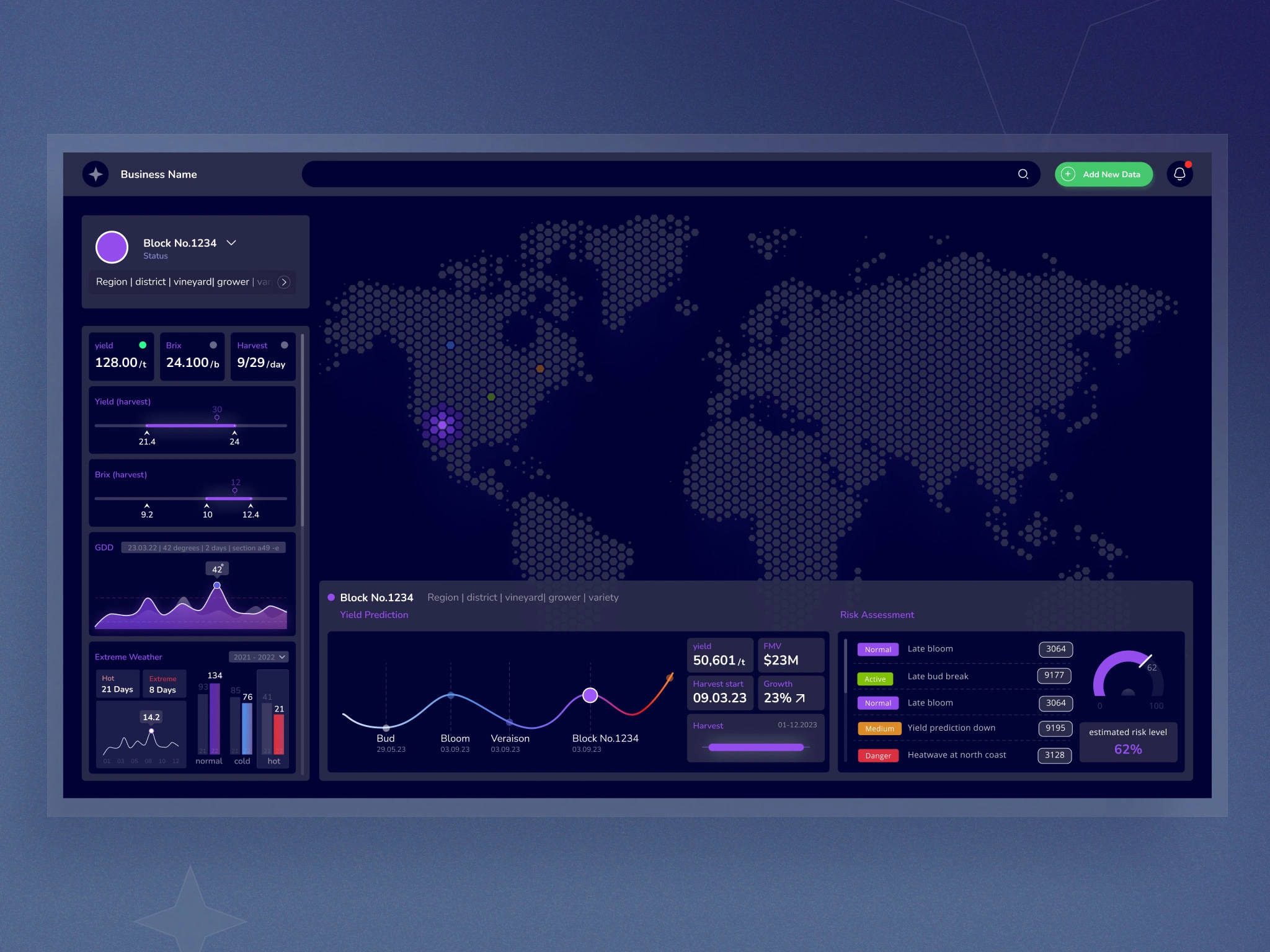
Main user interface: Global-View of all the client's assets around the world
Solution 01: Data Visualization
The main dashboard interface includes all the crucial data for the client at a glance. and with the option to set different parameters (date, risk level, harvest, and more) in one place.
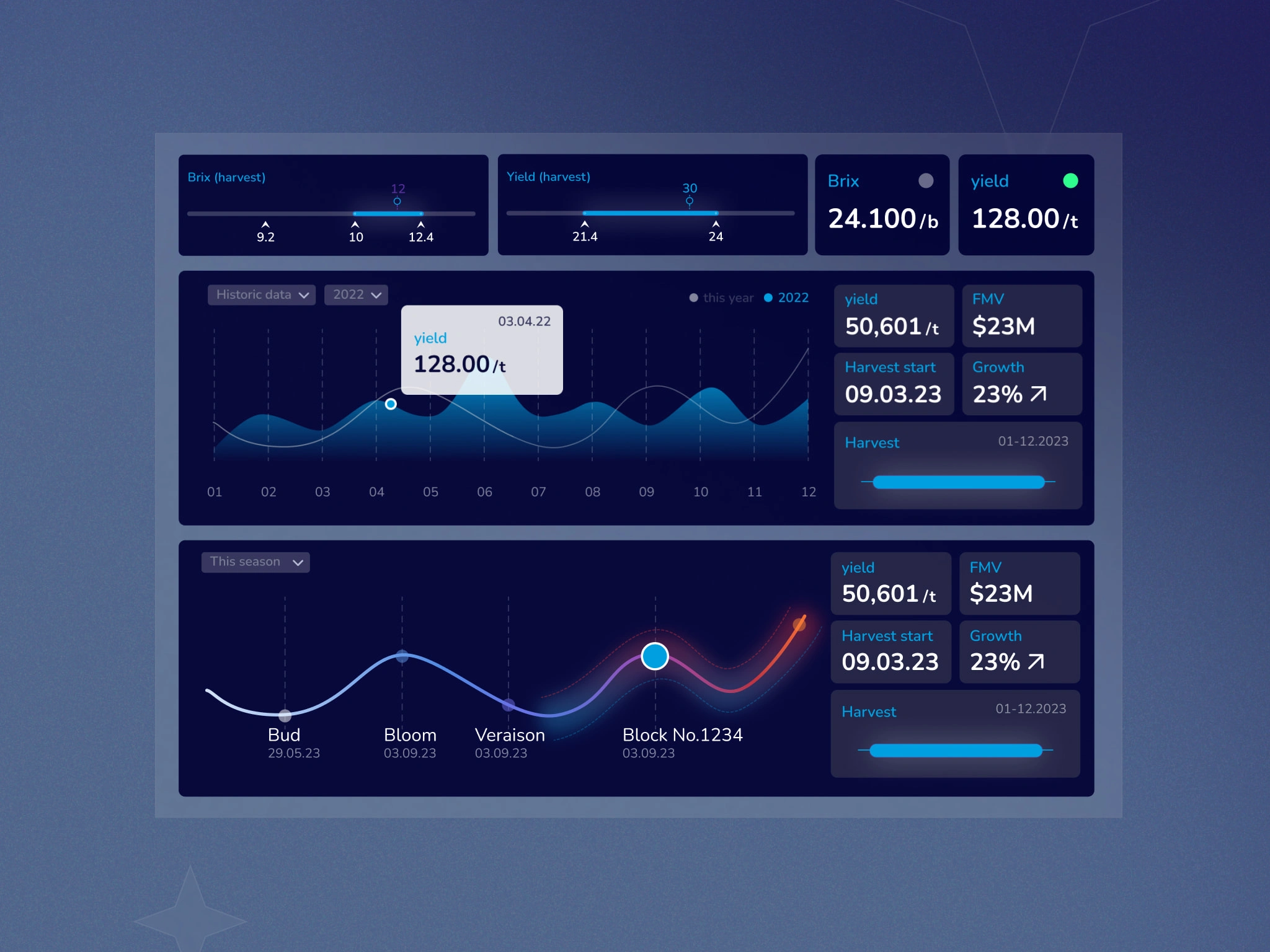
Main user interface data and graphs
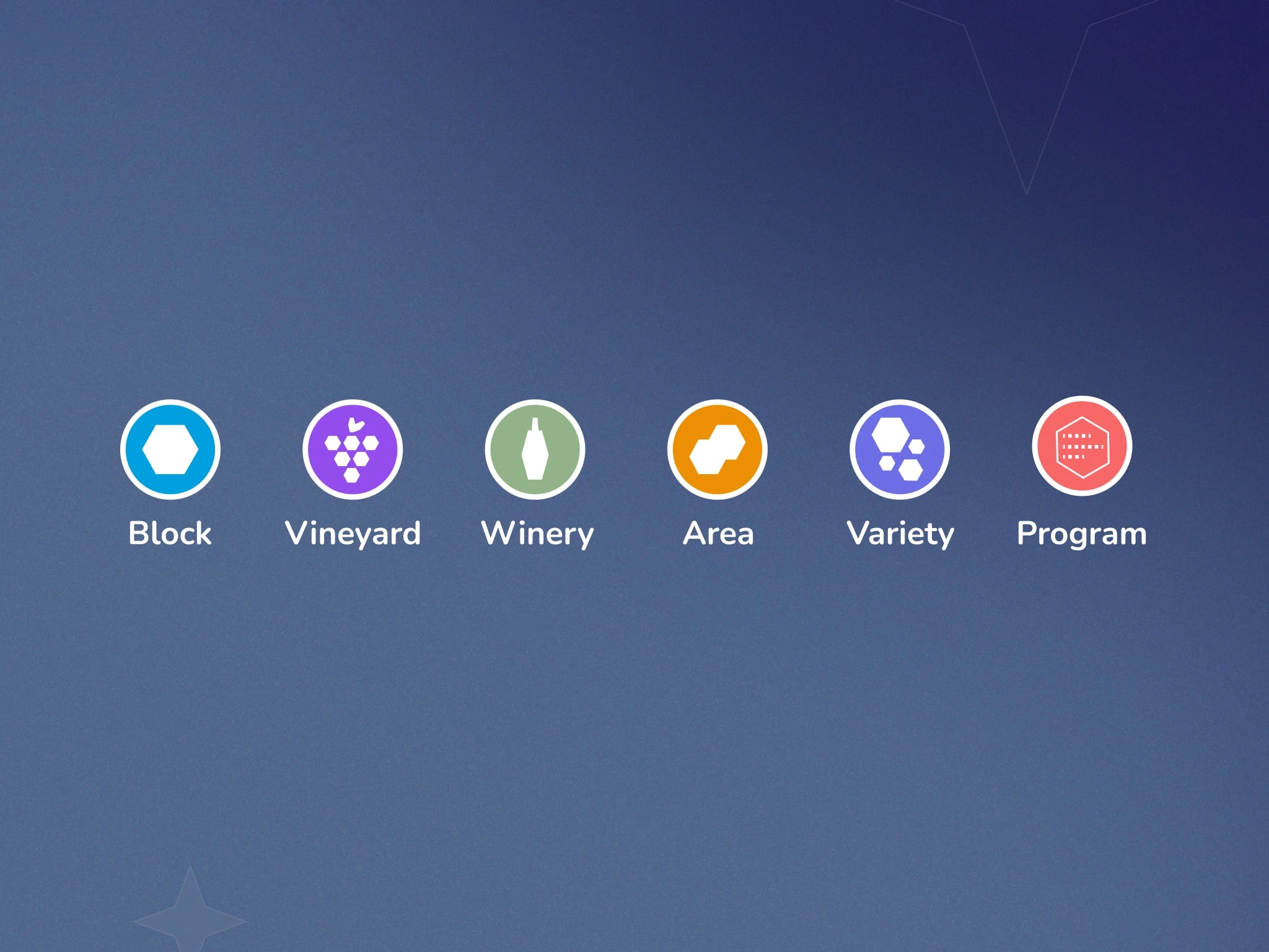
Solution 02: Index
Color-coded index with matching icons for the different types of assets.
Solution 03: Links between assets
Visualization of the links between the different assets, the user can see the full chain, to know where it starts and ends, and to easily identify the type of assent by color.
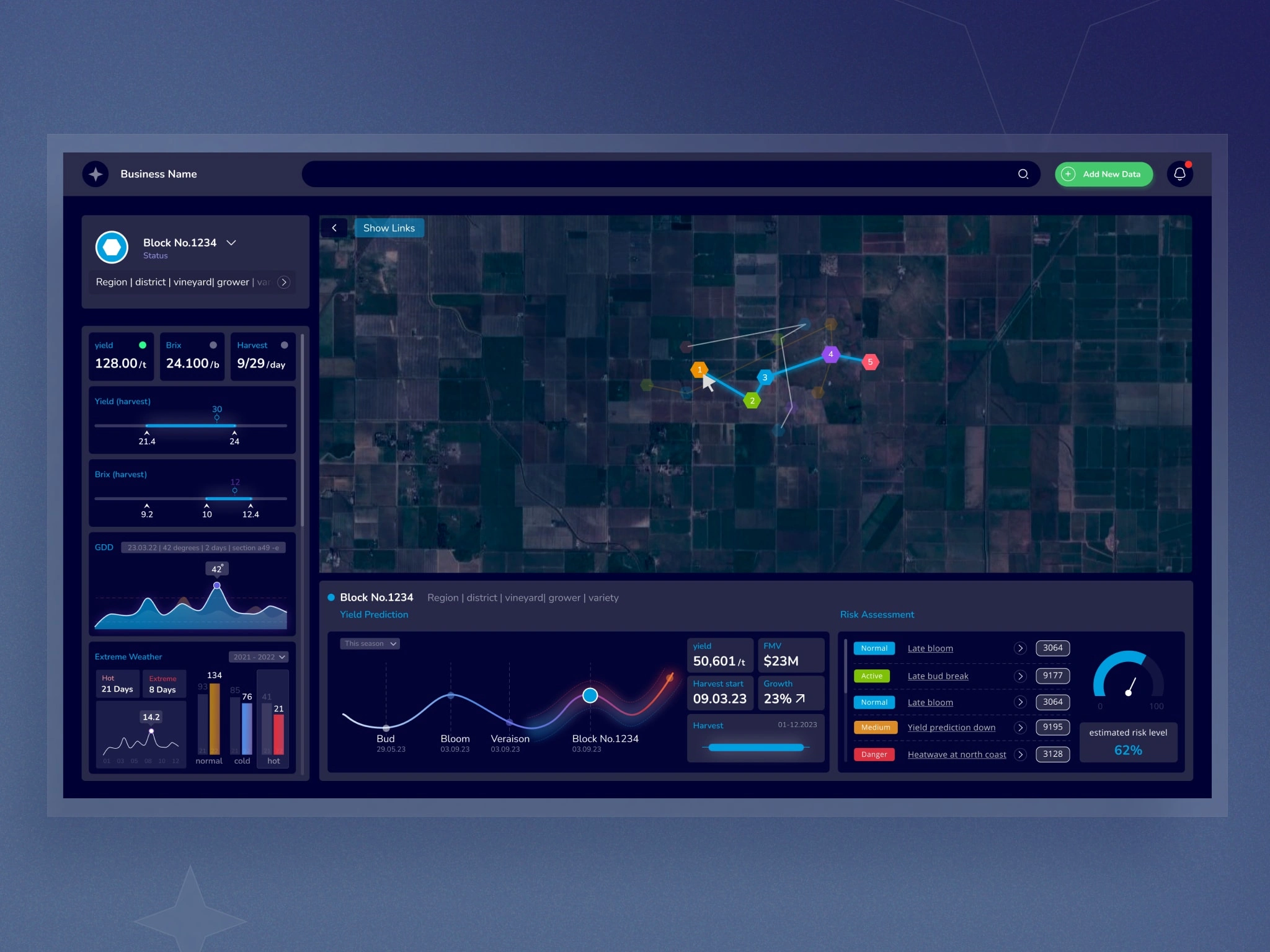
Links between assents - block view user interface
Solution 04: Plot View - specific data for each level
Zoom in to a specific asset - a second sidebar that displays only the chosen asset data.
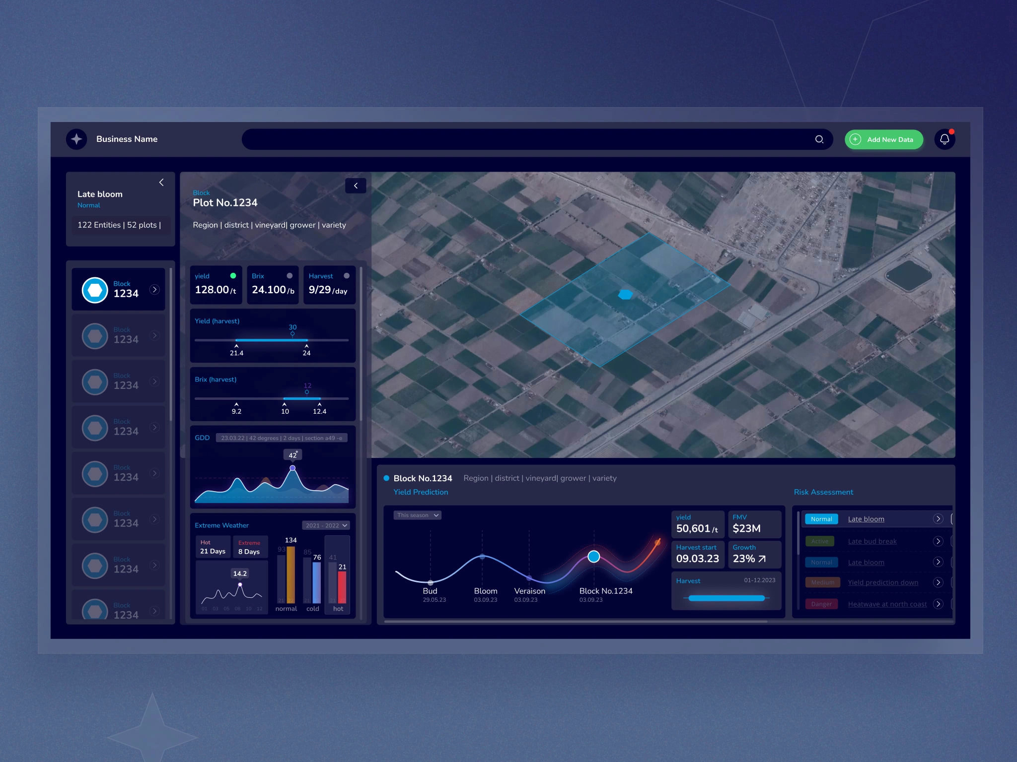
Plot view and second sidebar
Like this project
Posted Oct 14, 2023
Interface design and UX for a supply chain optimization platform, improving data visualization, assets management, performance, and revenue.
Likes
0
Views
70

