
LUMINA - Photography Portfolio Platform
Landing Page Series 7 of 17
─────────────────────────────
THE CONCEPT
─────────────────────────────
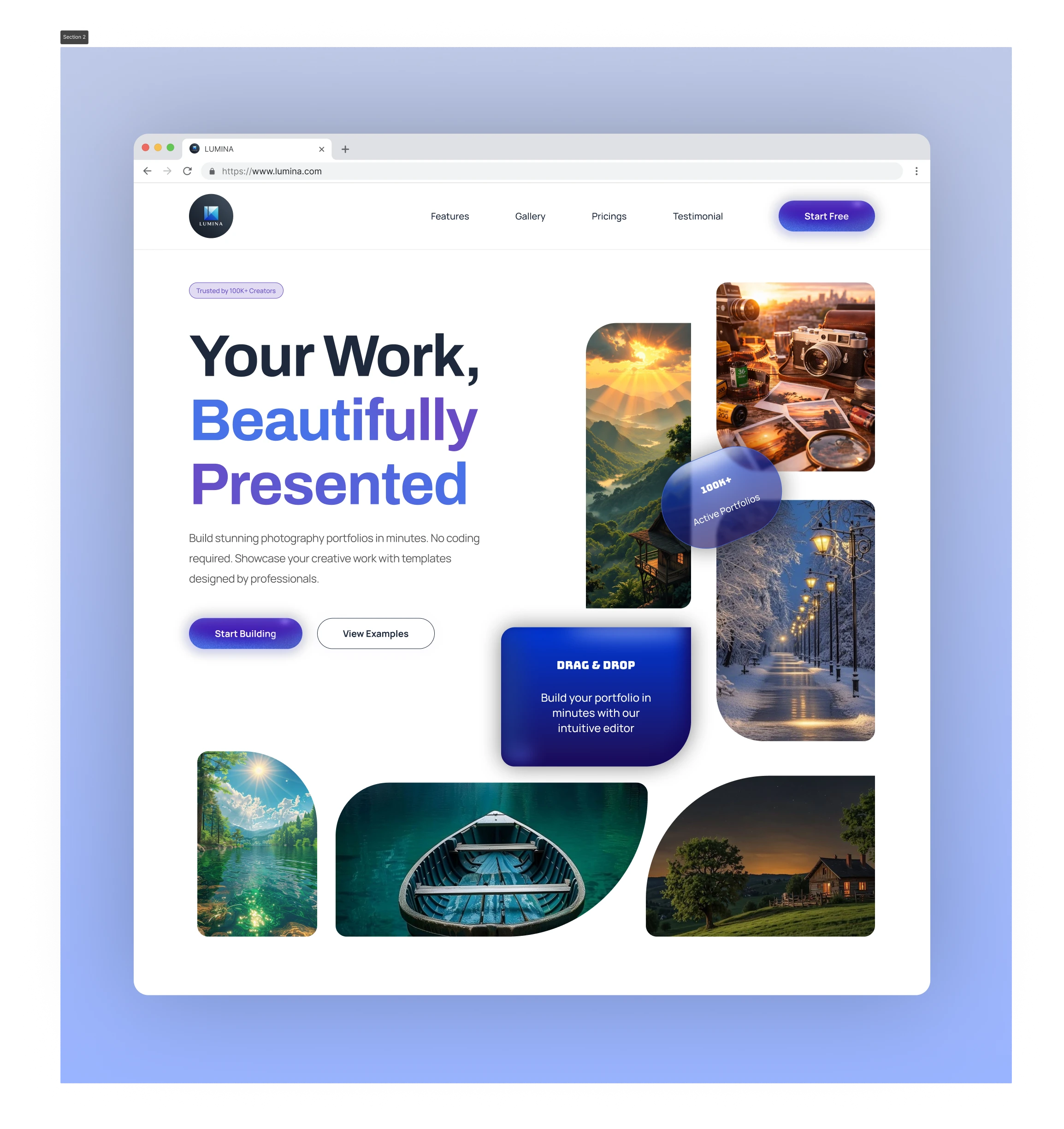
Bento Grid Hero. The layout popularised by Apple
in 2023 - now a staple of modern product design.
But most implementations are just photo grids.
This needed to be more than that.
The challenge: make the hero itself demonstrate
what LUMINA does. A photography portfolio platform
should showcase photography beautifully - before
the user reads anything.
─────────────────────────────
HERO — BENTO GRID BREAKDOWN
─────────────────────────────
The grid contains four content types:
01 - Photography cards (proof of product)
Real landscape, travel, and nature photography
in mixed sizes. Tall, wide, square - no rigid
structure. Each card has a unique border radius.
02 - Stats blob
"100K+ Active Portfolios" sits as a floating
glassmorphic element overlapping two cards.
Not a separate section. Not a stats row.
Embedded directly into the visual.
03 - Feature card
"DRAG & DROP - Build your portfolio in minutes"
lives inside the grid itself. Blue gradient
background makes it stand out without breaking flow.
04 - Bottom image row
Three full-width images bleed toward the edge.
Creates a sense of infinite depth - like there's
more to explore.
Result: the hero communicates product value,
social proof, and key features simultaneously.
Zero cognitive load.
─────────────────────────────
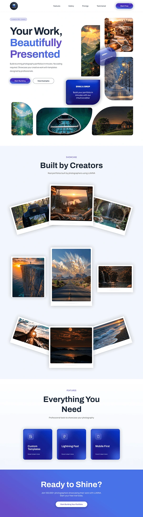
BUILT BY CREATORS — GALLERY
─────────────────────────────
The brief was: show real portfolios built on LUMINA.
Instead of a standard masonry grid, I went with
scattered polaroids. Each photo has:
· White border (polaroid reference)
· Slight rotation (organic, human)
· Drop shadow (physical depth)
· Grouped in rows of 3-4 (visual rhythm)
Three rows of scattered photos create a sense of
abundance without feeling overwhelming.
─────────────────────────────
DESIGN DECISIONS
─────────────────────────────
Color: Purple gradient (#6B46C1 - #3B82F6)
Why purple? Trust + creativity. Used by Figma,
Notion, and most creative tools. Signals
"professional creative platform."
Typography: Space Grotesk
Geometric, modern, slightly quirky. Matches
the creative-professional audience.
Border radius: Inconsistent (intentional)
Some cards fully round, some square, some
medium radius. Creates visual interest
and breaks the grid rigidity.
Browser mockup presentation: Shows the design
in context. Clients immediately understand
this is a web product, not an app.
─────────────────────────────
TOOLS
─────────────────────────────
Designed in: Figma
Presentation: MacBook Pro 16" mockup
0 likes · 0 views · Nov 3, 2026