
AURUM — Swiss Luxury Watch Landing Page
Landing Page Series · Layout 8
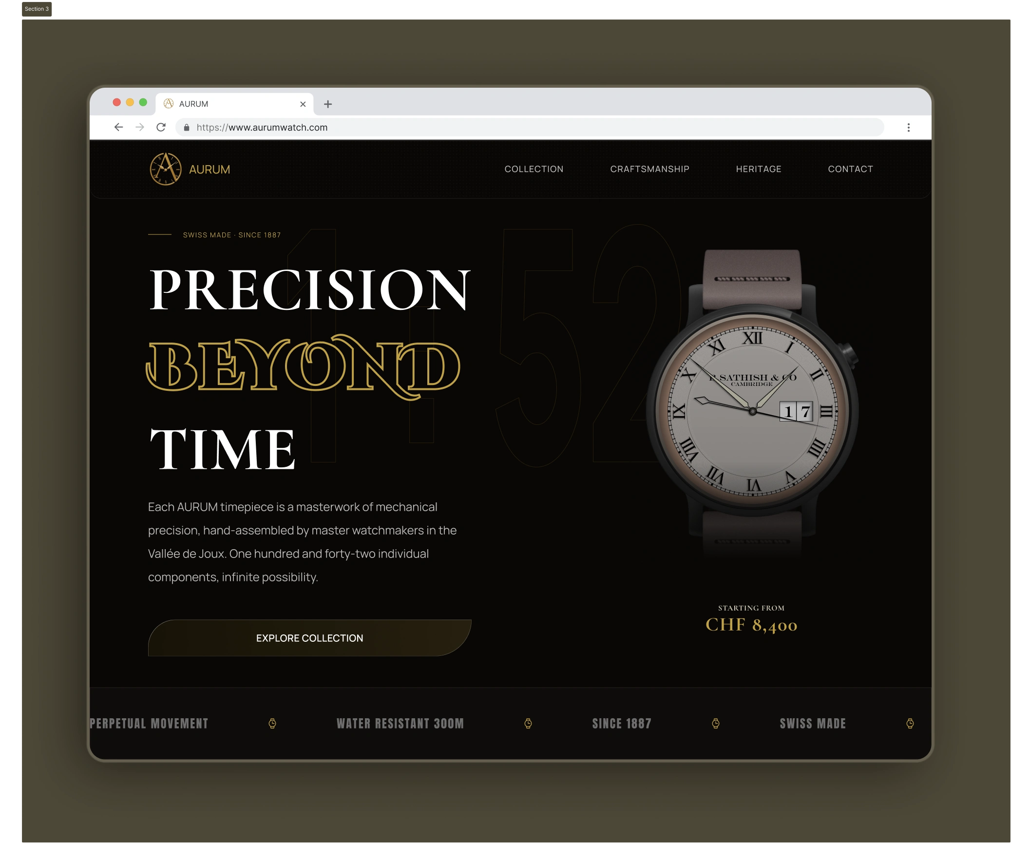
Hero Type: Typography-Led Hero
─────────────────────────────
THE BRIEF
─────────────────────────────
Design a luxury watch landing page where
typography is the primary design element —
not photography, not illustration. The type
itself must communicate prestige.
Industry: Luxury Horology
Brand: AURUM · Swiss Made · Since 1887
Palette: Pure black · White · Gold (#C9A84C)
─────────────────────────────
SECTION BREAKDOWN
─────────────────────────────
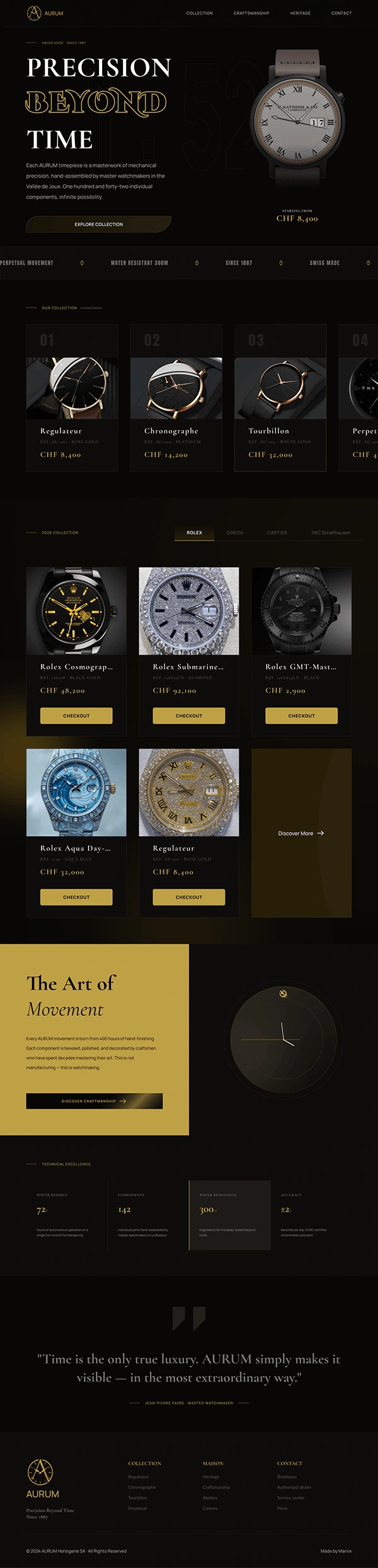
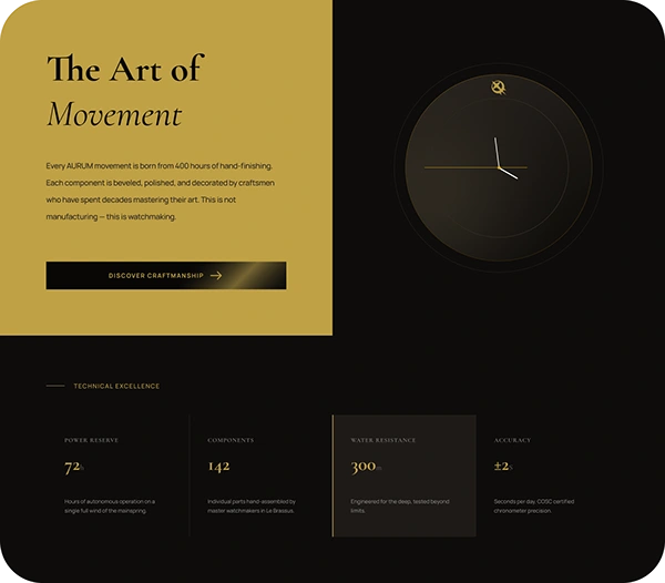
01 - The Art of Movement (Split Editorial)
Gold left panel / Dark right panel.
Animated watch face with real ticking hands.
Copy focused on craft, not features.
"This is not manufacturing - this is watchmaking."
One CTA only. Restraint.
02 - Technical Excellence (Spec Grid)
Four columns. Each spec gets its own panel.
Giant numbers lead. Small labels follow.
One highlighted panel (Water Resistance) -
creates visual rhythm without disrupting grid.
Numbers: 72h / 142 / 300m / ±2s
The specs sell themselves.
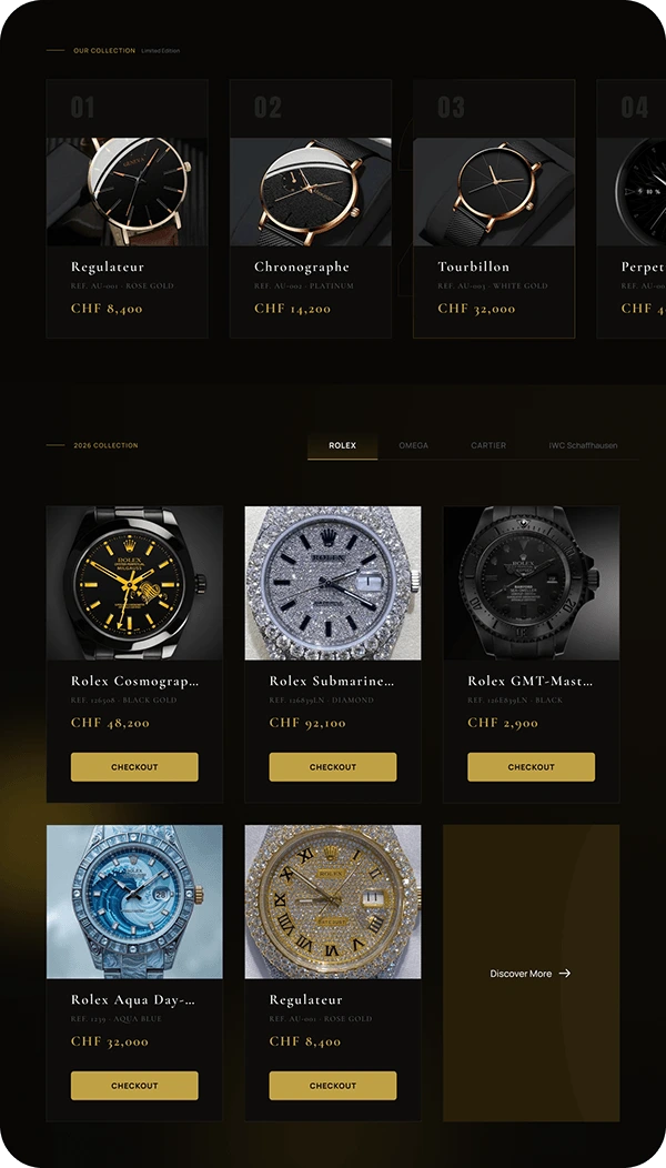
03 - Collection (Horizontal Scroll + Tabs)
Real watch photography.
Brand filter tabs: ROLEX · OMEGA · CARTIER · IWC
Numbered cards (01, 02, 03...) - editorial.
Gold CHECKOUT buttons - on brand, never off-brand.
Empty last card with "Discover More" -
suggests abundance without overwhelming.
─────────────────────────────
DESIGN PRINCIPLES APPLIED
─────────────────────────────
Restraint: Every element earns its place.
No decorative elements that don't serve a purpose.
Contrast: Light/dark, solid/outline,
large/small. Contrast creates hierarchy
without needing colour.
Typography as hero: When type is the primary
design element, every font choice, weight,
and spacing decision is magnified.
Real photography: Luxury cannot be faked
with illustrations. Real product imagery
is non-negotiable.
─────────────────────────────
TOOLS & SPECS
─────────────────────────────
Designed in: Figma
Presented in: MacBook Pro 16" mockup
Frame: 1728 width
© 2026 — Landing Page Design Series
0 likes · 0 views · Nov 3, 2026