Nativis - Logo Design and Brand Identity
Project developed in the academic field.
This project consisted in developing a comprehensive branding and visual identity for a small beauty center. The project’s goal was to showcase the center’s connection to nature while standing out in a highly competitive market. The project was initiated based on the brand’s ideas and requirements set by Nativis.
The team behind the brand has put great effort into conveying a sense of naturalness in their messaging. They wanted to provide a serene environment where customers could feel connected to nature while enjoying beauty treatments.
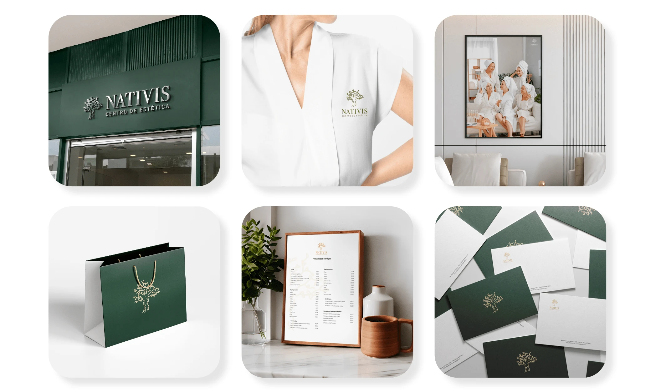
The branding and visual identity developed for this project were designed to reflect the brand’s core values and mission. The design elements incorporate natural elements such as leaves and trees, giving the brand a fresh, organic feel.
Overall, this project aimed to create a unique and memorable visual identity for a beauty center that emphasizes its connection to nature, while also providing a relaxing experience for its customers.
Logo Design
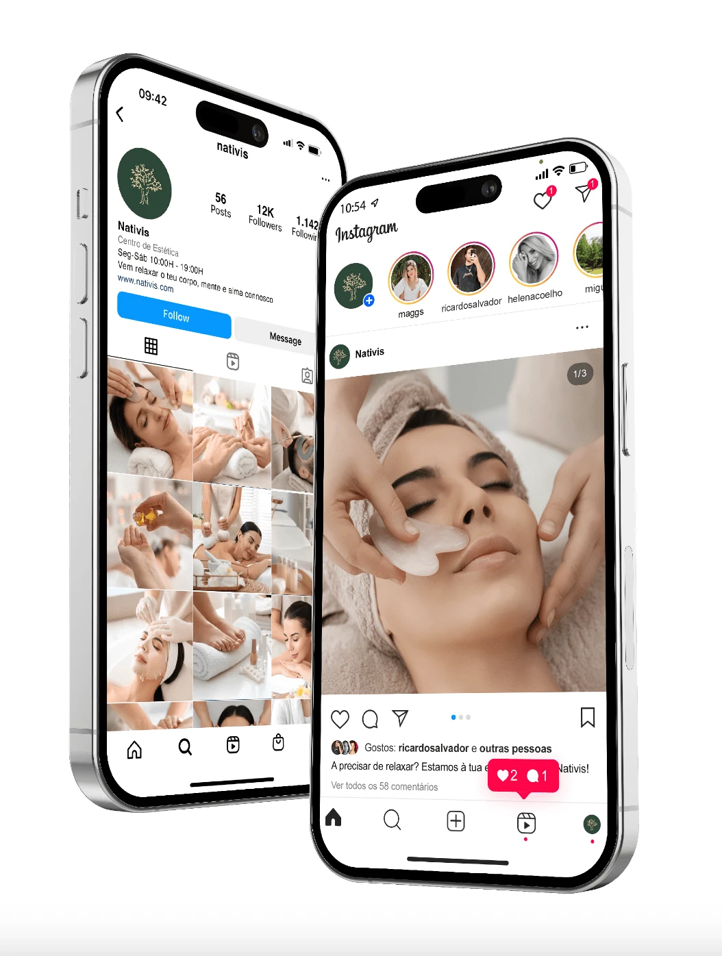
The graphic brand comes in two versions:
-vertical version
-horizontal version
The vertical version is the main one and therefore, whenever possible, it’s use is a priority.
In Nativis’ visual identity, two fonts are used, one for the logo - Bodoni 72 by ITC Fonts - and another for the description - Flama by Feliciano Type.
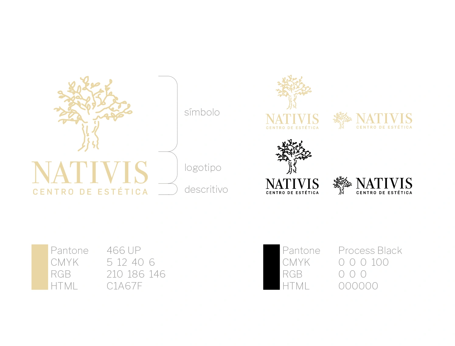
Another font was used in the brand applications - Baskerville by John Baskerville.
Brand Design - Applicattions
Brand Guidelines
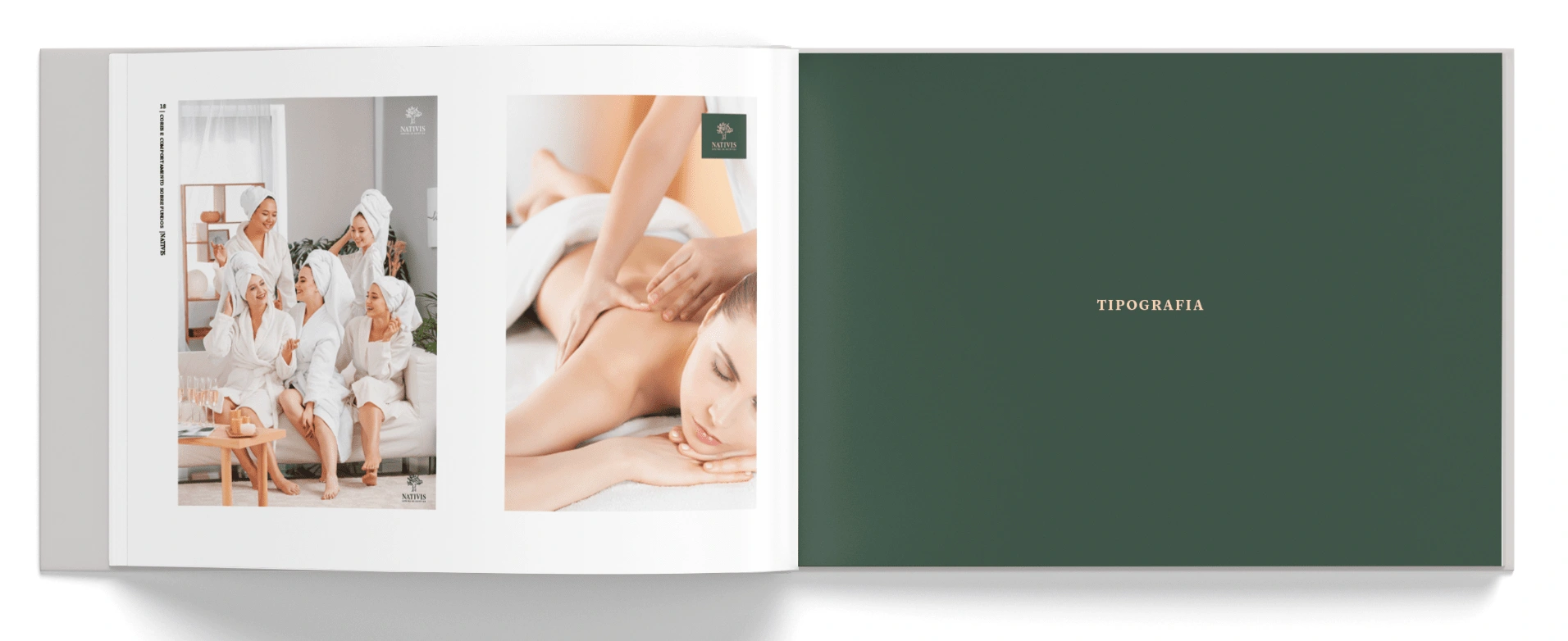
A brand guidelines manual was also developed, which has several chapters, including:
- Construction and Dimensions:
Brand elements
Versions
Minimum Dimensions
Safety margins
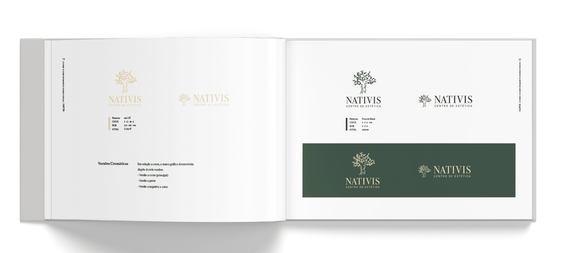
- Color and behaviors on backgrounds:
Chromatic Versions
Fund behaviors
- Typography
Like this project
Posted May 6, 2024
This project consisted in developing a comprehensive branding and visual identity for a small beauty center.

