KOYO Coffee Logo Design
Nicoleta Nica
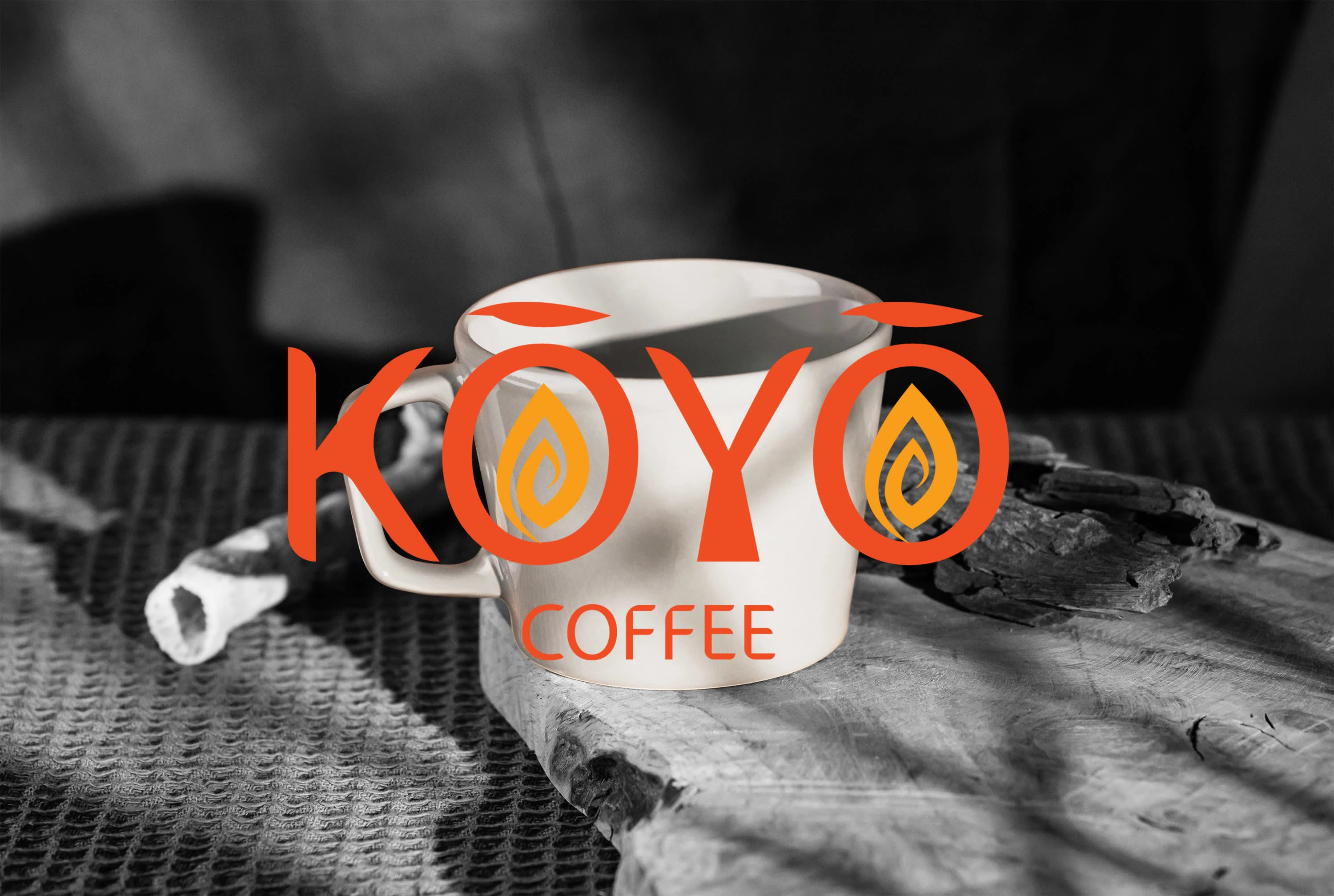
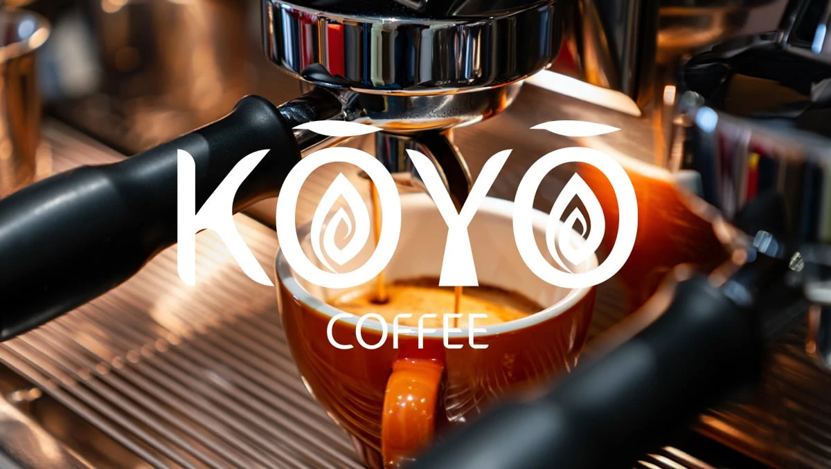
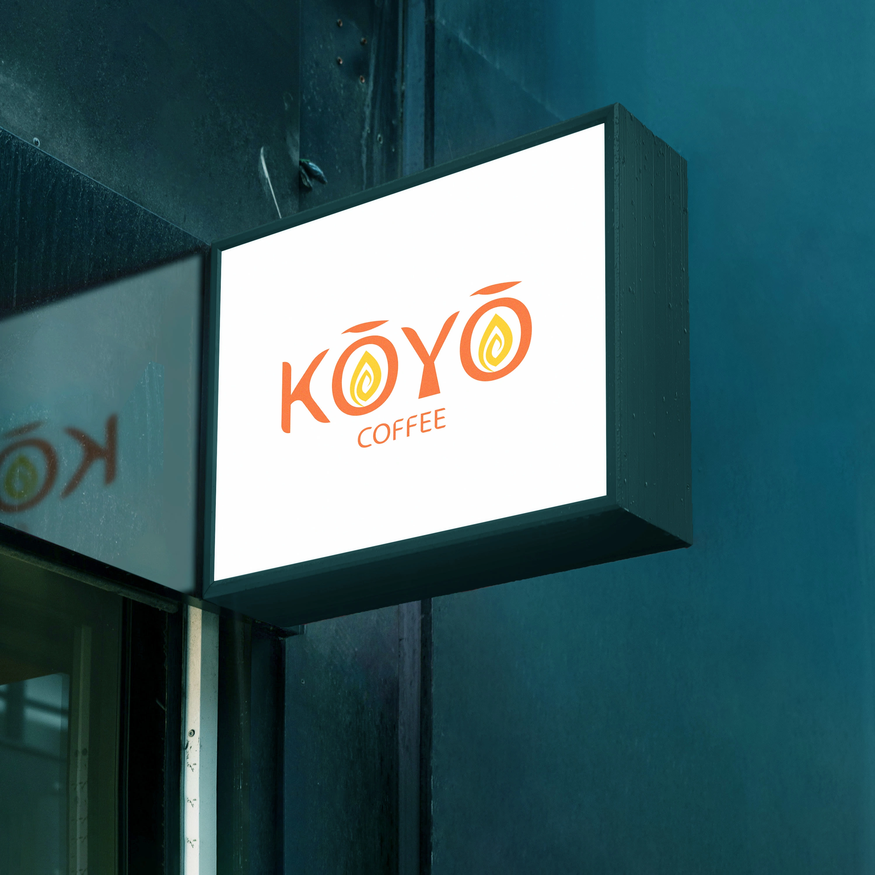
The KOYO Coffee logo is inspired by the Japanese word koyo, which means autumn leaves or autumn colors, which conveys a feeling of warmth, seasonality and comfort. Its vibrant orange color palette suggests positive energy and a cozy atmosphere, inviting customers to associate the cafe with a relaxing atmosphere. The symbols in the letters ’’O’’, which resemble both a leaf and a coffee bean, communicate the idea of freshness and naturalness. The design projects a friendly, warm and authentic brand image, oriented towards quality and pleasant customer experiences.
Like this project
Posted Feb 26, 2026
The goal of this project was to create a brand that feels as warm and inviting as a fresh roast on a crisp fall day.