Curry Watershed Partnership Newsletter
"The Curry Watersheds Partnership is a group of non-regulatory organizations working together to help local landowners and communities keep our shared lands and rivers healthy and sustainable."
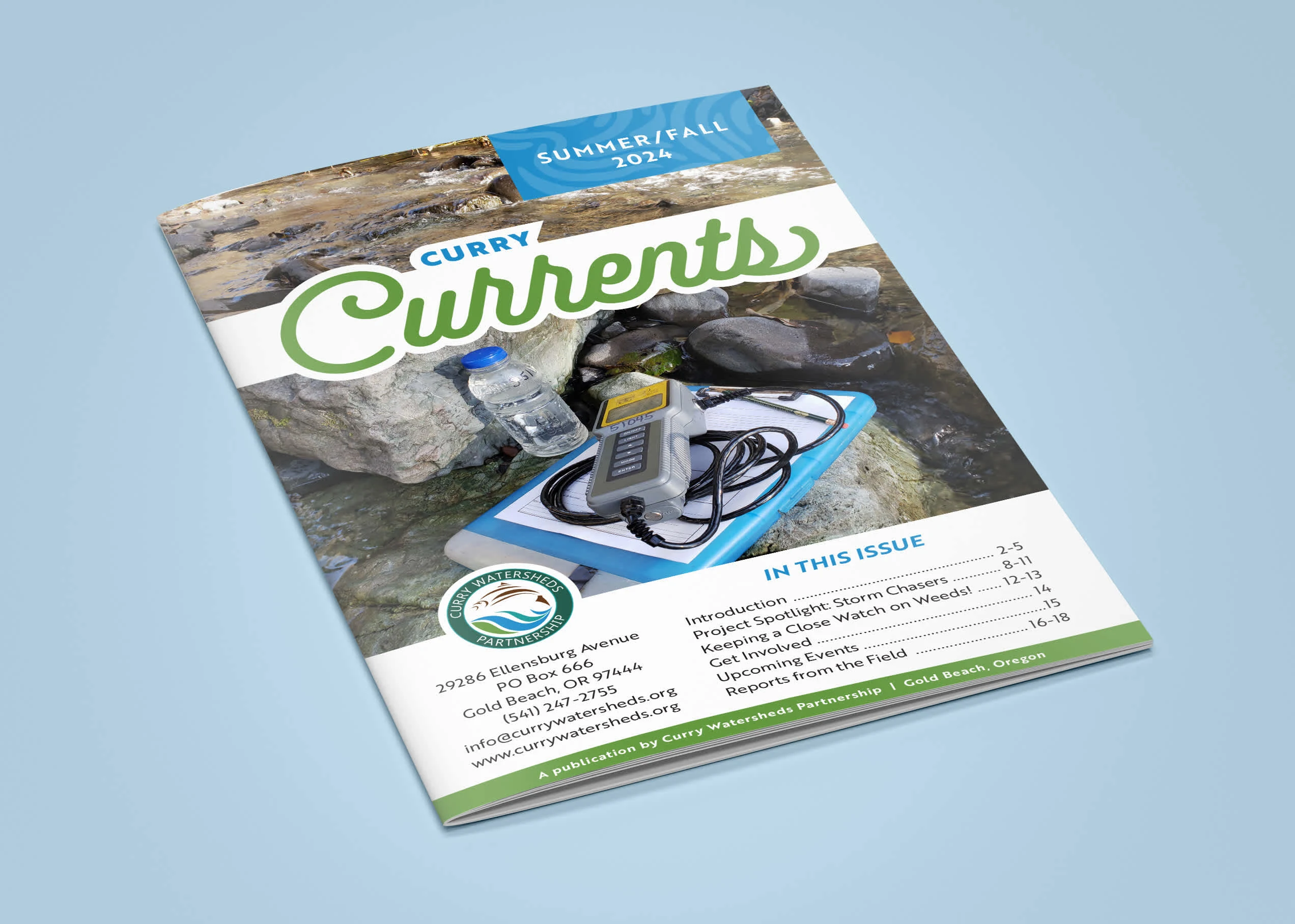
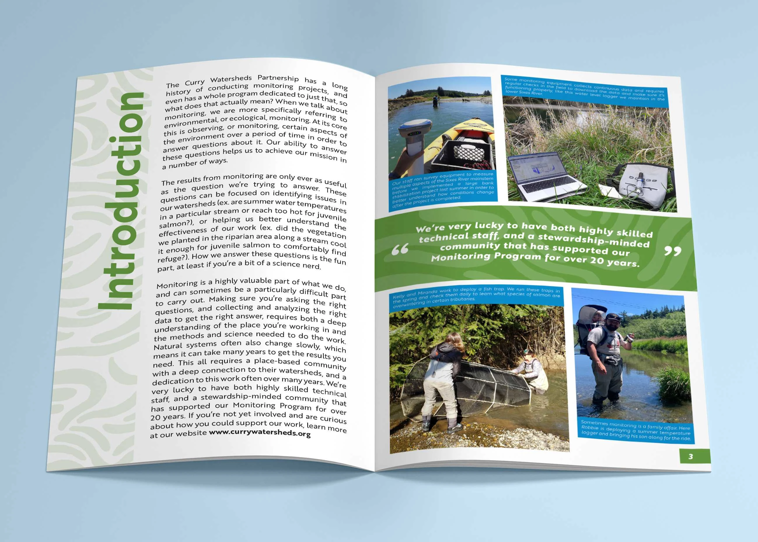
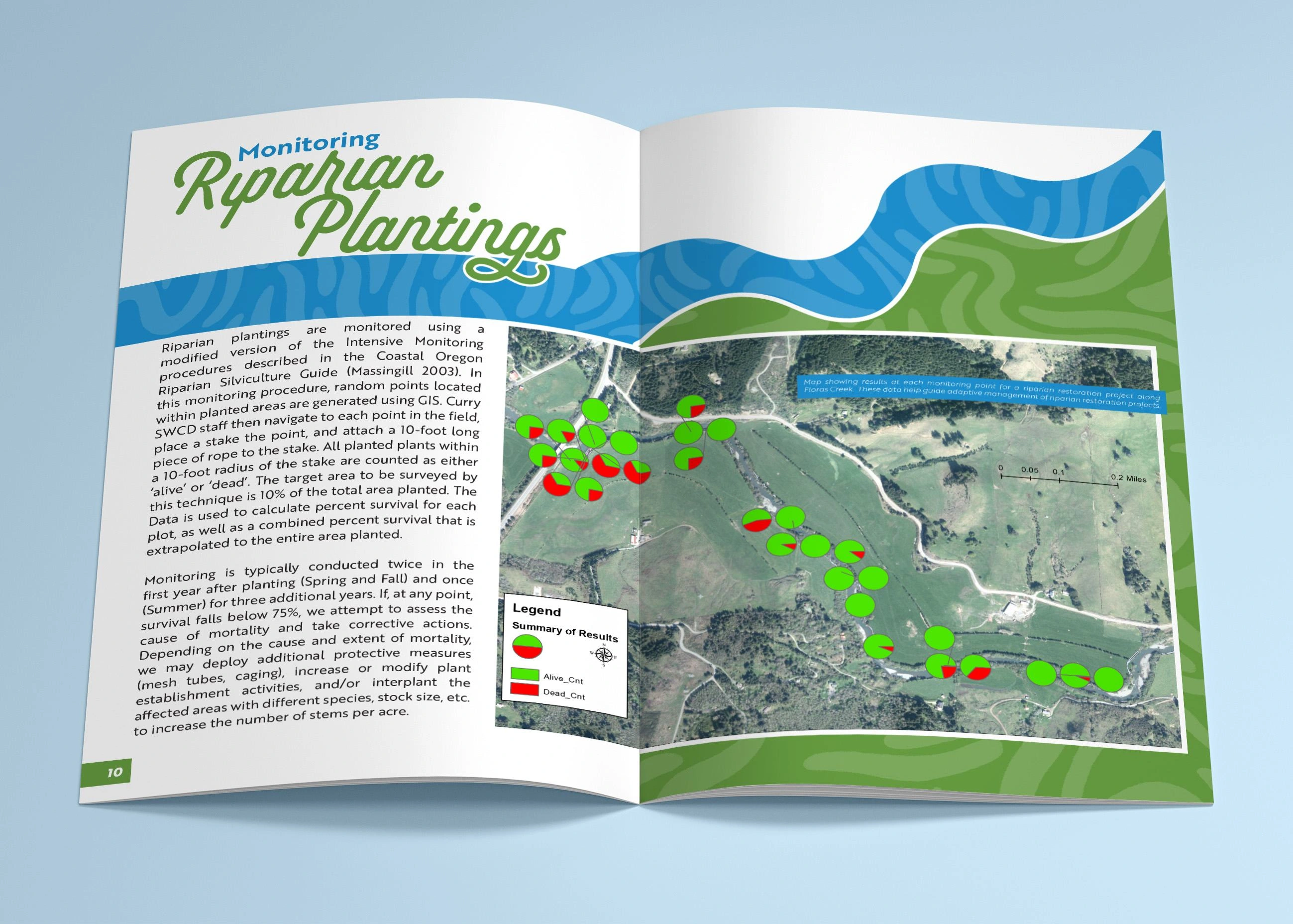
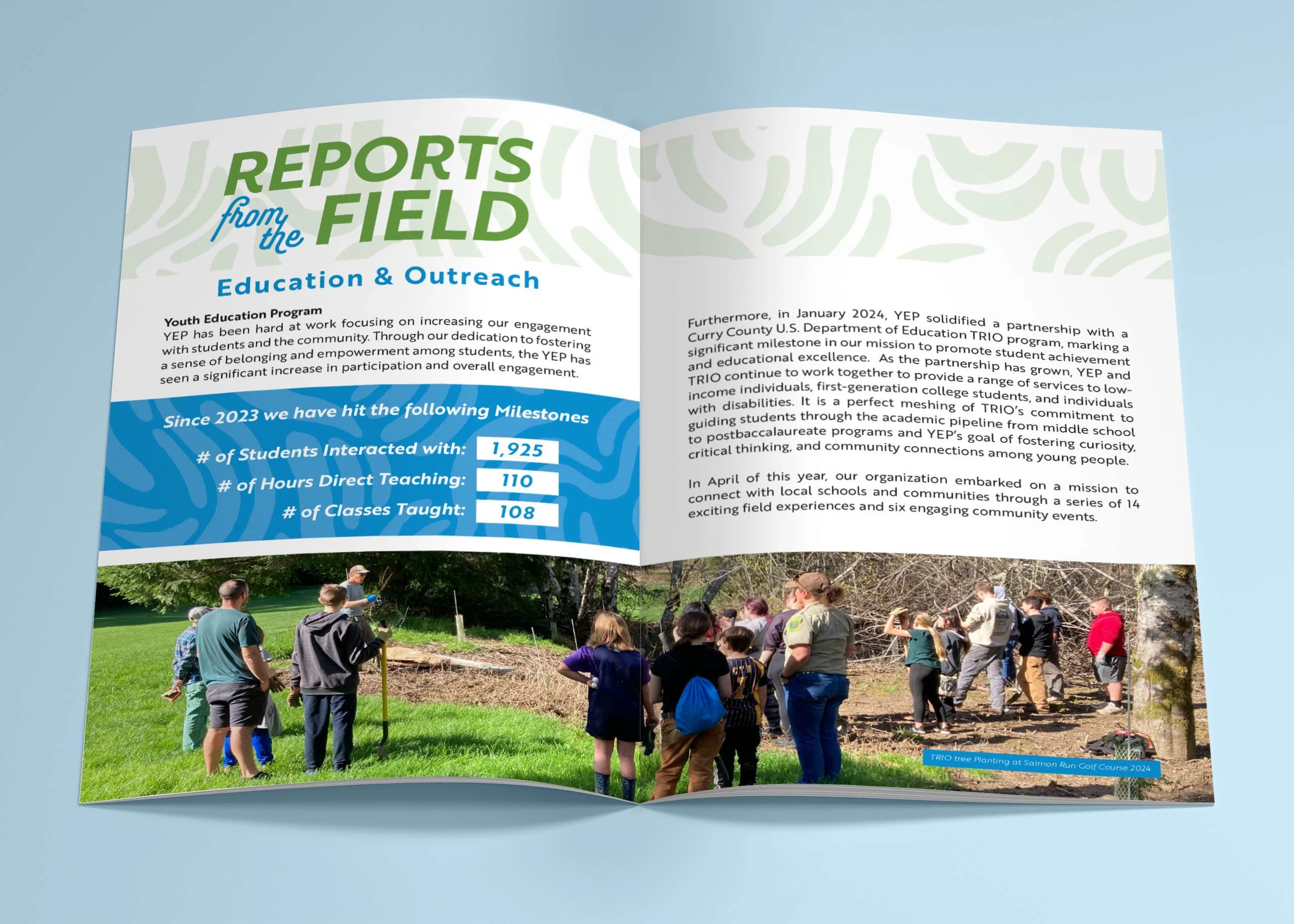
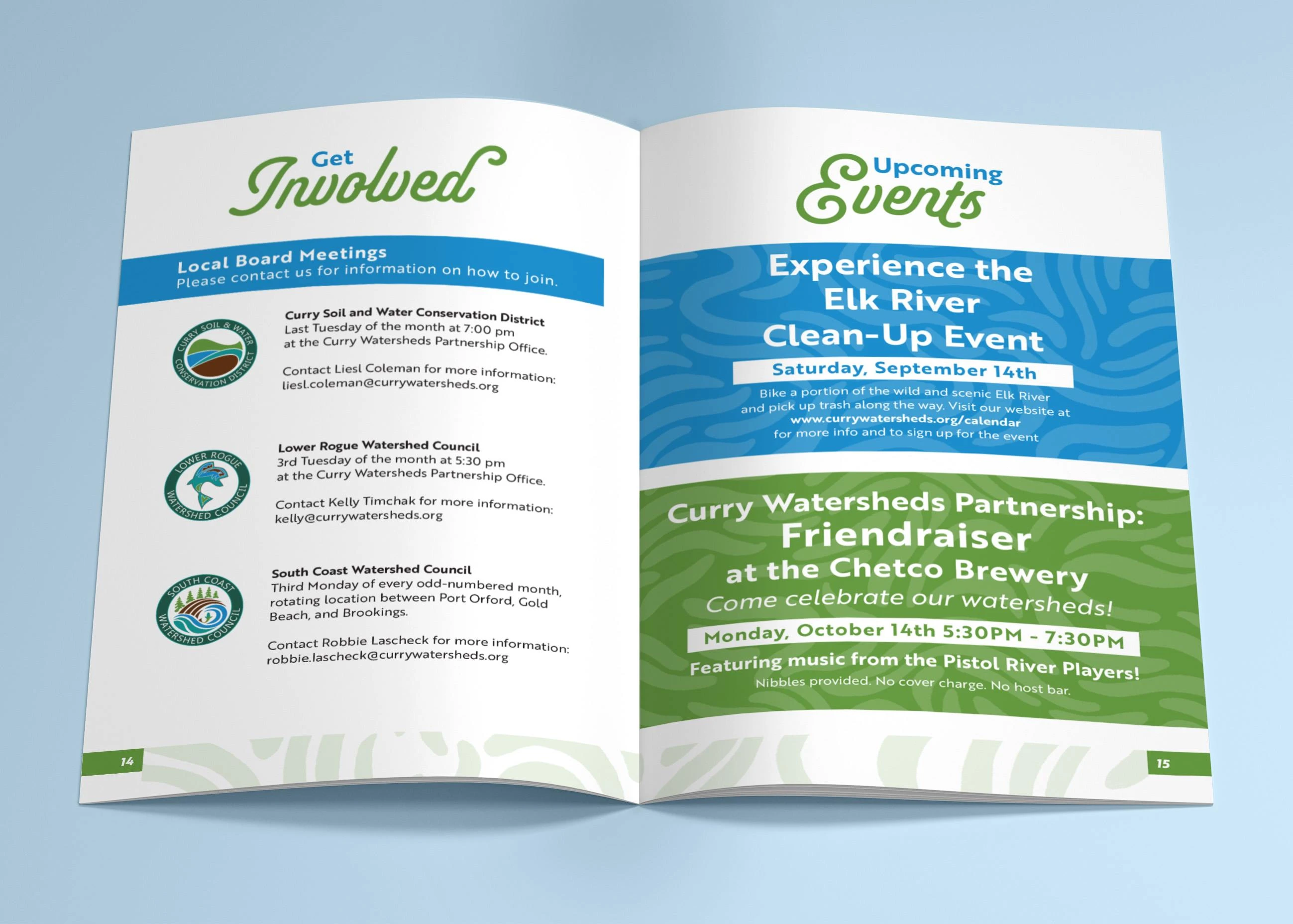
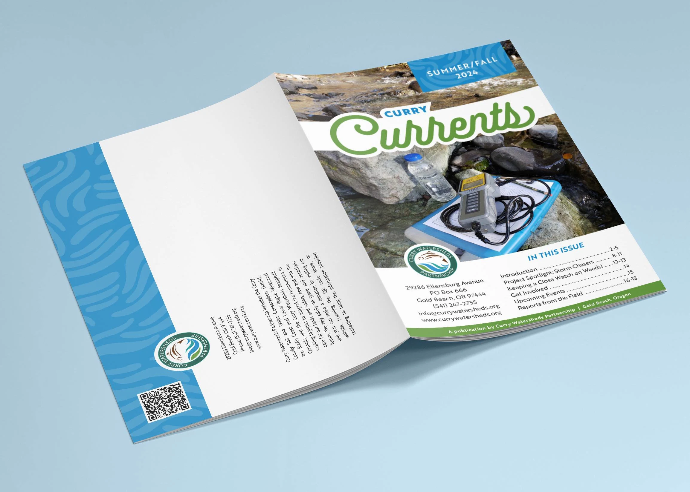
For their Curry Currents Summer/Fall 2024 newsletter, I adopted a minimalistic and professional approach. Utilizing two of their brand colors, I crafted an abstract pattern that evokes the texture of water, subtly reinforcing their mission. To maintain a playful yet polished feel, I selected a lively font, enhanced with cooler brand accents. This design balances elegance and approachability, making it visually engaging while clearly communicating our initiatives.
Like this project
Posted Sep 18, 2024
This non-profit was in need of on updated newsletter design. I brought a playful, yet professional perspective that fit perfectly with their brand & mission.
Likes
0
Views
8


