
Clinora — Rethinking the Healthcare Dashboard Experience
How can complex health information feel simpler, clearer, and more engaging?
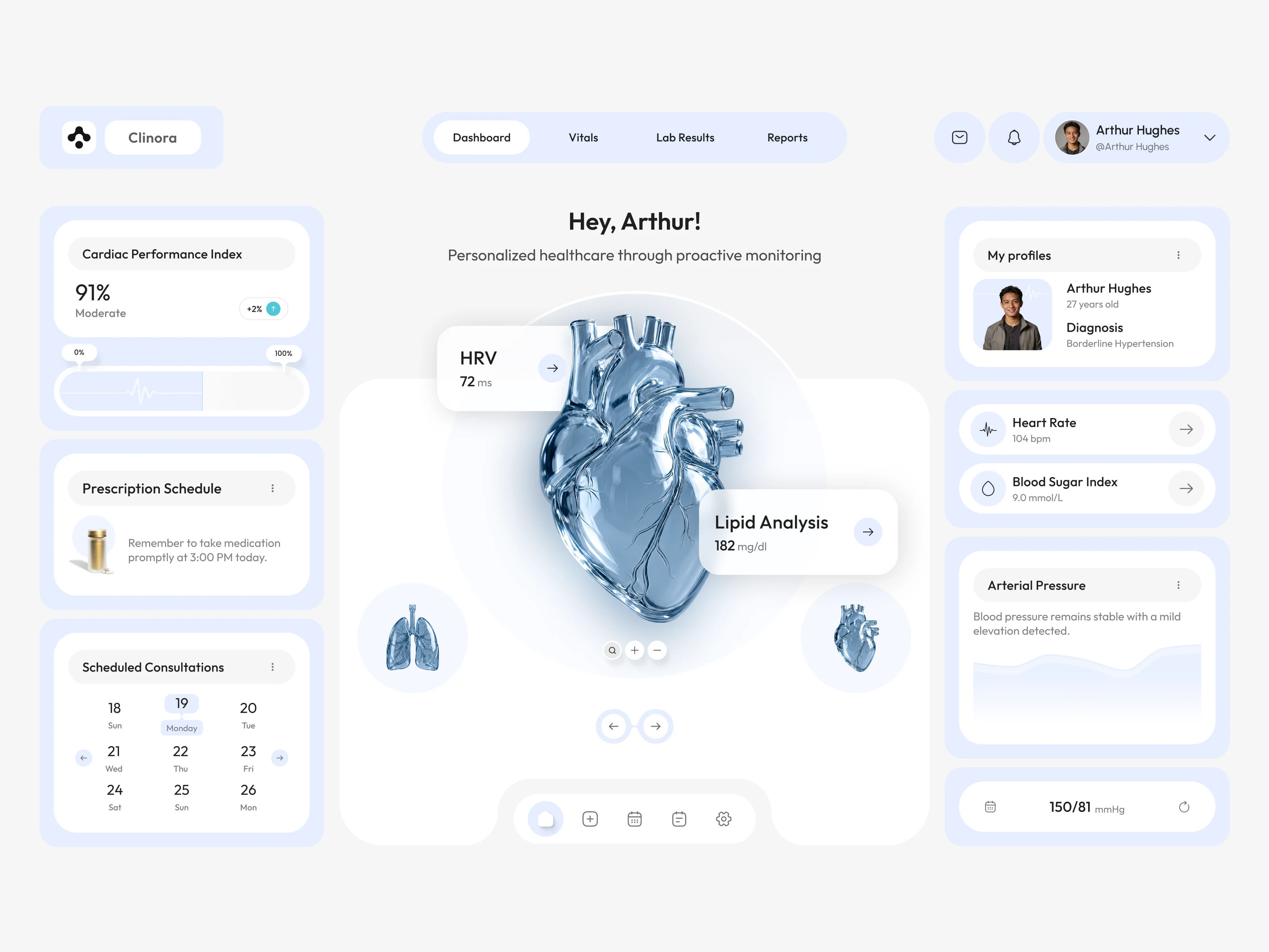
Introducing Clinora, a healthcare dashboard UI concept focused on presenting health metrics through a clean, organized, and visually engaging interface.
Design highlights
• Health monitoring dashboard with organized metric cards
• Heart rate, blood pressure, and blood sugar indicators
• Prescription reminders and consultation scheduling
• 3D anatomical visuals to create a more engaging experience
• Soft blue tones, clear information hierarchy, and consistent UI component.
My goal with this concept was to explore how thoughtful UI/UX design can make health information easier to navigate while maintaining a modern, approachable visual language.
What would you improve first in this dashboard: information hierarchy, data visualization, or navigation?
#Ui design #Ux design #Healthcare design #Dashboard design #Product design #Figma
0 likes · 0 views · Oct 31, 2026
Clinora — Rethinking the Healthcare Dashboard Experience How can complex health information feel simpler, clearer, and more engaging? Introducing Clinora, a ...


