Built with Framer
Attention.ad Website Redesign
Basit A. Khan
Verified
Project Overview
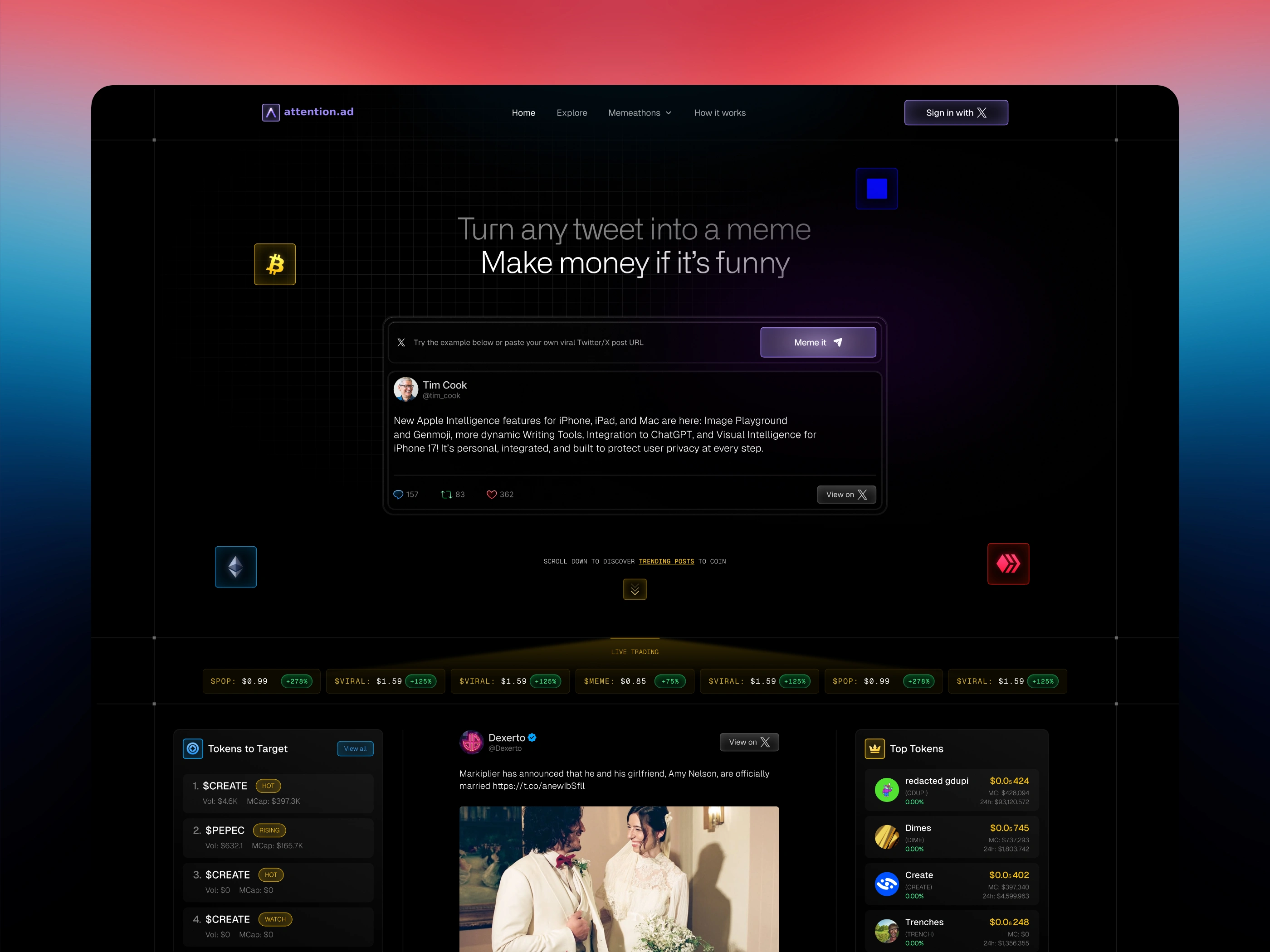
Attention.ad is a culture-first platform built around one simple idea: turn attention into value. With the tagline “Be First to Coin™ It. Get Paid to Meme It.”, the product enables users to turn tweets into memes and earn money when those memes perform.
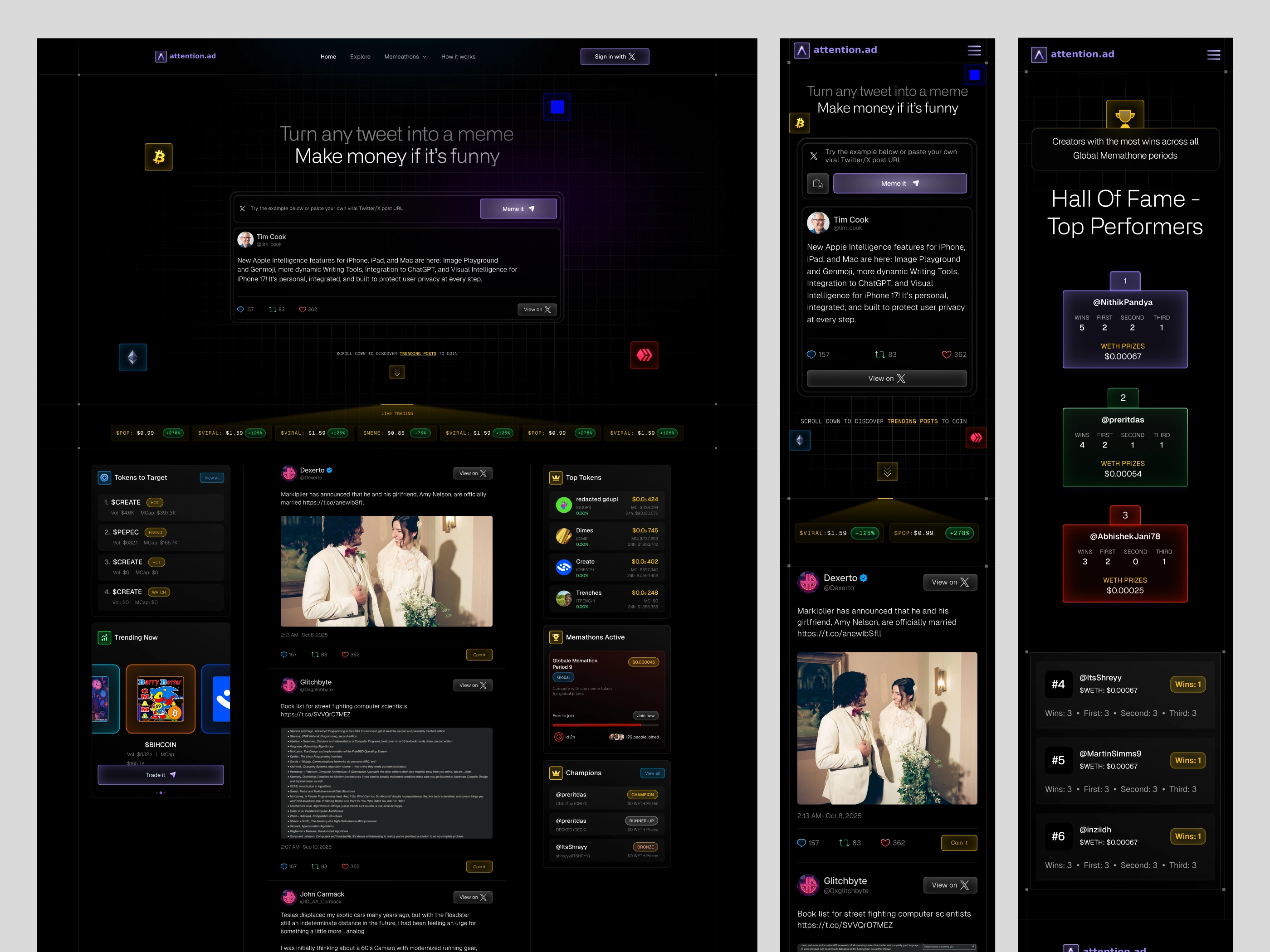
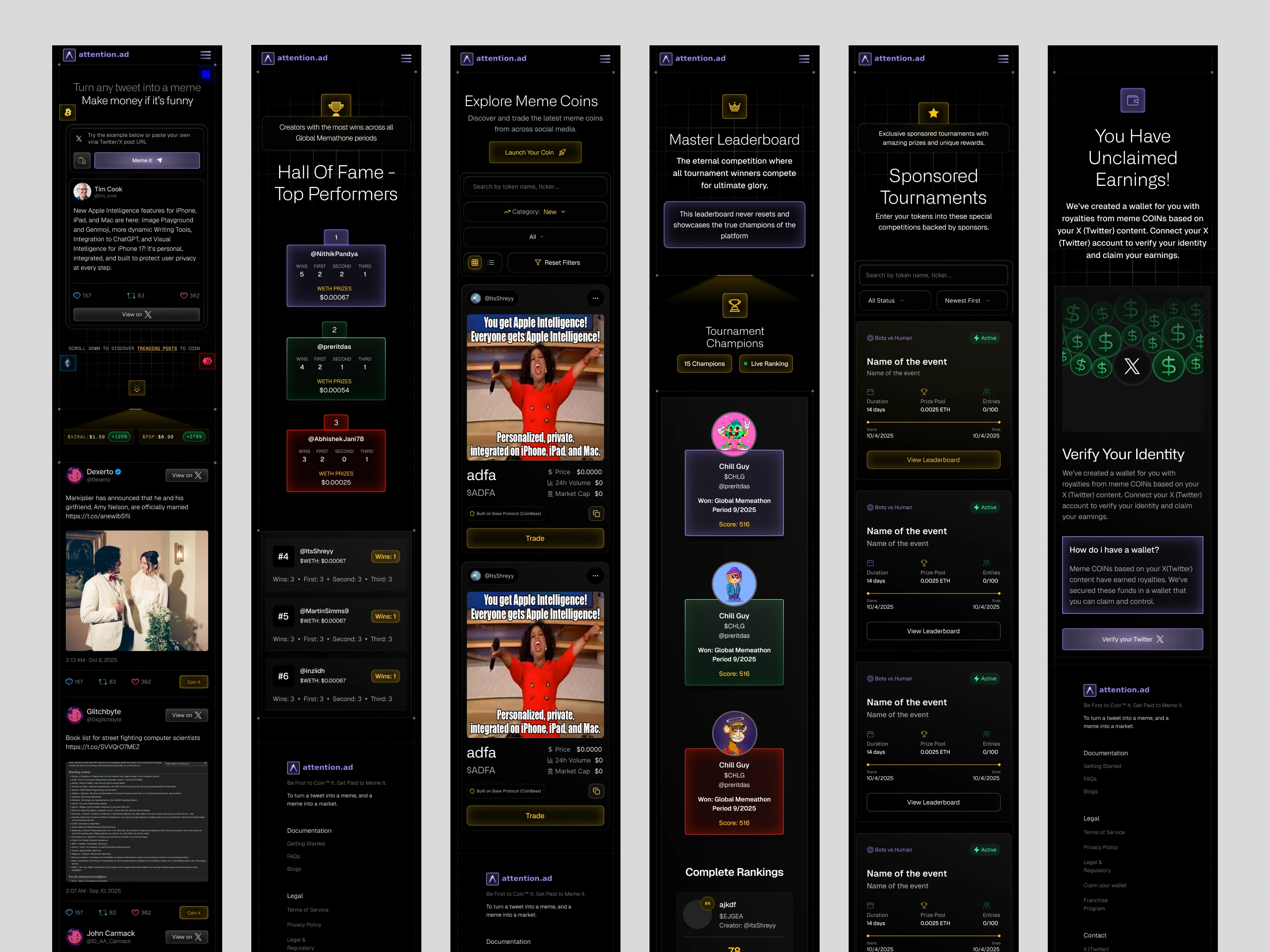
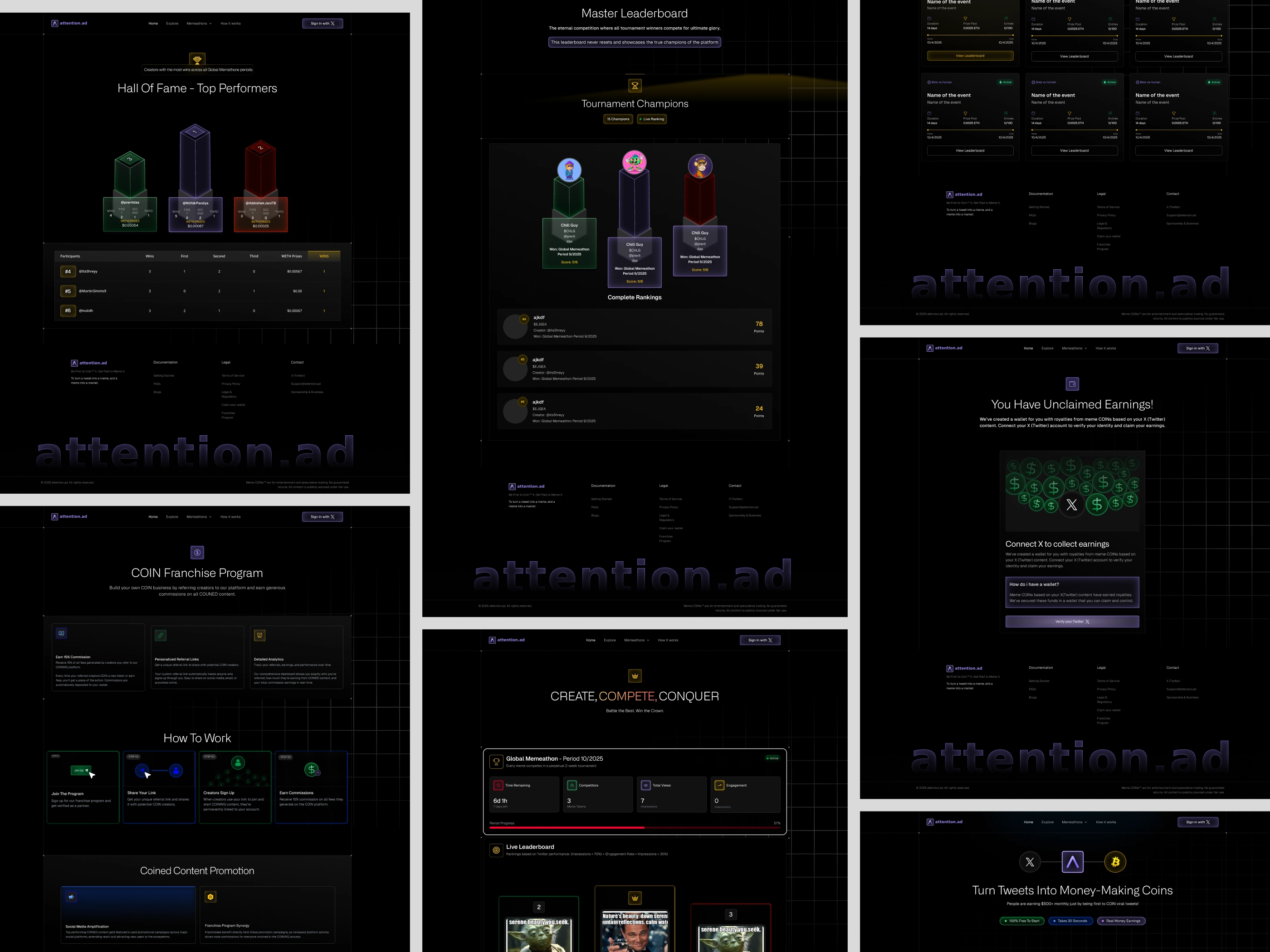
The project involved a full-scale website redesign of approximately 25 pages, including highly detailed UI components, advanced visual treatments, and a strong focus on lighting, depth, and shadows. The goal was to create a website that feels as bold, fast, and internet-native as the product itself.
Project Goals
Redesign a Large-Scale Website
Deliver a cohesive redesign across ~25 pages with consistent systems, layouts, and components.
Create a Distinct Visual Identity
Build a strong visual language using depth, lighting, and shadows to make the interface feel alive and expressive.
Match Internet Culture & Meme Energy
Reflect the playful, fast-moving nature of memes while maintaining clarity and usability.
Design for Scalability
Create reusable components and patterns that can scale as the product evolves.
Workflow & Process
Product & Brand Understanding
Started by understanding Attention.ad’s positioning, audience, and cultural tone. The site needed to feel fun, sharp, and confident without becoming chaotic.
Design System & Components
Designed a comprehensive set of reusable components, focusing heavily on spacing, contrast, lighting, and shadow behavior to create visual depth across the site.
Page-by-Page Redesign
Redesigned approximately 25 pages, ensuring consistency while allowing flexibility for different content types, from marketing pages to product-focused sections.
Visual Polish & Detailing
Extra attention was given to micro-details, including hover states, layering, gradients, and shadow treatments, to elevate the overall experience.
Responsive Design
Layouts were carefully adapted to work seamlessly across desktop, tablet, and mobile without losing visual impact.
Challenges
Maintaining Consistency at Scale
Designing and managing visual consistency across 25 pages required a strong system and attention to detail.
Balancing Fun With Usability
The interface needed to feel playful and meme-driven while remaining intuitive and easy to navigate.
High Visual Complexity
Working with lighting, shadows, and layered components without overwhelming the user or hurting clarity.
Results & Impact
Bold, Memorable Visual Presence
The redesign gives Attention.ad a strong, recognizable look that stands out in the creator economy space.
Cohesive Multi-Page Experience
Despite the size of the website, every page feels connected and intentional.
Scalable Design Foundation
The component system allows for easy expansion and future iterations.
Stronger Product Storytelling
The website clearly communicates the value of turning tweets into memes and earning from attention.
Conclusion
The Attention.ad website redesign brings internet culture, monetization, and product clarity together in a single, cohesive experience. Through detailed component design, thoughtful use of lighting and shadows, and a scalable system across 25 pages, the final result captures the energy of memes while maintaining structure and usability. The project demonstrates how expressive visual design can support complex products without sacrificing clarity.
Like this project
Posted Dec 22, 2025
A large-scale website redesign where memes meet monetization. 25 pages of high-detail UI, depth, shadows, and culture-driven design.
Likes
1
Views
11
Timeline
Oct 23, 2025 - Dec 1, 2025
Clients
Standard