Brand Design for Domovia
Seypox Studio
Introducing Domovia, Where design meets structure, and vision rises from the ground up.

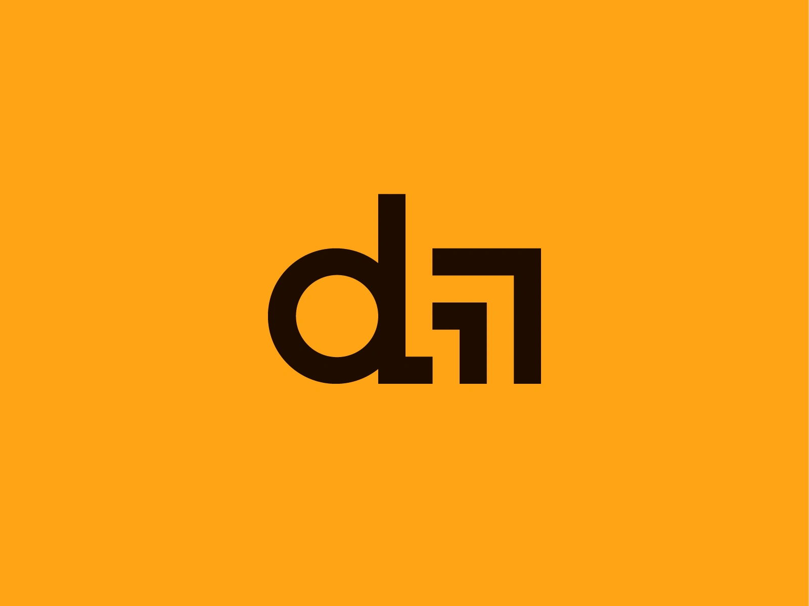
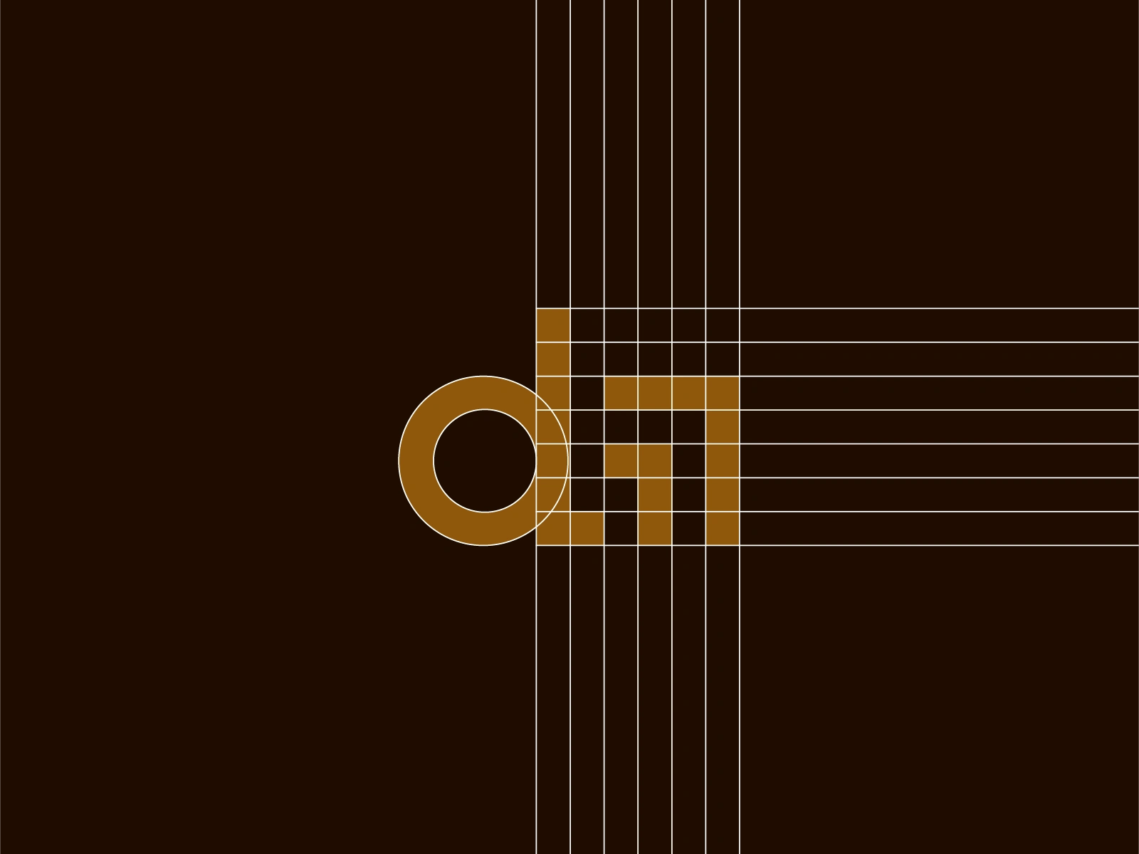
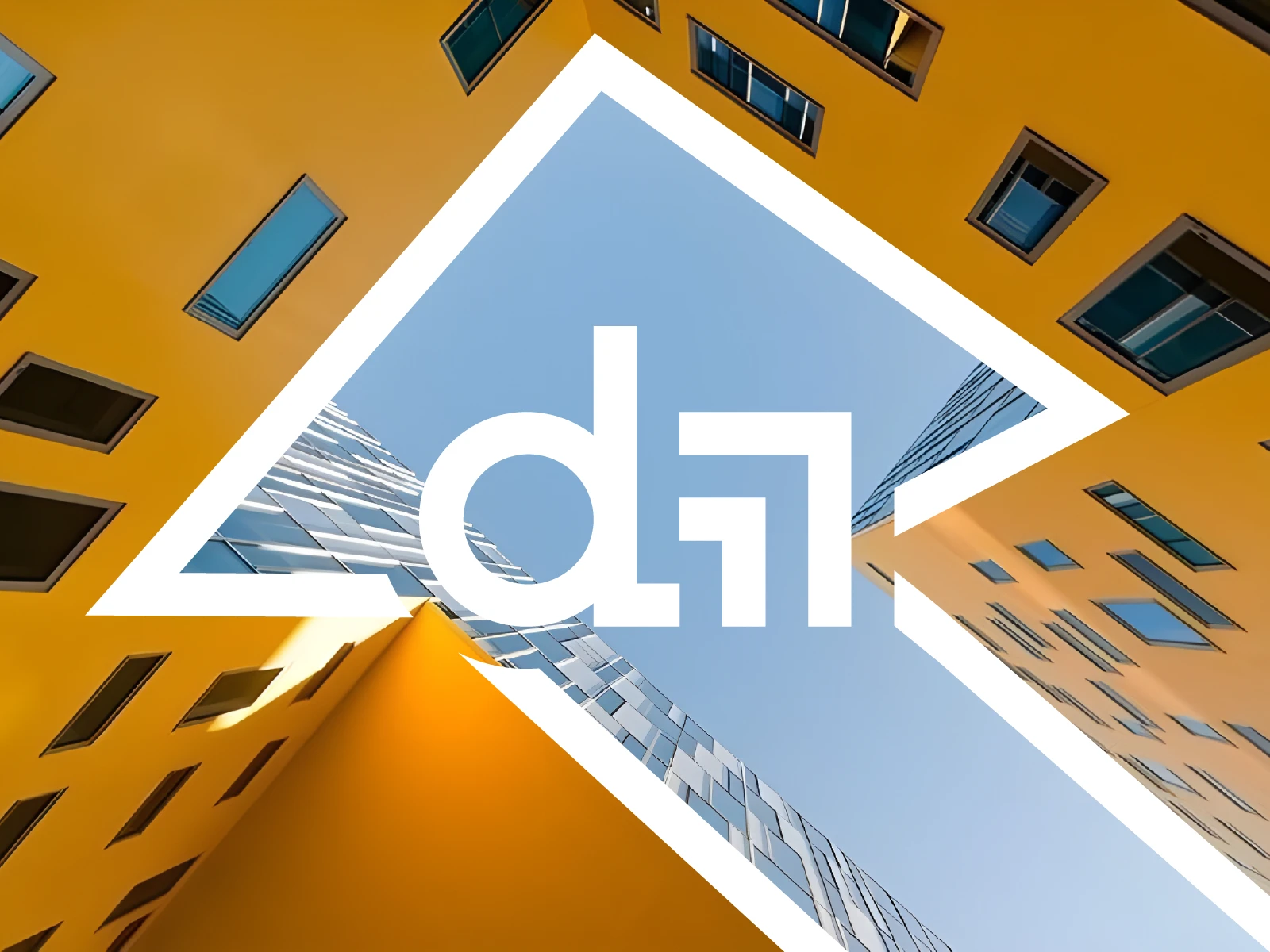
The Letter "d" :The foundation of the name and brand.
Rounded and solid, it represents stability, trust, and the human element — a reminder that behind every project are people, families, and futures.
The Rectangular Lines: These vertical and horizontal strokes are not just design elements — they symbolize the framework of modern architecture.
Each line echoes urban development, rising skylines, and structural growth.
Their upward alignment visually communicates progress, ambition, and elevation — all core to Domovia’s mission.

Like this project
Posted Jun 3, 2025
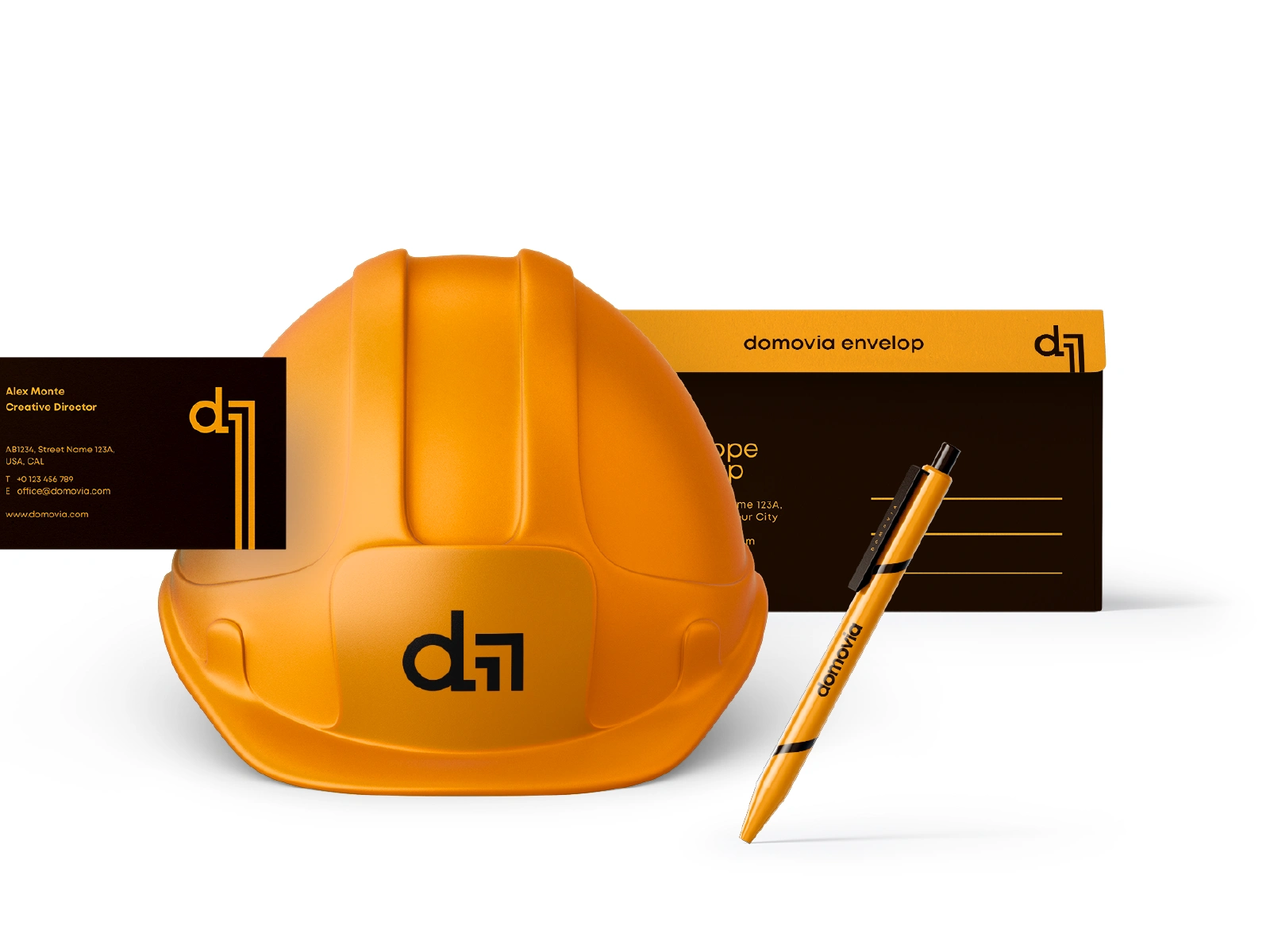
Designed brand elements for Domovia, symbolizing stability and architectural growth.
Likes
2
Views
16
Timeline
Apr 3, 2025 - Apr 10, 2025