Standard Chartered Mobile Banking App
Briefly describe the project you worked on. What did you create, who did you create it for, and how did you approach this project?
Tip: Try to keep this description brief and under 150 words by highlighting the best parts of this project— recruiters don’t spend much time reading detailed descriptions! 💪

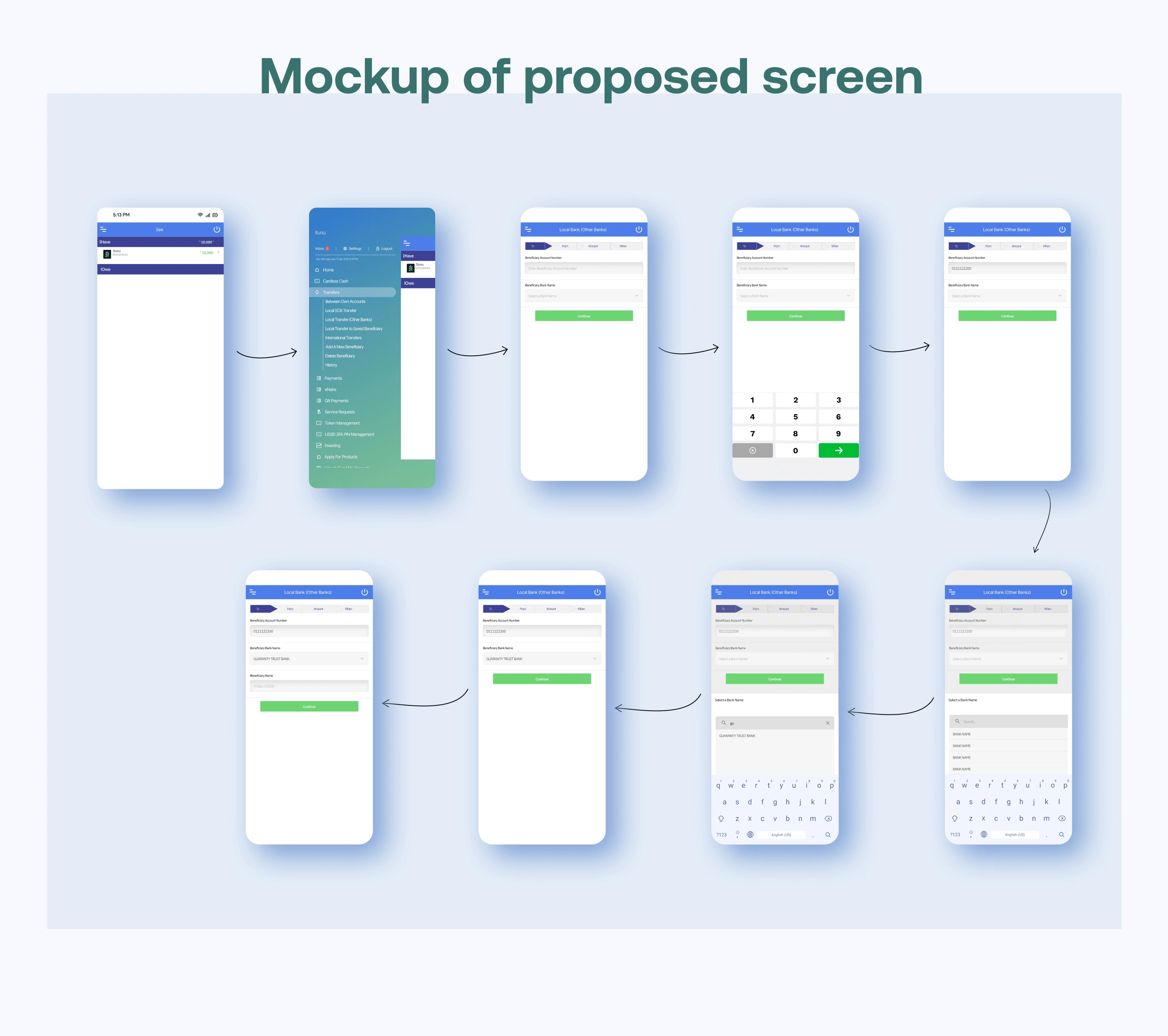
Mockup of Proposed screen
The Problem
The standard chartered banking app is a great app with outstanding UI. From research, it was clear that many customers found the task of transferring funds to a local beneficiary (i.e. sending money to another account within Nigeria) quite challenging.
During my research, I found that customers were having a hard time scrolling through almost 200 banks to find the beneficiary's bank. One user mentioned that if you made a mistake and clicked on a different bank either above or below the bank you were looking for and you tried to correct it, you have to scroll from bank "A" all over again.
The Goal
1. Add a search button so users can search for the beneficiary's bank instead of scrolling through hundreds of bank names to find the one bank they want.
2. Remove "optional information" from the transfer screen.
I also got rid of the following fields on the transfer screen
“Beneficiary address”: this is not required for funds to be transferred, if users don’t need to input that text field, it can be discarded.
“Beneficiary nickname”: not required for funds to be transferred. Also, the app prompts users to input this at the end of every successful transfer, especially if they want to save that recipient as a beneficiary.
“Beneficiary country (Country of residence)”: I removed this option for 2 reasons;
Like this project
Posted Nov 15, 2022
Redesigning the funds’ transfer experience
Likes
0
Views
22


