M-pesa Desktop App
Fredrick Odondi
Project Year: 2023
My Role: Interaction Designer
Tools : Figma
Duration: 3 Months
M-pesa Desktop App
Project Year: 2023
My Role: Interaction Designer
Tools : Figma
Duration: 3 Months
Overview
<aside>
💡 Safaricom is a publicly limited telecommunications company based in Kenya. It operates in more than three African countries, primarily offering telecommunication services. I have designed a web app that mimics the functionality of the mobile app. Additionally, I have incorporated a feature that allows M-pesa users to access all of their banking services in one platform: the Mpesa Web App.
</aside>
Approach
The primary goal is to create an efficient and accessible platform that combines online banking and make it accessible via the web. This case study explores into the process of designing a seamless and intuitive web application to facilitate better and accessible online money transfer system.
Design Process
I applied the Double Diamond design process model comprehensively, adapting it to emphasize both exploration and refinement in the design process
Discover ——- Define——— Design——— Deliver
The Problem
One of Safaricom's notable features is M-pesa, an online money transfer program. However, M-pesa currently lacks a web version or desktop version like Paypal. The current product:
Runs on mobile devices only.
Does not allow users to access all their banks in one platform without having to download numerous banking apps.
No desktop or web version.
Production Solution
We should implement a user-friendly web application with the following key features:
Cross platform functionality: Allow the service to be accessible in all devices, mobile and desktops
All in one banking and mobile money services: Allow mpesa users to access both mobile money and banking services in one platform
UX Research Findings
Insights are generated by our UX researchers. These insights provided deeper understanding into user behaviors, emotions, and motivations, helping to uncover the "why" behind user actions. By synthesizing UX research, I created a strong foundation for user-centered design decisions for inventory managers to understand the pain points of the existing manual system.
Interviews with staff shown challenges like:
The money transfer service is only limited to mobile devices only.
Many users are forced to use physical banking mode because some banks dont have apps.
Defining Persona: Who is this for?
Business Men and Women: The web app version allows for business owners to track closely payments made by customers from the comforts of their offices . The currents version only allows for creation of one account per device which means only the person with the registered phone can see which customer has made payments
General Public: This web app will be useful to the general public because the current version does not allow for integration of more than one bank in one platform
How Might We
We faced with a design challenge, like struggling with quickly assess equipment availability, then we used HMW statements to prompt innovative ideas and potential solutions outside the box.
We created HMW statements that followed by a concise description of the problem, formulated as a question that invites creative responses.
How
How might we introduce cross platform money transfer system?
Might
How might we allow users to access all their banking services in one platform?
We
How might we bring other financial services together under one platform with a friendly user interface ?Desktop - From sketch to high-fidelity wireframes
In this phase, I sketched out my ideas for each main page of the design. This step encouraged diverse perspectives and allowed me to express my unique vision for the project.
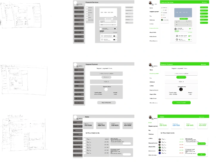
Prototyping
I developed the Low-fidelity and High-fidelity prototypes (desktop and mobile) to give stakeholders a tangible representation of the final product and validate the design choices.
My Design Rationale for Design Decisions
Forms, I used descriptive labels that clearly indicate the purpose of each form field
Usability Testing Methodology
To ensure a user-centered design, we engaged in in-depth discussions with potential participants to gather their feedback on the initial concepts and prototypes.
Moderated Usability testing: Participants went through usability study with the link of the prototype, and we observed and moderated them while working with our web app on mobile and desktop and took notes from their thoughts and behaviors. We asked specific open-ended question after the test and follow-up in real time. We built rapport between us and the participants.
Location: Canada , Remotely by Zoom .
Participants: 5 participants attended to complete several tasks.
Duration: Each Session last 30 to 45 minutes.
Creating a Final Design
Our process of designing for desktop and mobile was iterative, and it was crucial to involve user feedback at different stages to create a user-centric and visually appealing experience on both platforms. The final design reflected the brand identity, provided a seamless user journey, and was optimized for different devices and screen sizes.
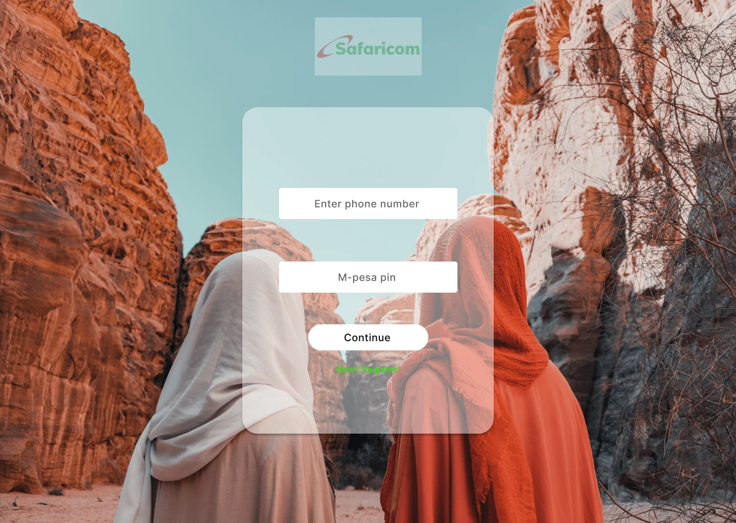
The Login Page Final Design
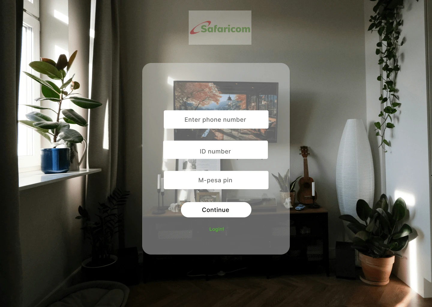
The Registration Page Final Design
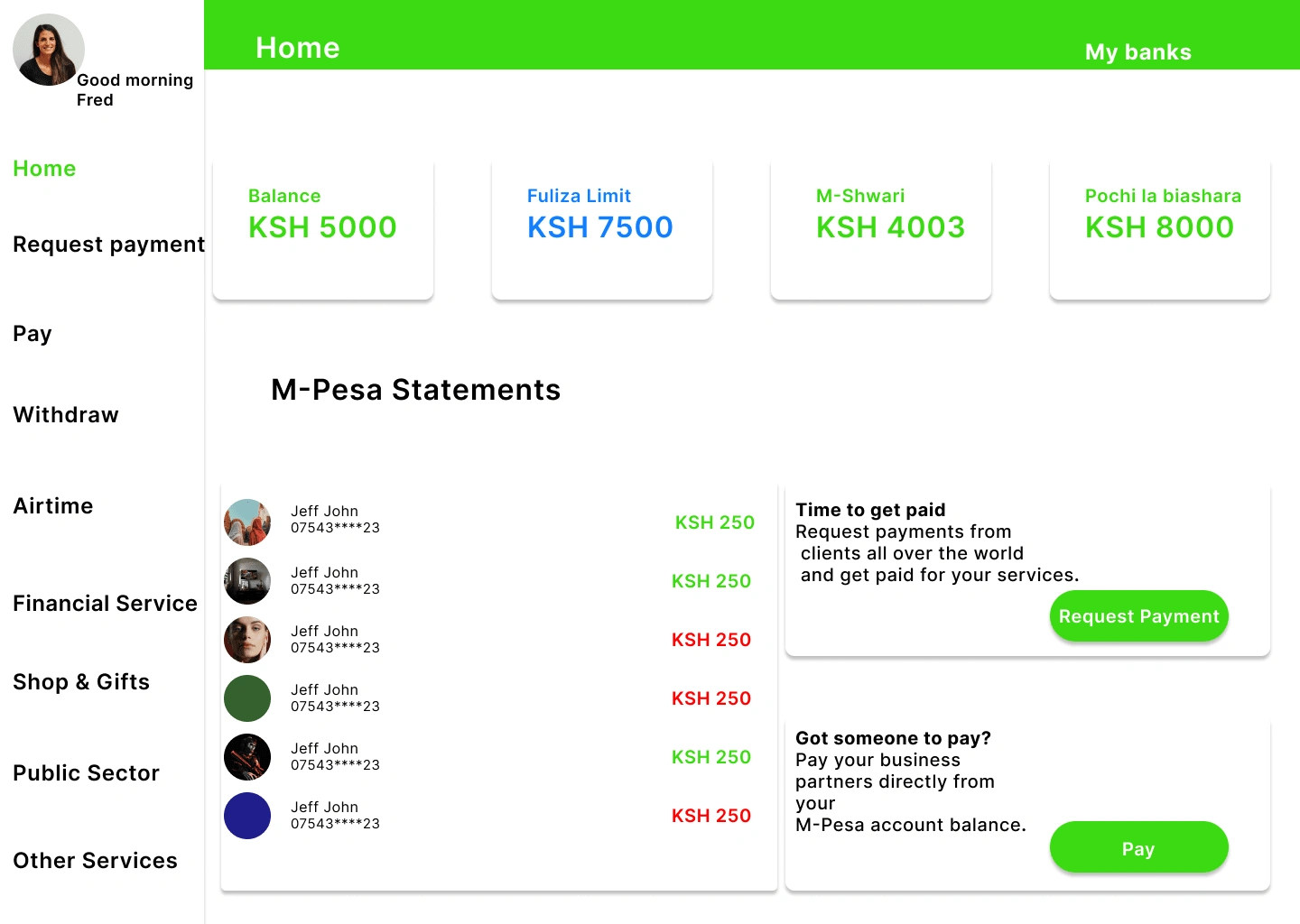
The Home Page Final Design
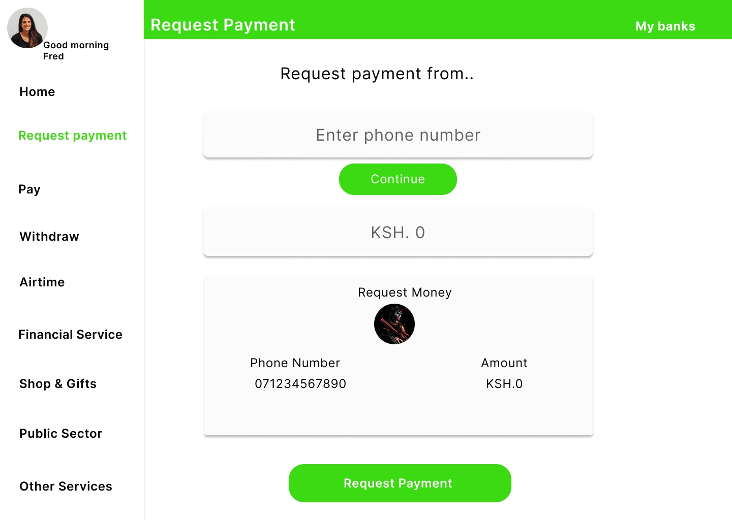
The Request Payment Page Final Design
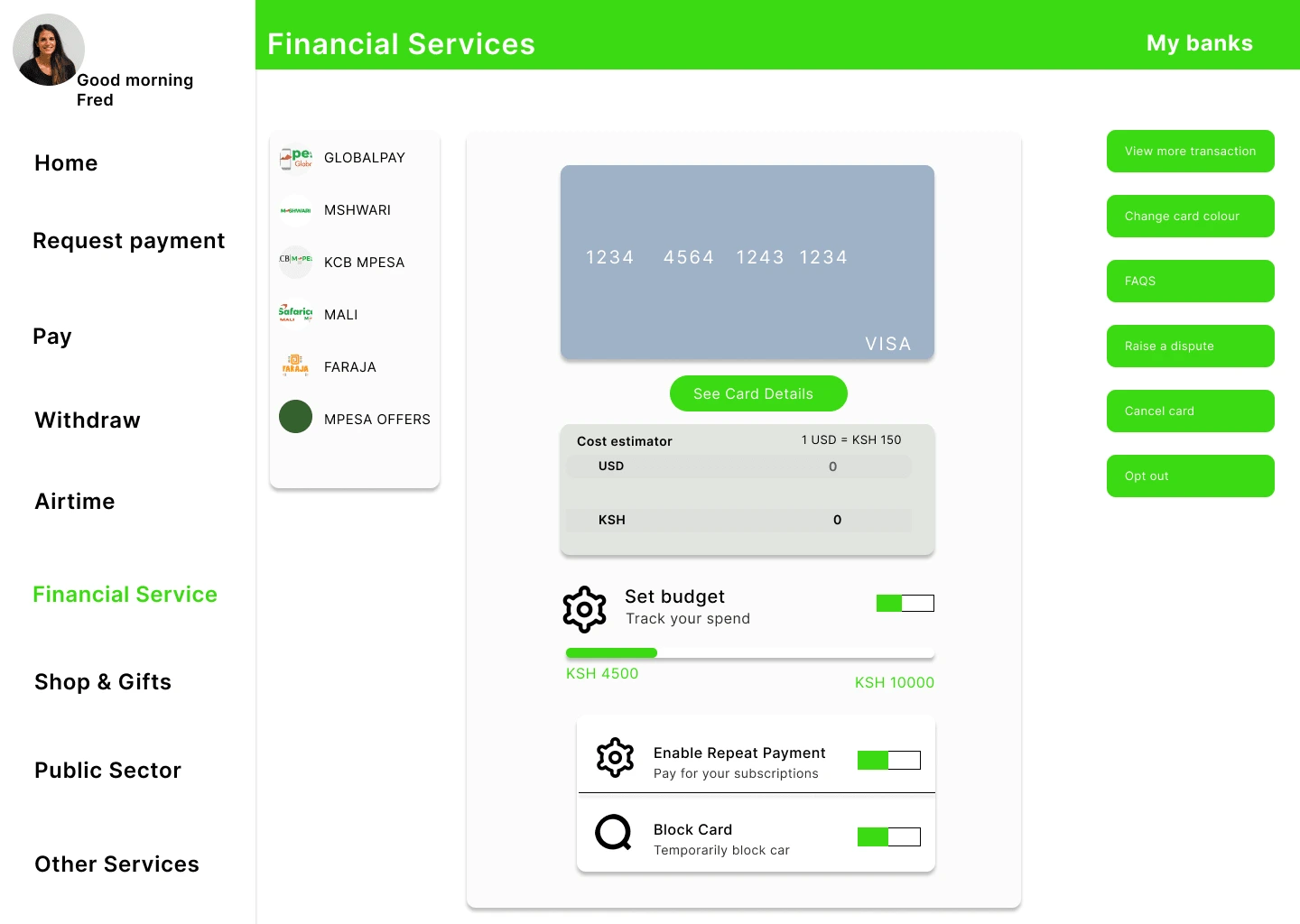
The Financial Services Page Final Design

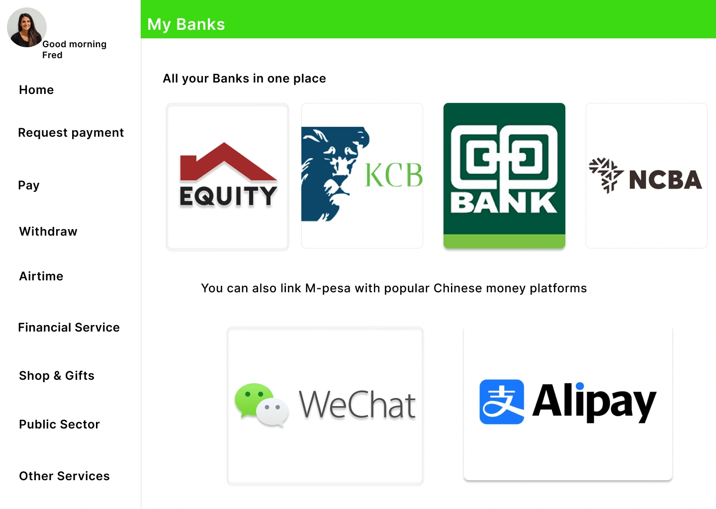
The Bank Page Final Design
You can check out the Figma prototype via this link:
Like this project
Posted Nov 30, 2023
I have designed a web app that mimics the functionality of the mobile app. Additionally, I have incorporated a feature that allows M-pesa users to access all of
Likes
0
Views
955