Martin Contracting - Brand Strategy | Identity Design
Rob Harrison
Martin Contracting
Brand Strategy | Identity Design
Martin Contracting approached [Brand Caddy] to create a whole new brand identity and set them apart from area competitors. They are a family-owned general contracting company in Omaha, NE that not only makes custom, quality builds but quality repairs as well.
The goal of the rebrand? To create a heritage-evoking identity that stays true to the industry without blending into their immediate competitors.
The Scope:
Logo System
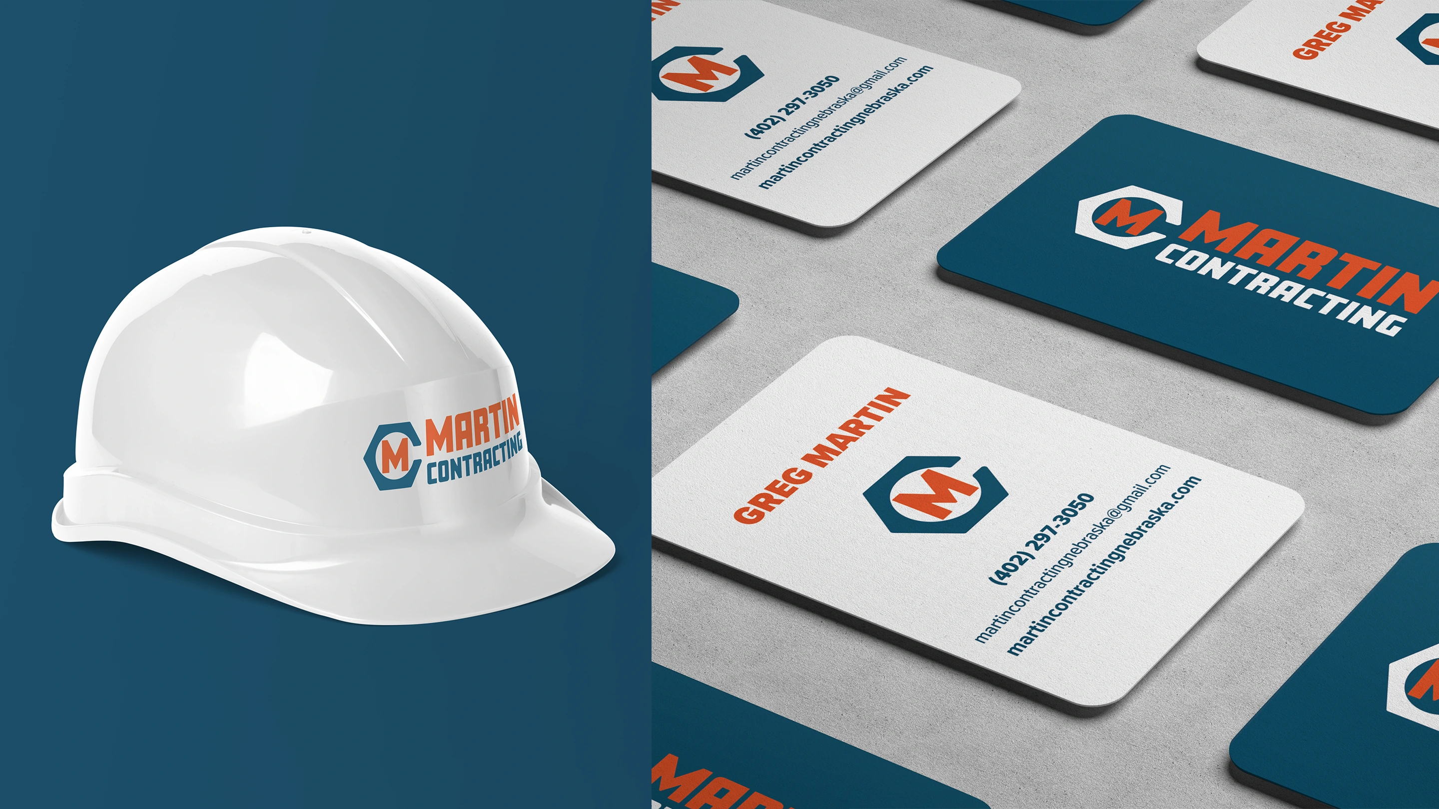
Apparel
Vehicle/Trailer Wrap
Yard Signs
Print Collateral
In working with Steve and Greg Martin, we determined together that the brand identity needed to channel the design and type of retro signs and some tool manufacturers. These styles fit both their brand personality and what their customers expect.
They also needed to remain easily identifiable as a contracting company while also avoiding any “contractor logo clichés”. Many of Martin Contracting’s competitors utilize red, black, and white as their color palette along with roof lines, hammers, and wrenches.
To differentiate, we went with orange and a complementary dark teal. This is still industry correct with orange, but stands out from competition.
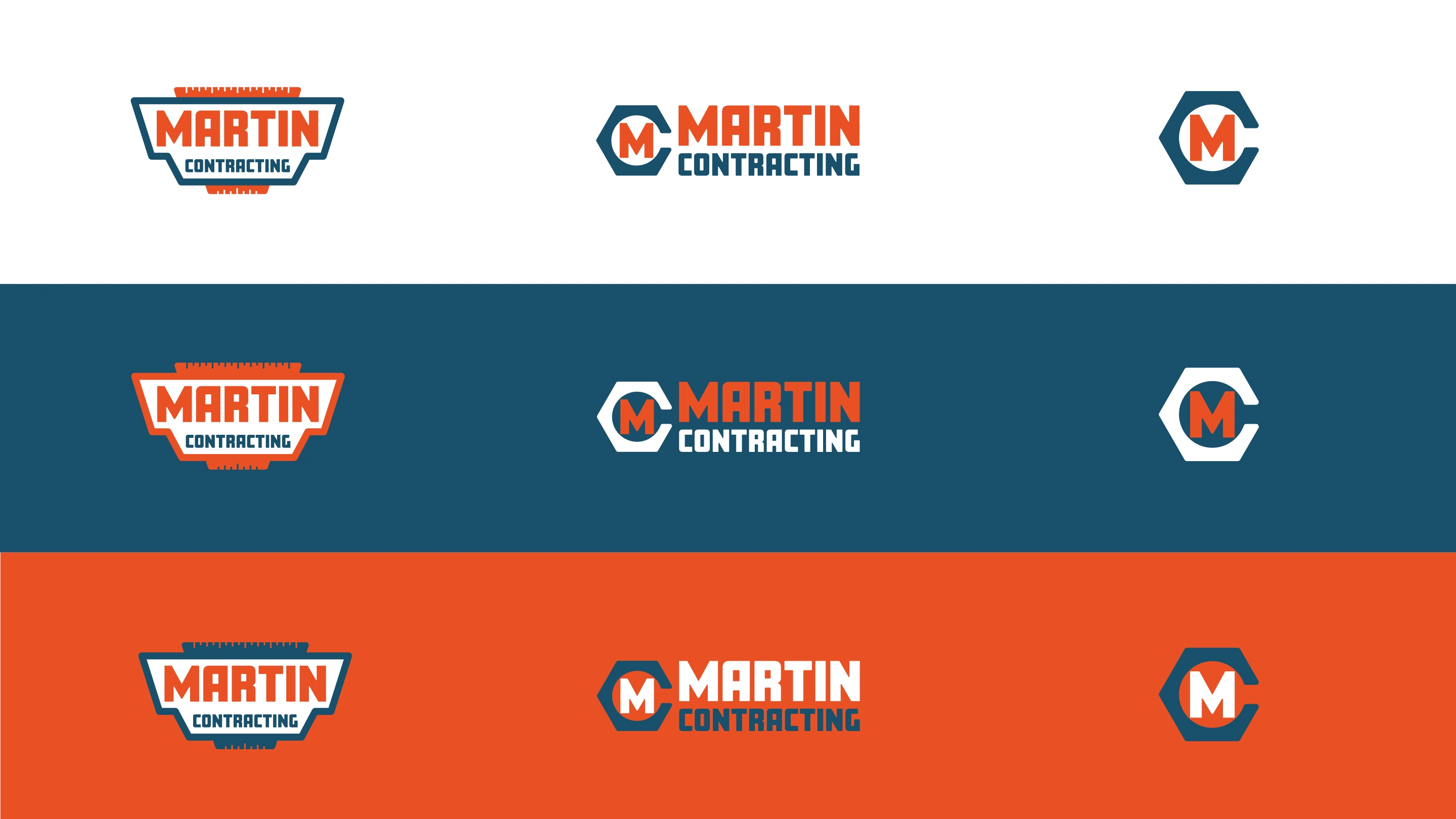
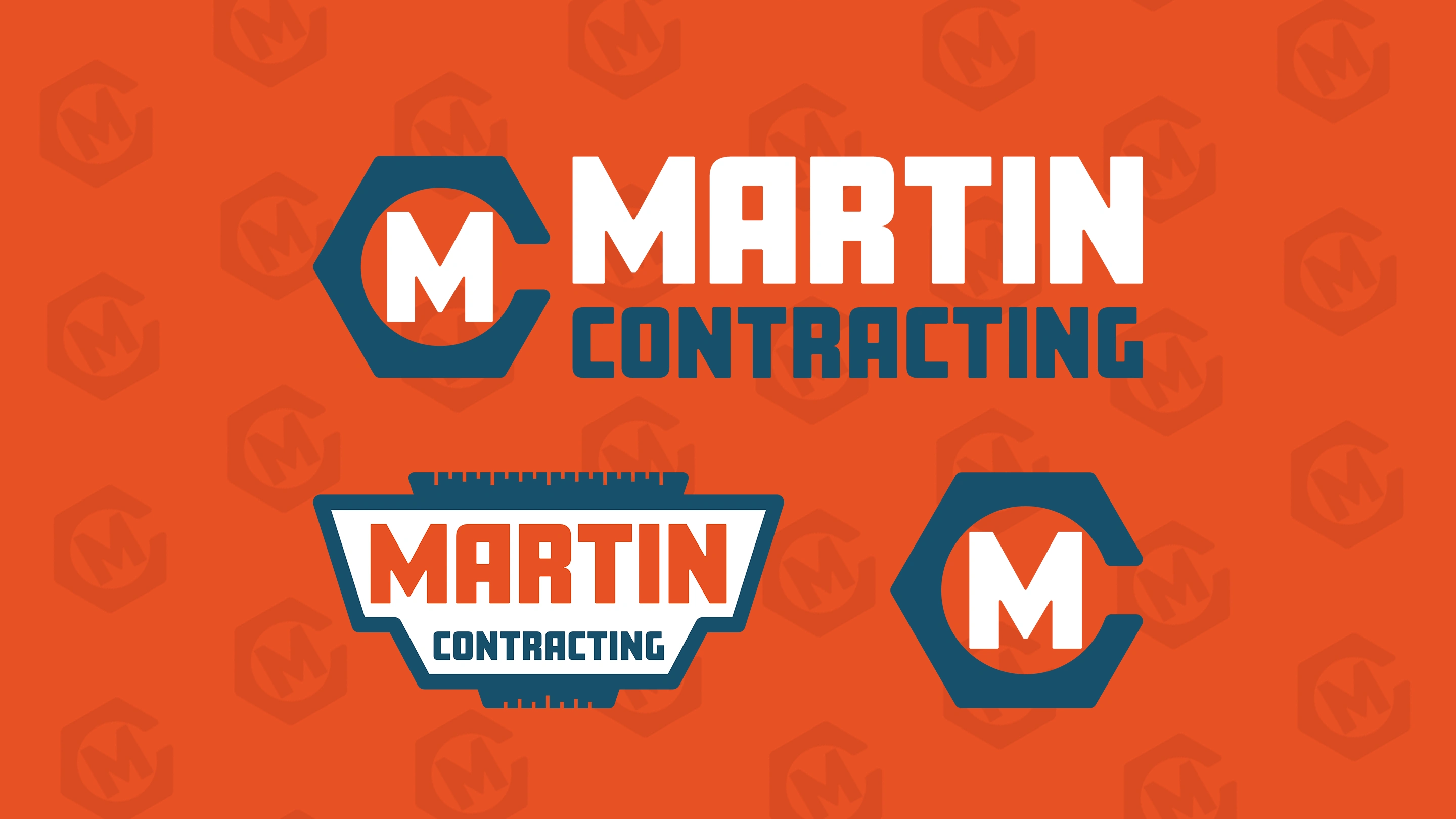
Square letters with a slightly rounded quality fit the style established from the mood board. Due to the many applications of their brand identity, some different types/scales of logos were needed.
The shield logo mimics the shape of retro signs. Framing the shield logo on top and bottom are measuring marks punched out from the shape. Intentionally adding these twice - they add to the “measure twice, cut once” adage that Martin Contracting’s quality work adheres to.

The “hex bolt” shape of the icon communicates utility and building qualities without playing into over-used construction imagery.
The open ended corner makes it a tidy monogram for use on smaller applications like apparel or a favicon.
In our initial meetings, Steve Martin explained that when they showed up to job sites, they were doing so unmarked. Meaning - their trailer was blank, their trucks didn’t have a logo, and there weren’t any signs in the yard to advertise or to signal to any additional crew members that this is the right house.
We designed a trailer wrap that would act as a moving billboard, and along with the trucks and yard signs - an advertisement for their services to neighboring homes
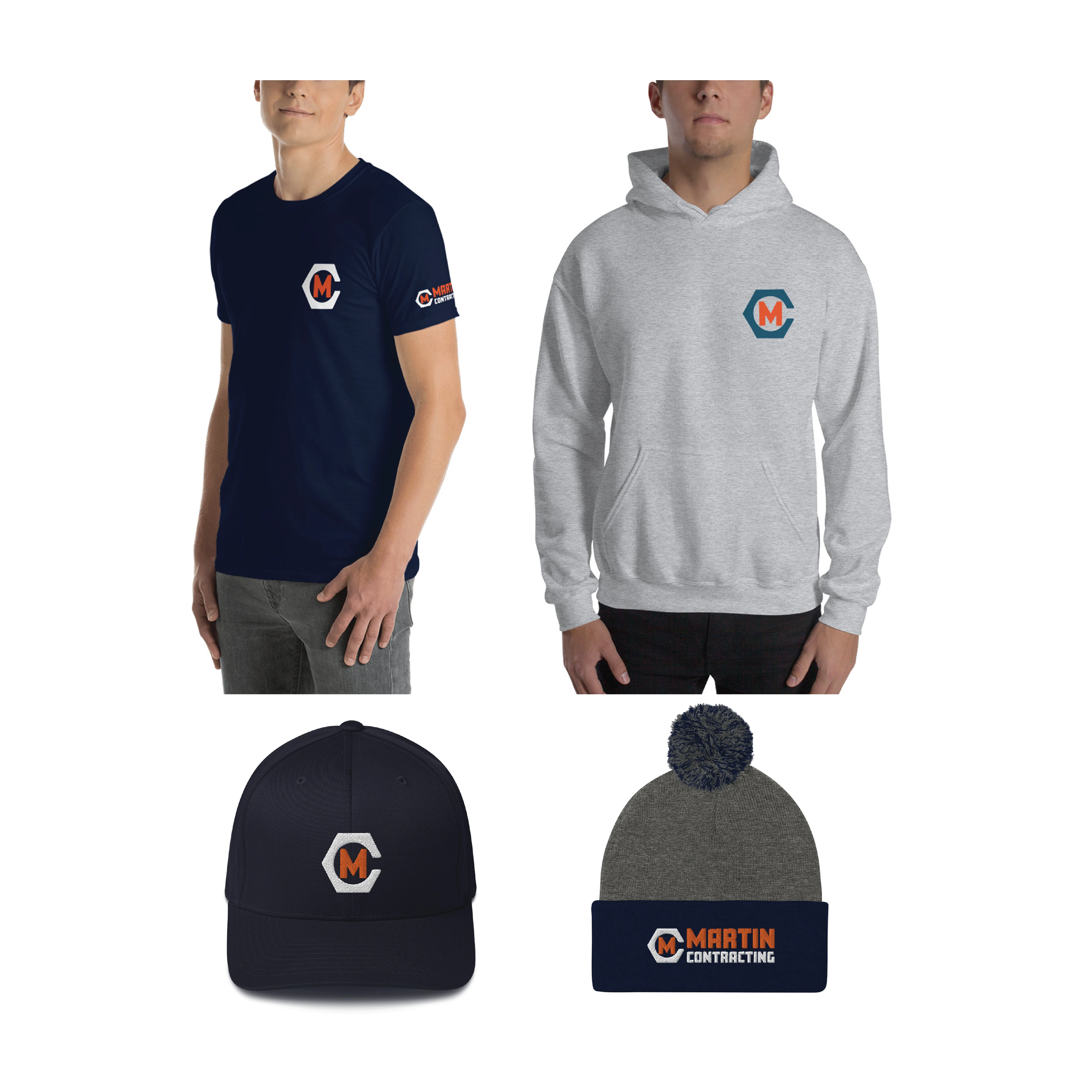
They need a wide variety of apparel for all seasons, and the flexibility of the icon or logotype lockup makes for easy-to-execute print or embroidery.
"…We had an idea of what we wanted out of our logo/brand, but didn't have any real concept of how that would/should look. After discussing our wants/goals with [Brand Caddy], they took the reigns and came back with some options that were pretty spot on straight away. They've also been a valuable resource to consult for ideas and strategies to optimize our branding/image. We'll certainly be working with them again as our needs expand! ”
- Steve Martin, Martin Contracting
Like this project
Posted Apr 29, 2025
Creating a Heritage-Evoking Contracting Brand Creating a scalable brand for a construction company needing to stand out.