Website UX Audit and Framer Prototype
Discover
Project Overview
Lighthouse International School is an educational institution based in Thailand’s most tourist-dense location – the island of Phuket. It services students from 1 to 12 Grade, while also providing visa support to students and parents during enrollment. Recognizing the potential for improvement in the international school's online platform, I initiated this UX audit to enhance the overall user experience and drive student enrollment.
Challenges and Goals
I revealed several usability challenges hindering the website's effectiveness. Users struggled to find specific information, navigate the site, and understand the school's pricing and offerings. Inconsistent information architecture and outdated content further contributed to a suboptimal user experience. I aimed to improve the user experience and optimize information hierarchy and navigation, ensuring a more intuitive user journey. I also focused on visualizing the proposed website enhancements.
Outcomes
To address the challenges and optimize website structure and logic:
1) created a list of UX recommendations
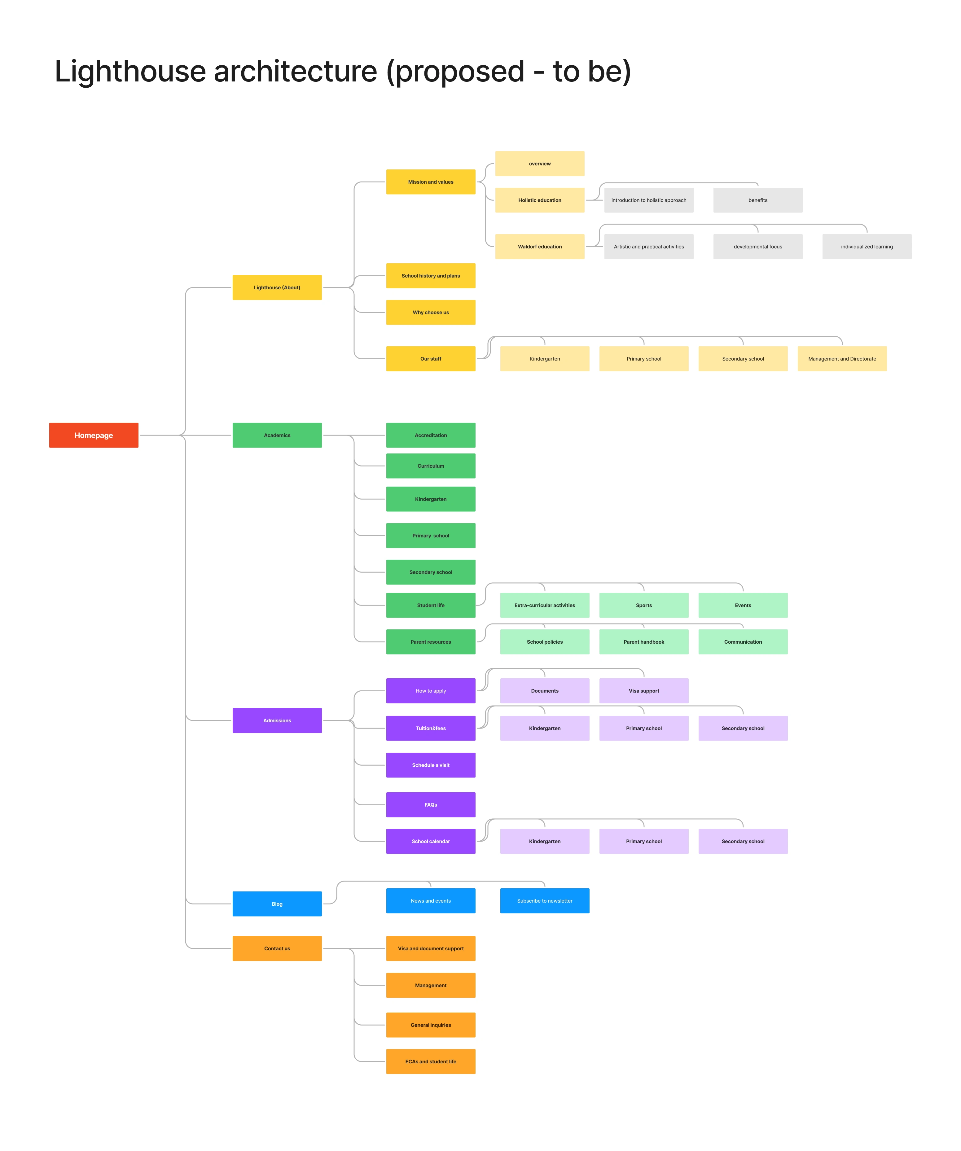
2) developed a refined sitemap
3) designed the prototype
4) developed and published the website on Framer
Target audience
Families of expats, both students and parents
School staff and management
Any person looking for information about education in Thailand and Phuket
Define
UX Audit
I started UX audit by evaluating the website on the following parameters: content, labeling, presentation, navigation, interaction, controls, feedback, visual hierarchy, forms. After meticulously looking through all pages I created a presentation with my recommendations. You can see it here:
💡 I determined the main focus problems to elevate the school website and make it more appealing to users:
unclear user flows;
lengthy texts and unclear tone of voice;
unclear CTA on the main page;
lack of easily accessible pricing information.
Here you can see the full list:
Model of Informational Expectations
Our users already have preconceived ideas about the information they need, where to find it, and how it should be presented.
What I did
Analyzed the target audience (parents, students, staff) to understand their primary goals and information needs.
Conducted user interviews and created personas to directly gather information about their expectations.
Created the list of questions a user might have when they first enter the school website (e.g.: Is this school expensive? Which curriculum does it have? Can I enrol without he knowledge of English?Who are the teachers?)
Created the list of actions my target user would wish to make on the website (e.g.: read facts about the school, see teachers, find contacts, book a visit, find pricing, etc.)
I proceeded to:
Evaluate how the current website aligns with user expectations.
Identify information gaps or inconsistencies that might frustrate users (like looping or abruptly ending user flows or doubled CTAs, unclear labeling).
I identified the following expectations:
Parent Expectations: Information about curriculum, admissions, fees, visa support, extracurricular activities, and school events would be a high priority.
Student Expectations: Access to academic resources, assignments, grades, extracurricular information, and social platforms would be crucial (however these are not addressed for the most part currently, but I can see that as an area for growth)
Staff Expectations: Efficient access to administrative tools, student information, and communication platforms would be essential (also not addressed presently)
Develop
Informational Architecture
Based on the Model I’ve created 2 sitemaps (as is and to be)
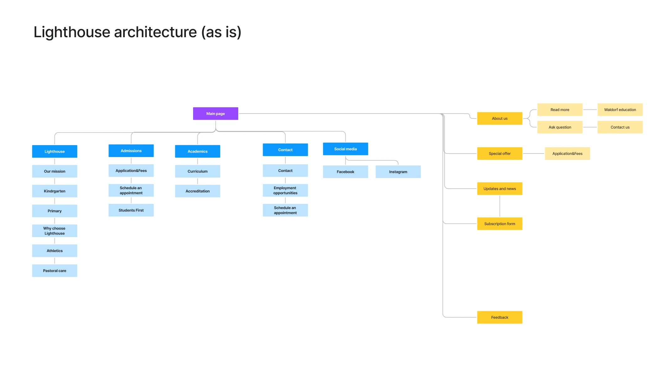
As is
Some problems I identified:
No actual call-to action
Some sections repeat each other in content but have different titles and are located on different pages
There are sections with unknown purpose - Each website section has to have a clear purpose as to why this information is here or the users won’t stay. So far this section has no clear purpose, maybe it should be re-designed to have some call-to-action or informative function
New sitemap I proposed before designing the prototype:
To be
Deliver
Prototype and Conclusions
For the purposes of the project I focused only on the main page for prototyping, consequently I’ve not designed all sub-pages and could not apply all the UX recommendations. For this part of research I applied the following recommendations:
reduce the length of texts;
add clear CTAs for more purpose;
add clear structure and organize navigation;
distinguish age groups of students;
provide necessary information and links according to the model of informational expectations.
I took the new prototype to people who I interviewed to get information on the user experience. Here are some of their impressions:
”Now I can see where to enroll and contact the school”
”I like that now I can see separate blocks for primary and kindergarten, I couldn’t find this information before”
”As far as I understand this is a block with school photos - I like it, I can see what the school is up to”
”Good thing I can download the curriculum - I’d like to skim through it before actually applying for enrollment”
”Schedule a tour is a nice thing, I would probably go straight to it”
Like this project
Posted Aug 20, 2024
Recognizing the potential for improvement in the international school's online platform, I initiated this UX audit to enhance the overall user experience and dr
Likes
0
Views
7

