Childers Co.
Ken Shew
Introduction & Background
Childers Co. is a Design + Build Company that prides itself on an elevated heirloom feeling combined with modern artful craft. Their tagline 'Built for Beautiful Living' encapsulates the essence of the brand. They aimed to evoke warmth, atmospheric interiors, captivating lighting, and lush scenery reminiscent of villagecore aesthetics.
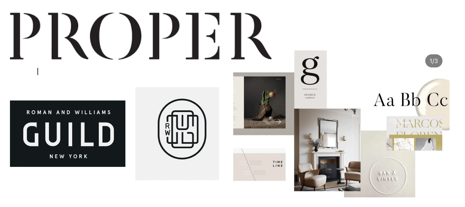
Inspiration & Concept
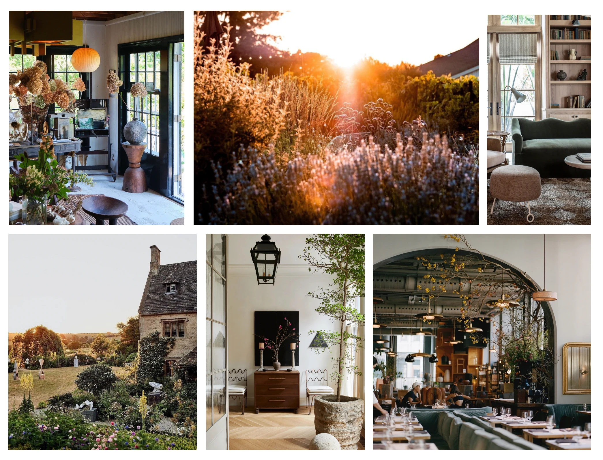
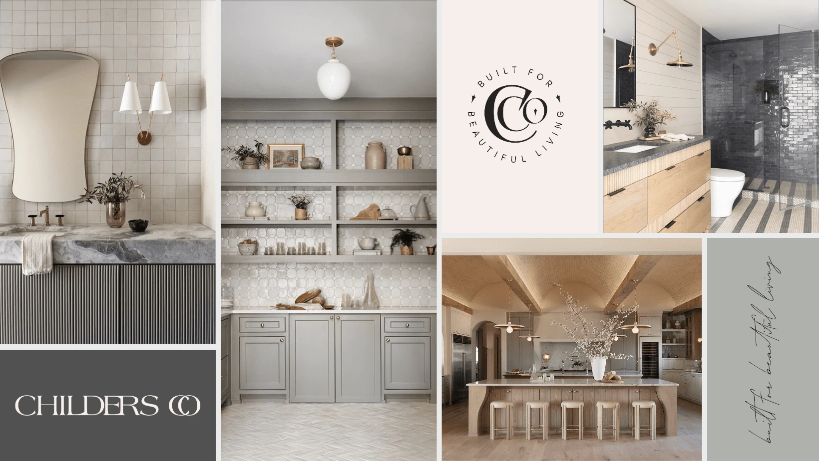
Inspired by brands like Proper Hotel and Flamingo Estate, the design sought to bring together the captivating essence of art, warm bronze hues, and the atmospheric touch of villagecore elegance. This mood board served as a guide to capture Childers Co.'s desire for beautiful and artful living.
Process & Drafts
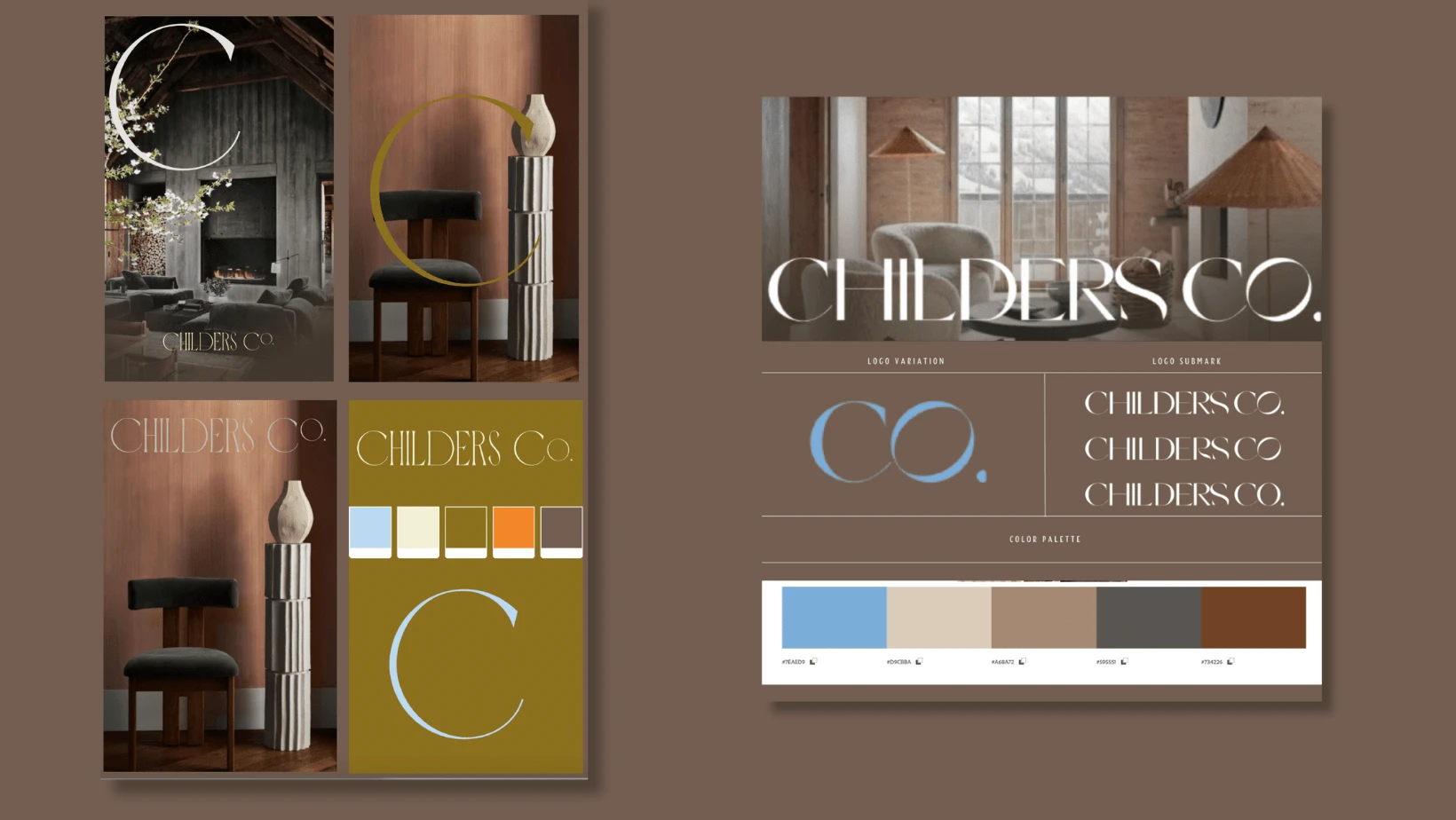
In the design process for Childers Co., a deep dive into the principles of design thinking was essential. By empathizing with the brand's core values and understanding the audience's perception, the project embarked on a journey to create something both classic and contemporary. Researching typography and color palettes led to the discovery of elegant and timeless styles that are also in sync with modern trends. The challenge was to find the perfect balance that reflects the heirloom quality yet speaks to the artful craft of today. Through meticulous attention to detail, the curves and edges of different letters were fused together, resulting in a seamless wordmark. Each draft underwent a series of iterations and refinements, aligning the aesthetics with the desired ambiance. Collaboration with the client and periodic evaluations ensured that the design maintained its integrity while adhering to the 'elevated heirloom' vision. The fusion of traditional elegance with a contemporary edge was not merely a design decision but a strategic choice to embody the brand's ethos of 'Built for Beautiful Living.' The result was a wordmark that serves as an epitome of design excellence, resonating with the modern artistic craftsmanship that Childers Co. represents.
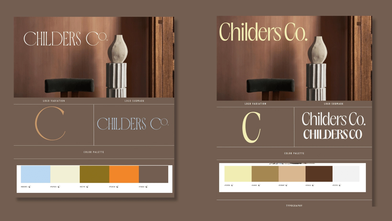
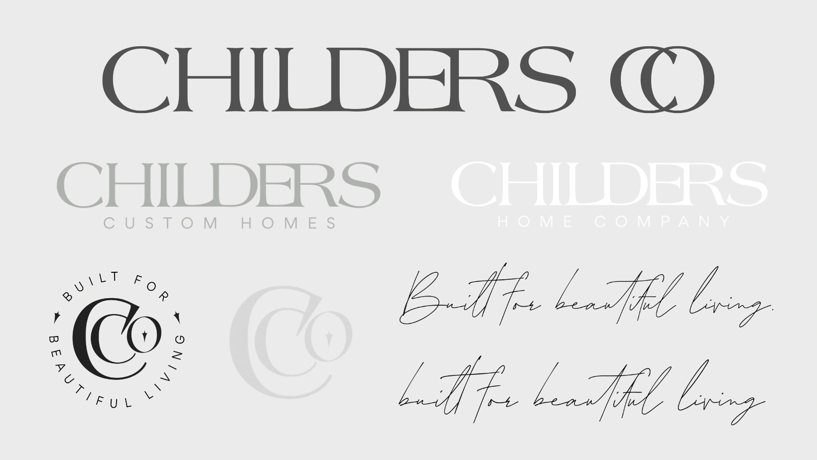
Final Design
The culmination of the design journey for Childers Co. lies in the meticulously crafted final elements that encapsulate the brand's ethos.

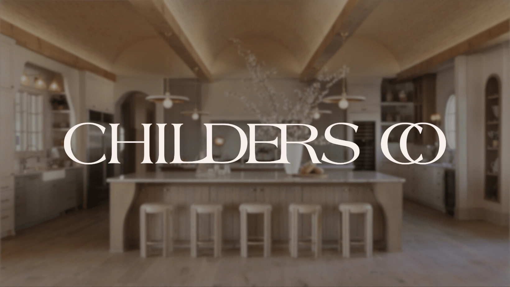
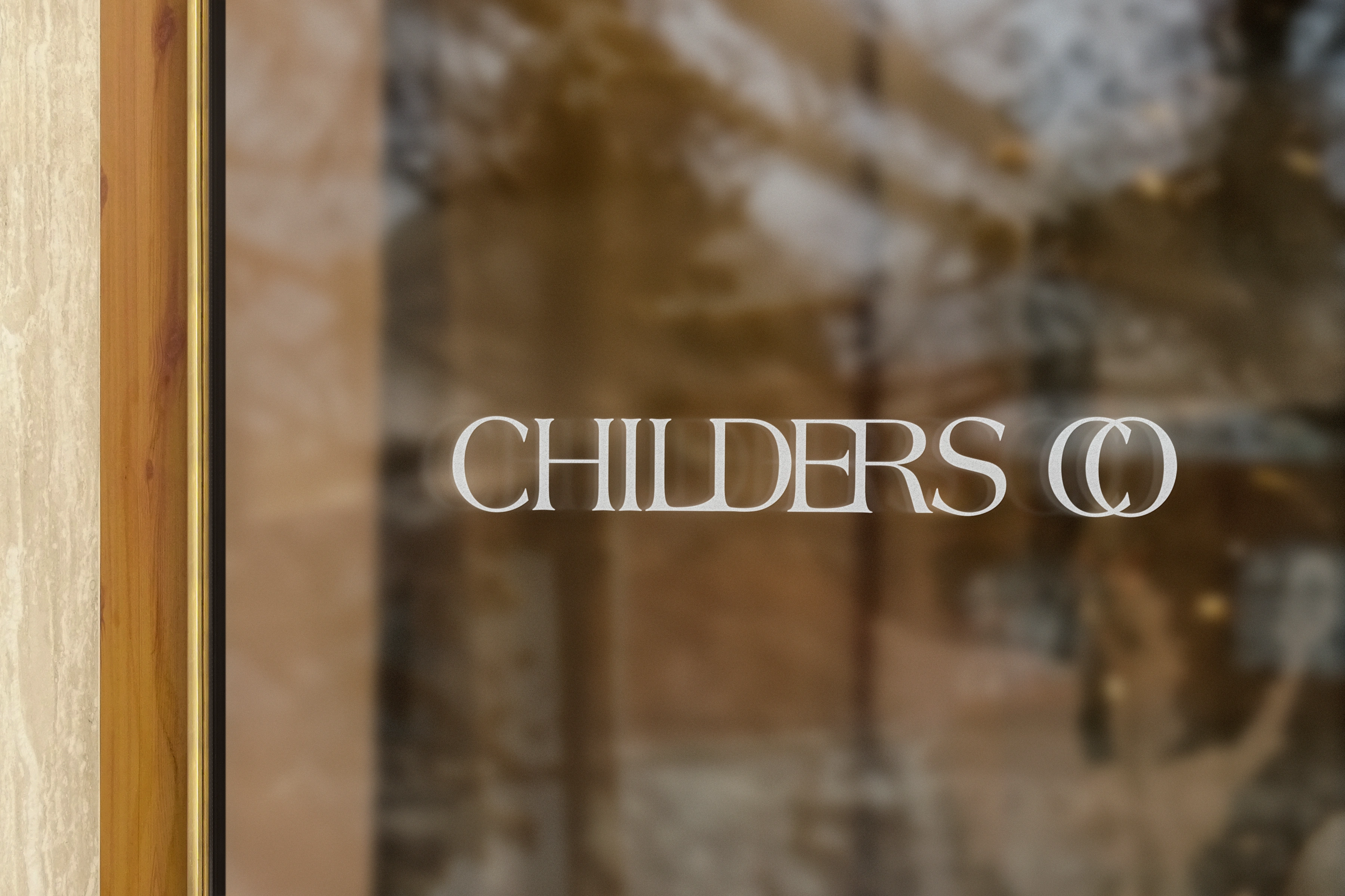
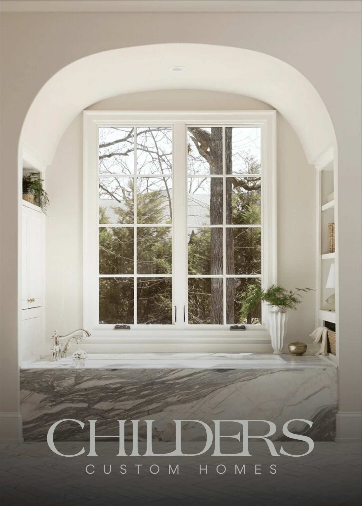
The wordmark logo, set against the backdrop of one of their elegantly constructed homes, symbolizes the intersection of artful craftsmanship and modern design.
The wordmark logo, set against the backdrop of one of their elegantly constructed homes, symbolizes the intersection of artful craftsmanship and modern design. The refined curves and edges resonate with the atmospheric and timeless appeal, creating a visual representation of the brand's commitment to 'Beautiful Living.'

The harmonious color palette, inspired by warm bronze hues and lush scenery, ties together all the visual elements.
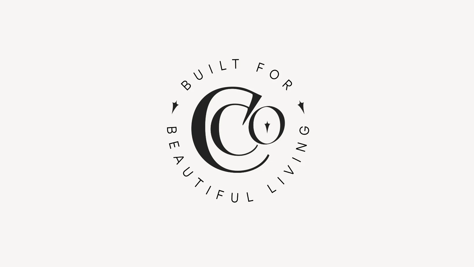
Accompanying the wordmark is a carefully selected favicon that complements the main logo, adding a cohesive and distinctive touch to the brand identity.
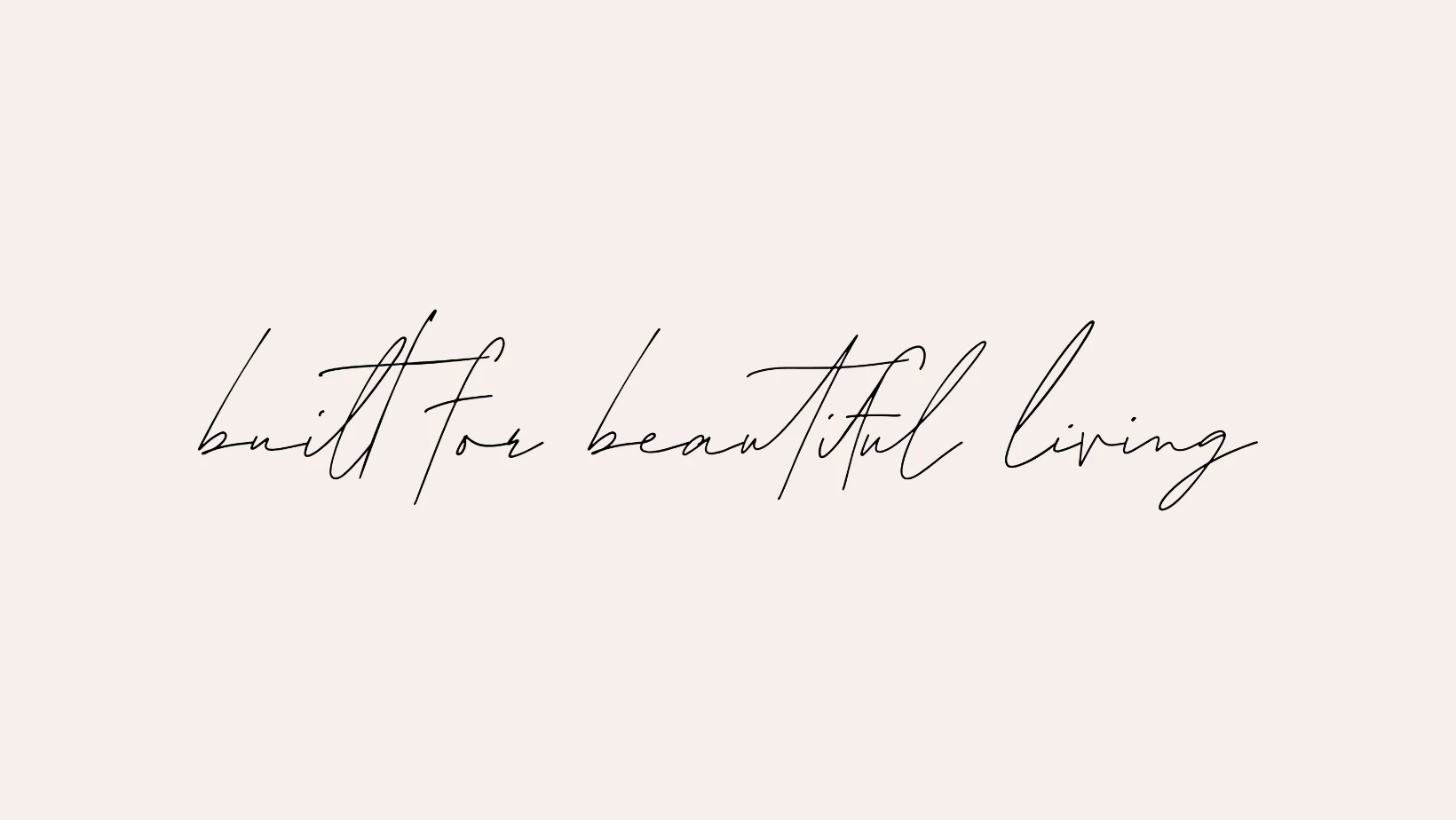
The tagline, rendered in the brand's unique fonts, further accentuates the heirloom feeling with a touch of contemporary elegance.
Each piece, designed with precision and a keen understanding of the brand's core, serves as a testament to Childers Co.'s elevated and artful approach to design and build. Together, they create a brand image that is both captivating and true to its roots, a perfect embodiment of Childers Co.'s dedication to 'Built for Beautiful Living.'
Inspired by what you've seen? There's more where that came from! Explore my other projects to see the range and depth of my creative abilities. If you have a vision that needs to be brought to life, I'm here to make it happen. Let's connect and start building something beautiful together. Feel the urge to share? Click the button below to spread the word about this artful design!
Like this project
Posted Aug 17, 2023
Crafted an elegant logo for Childers Co., blending heirloom quality with modern art. A symbol of beautiful living in design & build.