AMIA Brand Design
Luka Svonja
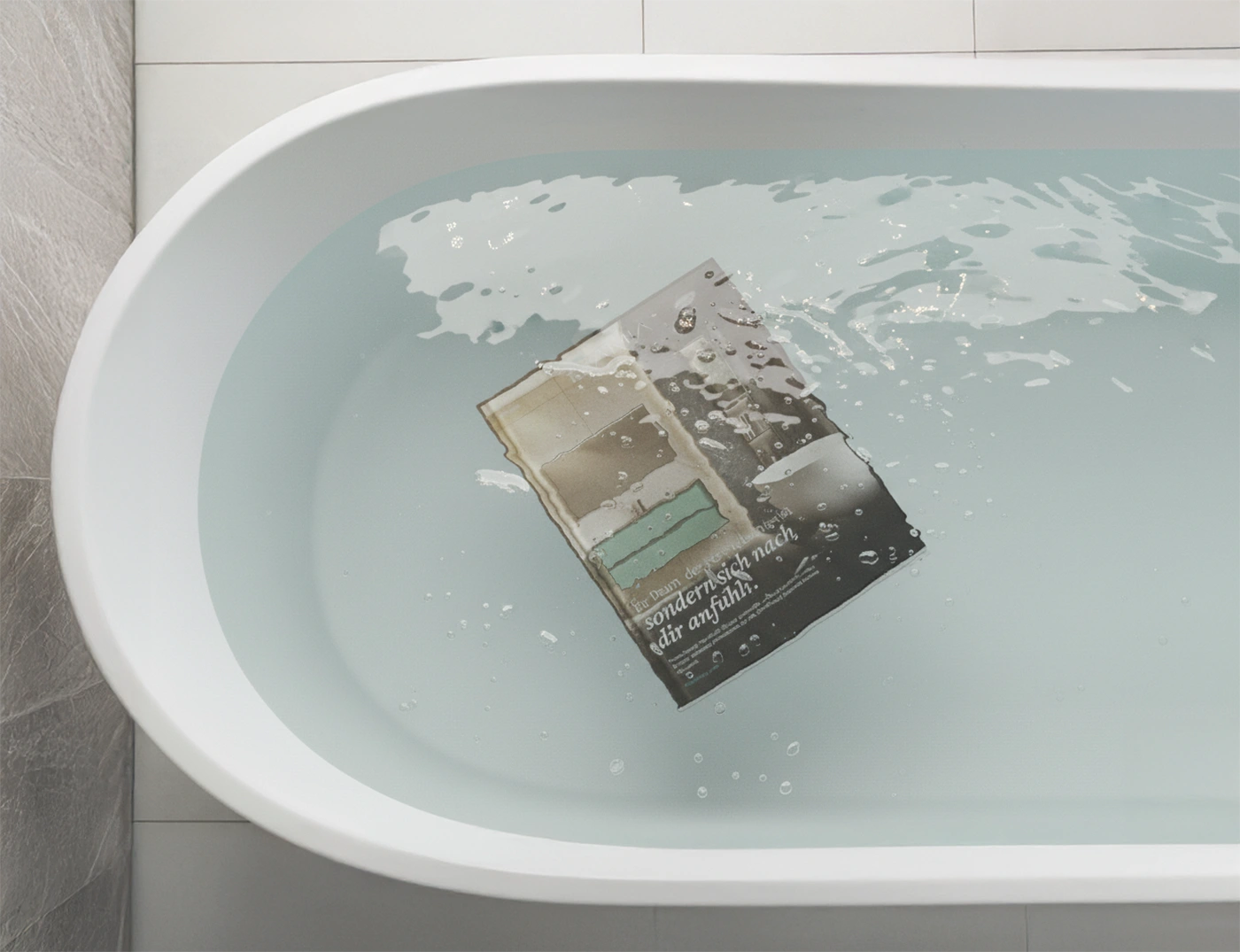
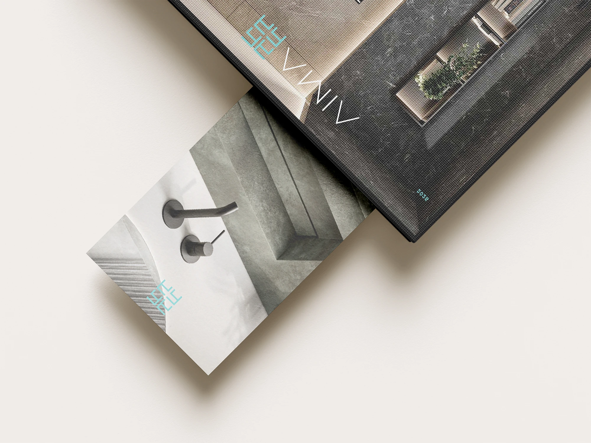
AMIA catalog in a bathtub
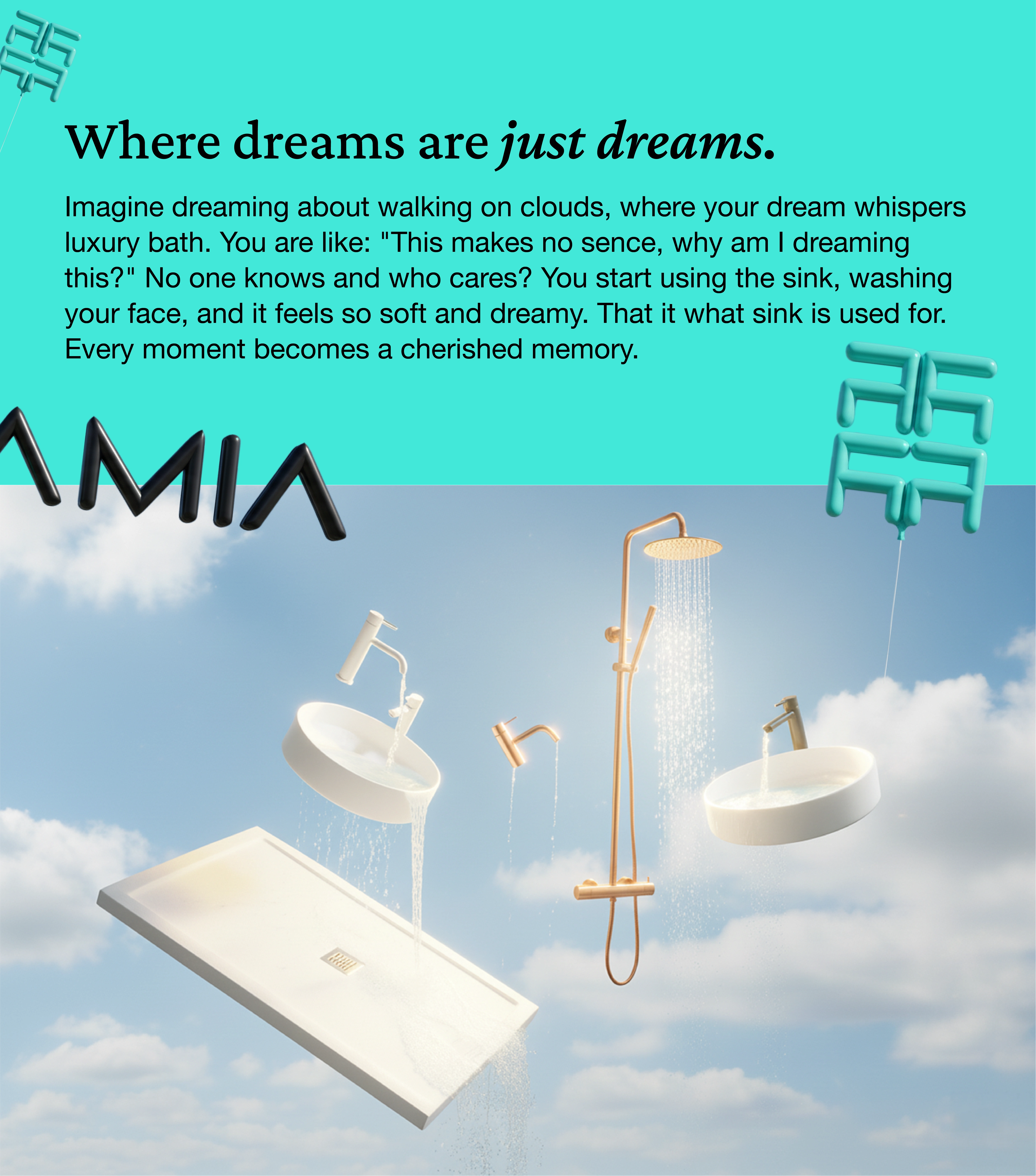
AMIA changing colors
Overview
AMIA isn’t just about bathrooms. It’s about turning daily routines into small rituals. The brand needed a visual identity that felt calm, modern, and human — like warm water and clean air in design form.
I built a brand that breathes minimalism, from the logo to the motion. The website became the brand’s softest voice — a place where design, water, and light move in harmony.
Challenge
Most bathroom brands talk about function. None talk about feeling.
The challenge was to create a brand that doesn’t just sell sinks, but creates an atmosphere. Something that feels premium, not pretentious. Honest, not cold.
AMIA Motion Intro
AMIA Intro
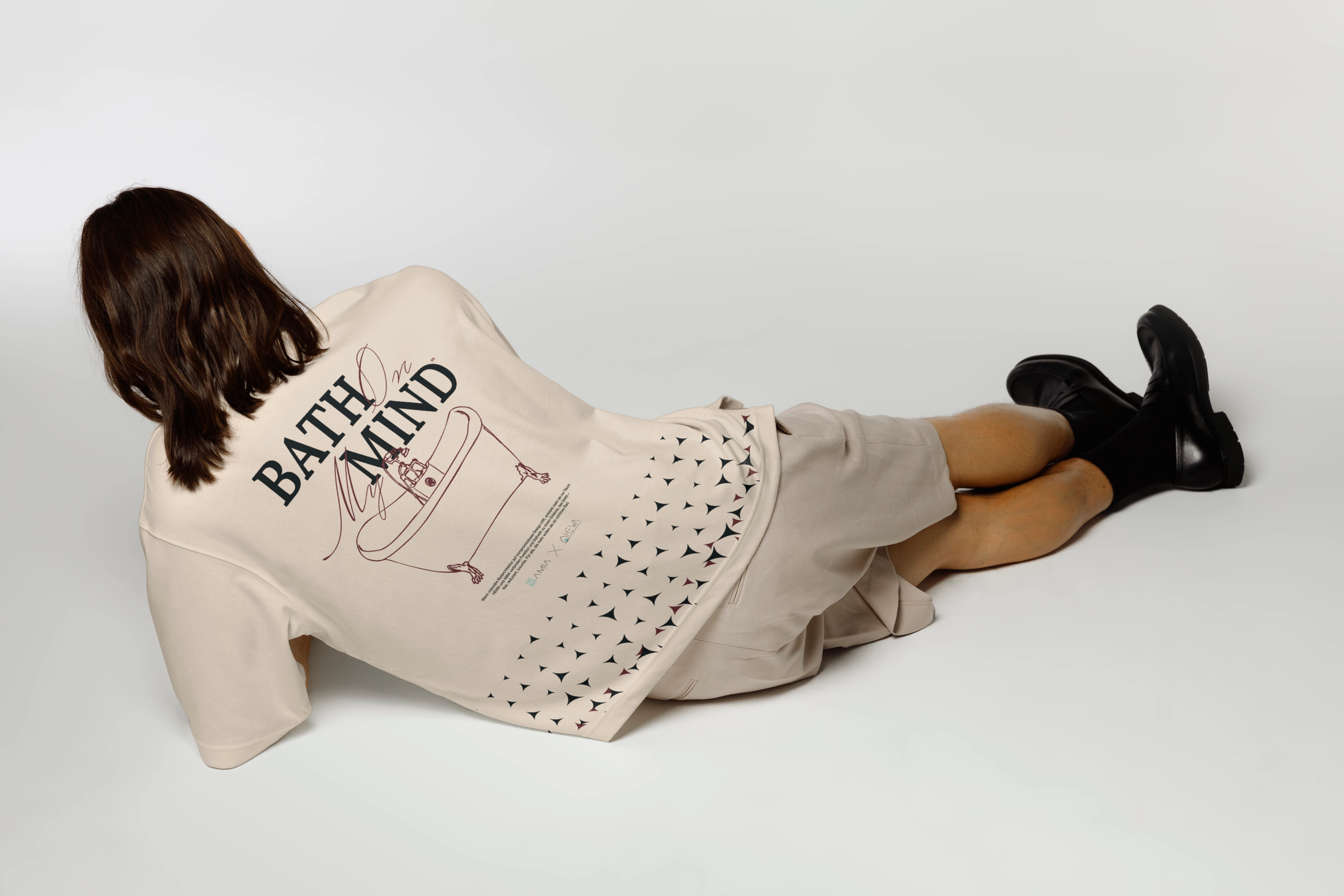
AMIA T-Shirt Design
AMIA Decks
Approach
I stripped everything down — shapes, words, colors — until only what mattered stayed.
Typography that whispers, not shouts. Photography that feels like touch.
Built in Figma and animated in Jitter, every movement flows like water.
I wanted users not just to scroll, but to feel.
Result
AMIA became more than a product brand — it became a small philosophy of calm.
From packaging to digital presence, every element now flows with one clear message:
Design that feels. Simplicity that stays.
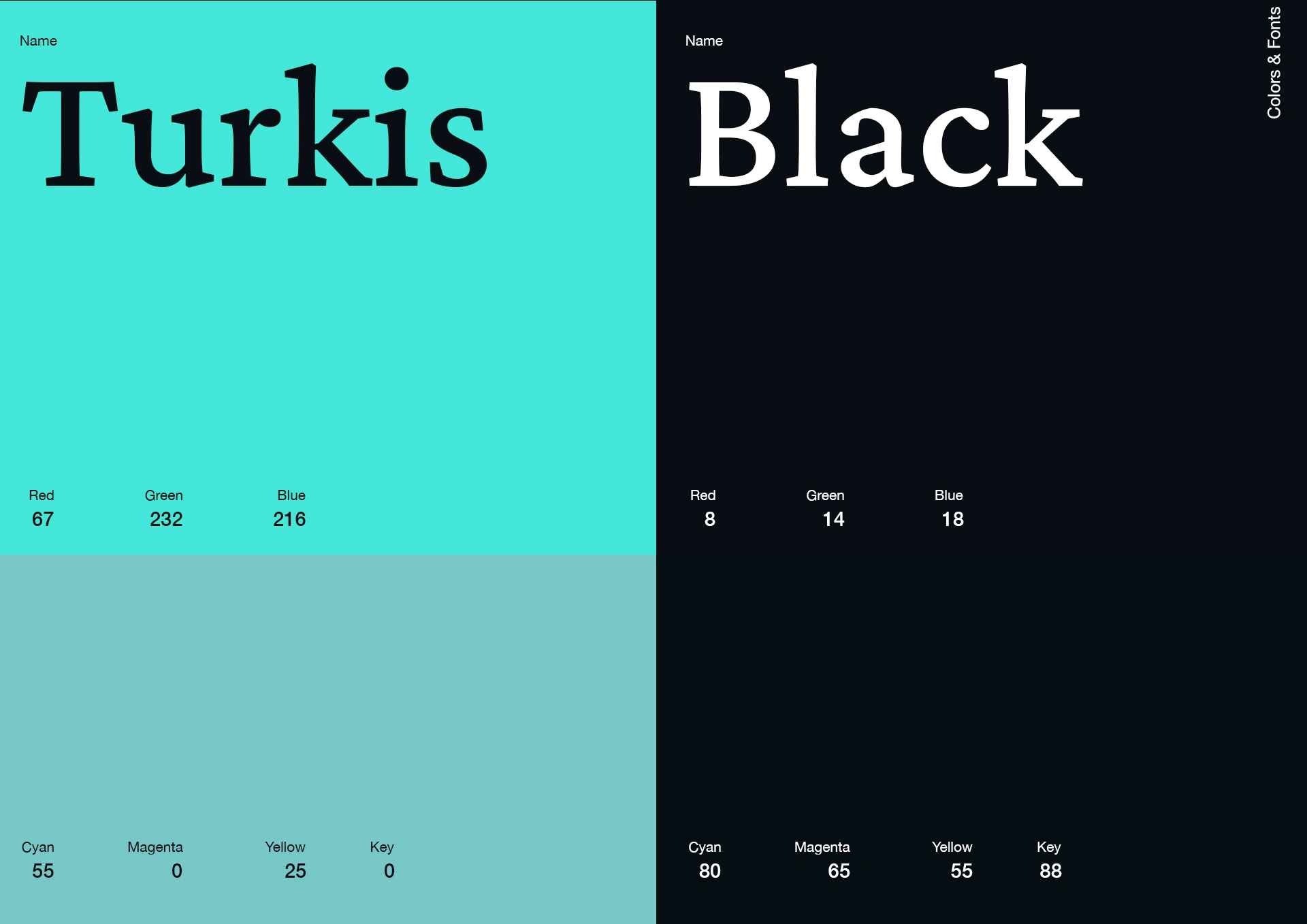
AMIA color palette
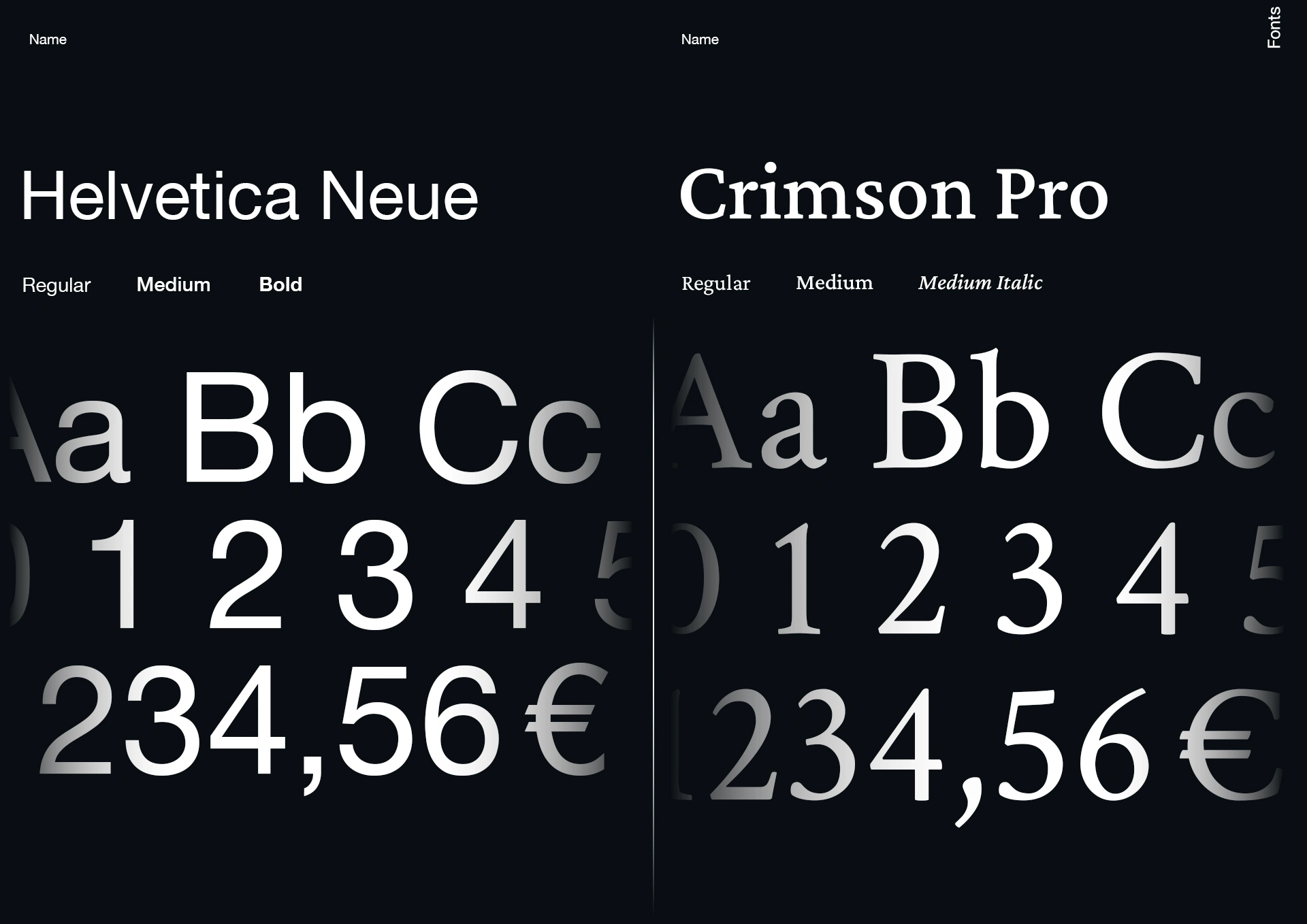
AMIA typograhy

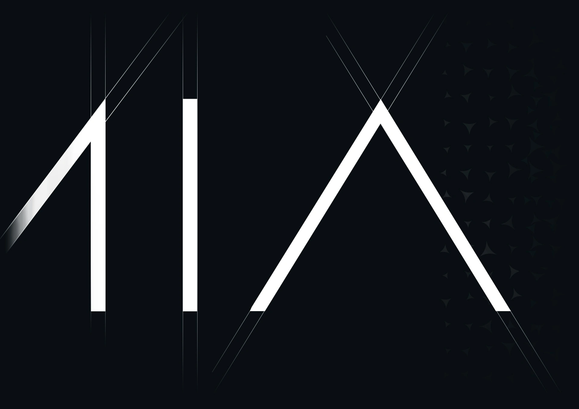
AMIA Logo – "Givenchy" part
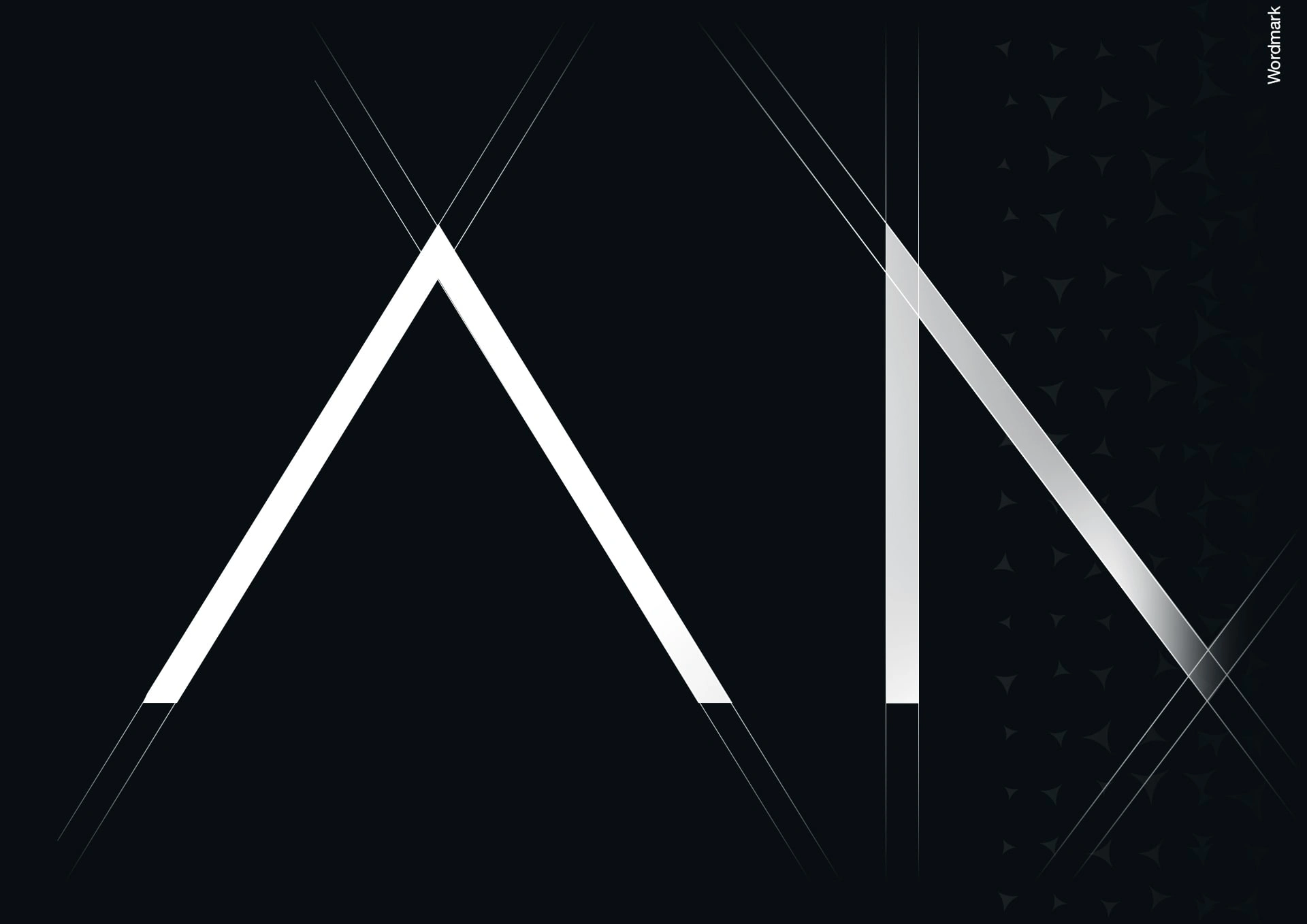
"AM" part & "MIA"
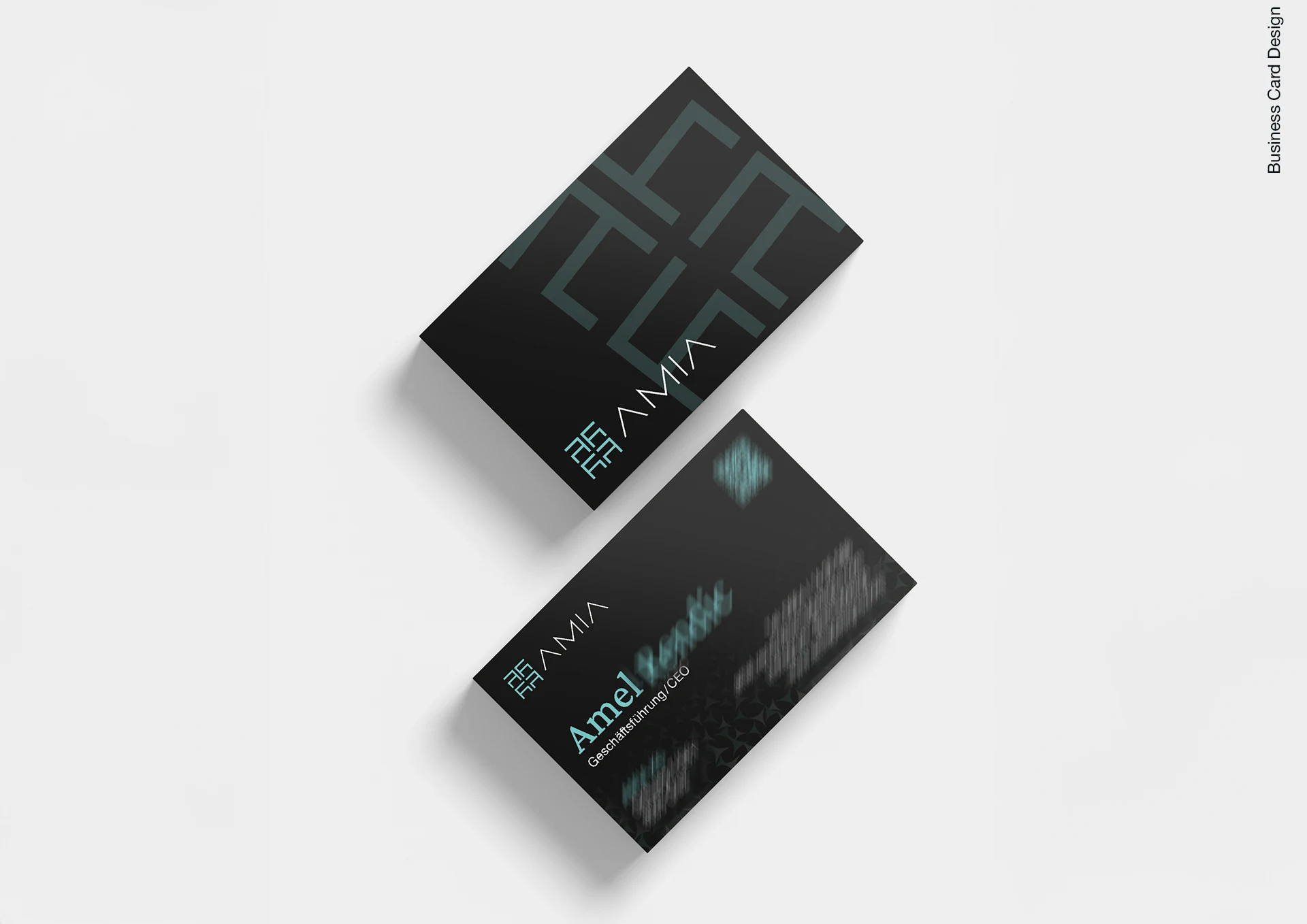
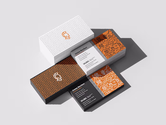
AMIA business card design
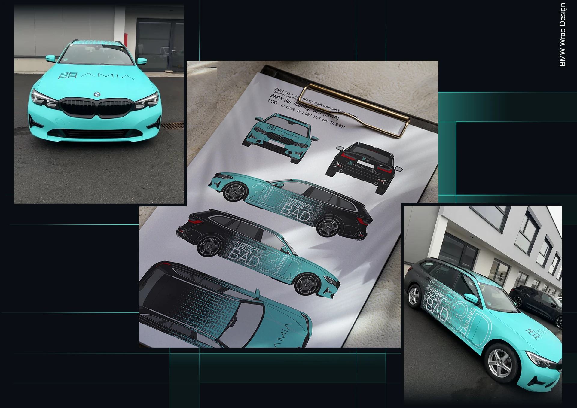
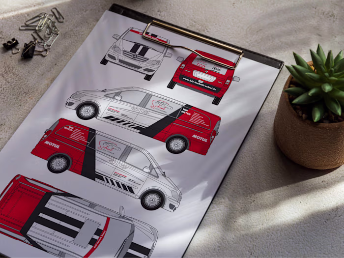
AMIA car wrap design
The blue BMW
I turned a BMW 3er into a statement piece — a moving reflection of AMIA’s design philosophy.
The color wasn’t chosen to stand out. It was chosen to calm. The soft turquoise tone captures AMIA’s freshness and purity, while the geometric grid across the body brings structure — like the balance between water and architecture.
Typography & design
It plays the main role: bold yet subtle, wrapping around the car with confidence.
Instead of traditional advertising, it’s quiet branding — one that doesn’t shout, but turns heads anyway.
The design was fully developed on precise ccvision templates at a 1:30 scale, ensuring every curve, line, and transition aligns perfectly on the real vehicle.
Every drive became part of the brand story — a brand that moves.
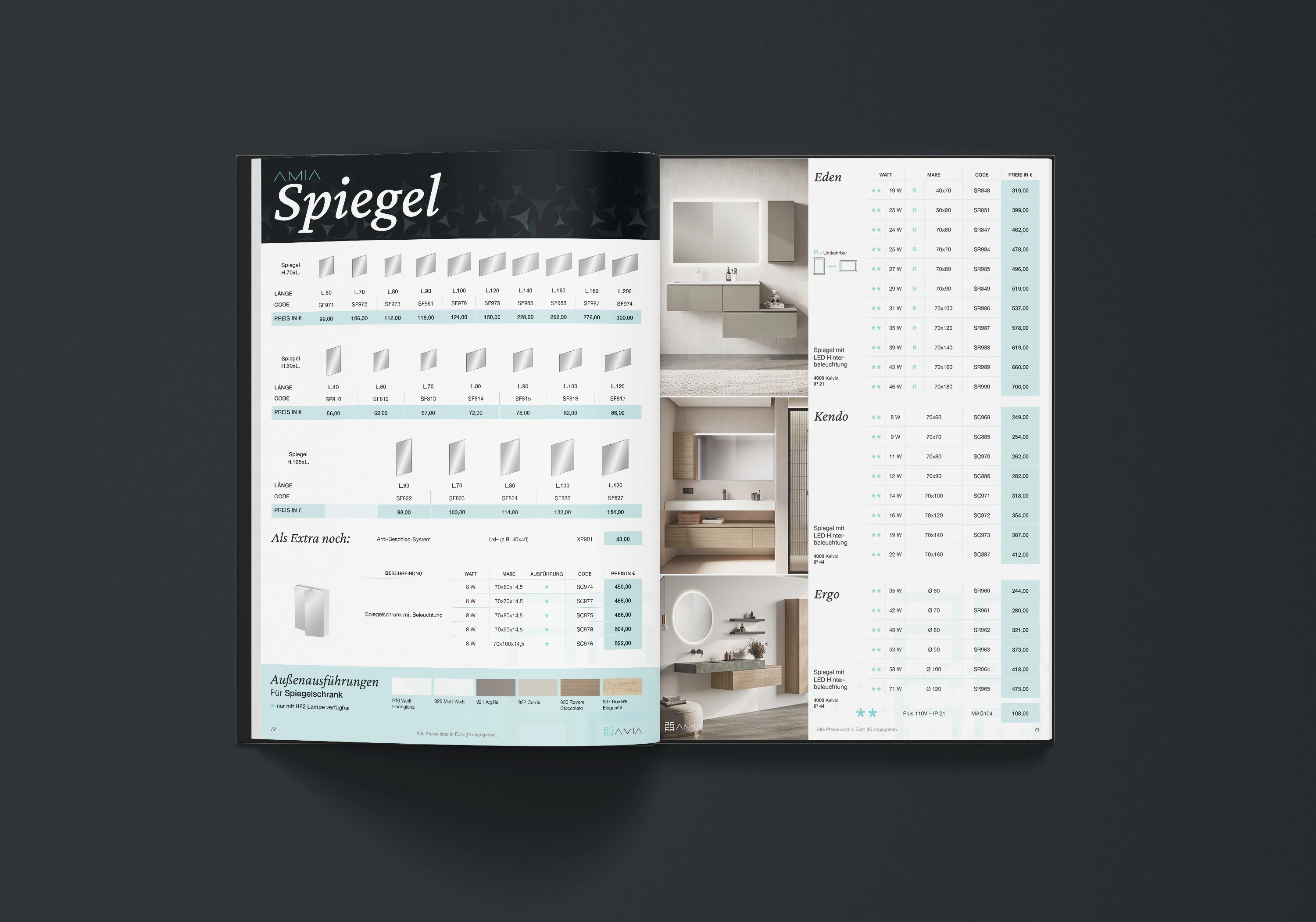
AMIA catalog design – prices of mirrors
The 250+ pages blue catalog
A 250-page design object — not a catalog.
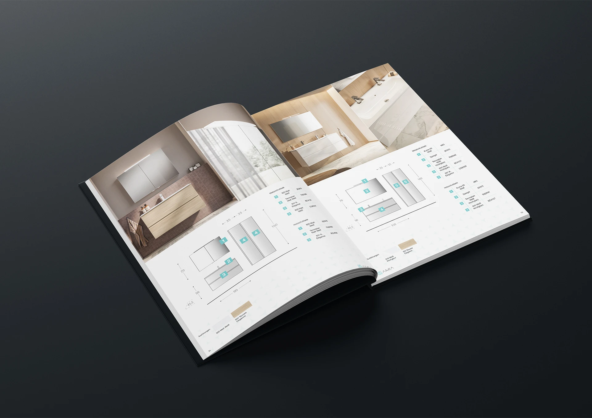
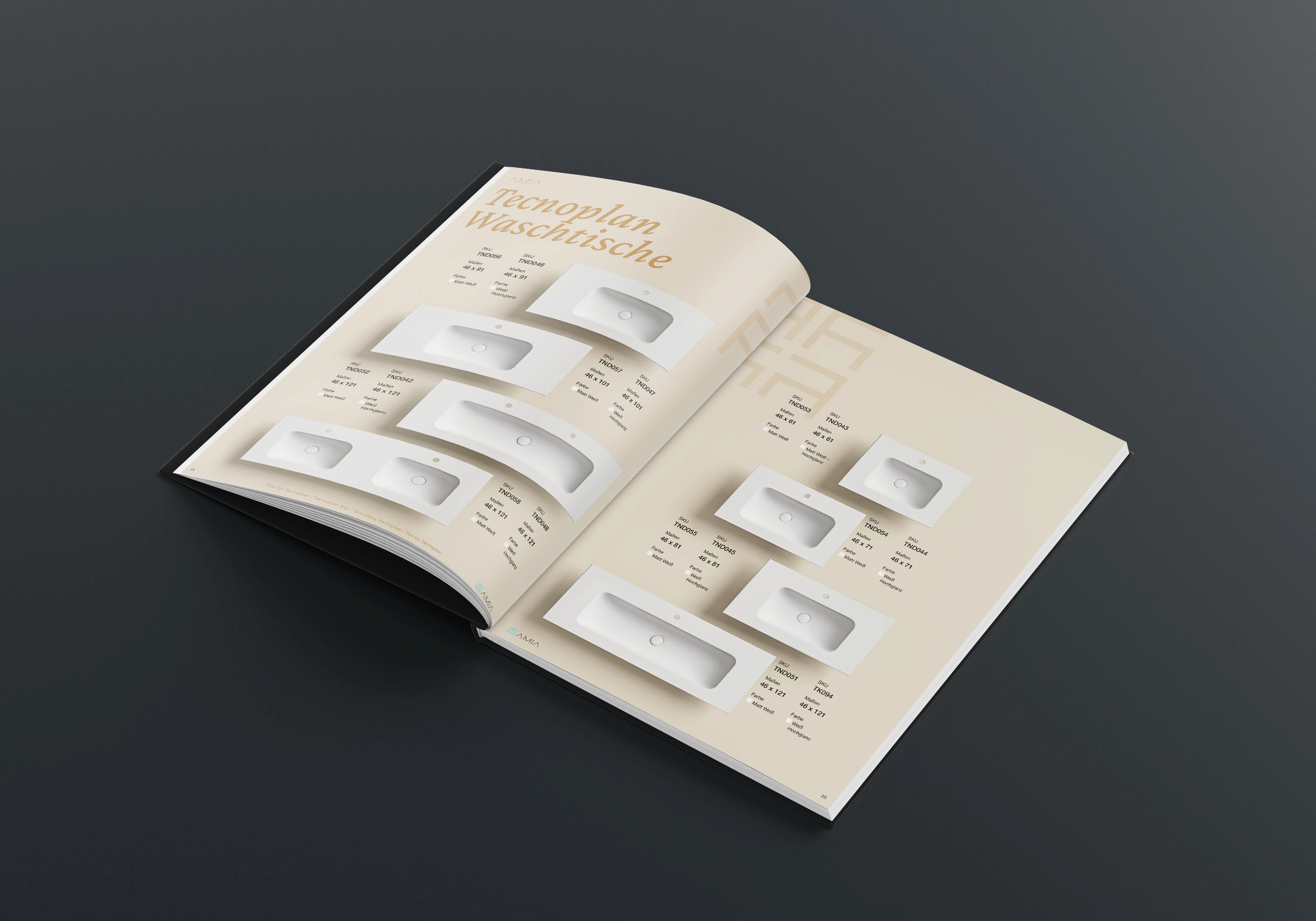
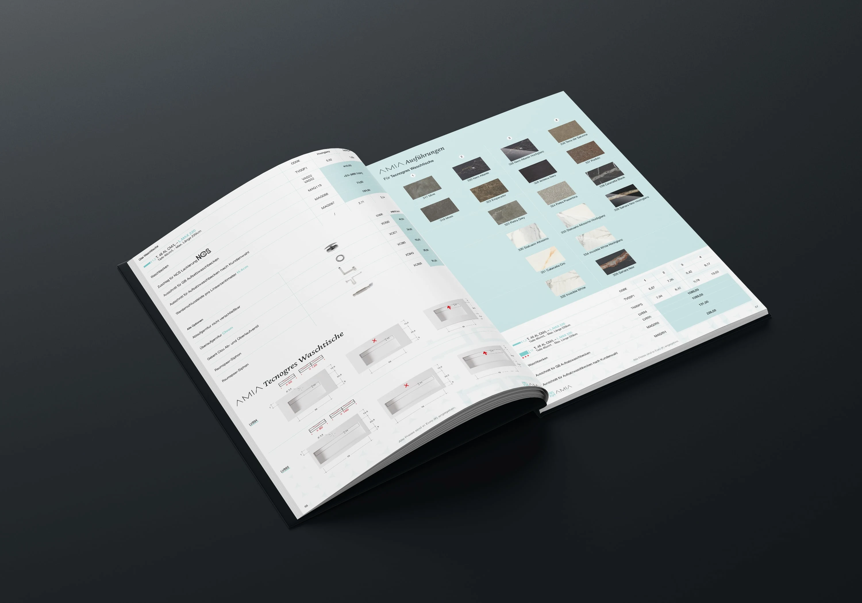
Every spread was crafted like a magazine layout: generous white space, tactile textures, and a calm rhythm of product and material. The goal was clarity without coldness — a catalog that breathes.
Each section unfolds like a story: from minimal mirrors to textured sinks, everything follows one visual language — balance, precision, calm.
AMIA catalog
Design Approach
Typography in Helvetica Neue 7pt keeps the structure quiet, while muted tones and gentle gradients echo AMIA’s identity.
Grid systems flow like architecture, giving every element space to be understood.
Photography was curated to feel natural, warm, and lived-in — reminding users that AMIA belongs in real homes, not showrooms.
AMIA catalog
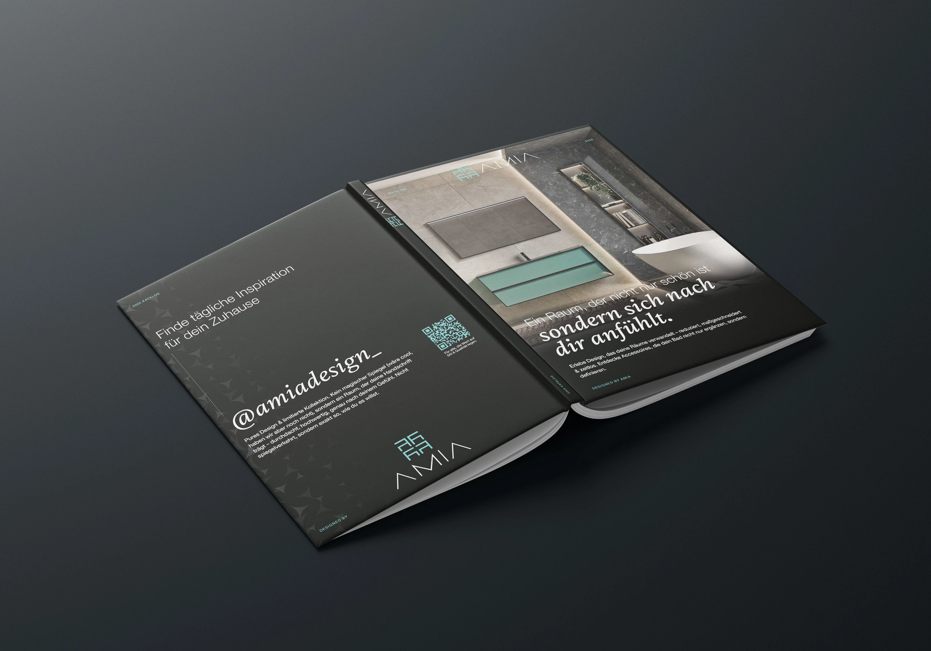
AMIA catalog back side
AMIA insert card – it is used for example to jump fast to sink section
The Detail That Matters
Inside the back cover lies a small surprise — a removable insert card, printed on textured paper with soft embossing.
It’s more than a design accent — it has a really good function: it is used to jump fast to catalog sections. Sinks, bathtubs and more.
It's simple.
Just like the brand itself — simple, elegant, and quietly confident.
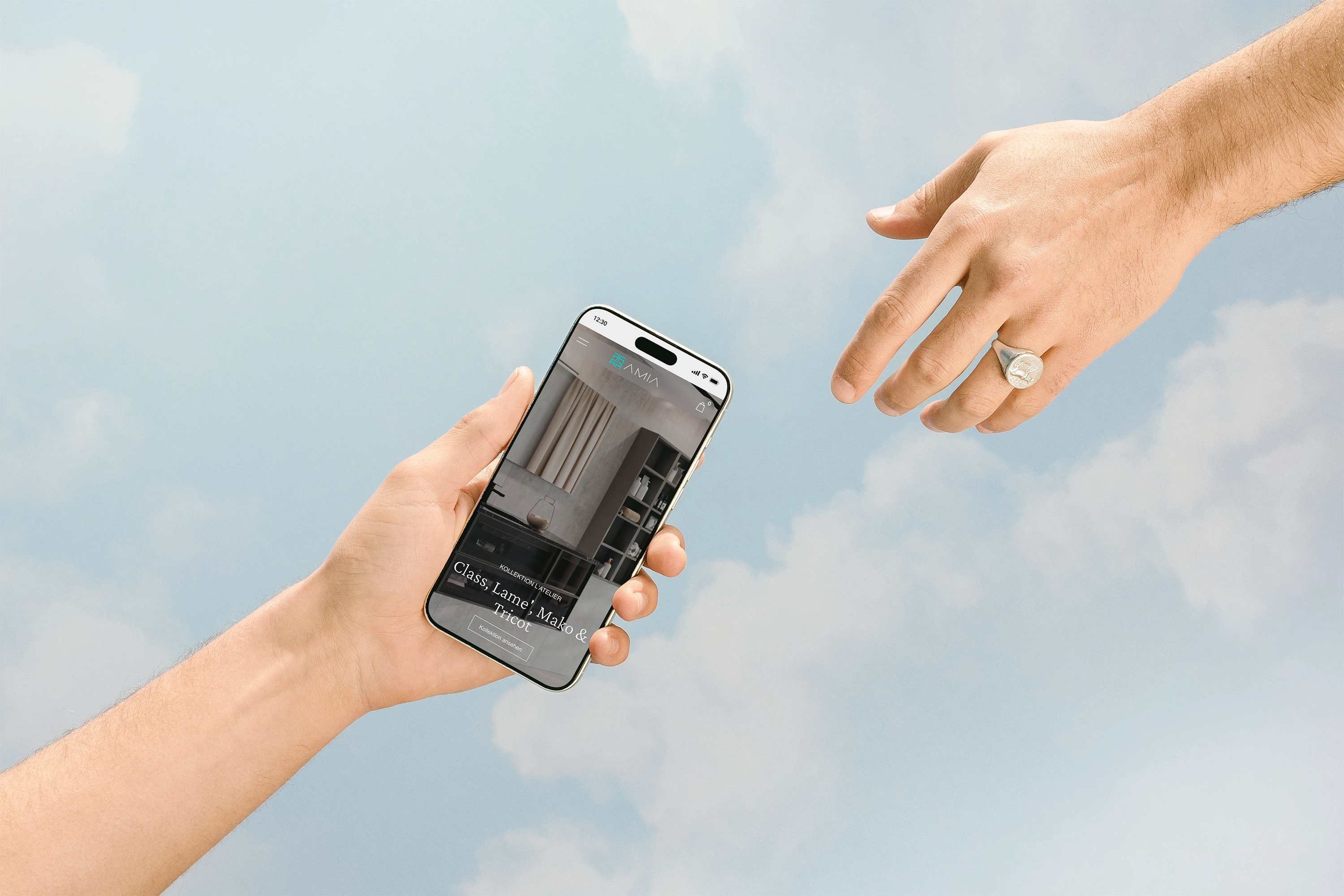
AMIA website
The Website
A digital reflection of calm.
The AMIA website wasn’t built to impress — it was built to breathe.
Each section moves like water — smooth, slow, intentional. Built in Figma and animated in Jitter, the motion design captures the essence of AMIA: clarity in every drop, precision in every frame.
Design Approach
The layout follows a rhythm — large imagery, generous spacing, and typography that whispers, not shouts.
Interactive transitions reveal products the same way light reveals texture: gently, with purpose.
The UI flows from desktop to mobile without breaking the feeling — everything feels part of one surface, one gesture, one mood.
AMIA website
Conclusion
AMIA became more than a bathroom brand — it became a visual language of calm.
Every medium, from print to pixels to motion, speaks the same fluent tone: design that feels.
The catalog taught us that structure can be emotional.
The car wrap proved that branding can move.
And the website showed that digital can breathe.
AMIA now lives as a timeless identity: clean, human, and quietly confident.
Designed to flow. Built to feel.

You made it till the end! 🫶
Like this project
Posted Oct 28, 2025
Turned AMIA into a modern bathroom brand. Clean visuals, subtle motion, & a website that feels premium & alive. Outcome: premium pricing & satisfied clients.
Likes
1
Views
13
Timeline
Jun 1, 2024 - Jun 1, 2025