Ojo Cafe — Branding, Packaging
Paola Santos
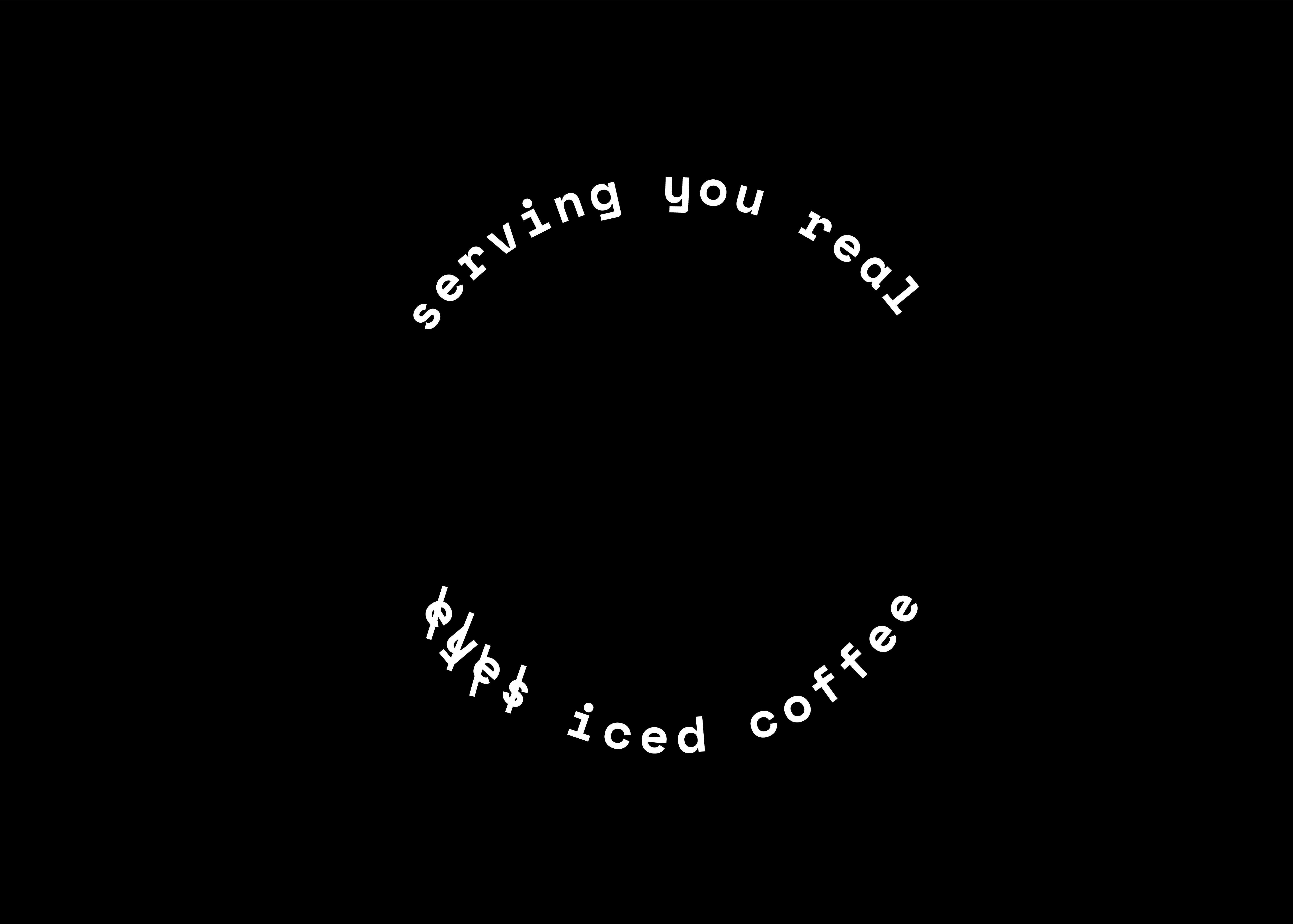
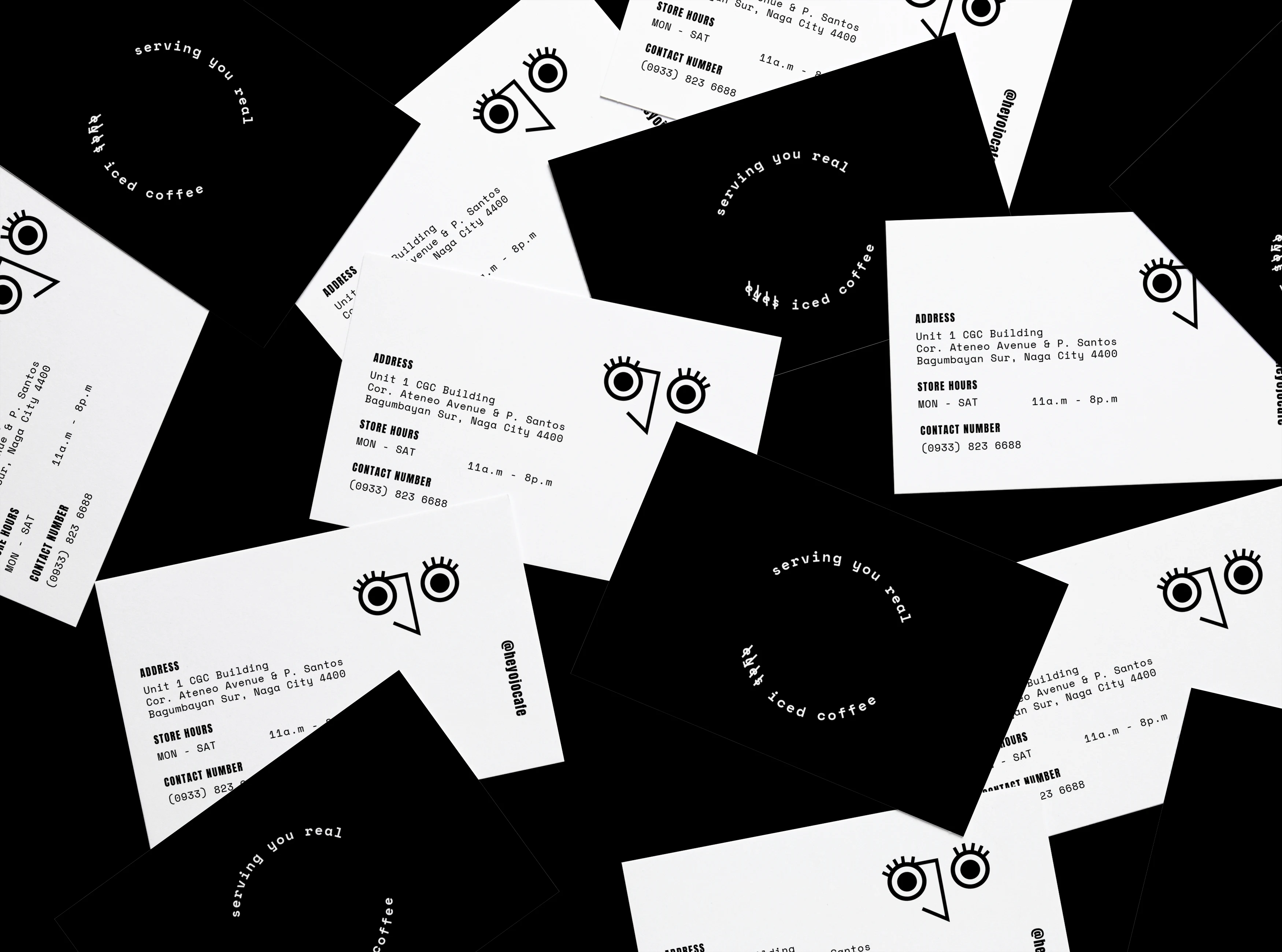
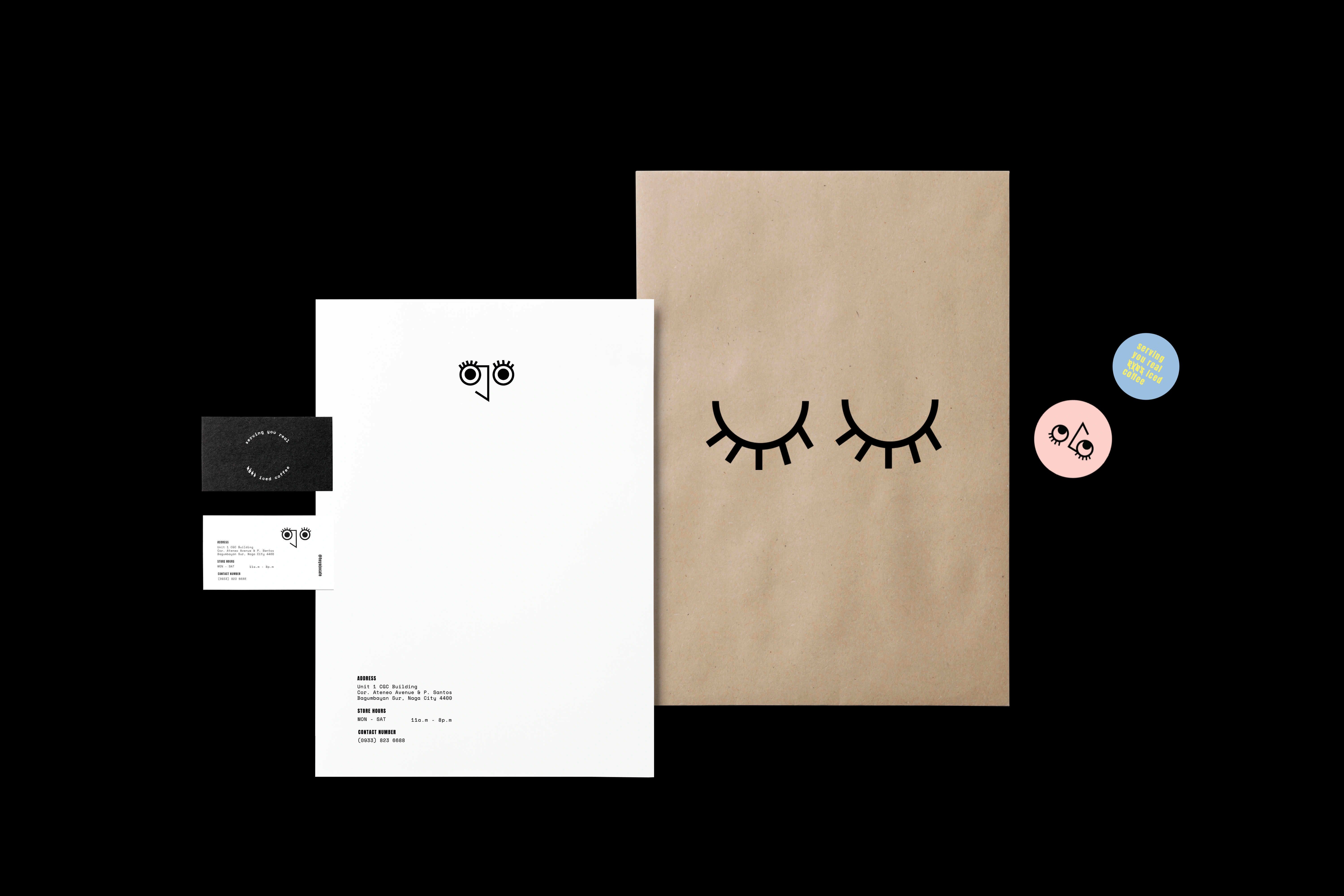
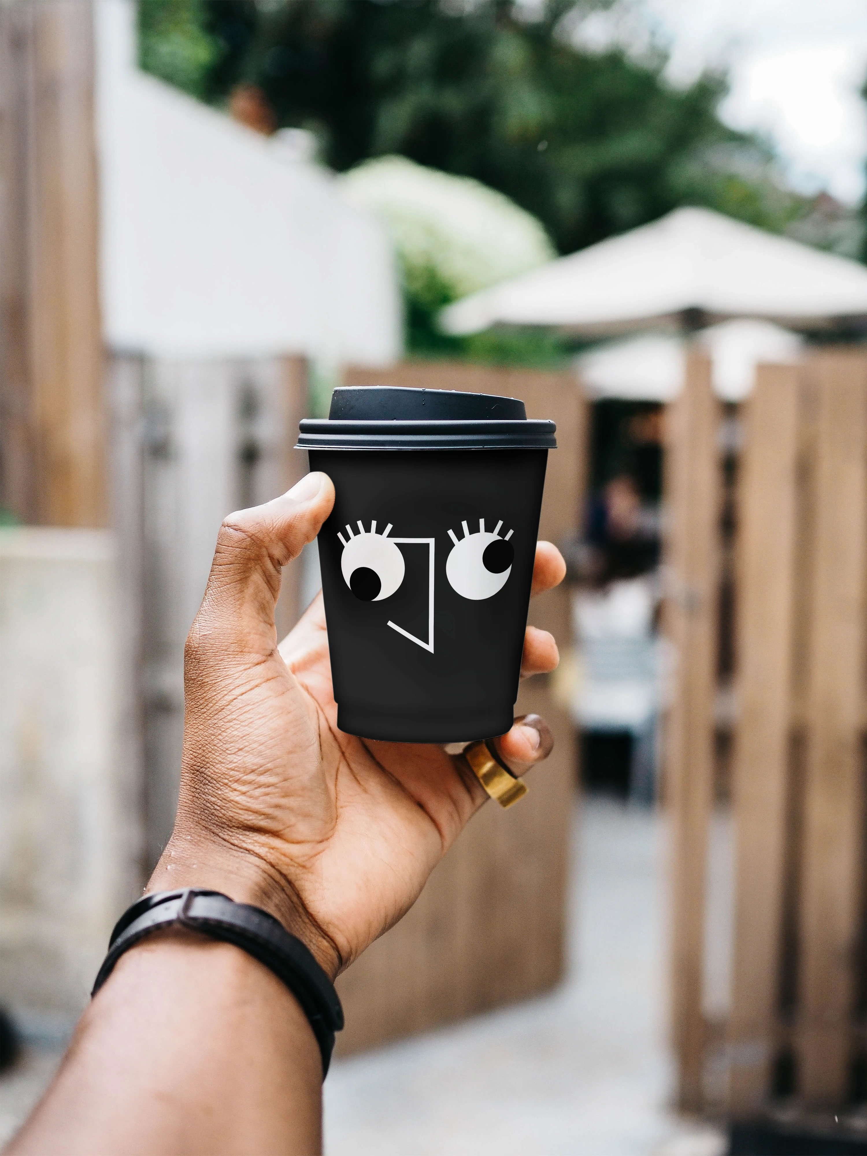
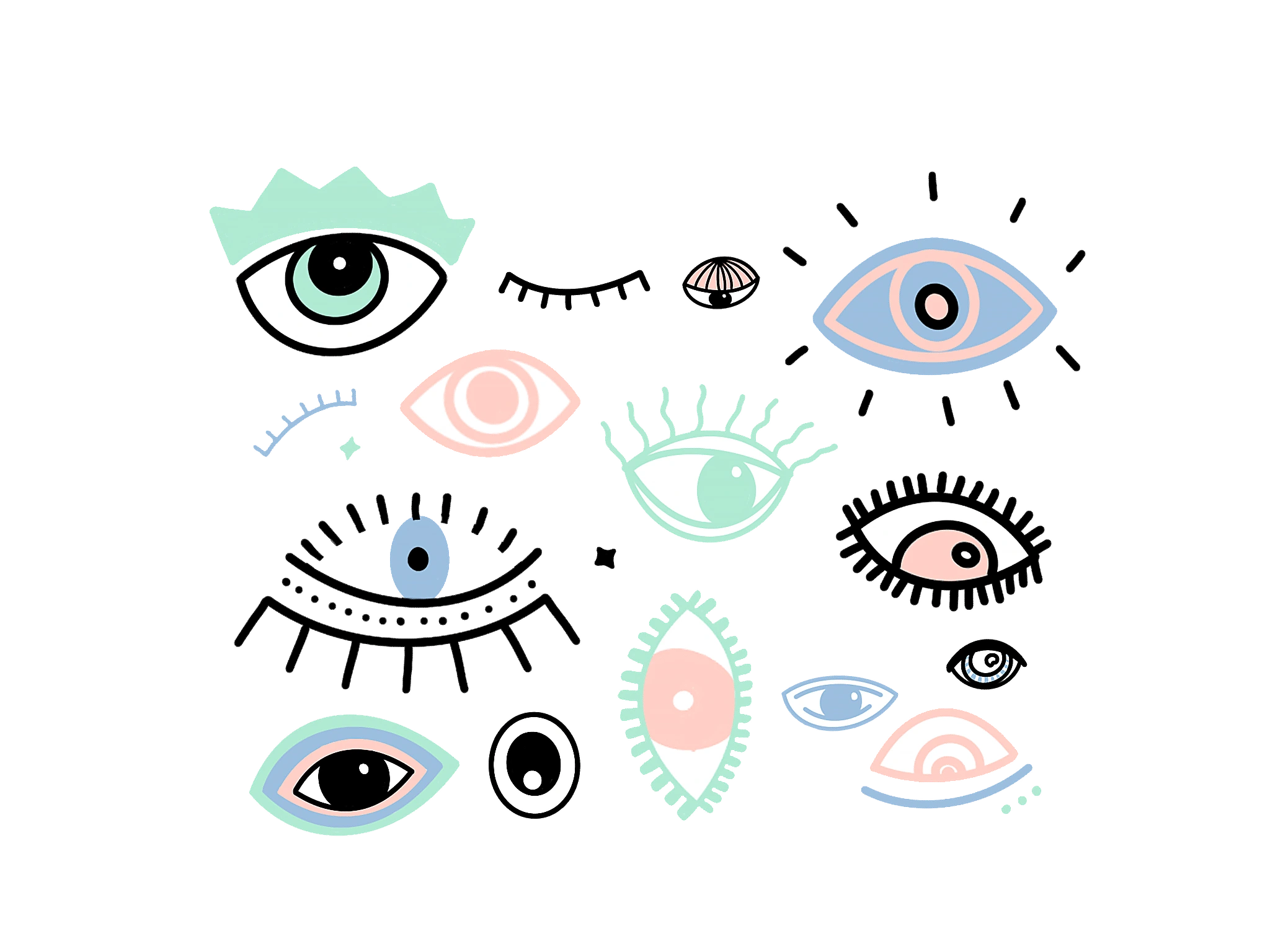
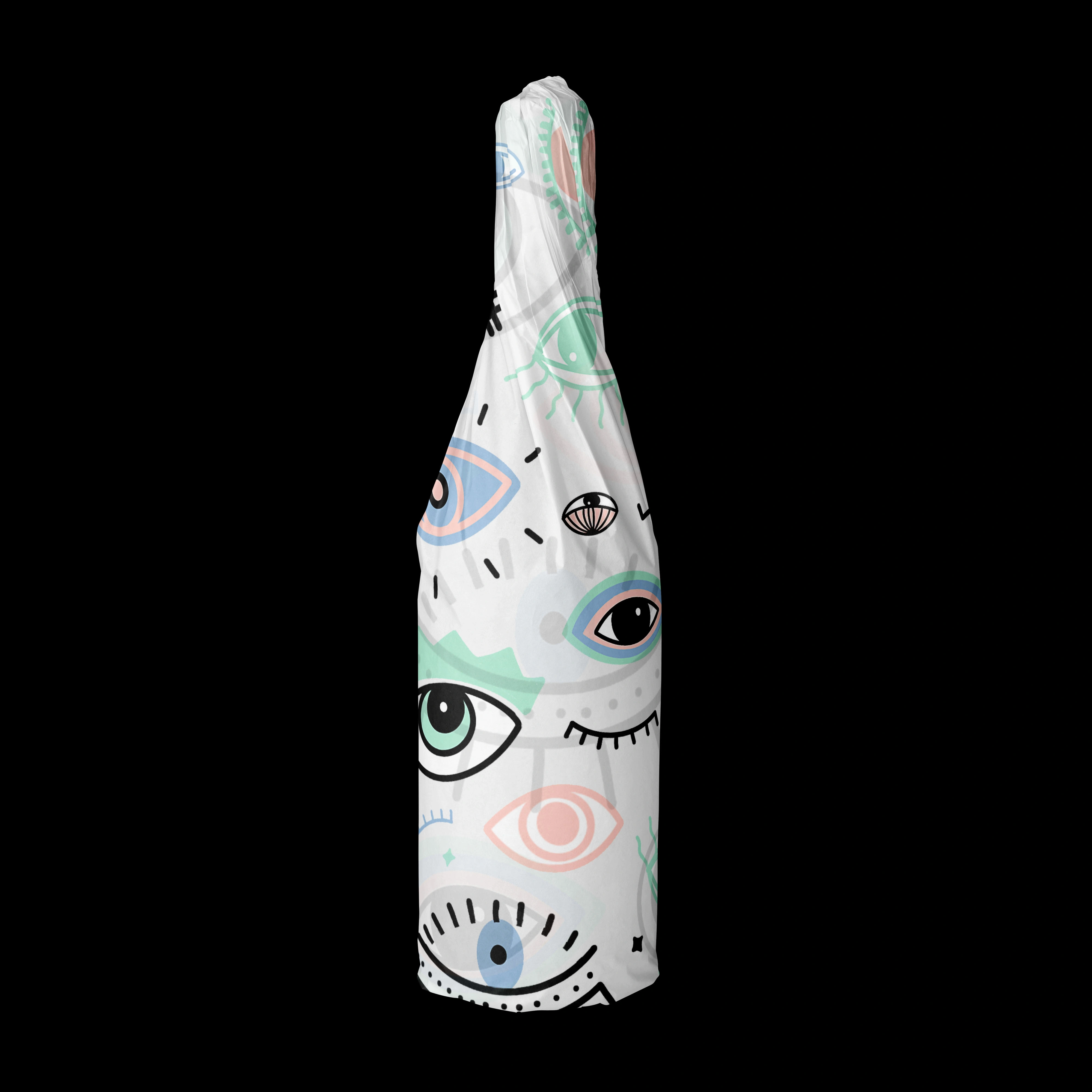
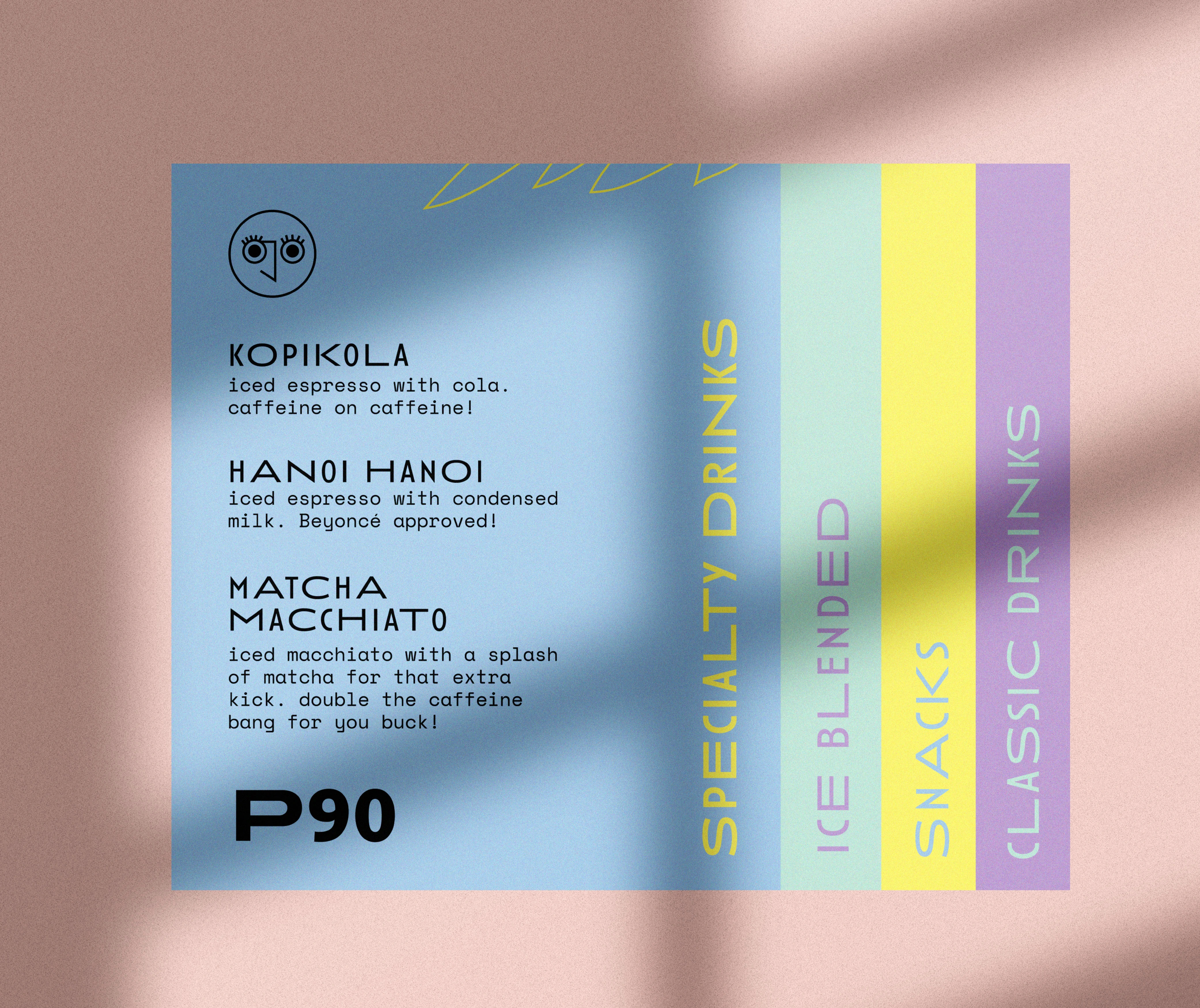
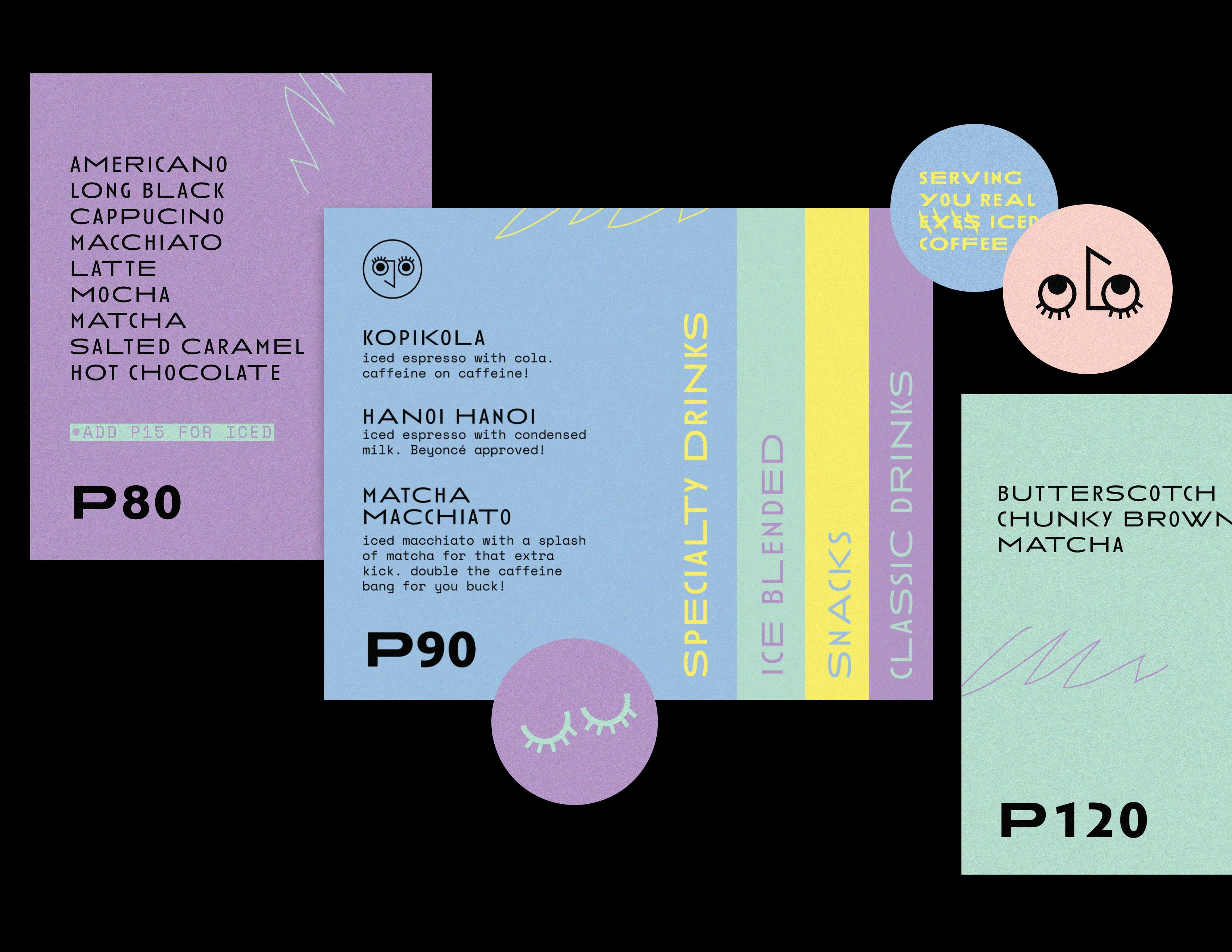
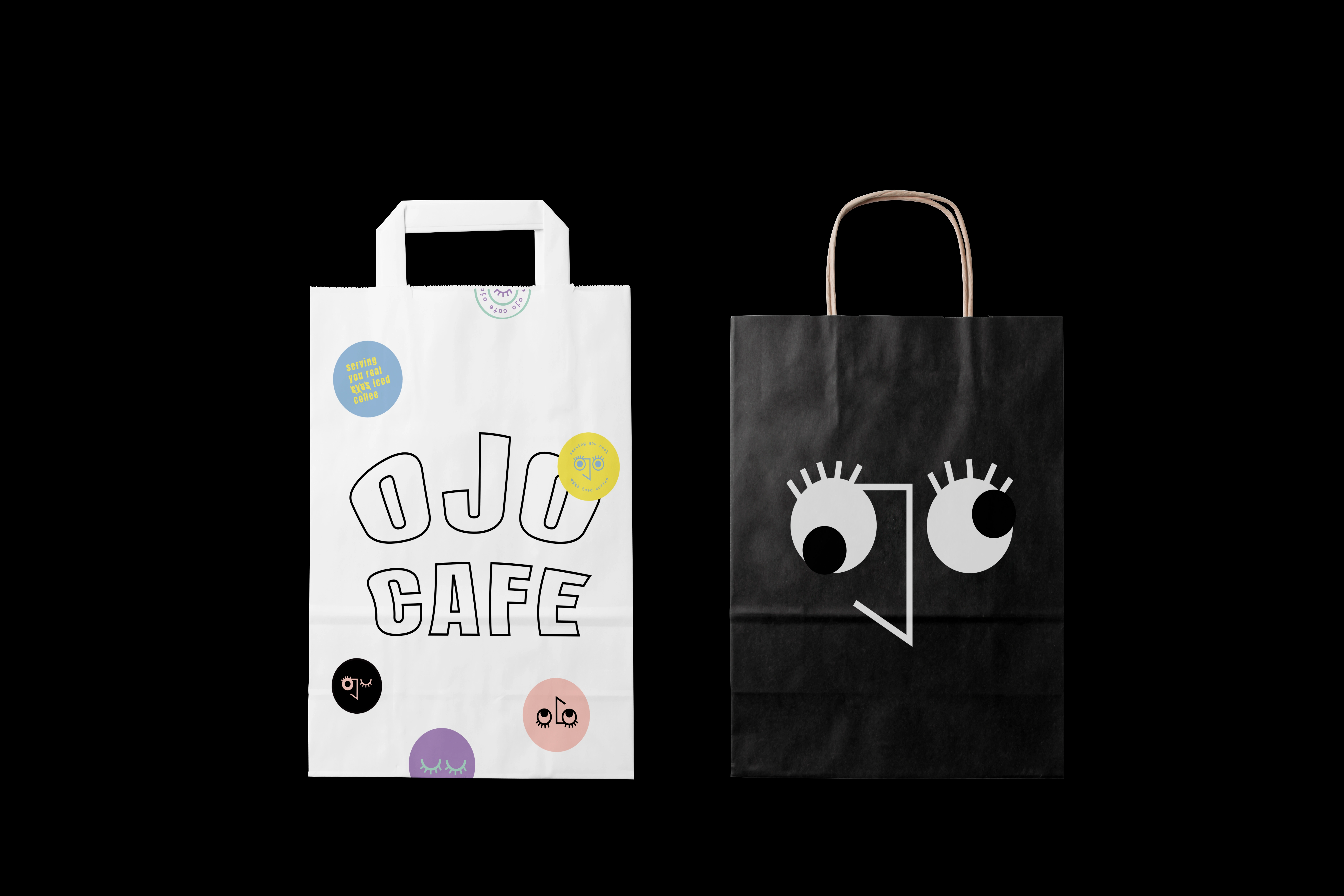
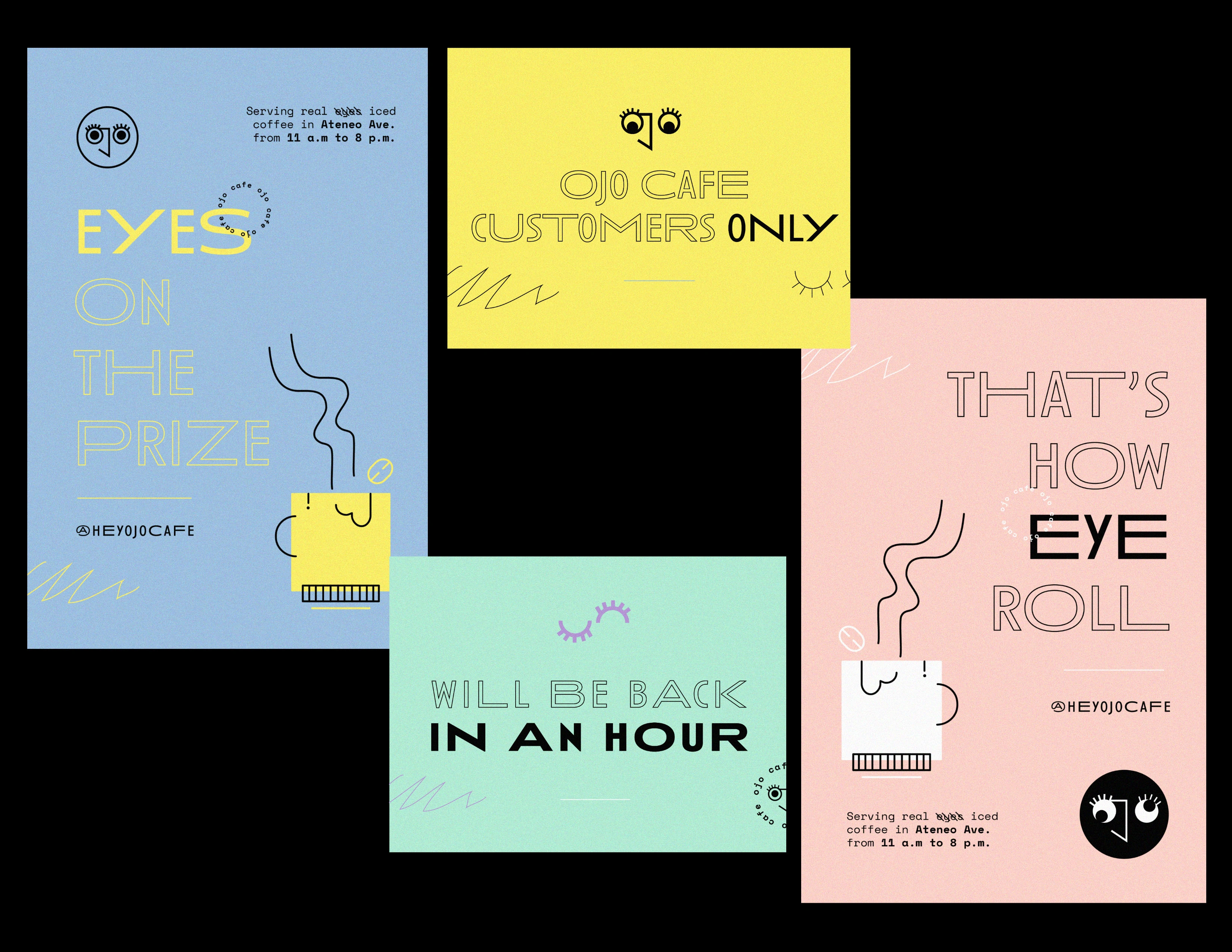
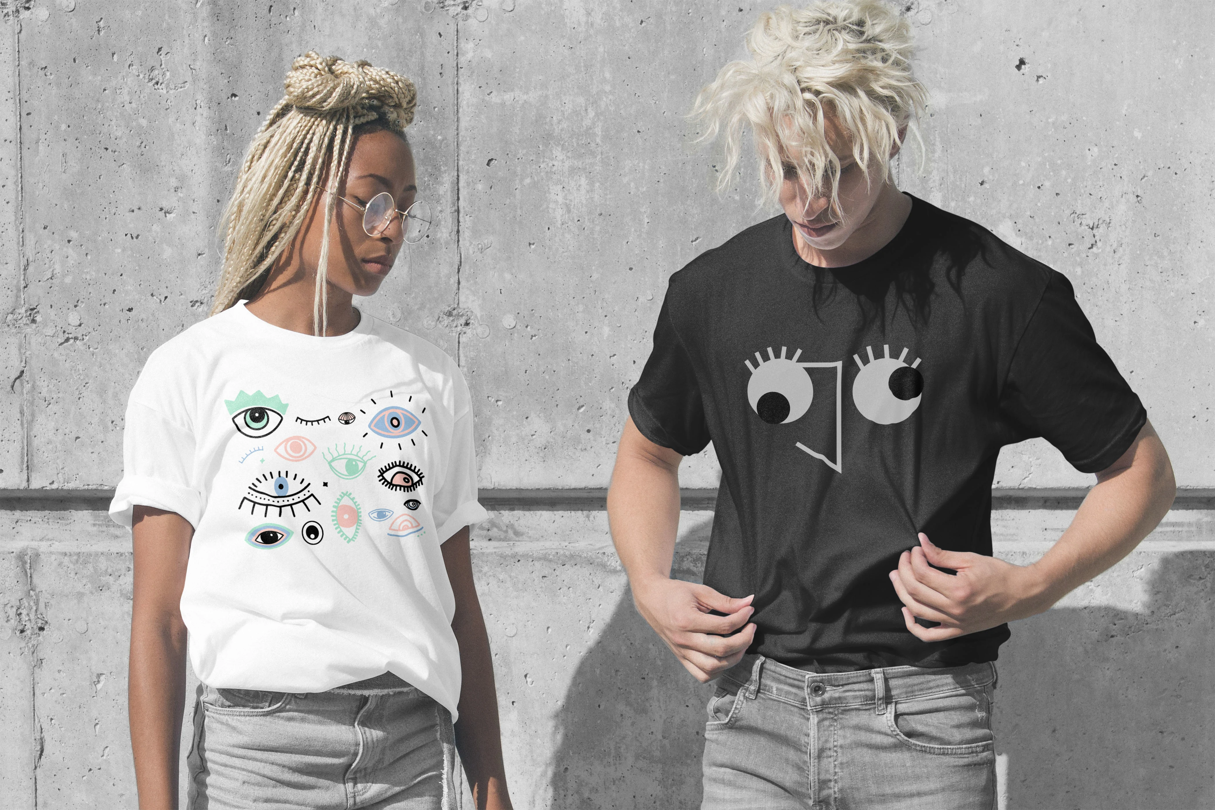
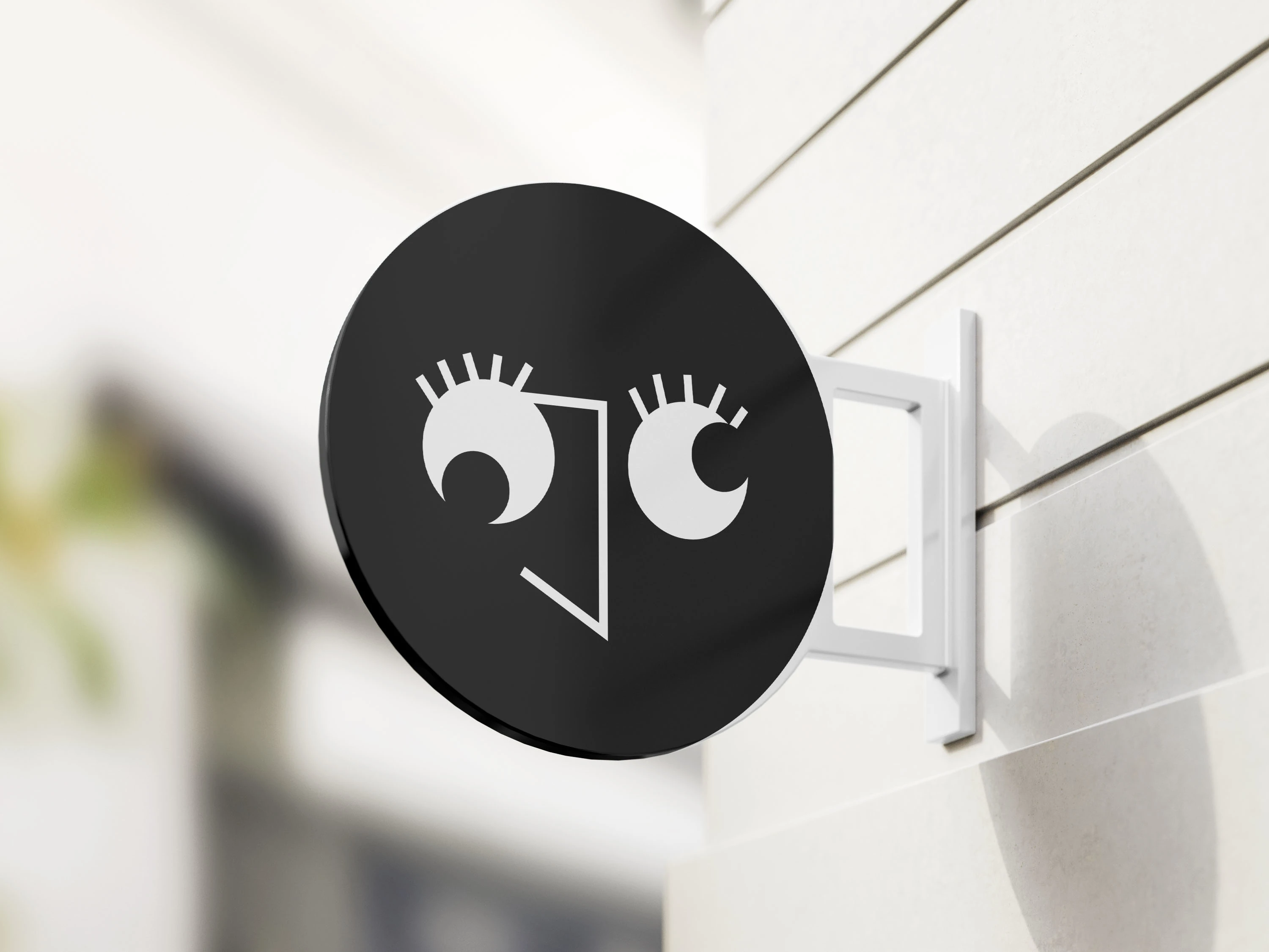
Naming the business after their family name — which also happens to mean eye — naturally shaped the logo and overall art direction. The brand leans into this coincidence with playful eye motifs and quirky characters. They envision the café as a home for creative people, not just another place to hang out. The identity channels a bold, vibrant, and joyful energy that sets the tone for the brand’s future.
This project is under my internship with Maine Manalansan.
YEAR: 2019
Like this project
Posted Nov 19, 2025
The project gained strong traction, earning features in two design publications and leading to interviews about the creative process behind Ojo Café.
Likes
0
Views
8