Healthcare Branding and Visual Identity Design

Akbar Rhadit


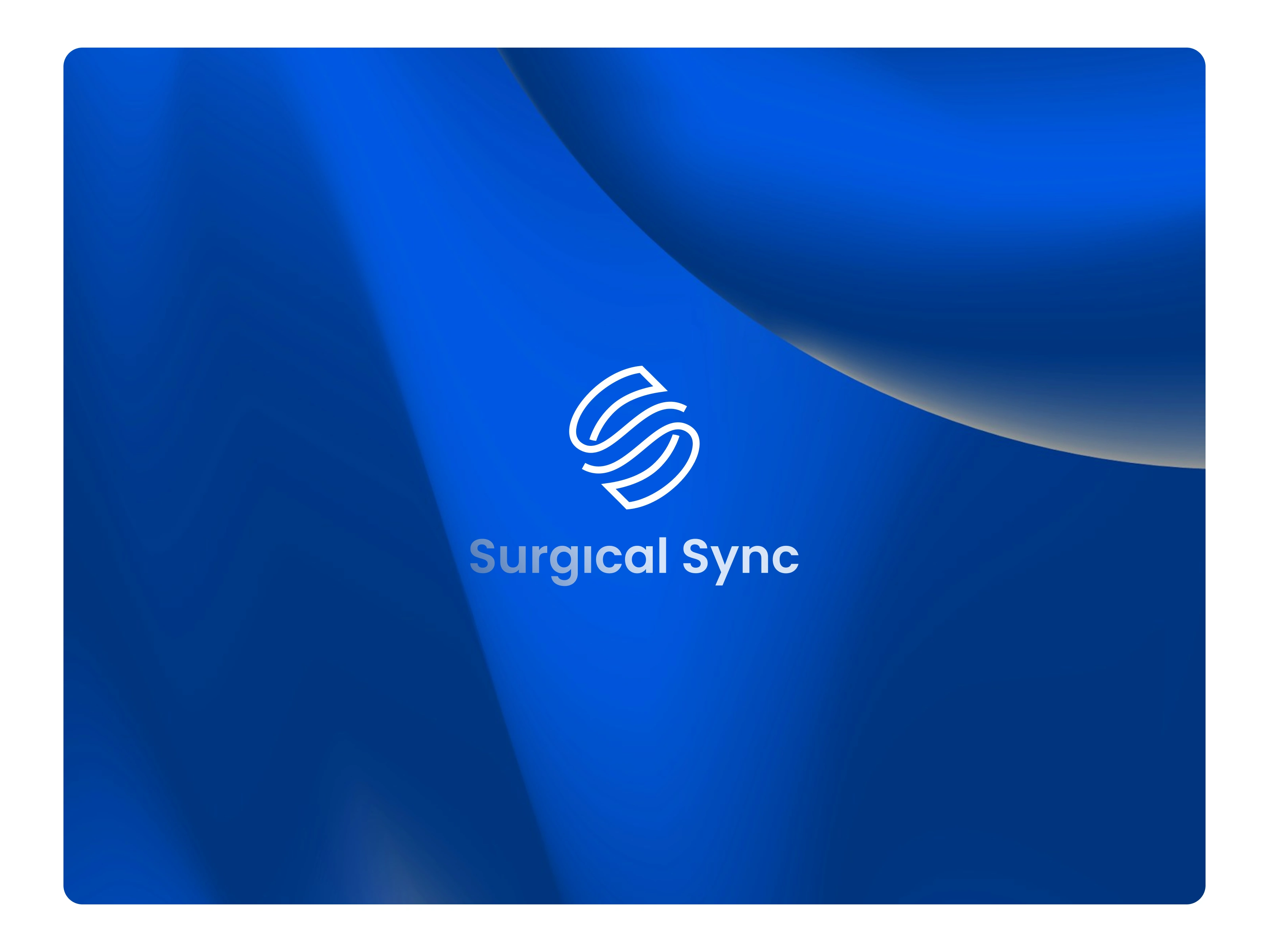
Brand identity design for a medical health app that helps cataract patients prepare for eye exams on their phone, so doctors understand the diagnosis faster.
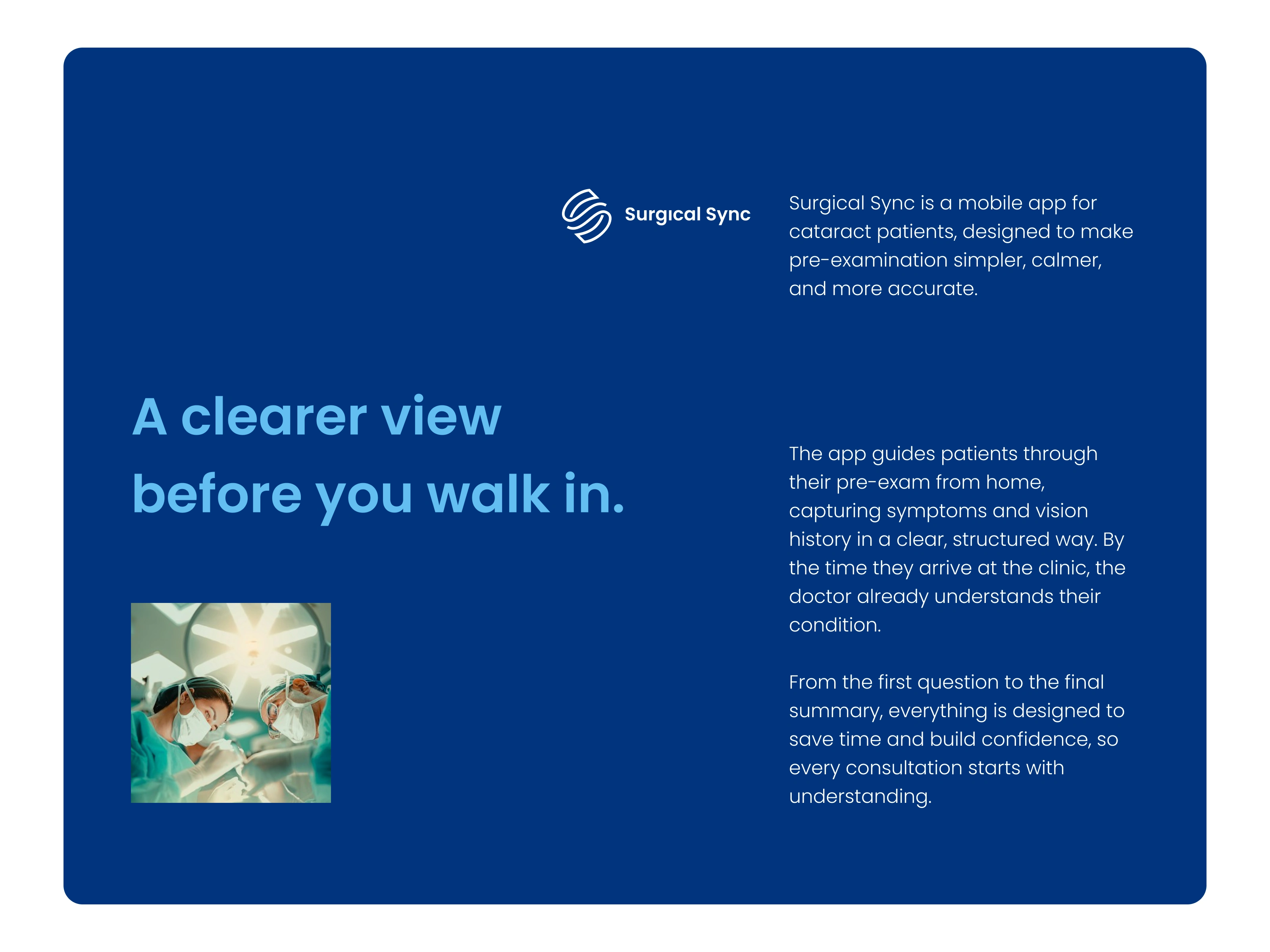
Brand identity overview for a medical app that supports cataract pre-examination.
Project Brief: Medical Brand Identity for a Cataract Pre-Exam App
Surgical Sync is a mobile app that guides cataract patients through a pre-examination at home. When patients arrive at the clinic, the doctor already understands their symptoms and vision history. The challenge was to design a healthcare brand identity that feels trustworthy and clinical, but also calm and approachable for older patients and their families.
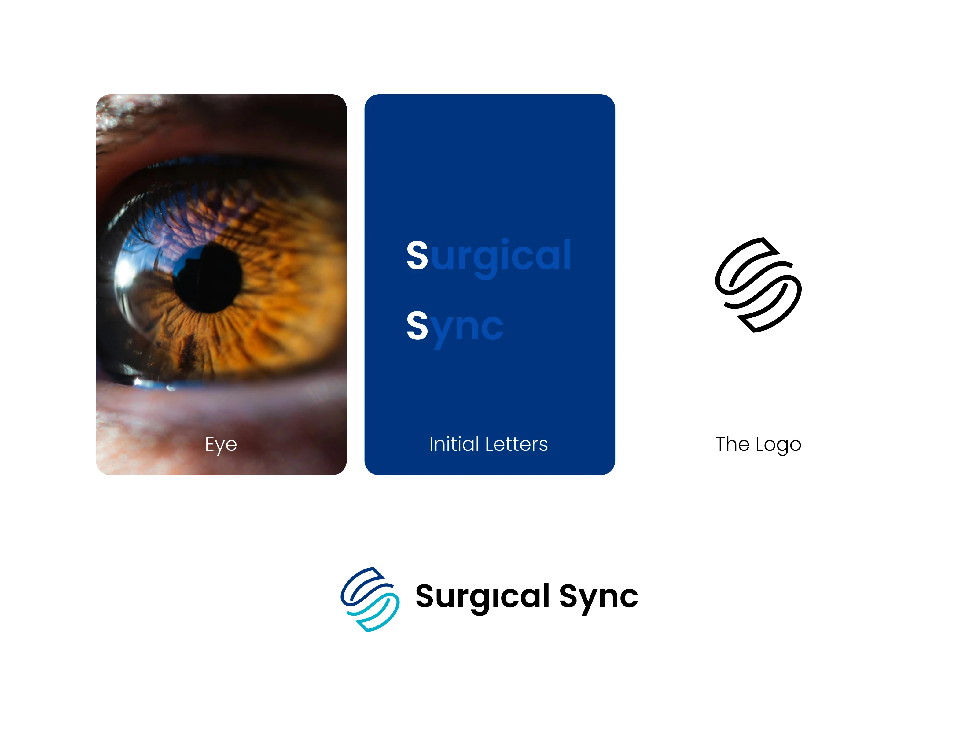
Eye-shaped monogram logo formed by two interlocking letter S shapes.
Logo Design Concept: Eye Symbol Combined With Double S Monogram
The logo combines two ideas: the shape of an eye and the initials S and S for Surgical Sync. Two flowing S strokes wrap around each other and form the iris, with the center acting as the pupil. The interlocking strokes also show two sides syncing, patient and doctor. The result is a simple, memorable logo mark for the medical industry that works as an eye symbol, a monogram, and a sync loop at once.
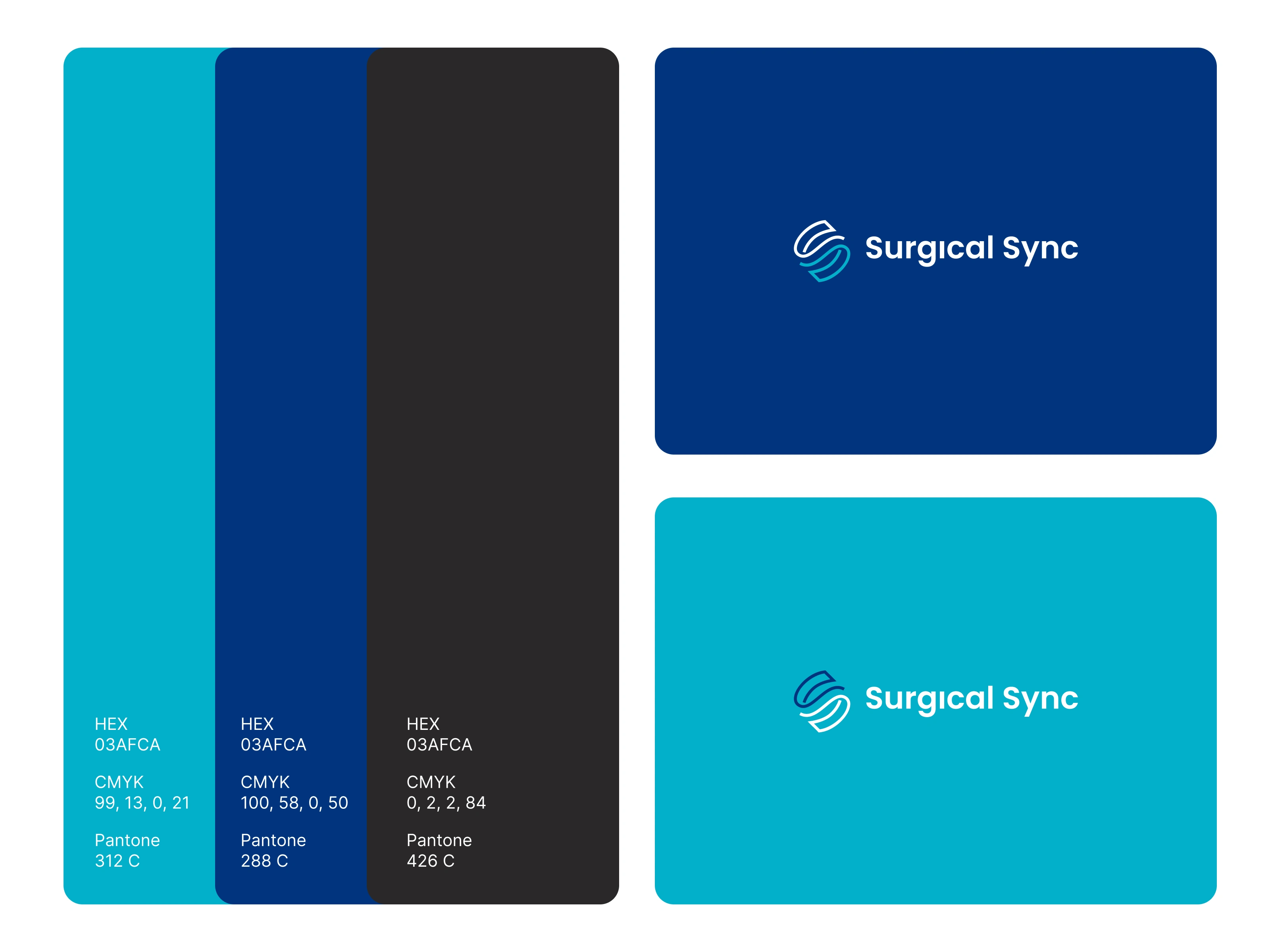
Brand color palette in cyan, deep blue, and charcoal with Pantone and RGB codes.
Healthcare Brand Color Palette With Pantone, RGB, and HEX Codes
The palette uses clear blues for trust and medical credibility, with a bright cyan for clarity and a soft charcoal for readable text.
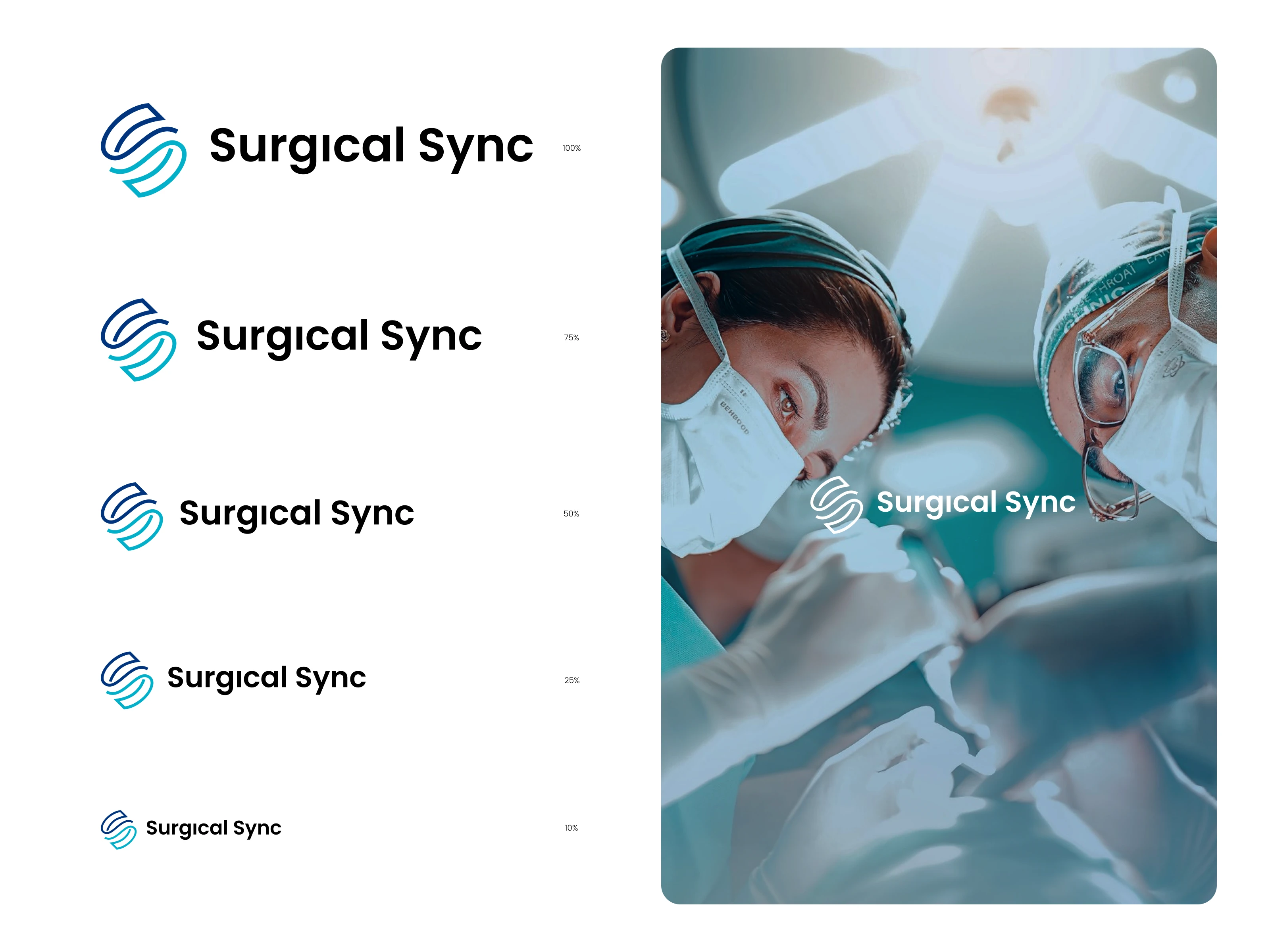
Logo size hierarchy showing the full logo reduced to a small icon.
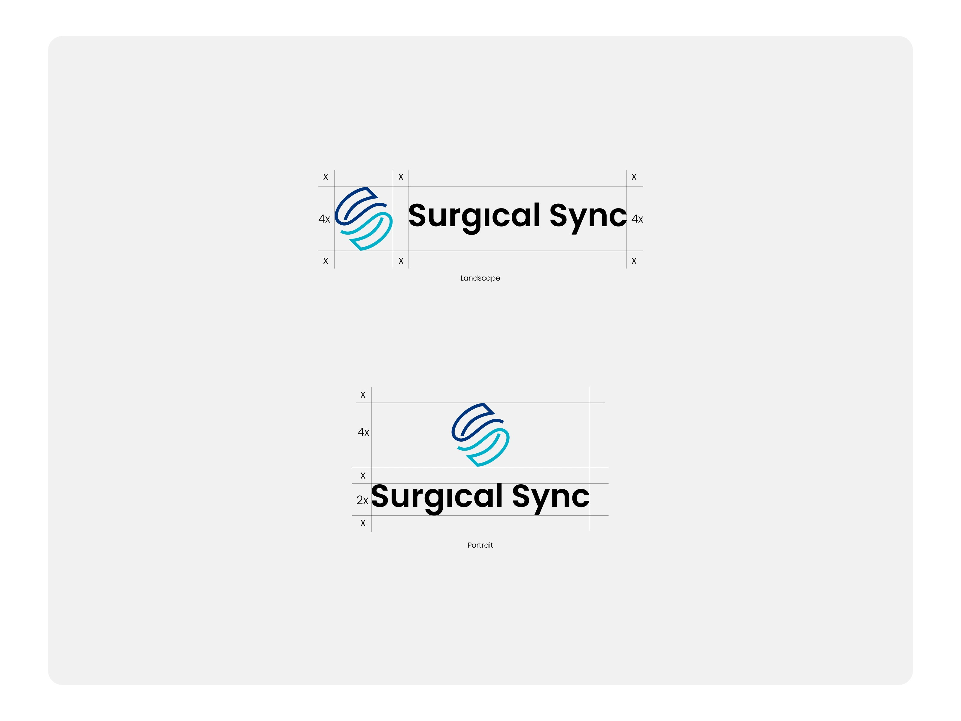
Logo clear space guidelines
Logo Usage and Size Guidelines From Large Format to Small Icon
A logo system has to stay readable at every size, from outdoor billboards to a browser tab. Each size level uses a version suited to its space.
Large format (billboards, banners, signage): full logo with wordmark and generous clear space
Standard (website header, documents, presentations): full logo, minimum width of about 120 px on screen or 30 mm in print
Small (social profile, email signature): compact logo or icon with a short wordmark
Micro (favicon, app notification): icon only, minimum 16 px
Clear space around the logo equals the height of one S stroke, so it never feels crowded.
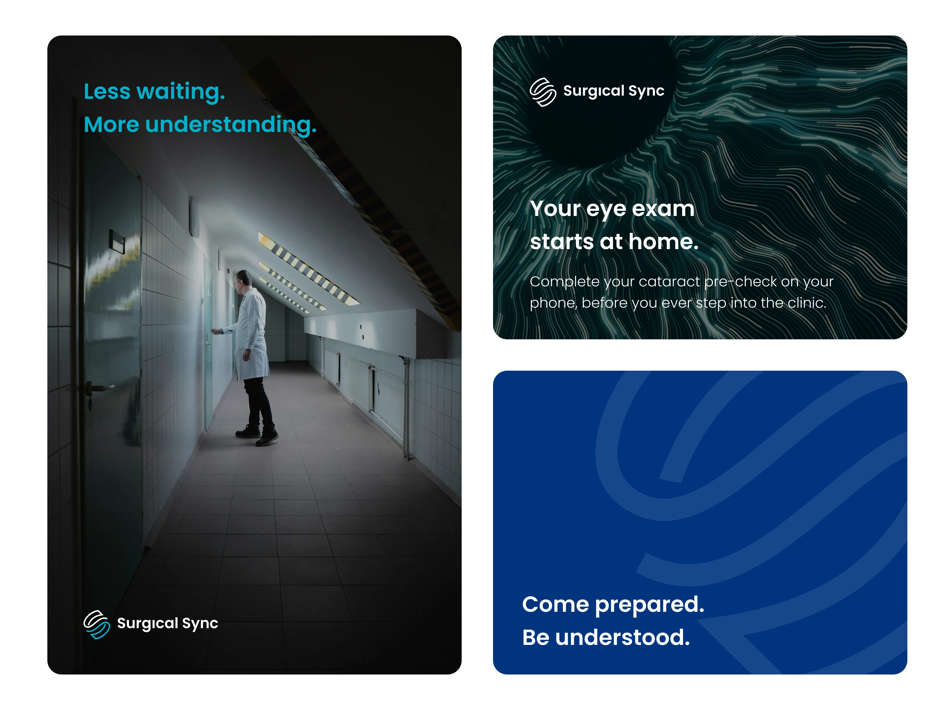
Brand banner layout with headline, body text, logo, and repeating eye icon pattern.
Visual Strategy: Typography, Imagery, and Pattern System
The visual language is built on warm photography, bold headlines, and calm body text, all on deep blue. The headline uses large, friendly sans-serif type, supported by shorter body text for easy reading. The logo sits in a consistent corner, and the eye icon repeats as a subtle pattern across banners and backgrounds. Human photography, such as family members and care teams, keeps the medical brand warm rather than cold.
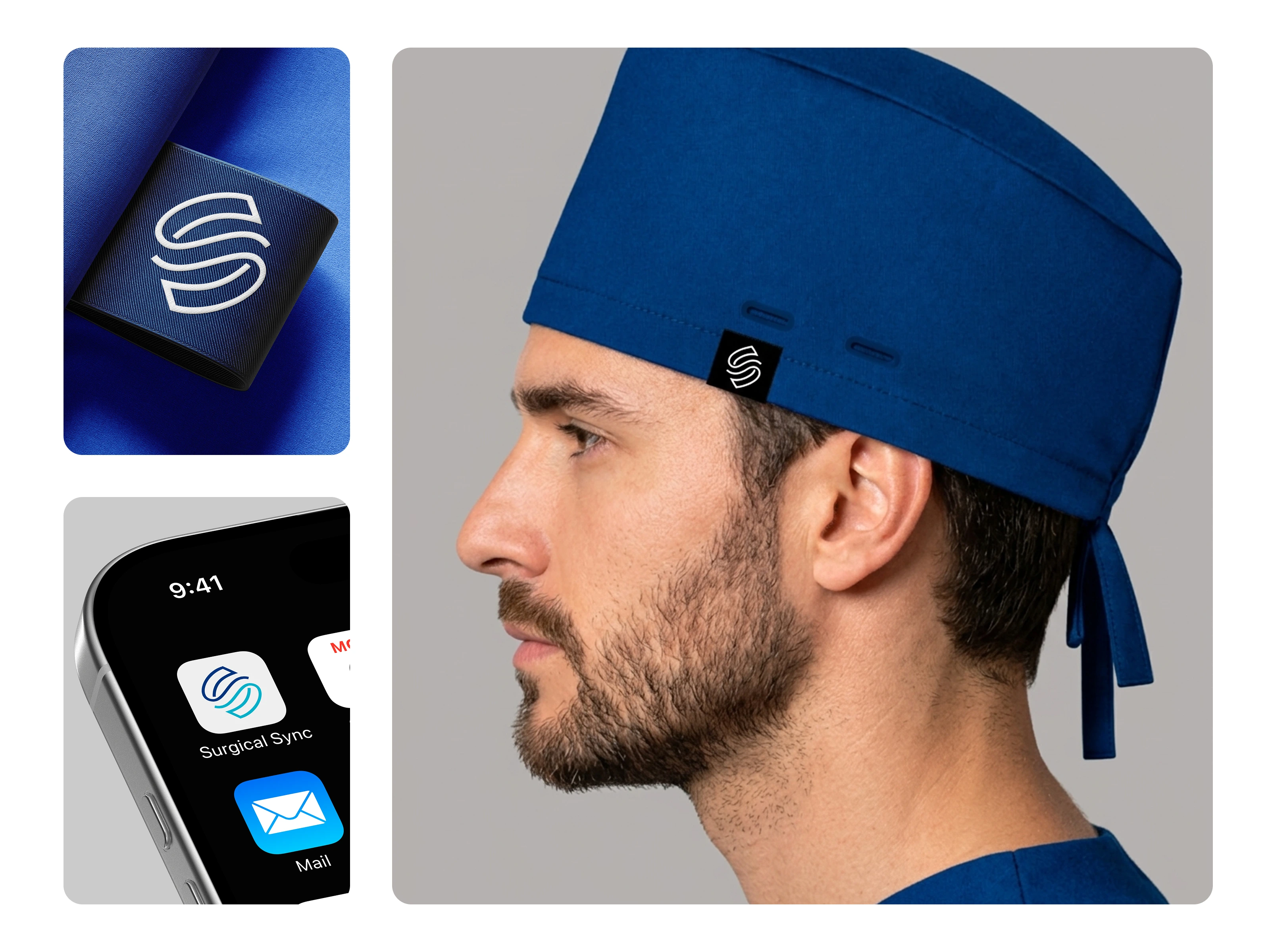
Eye monogram icon applied to a medical uniform, app icon, and surgical head cover.
Standalone Icon Design for Uniforms, App Icon, and Medical Head Cover
The eye monogram works on its own as a brand symbol. It can appear as a border pattern on medical uniforms, as the app icon on a phone, and as a repeated print on surgical head covers. Because the icon is simple and bold, it stays clear on fabric, on small screens, and in embroidery.
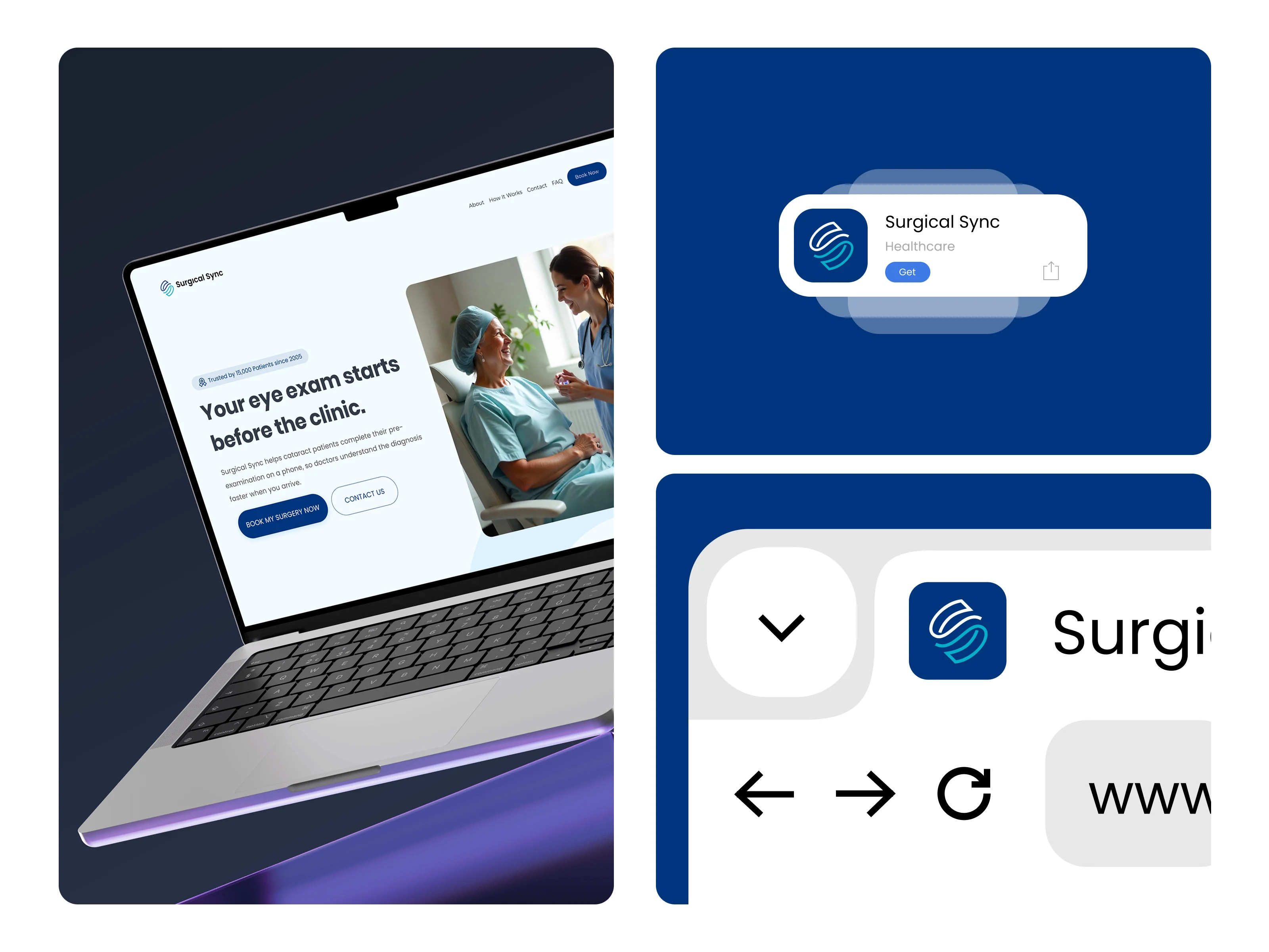
Website homepage, app store screenshots, and browser favicon using the same brand identity.
Digital Presence: Website Homepage, App Store Listing, and Favicon
The identity extends across every digital touchpoint:
Homepage: a hero section that explains the benefit at once, with the headline, supporting text, and a clear download button
App Store and Google Play: a consistent app icon and screenshots that tell the pre-exam story in a few steps
Browser: the icon as a favicon for instant recognition in tabs and bookmarks

Instagram post templates for a healthcare brand with consistent colors and icon.
Instagram Branding for a Healthcare Brand: Social Media Visual System
The social media system uses consistent templates in brand colors, with large headlines, short educational text, and the eye icon as a recurring graphic. Posts mix patient awareness, doctor support, and family-focused messages, so the feed feels informative and caring rather than clinical.
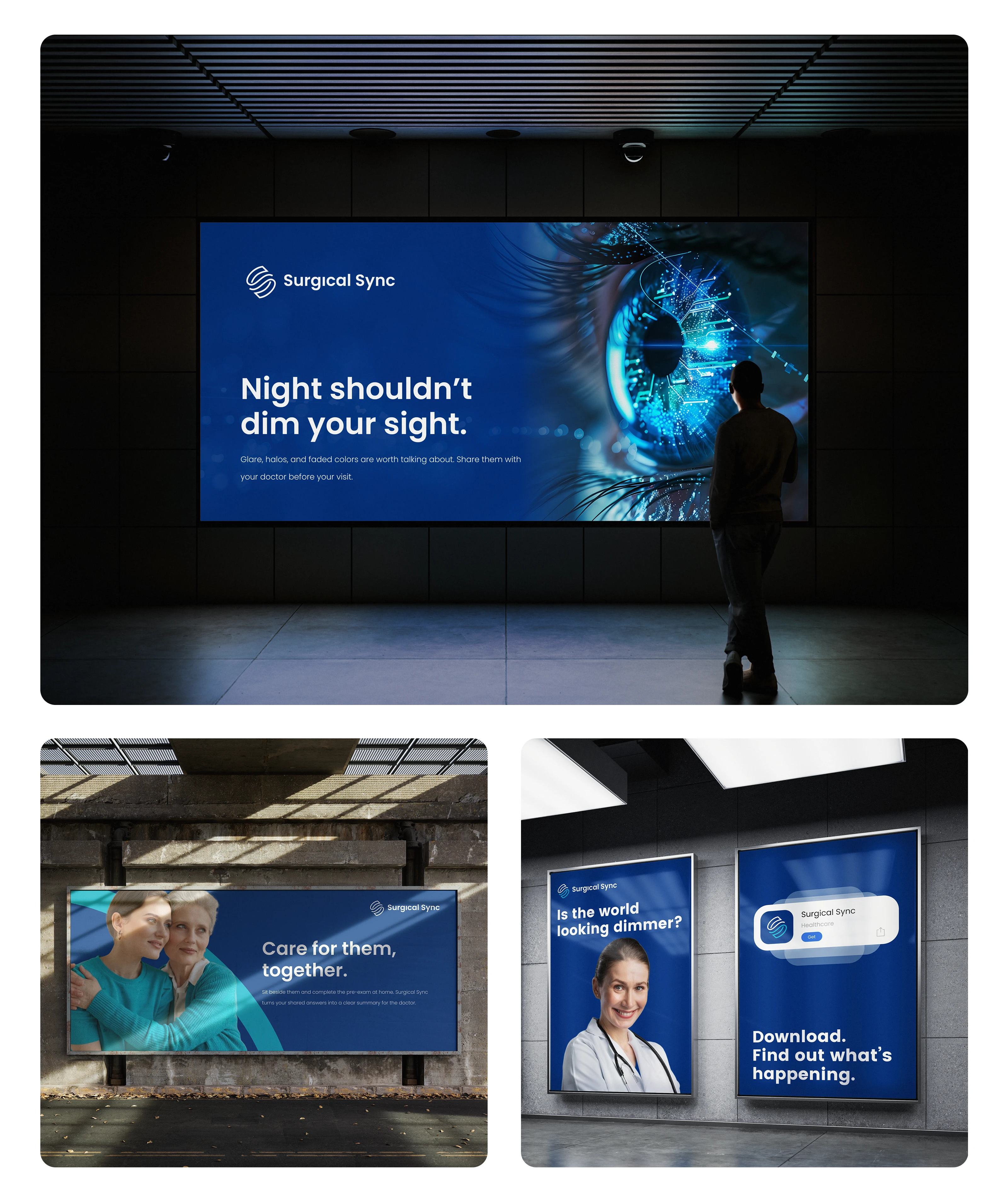
Outdoor billboard design for a medical app in blue and cyan with a bold headline.
Outdoor Banner Design for a Medical Brand: High-Contrast Billboard Concepts
Outdoor banners use light text on deep blue and cyan accents for high contrast, so the message stays readable in morning light and shadow. Headlines are kept to a few words and the call to action sits where shade is least likely to fall. A neon-style version uses a cyan glow against a dark background to suggest light returning to clear vision.
Looking for a brand designer, logo designer, or visual identity designer for your healthcare or medical project?
I design clear, trustworthy brand identities that help medical products connect with patients and doctors. Book a 30-minute consultation.
Like this project
Posted Oct 10, 2026
Brand identity design for a medical health app that helps cataract patients prepare for eye exams on their phone, so doctors understand the diagnosis faster.
Likes
0
Views
1
Timeline
Mar 2, 2025 - Jun 24, 2025