Reimagining Benny’s Burger (1983)
Parmesh Lata
Reimagining Benny’s Burger (1983)
Hypothetical brand identity redesign
Disclaimer:
This is a hypothetical case study created for portfolio purposes.
“Benny’s Burger” is a fictional diner shown in Stranger Things (Season 1).
This project is not affiliated with Netflix.
Context
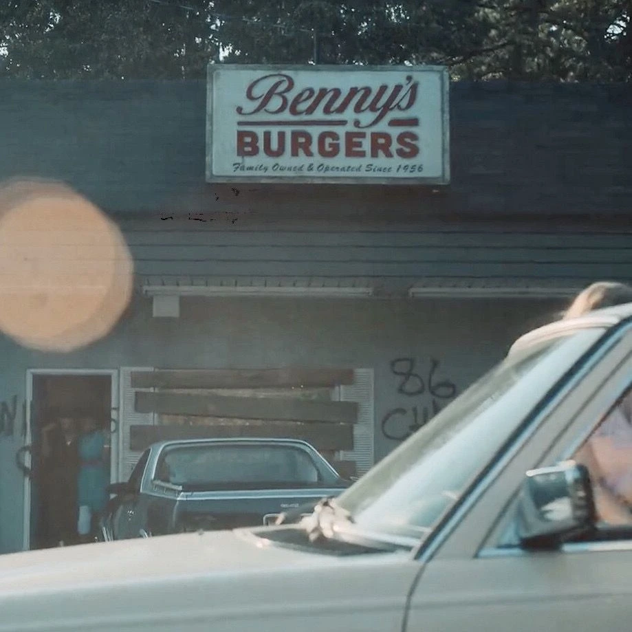
In Stranger Things, Benny’s Burger is depicted as a small-town American diner set in 1983.
While the environment feels authentic to the era, the original logo lacked the visual language commonly used in food branding at that time.
The Problem
The original logo felt out of place because it:
Appeared too clean and modern
Lacked handcrafted character
Didn’t translate well to signage, packaging, or neon
Failed to reflect early-80s diner culture
Food branding in 1983 was physical-first—designed for boards, bags, and storefronts, not screens.
The Goal
To redesign the logo so it:
Feels authentic to 1983
Blends naturally into a small-town diner setting
Works across signage, packaging, and storefronts
Retains warmth, familiarity, and personality
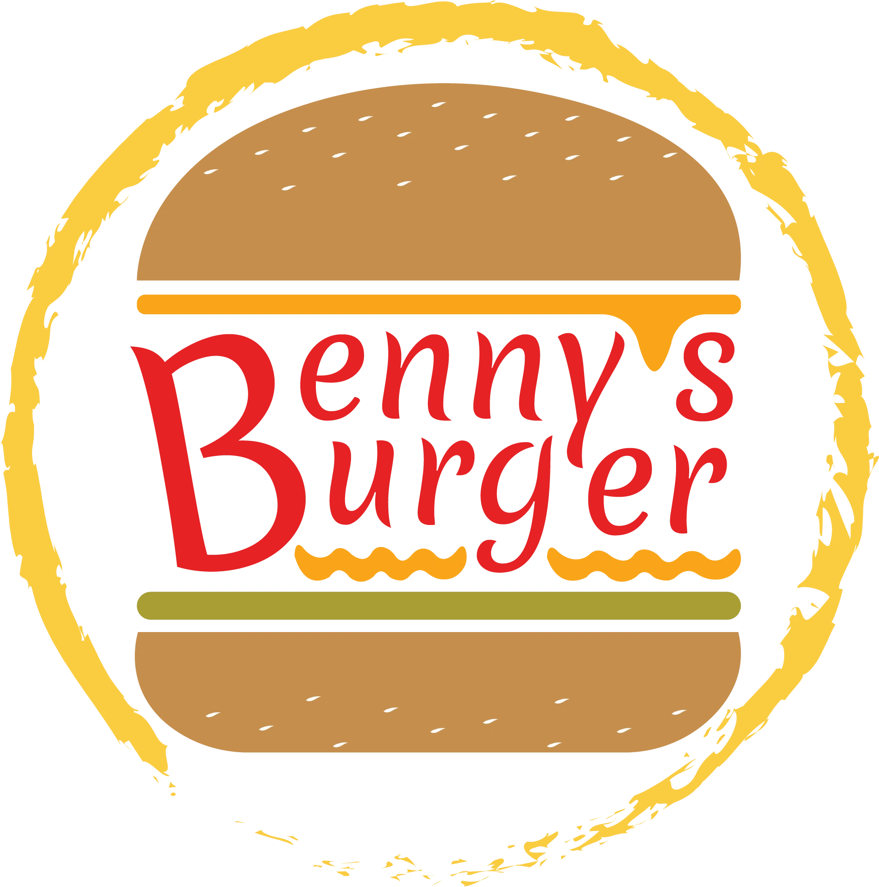
The First Redesigned Logo

The Second Redesigned Logo

The Third Redesigned Logo
The Solution
The redesigned logo uses:
Hand-drawn typography
A burger-led visual identity
Circular badge structure for signage
Warm, saturated colors
Slight imperfections to avoid a digital feel
The result is a logo that feels crafted, nostalgic, and era-appropriate.
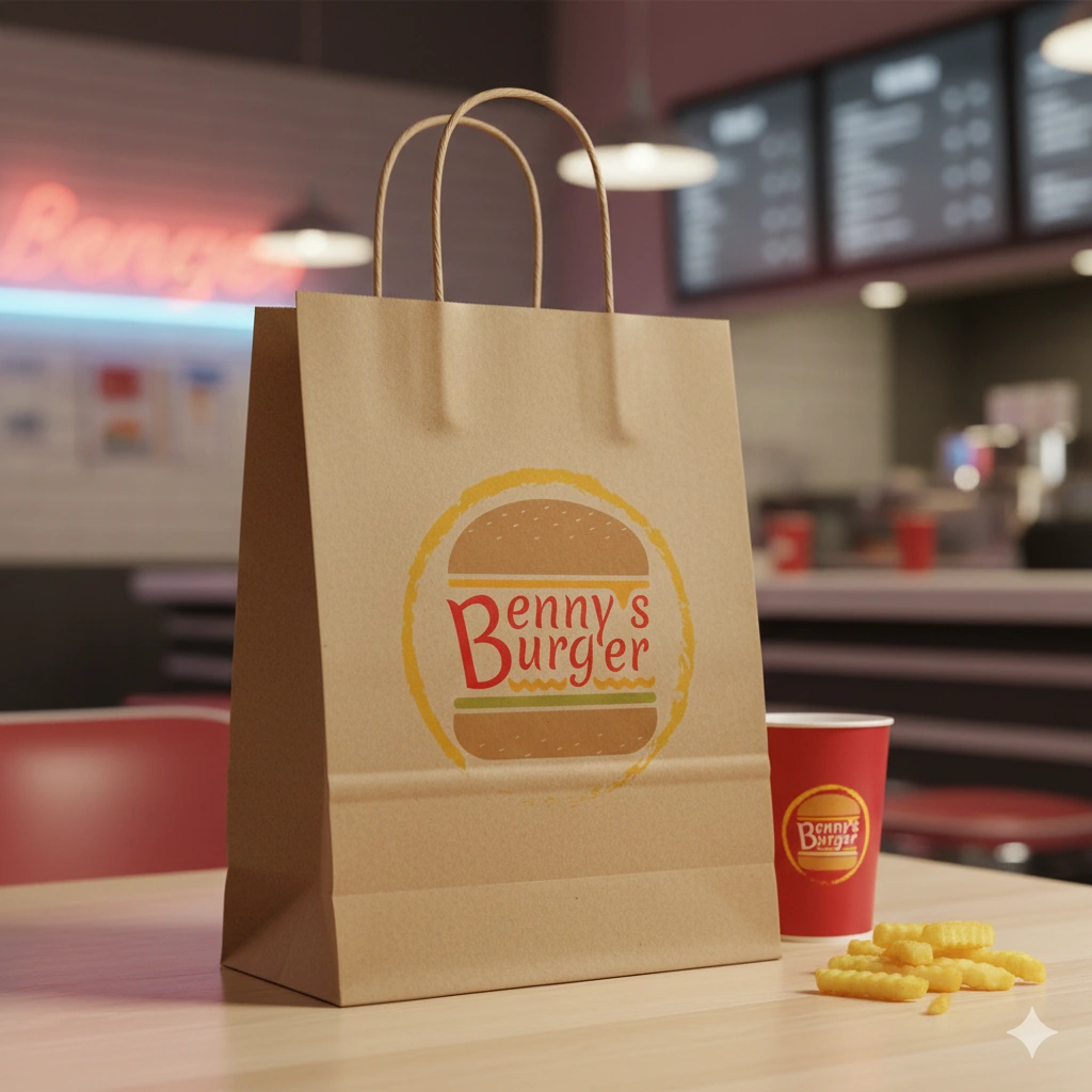
Applications
The logo was tested across:
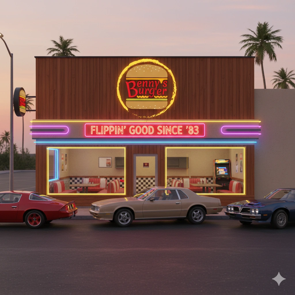
Storefront signage
Neon-style boards
Takeaway packaging (bags & cups)
Each application reinforces the diner’s 1983 visual identity while remaining functional and readable.
Take Our Taste With You
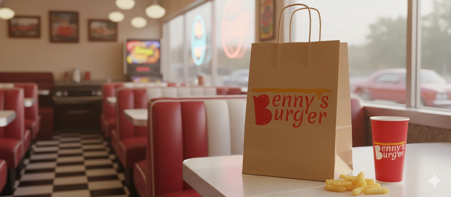
Displaying Can Also Be Serving
Outcome
This hypothetical redesign places Benny’s Burger firmly within its time—visually aligning the brand with its environment, culture, and storytelling context.
Key Takeaway
Great branding isn’t just about style—it’s about belonging to a time and place.
What 83 Taste Likes
Like this project
Posted Dec 24, 2025
A fictional 1983 diner logo reimagined to authentically fit its era, environment, and visual culture.
Likes
0
Views
0