MOVU Landingpage optimisation
Project Overview
What is MOVU?
MOVU AG is a comparison and booking platform for moving and move-out cleaning companies. The concept is simple, create an inquiry, answer some questions, get 5 quotes and book.
What makes MOVU unique?
MOVU is the biggest platform providing this service in Switzerland. The moving companies are very selected and have to pass certain requirements to be partnered with MOVU.
My project roles & responsibilities
Team size:
1 Product Owner, 1 UX Designer, 1 UI Designer, 1 FE Developer
Define project requirements
Stakeholder management
Testing requirements
Wireframing
Design lead - the junior designer created visual design under my lead
______________________________________________
Goal
Rethink the Landingpage experience to enable people to understand what we do
The current communication is very unstructured and doesn't have a common goal.
______________________________________________
Requirements
Content:
Agree on a common set of company values
Rephrase the values using a set of attributes
Reduce currently used keywords to clarify the communication
Design:
Improve value proposition
Highlight specific situations, solutions and feelings
Streamline user focus points
Testing:
How to test the new design?
______________________________________________
Ultra short summary
I conducted a workshop where we explored new communication goals & values. A complete landing page redesign was proposed and tested in several A/B tests. Overall resulting in a 23% conversion uplift on mobile & a 6% uplift on desktop. There was no loss in SEO ranking. The project was a success.
______________________________________________
In-Depth Case Study
Content requirements – Step 1
Kicking off with a workshop
Workshop Goals
Find 3 values that MOVU wants to be represented with
Develop the values into principles
I heard that there is a general misconception within the C-Level about the values MOVU represents towards our audience. I facilitated a workshop and partnered with our content marketing manager to align all stakeholders and agree on a common set of values we want to present and communicate in the new design of the landing page.
______________________________________________
Content requirements – Step 2
Simple, strong and effective language
After the workshop the goal was to translate the values we defined into clear, easy to understand, straightforward and actionable language.

Workshop result & translation into text
______________________________________________
Content requirements – Step 3
Reducing and simplifying keywords
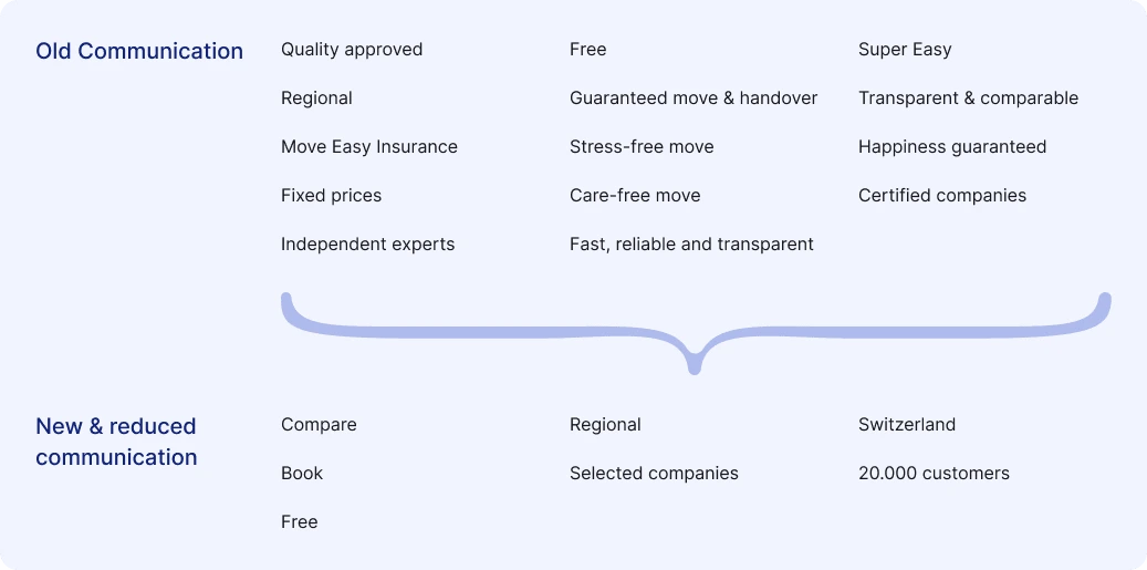
Old vs. new communication on the landing page
______________________________________________
Design requirements – Step 1
Improve value proposition
We wanted to position MOVU as a comparison & booking platform.
With that, the goal was to give the user a 3 step action that is easy to share with friends and family. Each step contains an actionable keyword at the beginning (Fill out, Compare, Book).
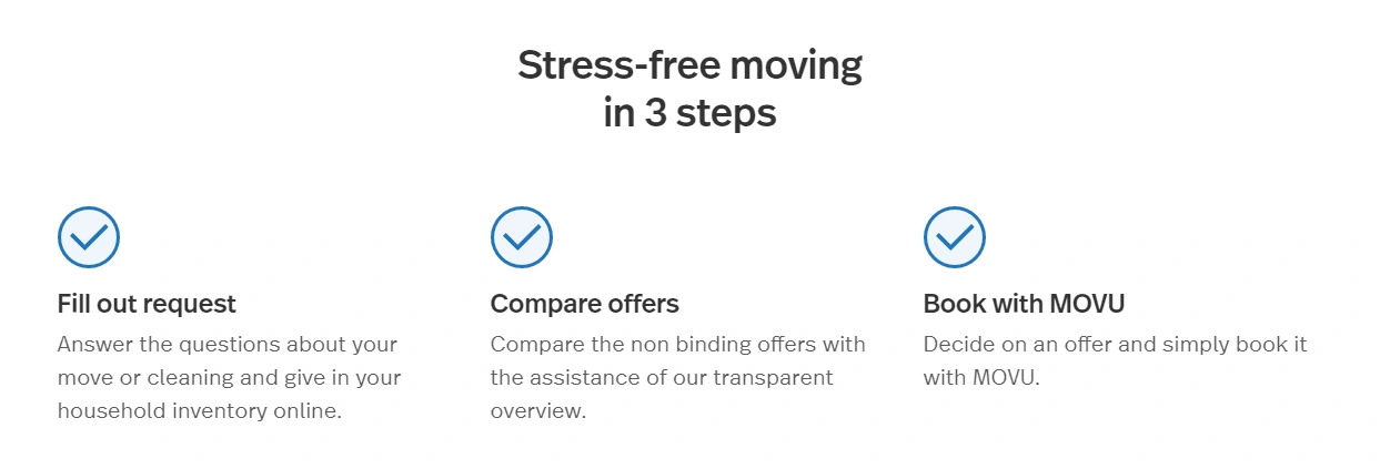
One design element of the new landingpage using the 3 step action
We improved the readability and focus by going away from the old centred text layout to a more approachable "F" reading pattern. This way the keywords can be scanned easily.
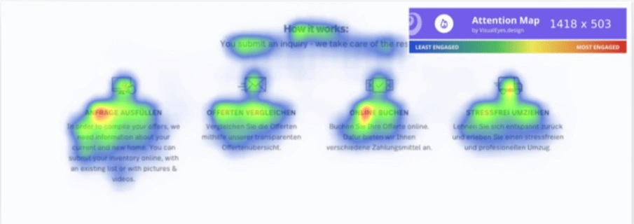
Old Heatmap pattern

New Heatmap pattern
______________________________________________
Design requirements – Step 2
More streamlined user focus points
The goal is to focus the interest on the headline & call to action button. We validated the reason the user visited the website and set a goal that the user can achieve.
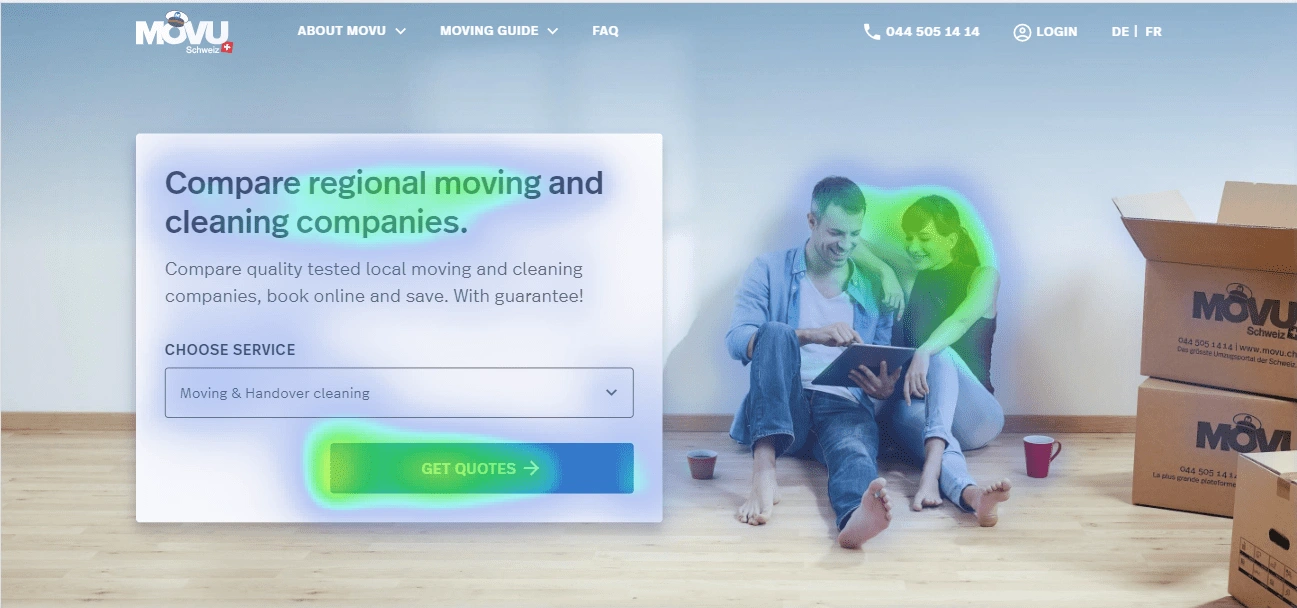
New Heatmap with focus on the CTA Button and the Keywords
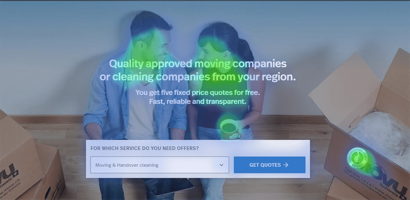
Old Heatmap with no clear focus. Faces taking away most of the attention.
______________________________________________
Design requirements – Step 3
Highlighting specific situations, solutions and feelings
Additionally to our new 3 Step value proposition, we want to highlight specific situations with the feelings of our customers.
In the example below, we are highlighting "fill out request" by supporting it with a specific situation of the customer in a testimonial. The goal is to combine our product claims with real user emotion.
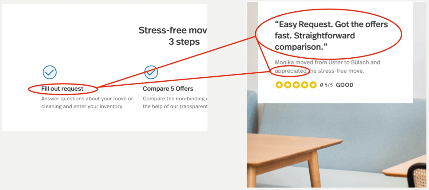
Triangle of "situation, solution & feelings"
______________________________________________
How can we test the design?
Testing requirements
We want to test the design changes with an A/B Test. We split the landing page into “above the fold” and “below the fold” to test them separately. In total, we want to run 3 tests.
From earlier tests, we found out that our content below the fold, meaning everything that is not seen immediately when you enter the page, does not have a significant impact on our “CTA click” conversion rates.
______________________________________________
Test 1
Old “below the fold” vs. new “below the fold”
Goal: Don’t lose any “CTA click” conversion
Result test 1
As expected, the “CTA click” conversion did not significantly increase or decrease on any device. We implemented the “below the fold” design to all devices.
______________________________________________
Test 2 - Desktop & Tablet only
Old “above the fold” vs. new “above the fold”
Goal 1: Don’t lose any “CTA click” conversion
Goal 2: Increase “CTA click” conversion
Result test 2
Goal 1 and 2 were reached. Additionally to no “CTA click” conversion loss, the new design converted 6% better than the old one. Therefore we released the new design.
______________________________________________
Test 3 - Mobile only
Old “above the fold” vs. new “above the fold”
Goal 1: Don’t lose any “CTA click” conversion
Goal 2: Increase “CTA click” conversion
Result test 3
As we have already seen an increase in “CTA click” conversion on the Desktop version, we expected an uplift on mobile as well.
The test definitely exceeded our expectations with an increase of conversion by 23% to the old conversion.
______________________________________________
Conclusion
The project was a success. I was able to successfully plan the project, facilitate the workshop, all resulting in a positive test result with the design being implemented on all devices.
Two things I learned from this project are:
That it is very important to talk about any discrepancies that occur on certain topics or projects. This rocket started the project and aligned all stakeholders when we sought approval.
That your hypothesis can only be measured properly if you also have the test environment to do so. As we only looked at the conversion rate we couldn’t find out if customers actually got more guidance or not. A better solution for that would have been a more qualitative testing approach like user testing.
Like this project
Posted Jul 14, 2021
Likes
0
Views
15


