NetMirror taught me a simple design rule. People want to wat...
Uitobs
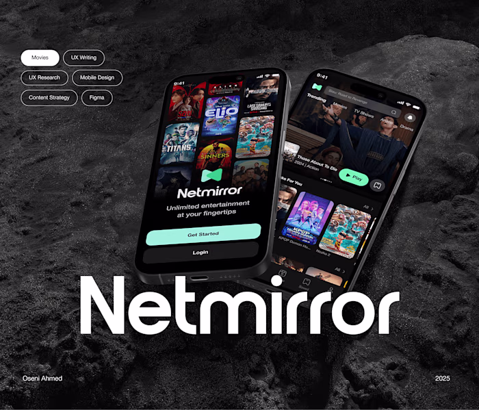
NetMirror taught me a simple design rule. People want to watch a movie, not work for it.
The app had no real sign up flow. Users opened it, felt lost, and left. I redesigned sign up to respect time and get users watching fast.
What I changed
• Four clear screens. Email. Auth. Password. Light extra info
• One action per screen. No clutter
• Real movie frames instead of abstract art to build instant trust
• One input at a time with human microcopy
• Big thumb friendly buttons
• Colors that guide focus. Emerald for premium. Charcoal for content. White and ash for breathing room
• Simple subscription choices with a gentle recommendation.
The goal is to get users from I want to watch to I am watching with zero friction.
The result: People do not remember signing up. They remember the movie starting fast.
Like this project
Posted Dec 31, 2025
NetMirror taught me a simple design rule. People want to watch a movie, not work for it. The app had no real sign up flow. Users opened it, felt lost, and l...
Likes
0
Views
0