ezWallet iOS Wallet App UI Design
Fahad R
1 collaborator
ezWallet — iOS Wallet App UI Design
Sending money shouldn't feel like filing taxes. That's the entire thesis behind ezWallet.
The problem with most wallet apps
Open any major fintech app and count the things competing for your attention. Promotional banners. Crypto tickers. Rewards points. Investment nudges. Somewhere in that mess is the actual reason you opened the app, which is usually to check your balance or send someone money.
ezWallet was a deliberate exercise in subtraction. What does a wallet look like when you remove everything that isn't core to the job?
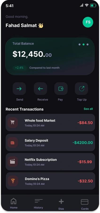
Designing the home screen
The first decision was the hardest: what's the one thing a user wants to see when they open the app? Balance. Not a dashboard, not a feed, not a hero illustration. A number.
So the balance gets the largest type on the screen and sits in a glass-treated card that catches just enough light to feel alive without stealing focus. A small delta underneath ("=2.4% compared to last month") gives the number context, the kind of detail you don't notice until you realize you've been craving it in every other app.
The four primary actions, Send, Receive, Pay, Top Up, are sized identically. This was a contrarian choice. Most apps make "Send" larger or louder because it drives engagement. But in real life, no one opens a wallet thinking "I bet I'll do the action the product team wants me to do." Equal weight respects the user's actual intent.
Recent transactions use a strict color rule, red leaving, green arriving, with category icons that let you scan a week of spending in three seconds.
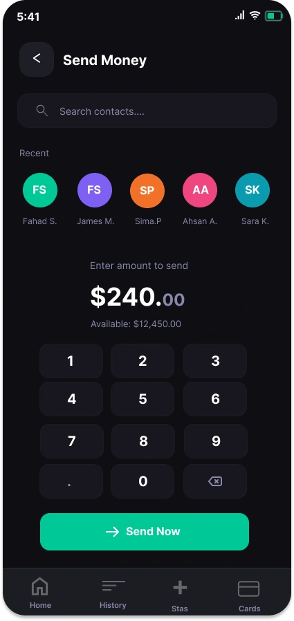
Designing the send flow
Sending money is three questions: who, how much, confirm. Every additional tap is a tax on the user.
Recent contacts sit at the top because the unspoken truth of P2P payments is that you send money to the same five people on repeat. Surfacing them first turns a search into a tap.
The numpad is oversized and treated as the main event of the screen. Most apps relegate it to a system keyboard, which is the wrong call, this is a financial action and the input deserves the gravity. The amount renders in display weight above it, with cents in muted gray so the dollars stay loud.
The "Send Now" button is the only mint-green element on the screen below the fold. By the time you reach it, there's no ambiguity about what to tap.
The visual system
One accent color. That was the rule.
Mint green does everything: it confirms positive balance changes, it marks the primary CTA, it brands the avatar. Restricting the palette to a single accent forces every interactive element to earn its visibility, which is what makes the interface feel calm instead of cluttered.
The dark canvas isn't a trend choice. Money is private. Dark mode treats financial data with the discretion it deserves and reduces the "casino glow" that plagues most fintech apps in the wild.
Typography does the heavy lifting through weight contrast rather than size variation. This keeps the layout feeling tight at every screen size and makes the hierarchy work even when the data gets dense.
What I'd build next
The natural extension is the iPad layout, where the challenge flips: how do you preserve the focused, single-task feeling of the phone version when you suddenly have ten times the canvas? My instinct is a two-pane structure where the left side stays minimal and the right side becomes the workspace for whatever action you're taking.
Stack
Designed in Figma. Native iOS components with custom theming.
Like this project
Posted May 5, 2026
Designed an iOS wallet app UI emphasizing simplicity and user-friendly interaction.