Built with Framer
Moka: Brand Identity & Editorial Coffee Concept

Shivam .


Moka
Concept project
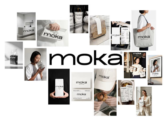
Moka is a self-initiated brand identity concept for a modern coffee experience. The work explores a quieter version of luxury: warm off-whites, controlled typography, tactile packaging, and an editorial visual language designed to make the everyday coffee ritual feel considered.
The concept brings brand strategy, product presentation, and lifestyle direction into one connected system. Every touchpoint was approached as part of the same atmosphere, from the logo to the way a package sits in someone’s hand.
Moka motion introduction
A coffee brand built around stillness
Rather than relying on loud color or familiar café cues, Moka is designed to feel calm, refined, and tactile. The visual direction uses softness and restraint to create a premium identity that can live across packaging, print, spatial moments, and digital storytelling.
Brand foundation
This opening composition establishes the core of the Moka world: a minimal, high-end identity with space to breathe. It sets the tone for a brand that feels polished while remaining warm and human.
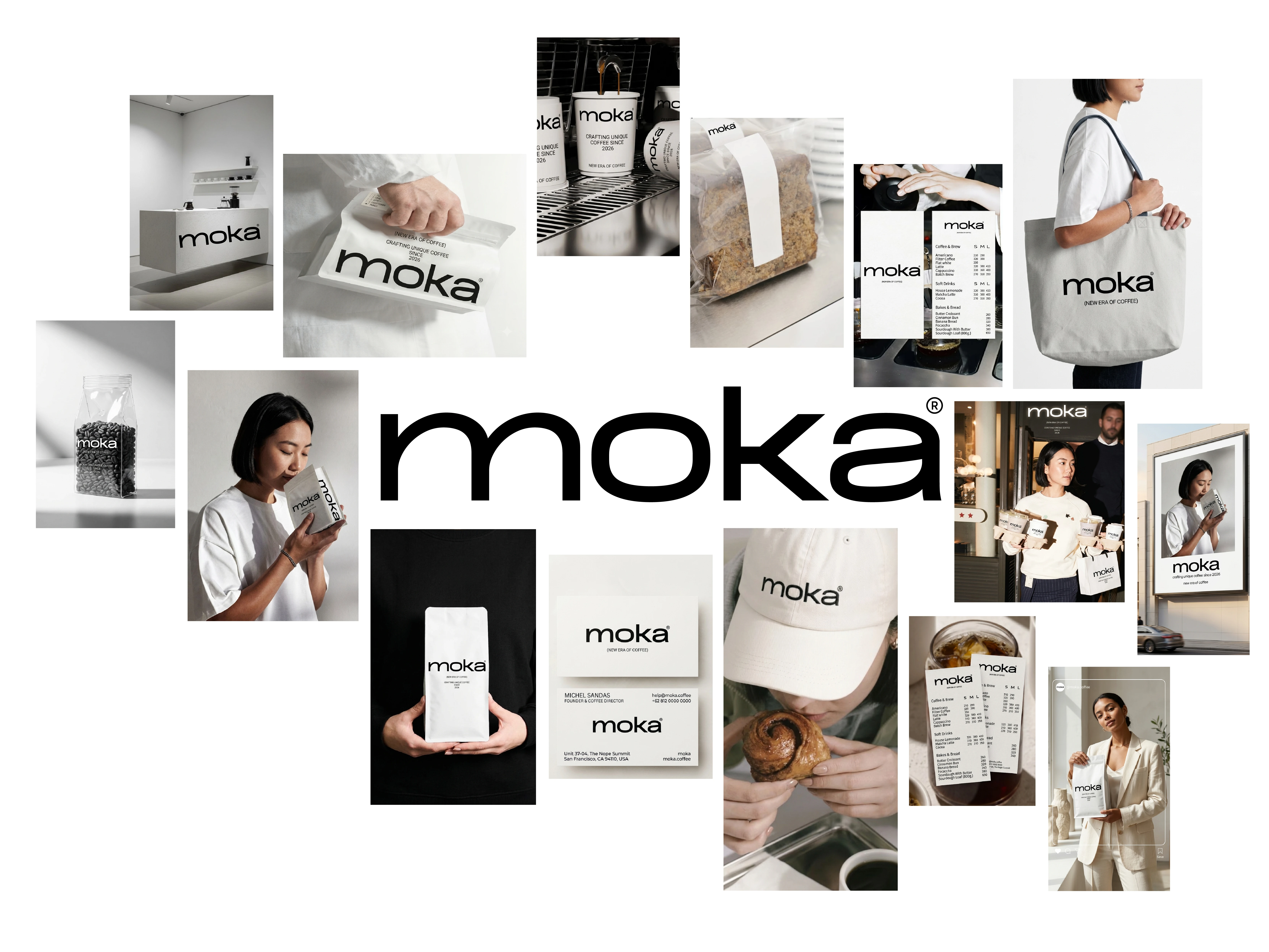
Moka brand identity
The brief
The goal was to create a complete visual world for a contemporary coffee brand. The identity needed to hold together across packaging, printed matter, spatial cues, and campaign-style imagery, while keeping a single restrained point of view.
The creative challenge was balance. Moka needed enough clarity for product-led communication, but enough texture and atmosphere to feel memorable beyond the shelf.
Identity direction
The system combines warm tonal contrast with clean typographic structure. The off-white palette makes room for subtle materials, shadows, and surface detail, while the type keeps the identity precise and legible.
Typography and tone
The visual system uses a calm hierarchy rather than decorative noise. This direction gives Moka a flexible foundation for editorial layouts, product labels, menus, and future campaign applications.
Moka visual system
The mark in context
The logo is designed to feel composed and unmistakable within the wider system. Paired with the muted palette and generous spacing, it supports the brand’s quiet confidence.
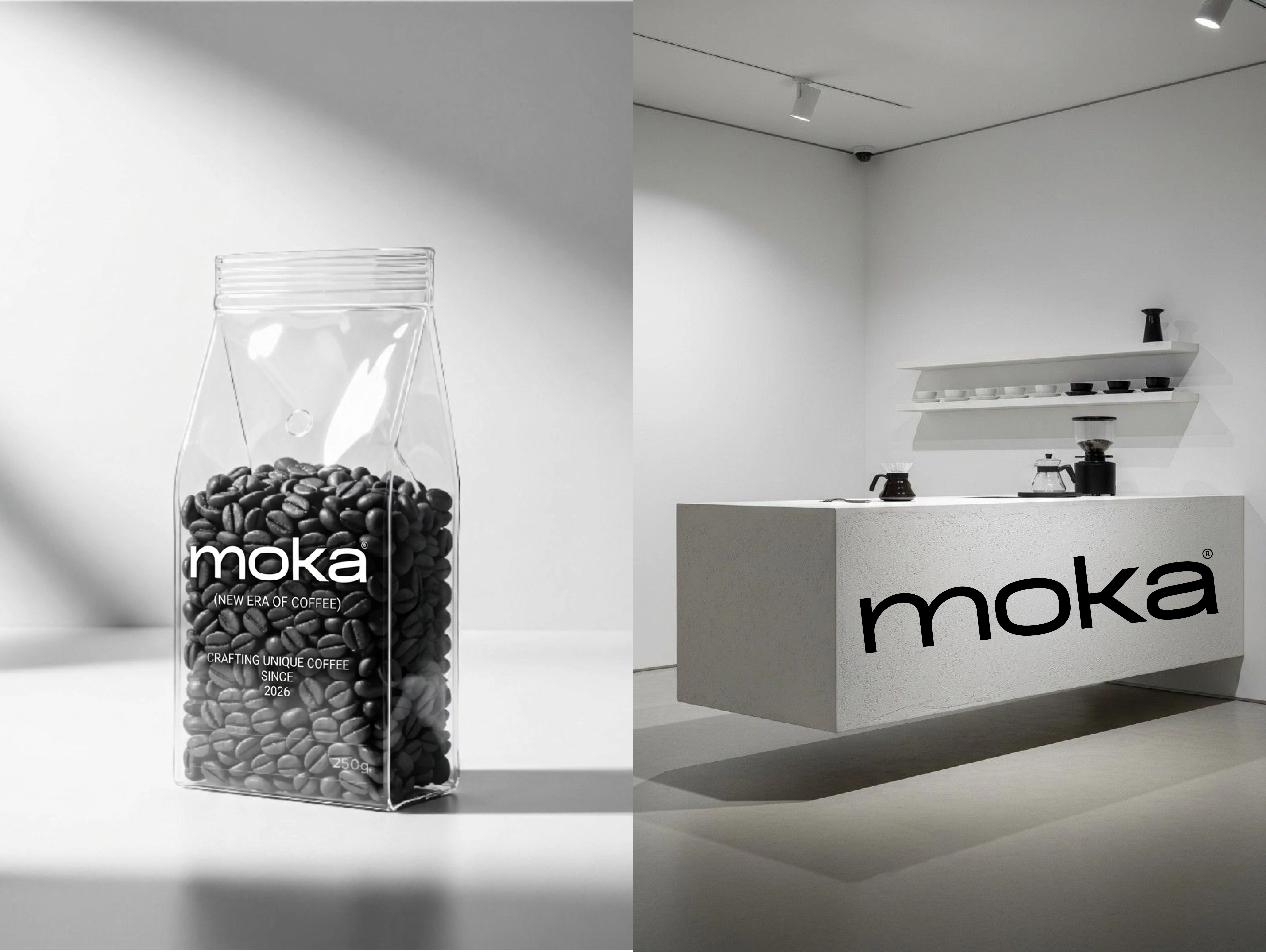
Moka packaging detail
Packaging as an object
Packaging is central to the Moka experience. It was treated as an object people would want to keep in view, not simply a container for product information.
Minimal layouts make the information easy to navigate. Material-led styling and close-cropped product imagery give the range a tactile, collectible quality without breaking the overall calm of the identity.
Product presentation
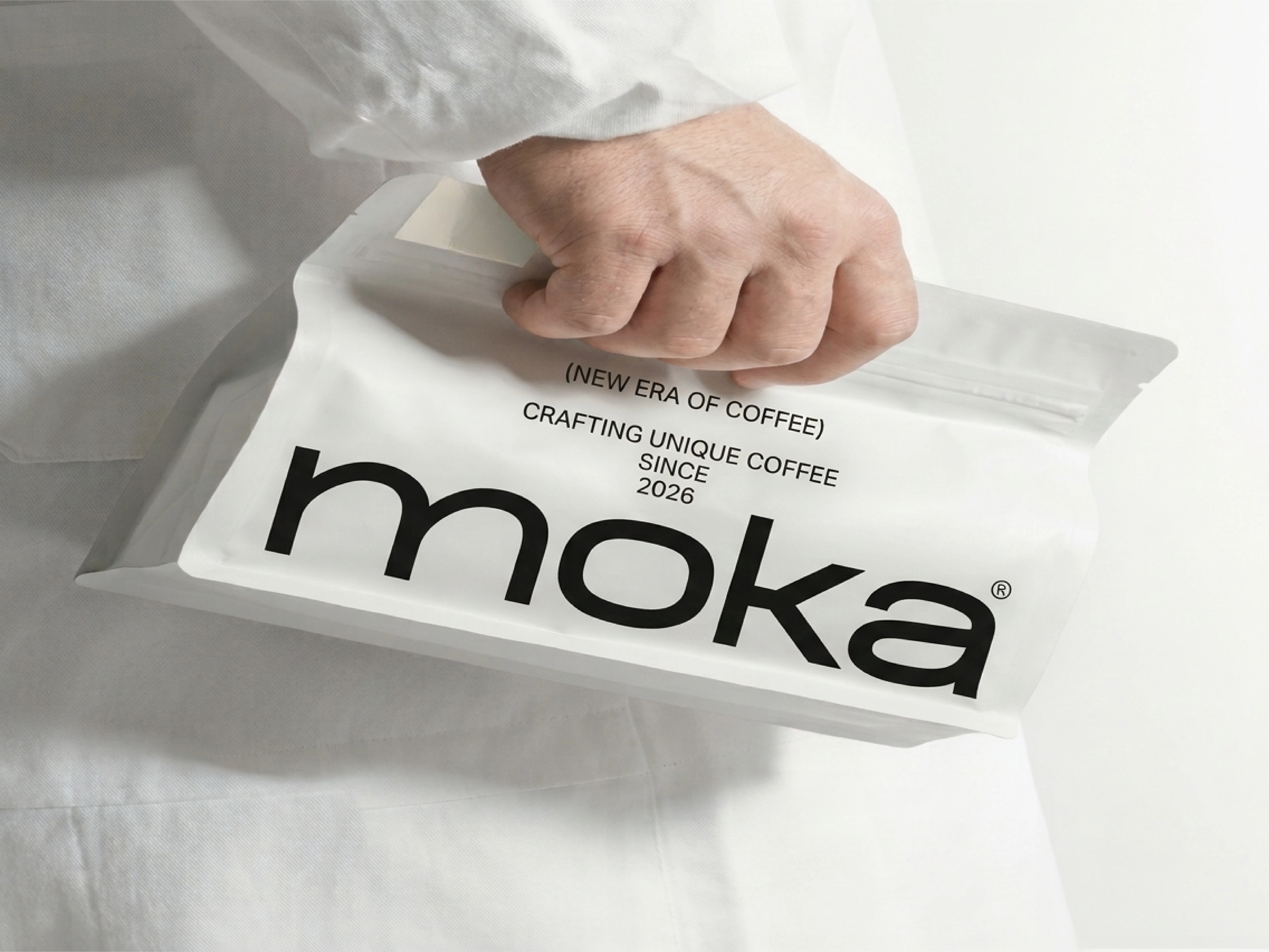
This packaging application brings the core identity to the product level. The layout stays clean and intentional, letting form, texture, and typography do the work.
Moka packaging
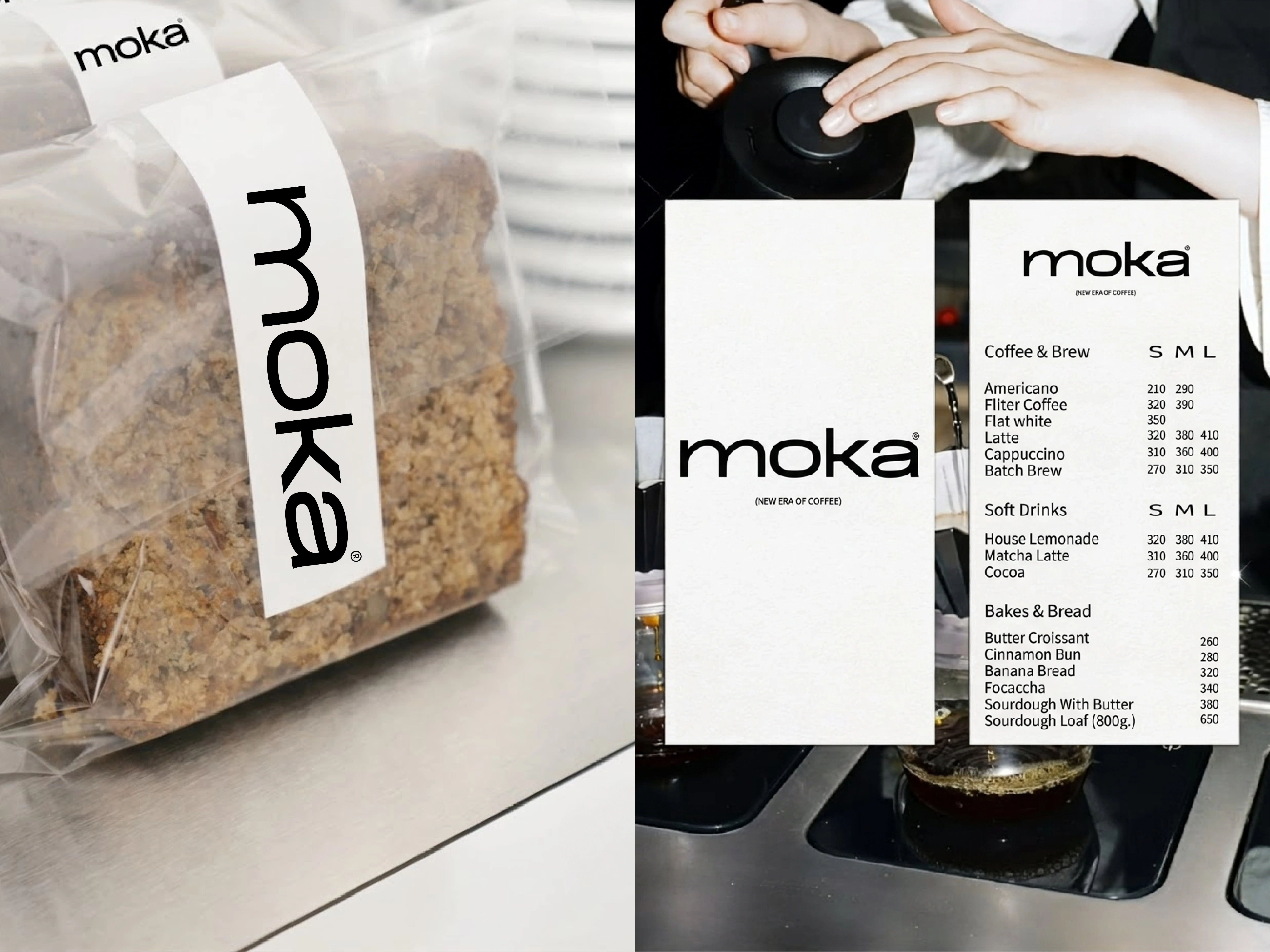
A consistent family of touchpoints
The packaging suite shows how the system can scale across multiple formats while retaining one recognizable visual voice. Repetition is used carefully, creating cohesion without making each piece feel identical.
Moka packaging suite
Tactile detail
Close-up product moments focus on the sensory side of the concept. Surface, proportion, and negative space help position the packaging as part of the coffee ritual itself.
Moka product detail
Editorial world
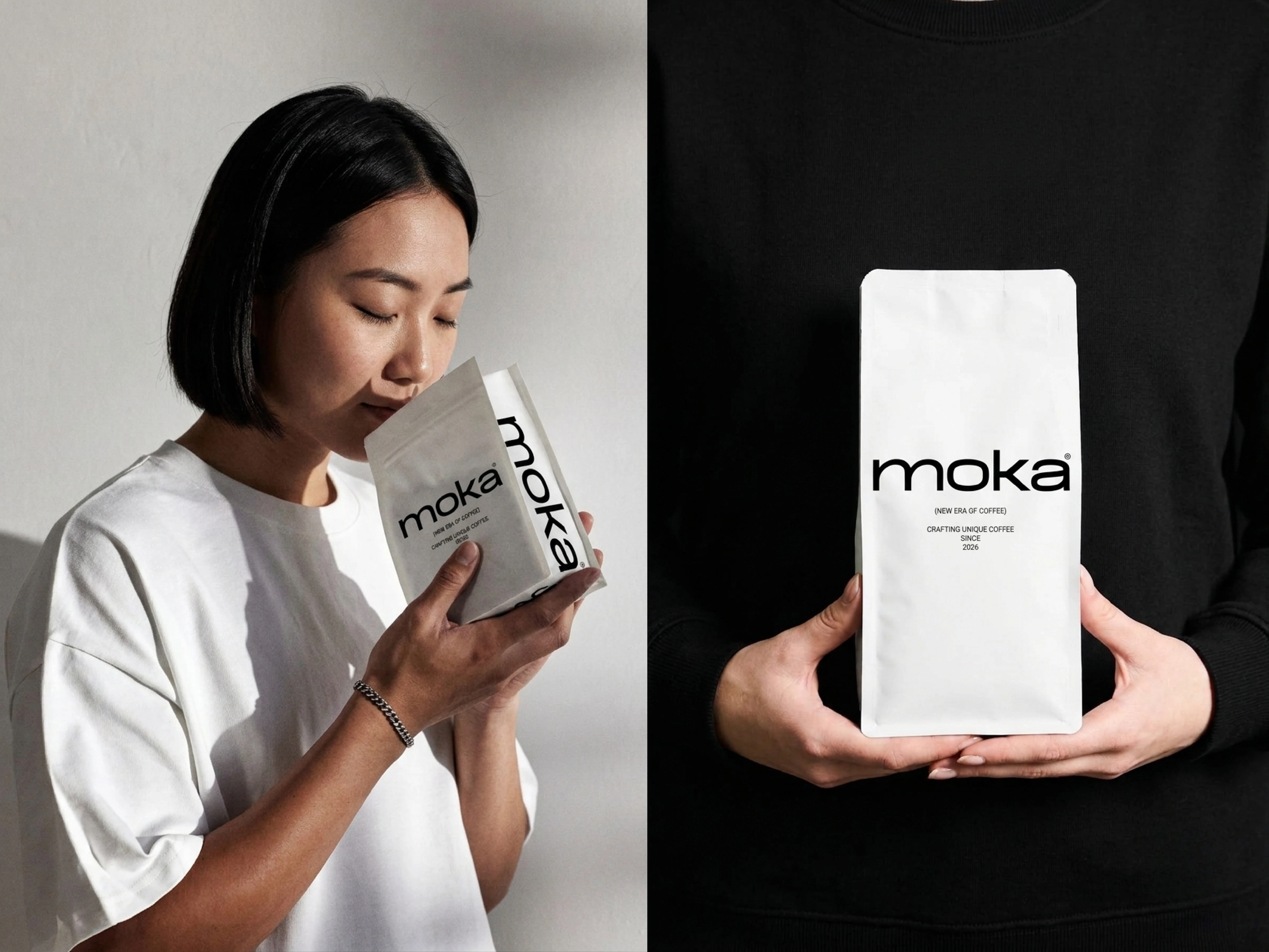
Moka’s visual language extends beyond the product. The lifestyle direction frames coffee as a pause in the day, with soft light, composed interiors, and an intimate editorial sensibility.
The imagery was developed to make the brand feel lived-in and aspirational at the same time, building a world that can support campaigns, social storytelling, and retail communication.
Lifestyle art direction
This image sets the emotional register for the brand. It introduces a serene, female-centric lifestyle perspective that gives Moka personality without overpowering the product.
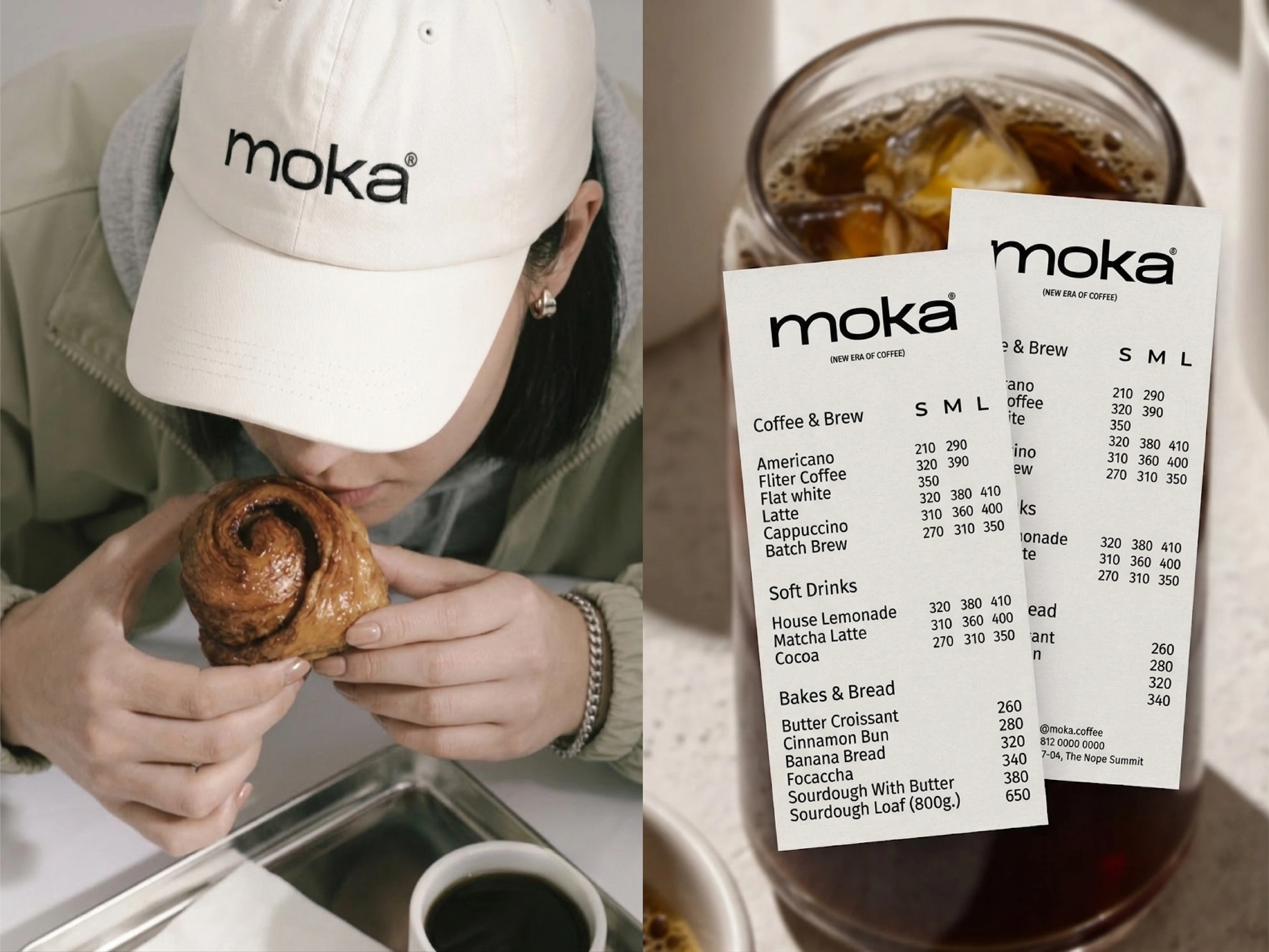
Moka editorial direction
A ritual, not a routine
The lifestyle imagery positions Moka within a slower, more deliberate moment. It supports the identity with feeling, helping the brand move from a visual system into a recognisable experience.
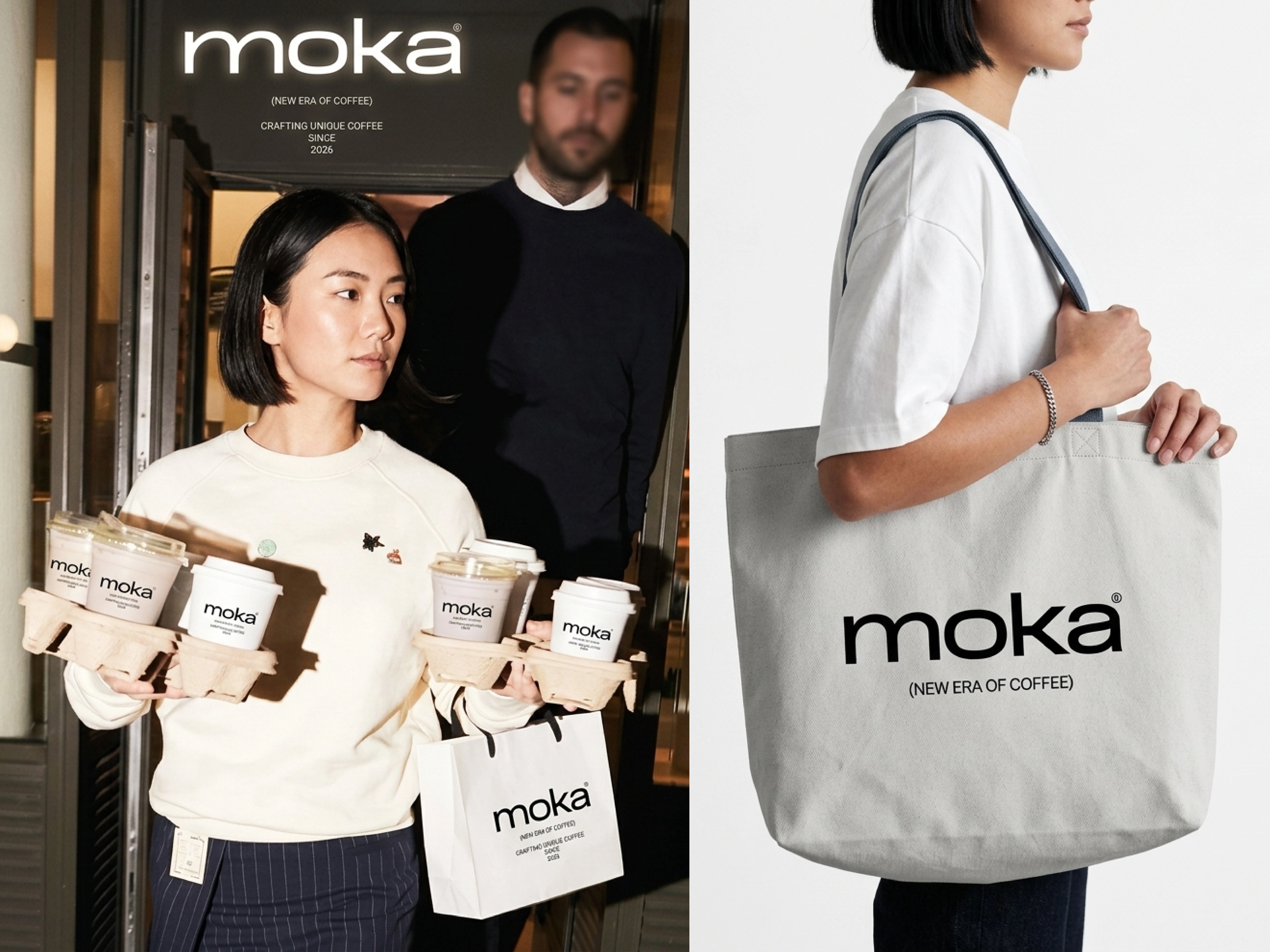
Moka lifestyle imagery
The logo system
The logo is designed to anchor the entire brand world. Its role is simple: create immediate recognition while leaving space for the materials, photography, and editorial layouts to carry their own weight.
Primary mark
This logo presentation focuses on the clarity and restraint of the Moka mark. It provides a flexible signature for packaging, printed collateral, and digital brand applications.
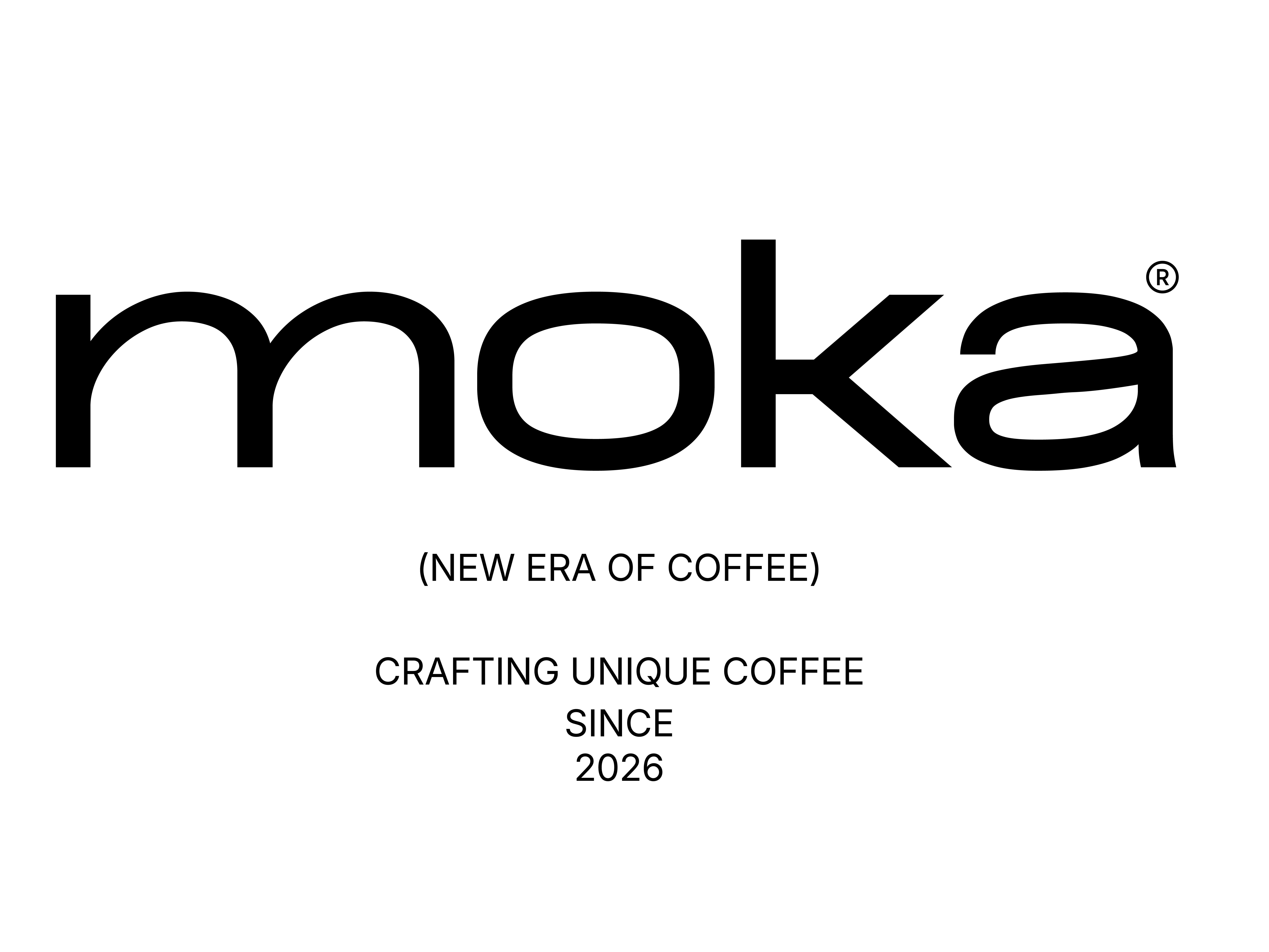
Moka logo design
Beyond packaging
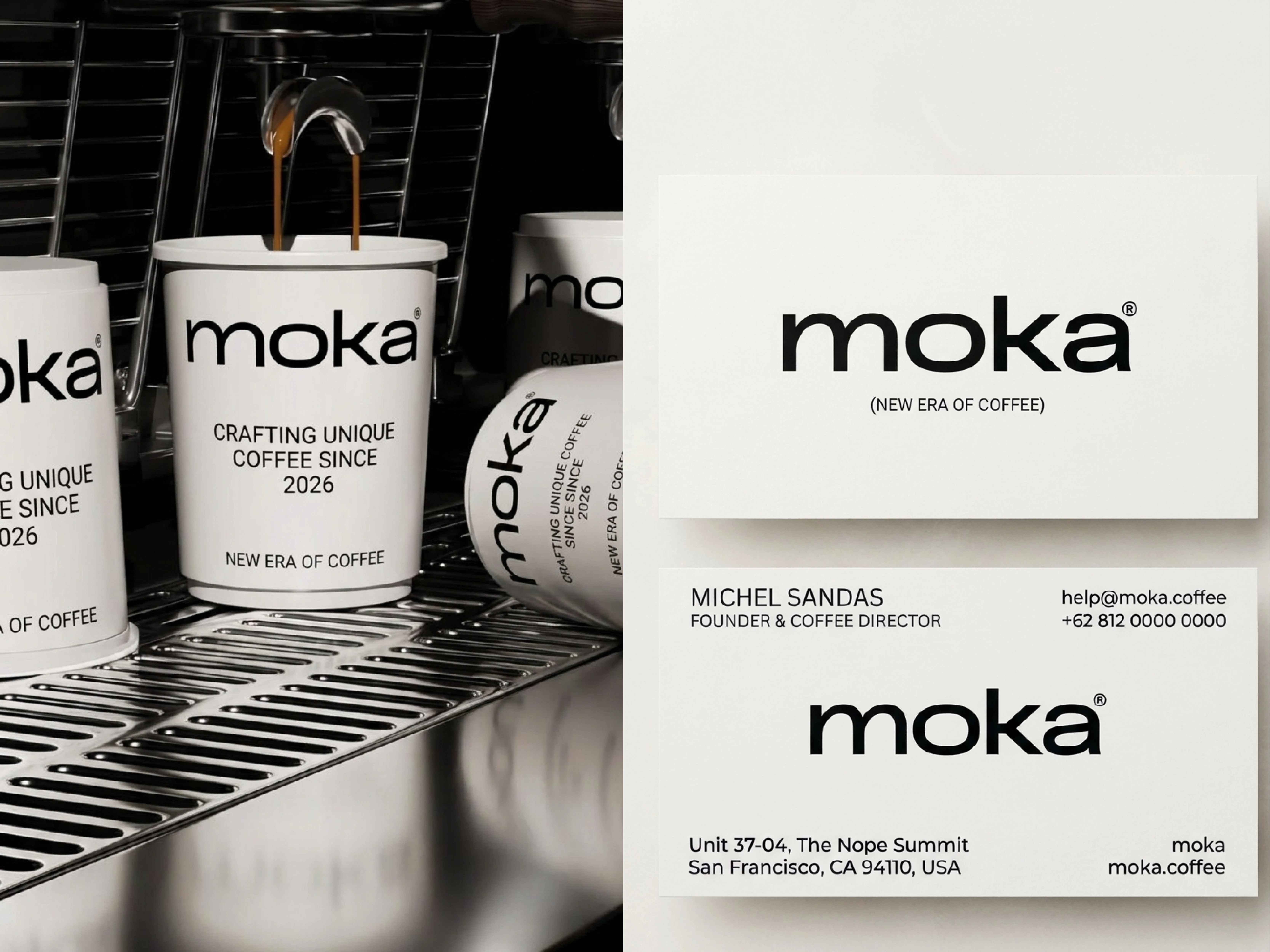
The identity is built to move through a full brand environment. Stationery and spatial direction extend Moka’s mood into physical touchpoints, creating a consistent experience wherever the customer encounters the brand.
Spatial and print touchpoints
This final application shows how the visual language can carry into physical environments and printed materials. The result is a cohesive concept designed to feel intentional at every scale.
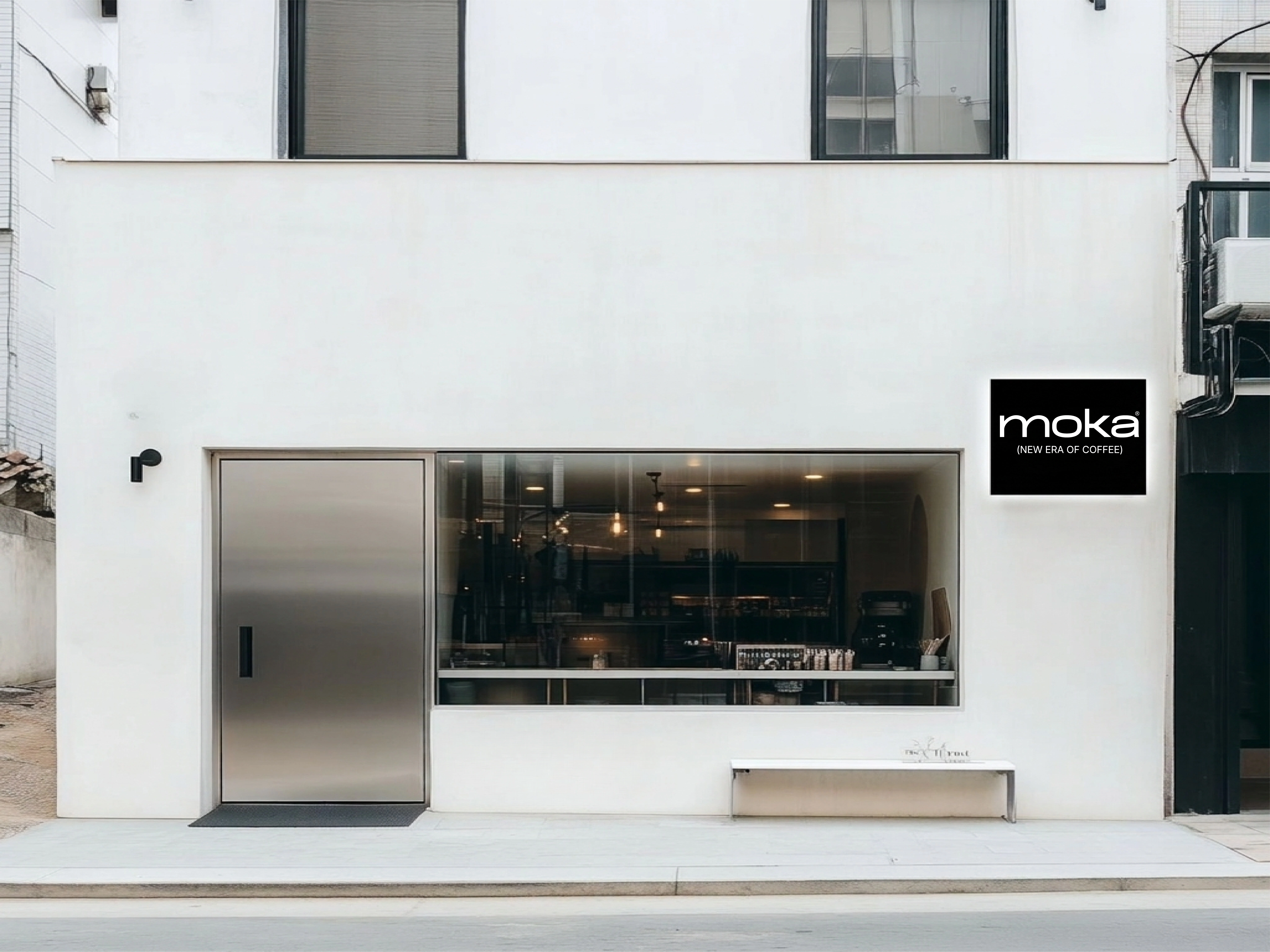
Moka stationery and spatial direction
Deliverables
Brand identity and logo system
Packaging suite
Editorial lifestyle mockups
Spatial art direction
Stationery design
Credits
Designer: @shivamx3
Project: Moka
Year: 2026
Scope: Brand Identity, Packaging Design, Editorial Art Direction, Stationery Design
Platform: Concept project
Contra: https://contra.com/shivamx3
Work with me
Looking for a brand identity that feels distinct across every touchpoint? Explore more work and get in touch: https://contra.com/shivamx3
Like this project
Posted Oct 27, 2026
A concept-led identity system for a minimalist luxury coffee brand, spanning packaging, editorial direction, stationery, and spatial touchpoints.