EventPark
Osunleke Samuel

Find. Book. Celebrate
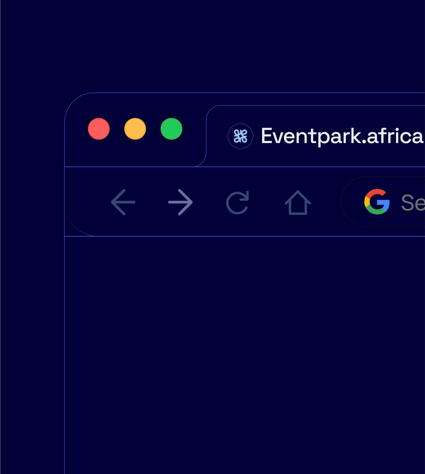
Eventpark is an innovative platform designed to connect event organizers with trusted vendors. It simplifies event planning by offering tailored vendor recommendations, secure payment options, and a seamless booking experience.
Our goal is to become the go-to marketplace for event planning across all major cities.
Strategy
We approached Eventpark’s brand identity with a dual lens:
Trust & Professionalism: Establishing Eventpark as the go-to marketplace for serious event organizers, vendors, and enterprises.
Celebration & Community: Capturing the excitement, vibrancy, and humanity at the core of every event. This balance became the foundation of the identity system.
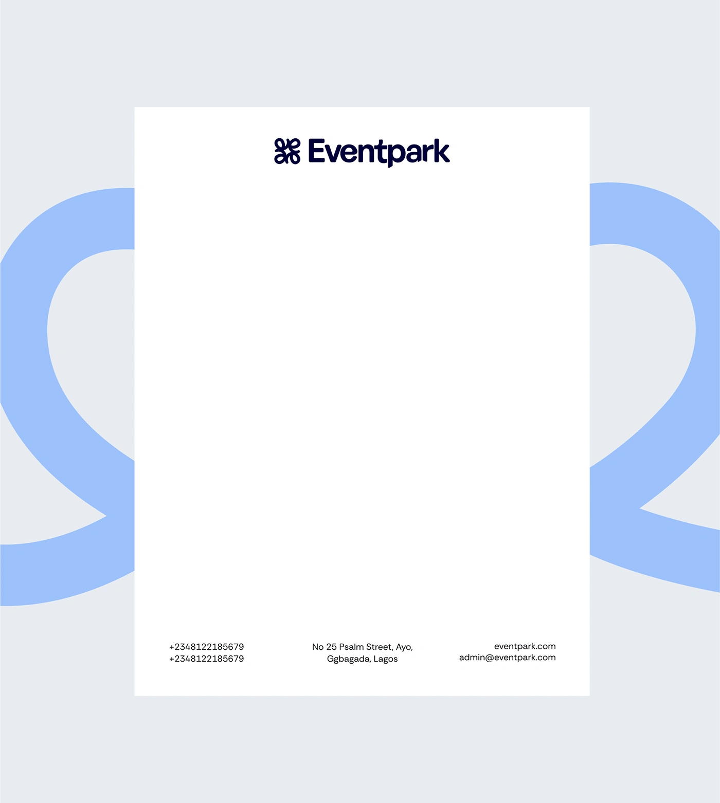
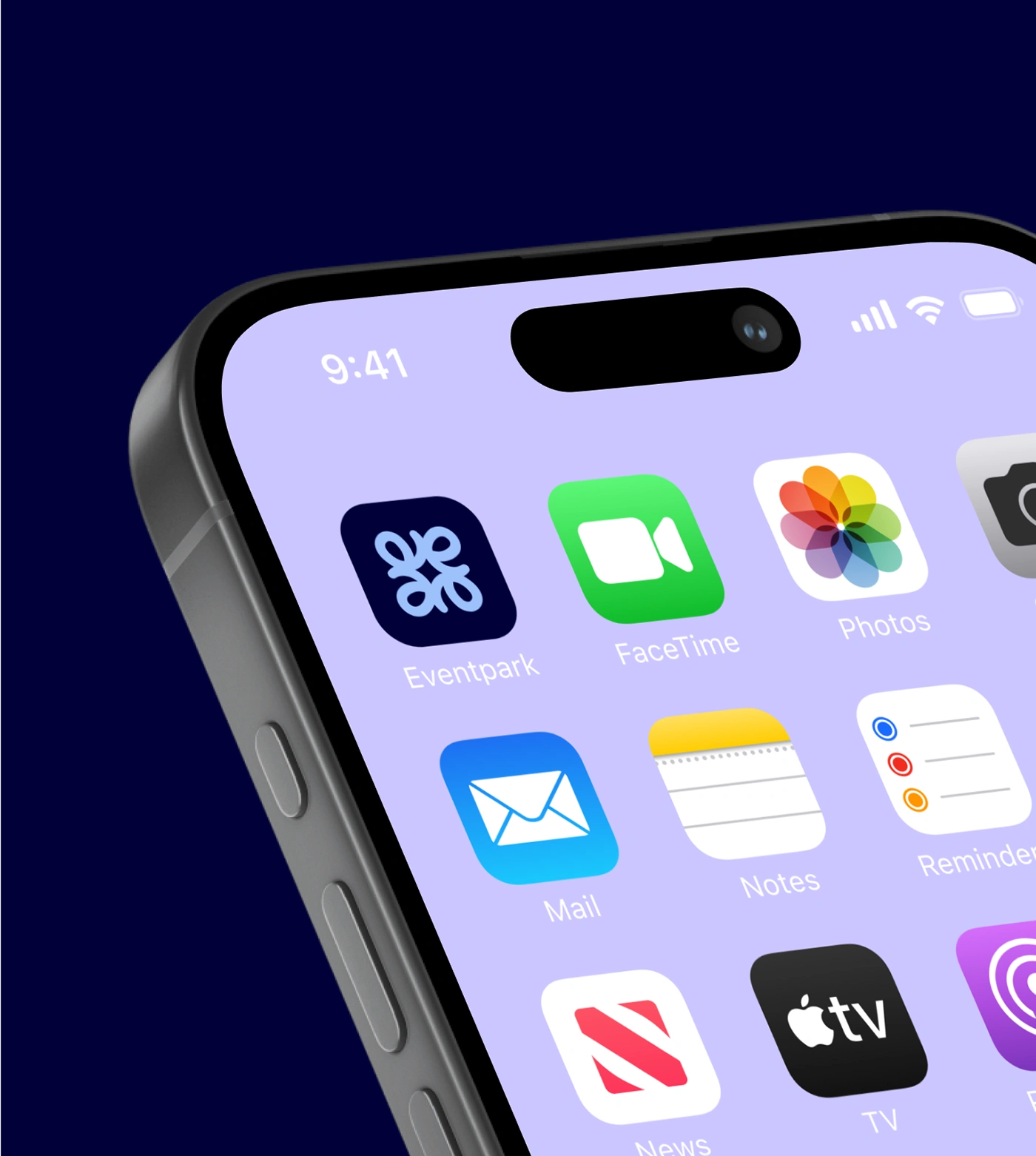
Design
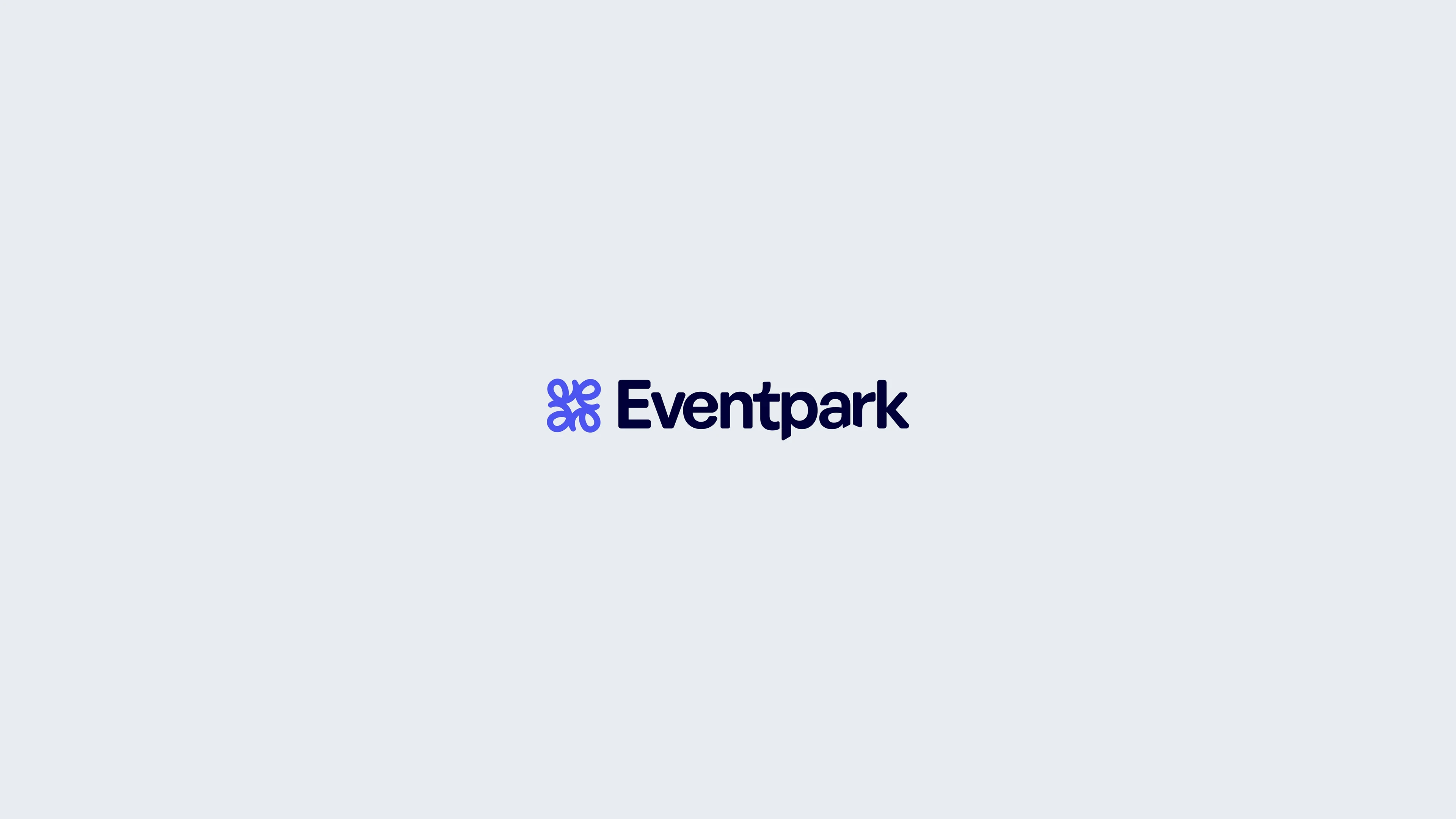
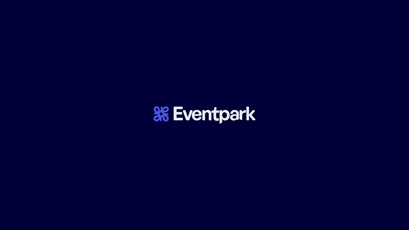
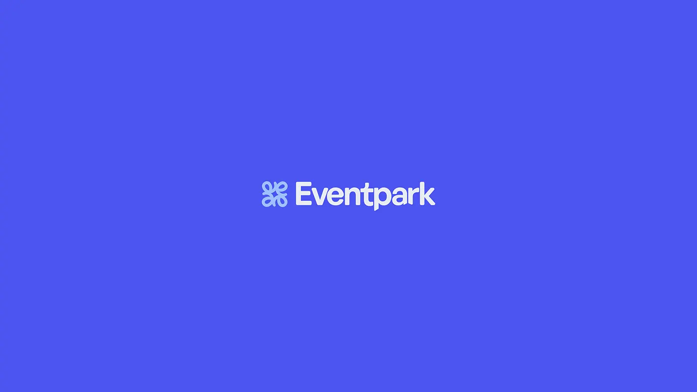
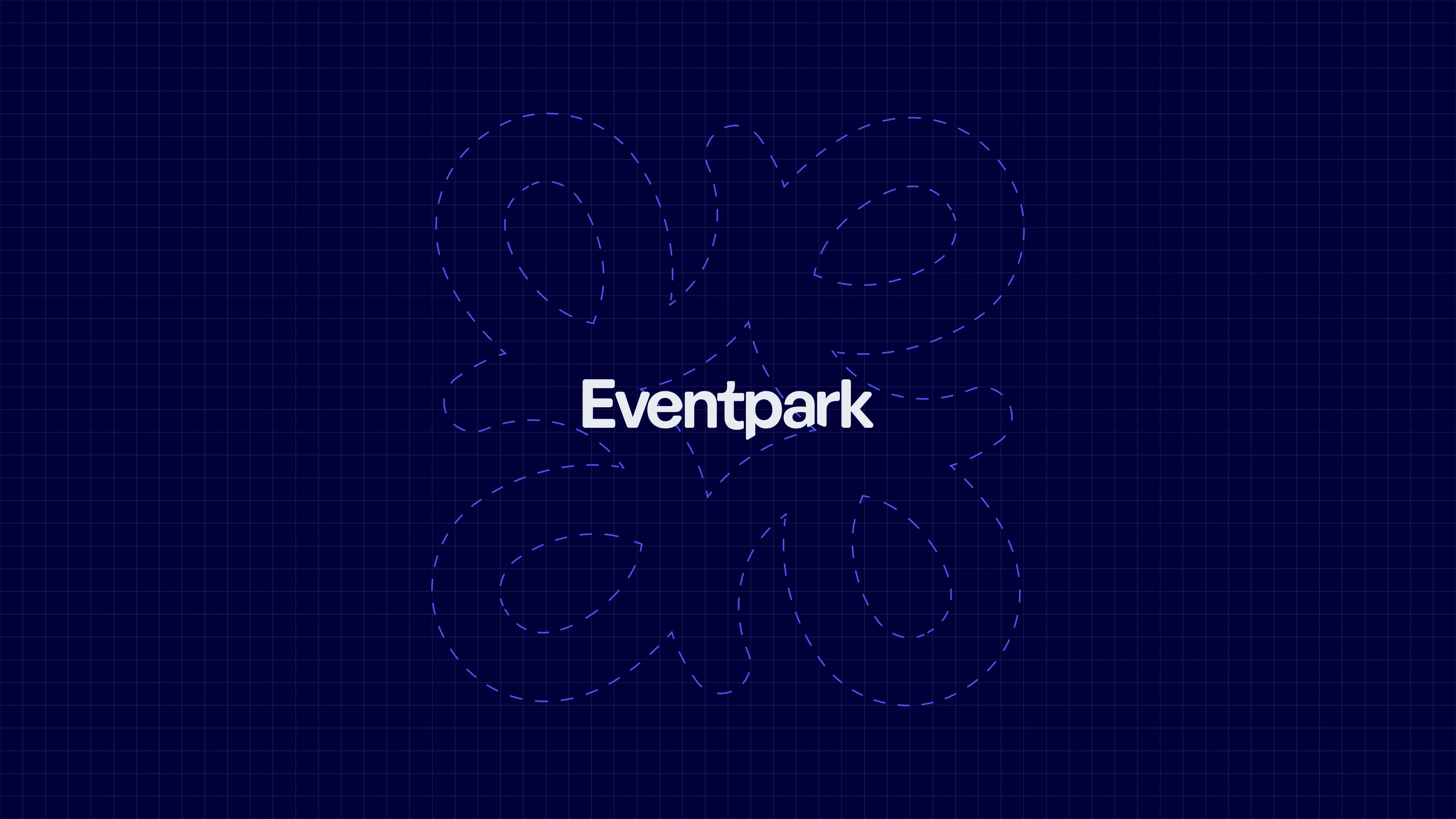
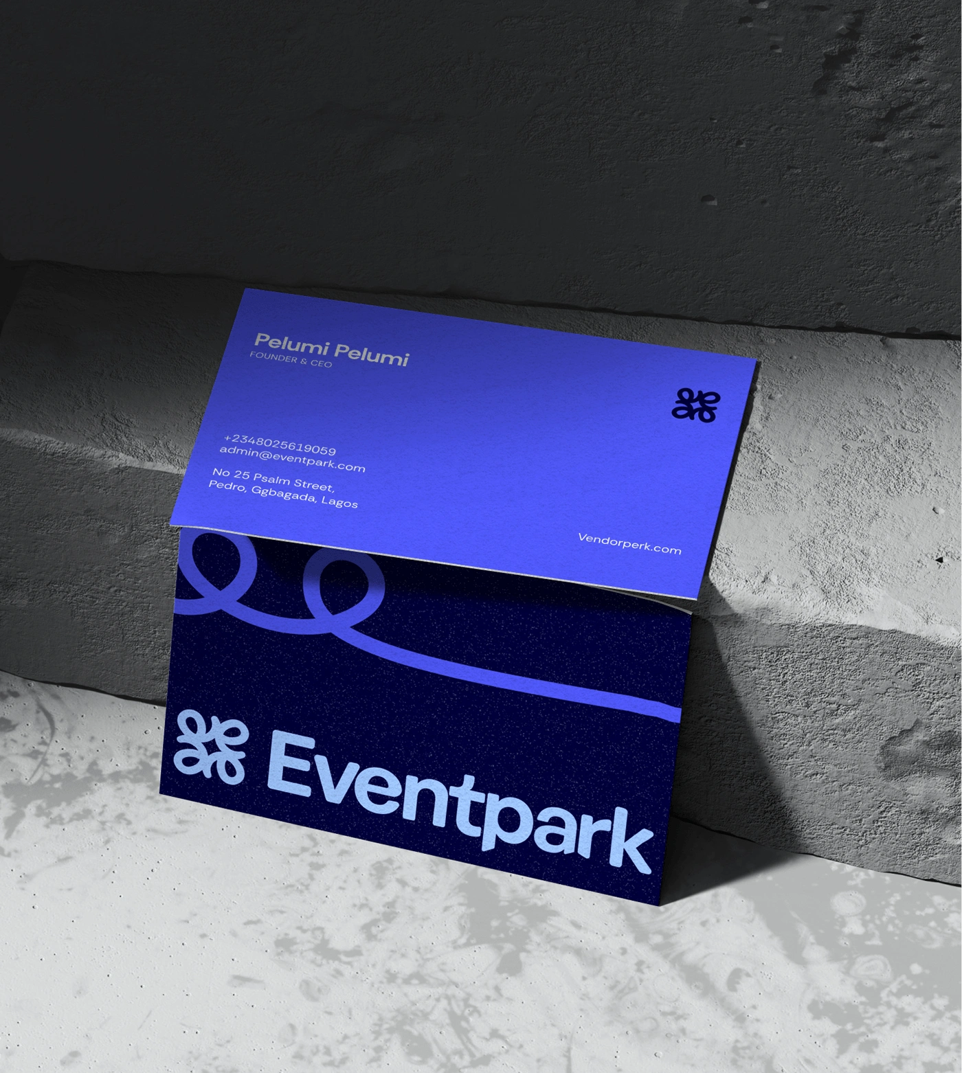
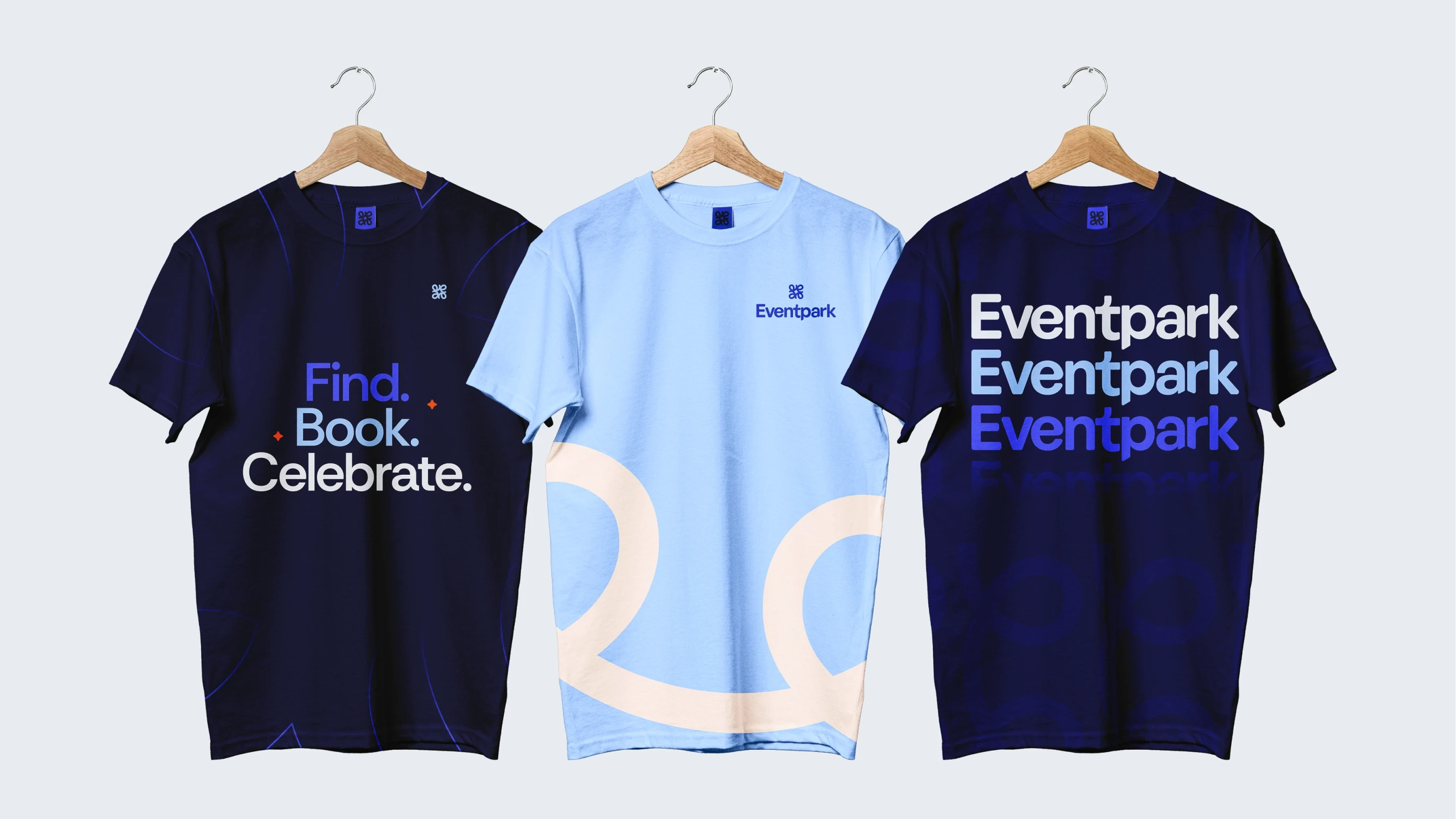
At the heart of the system is a radial ‘E’, a gathering symbol inspired by community clusters and ribbons that tie gift boxes. This flexible mark became the brand's anchor.
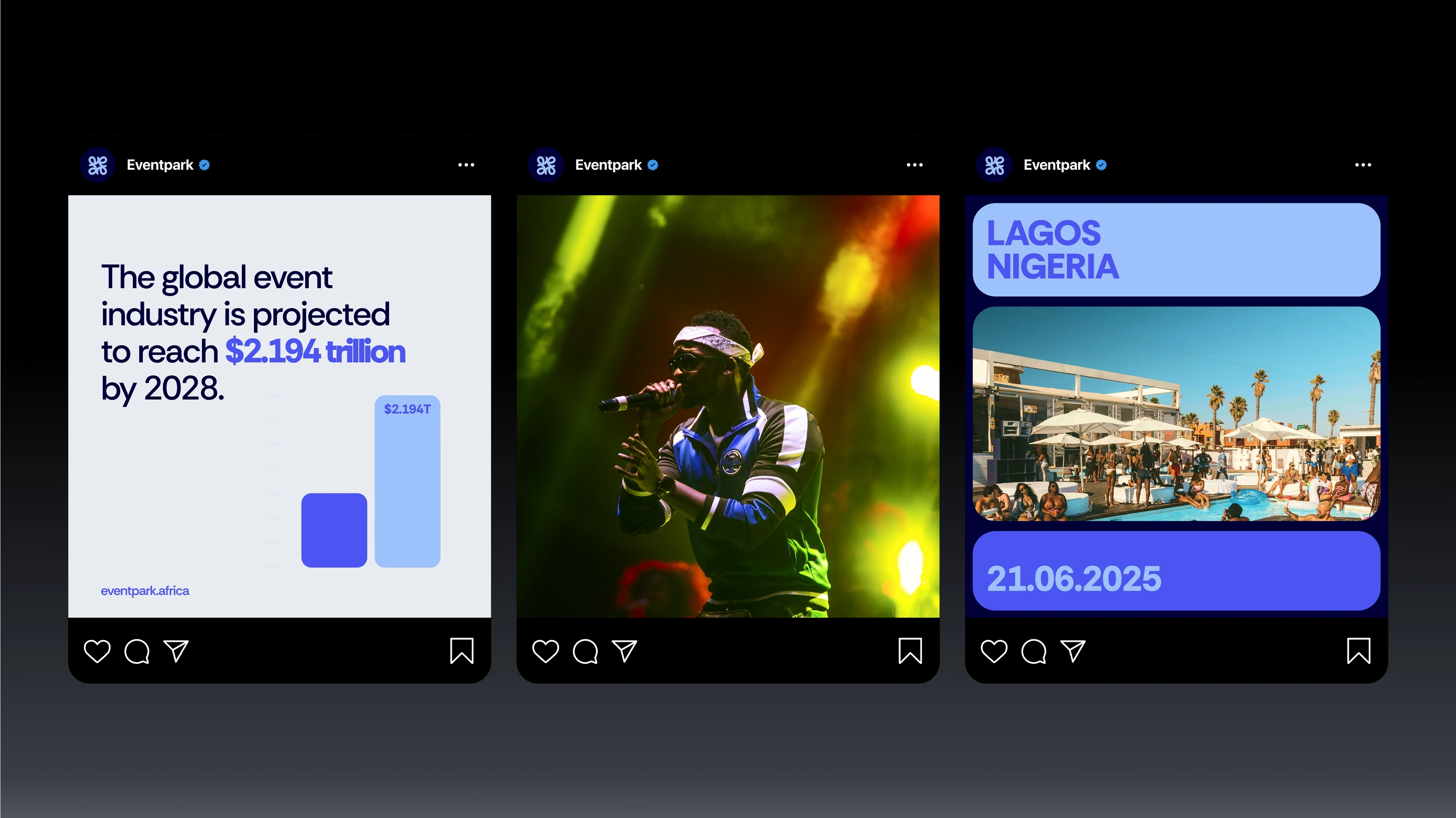
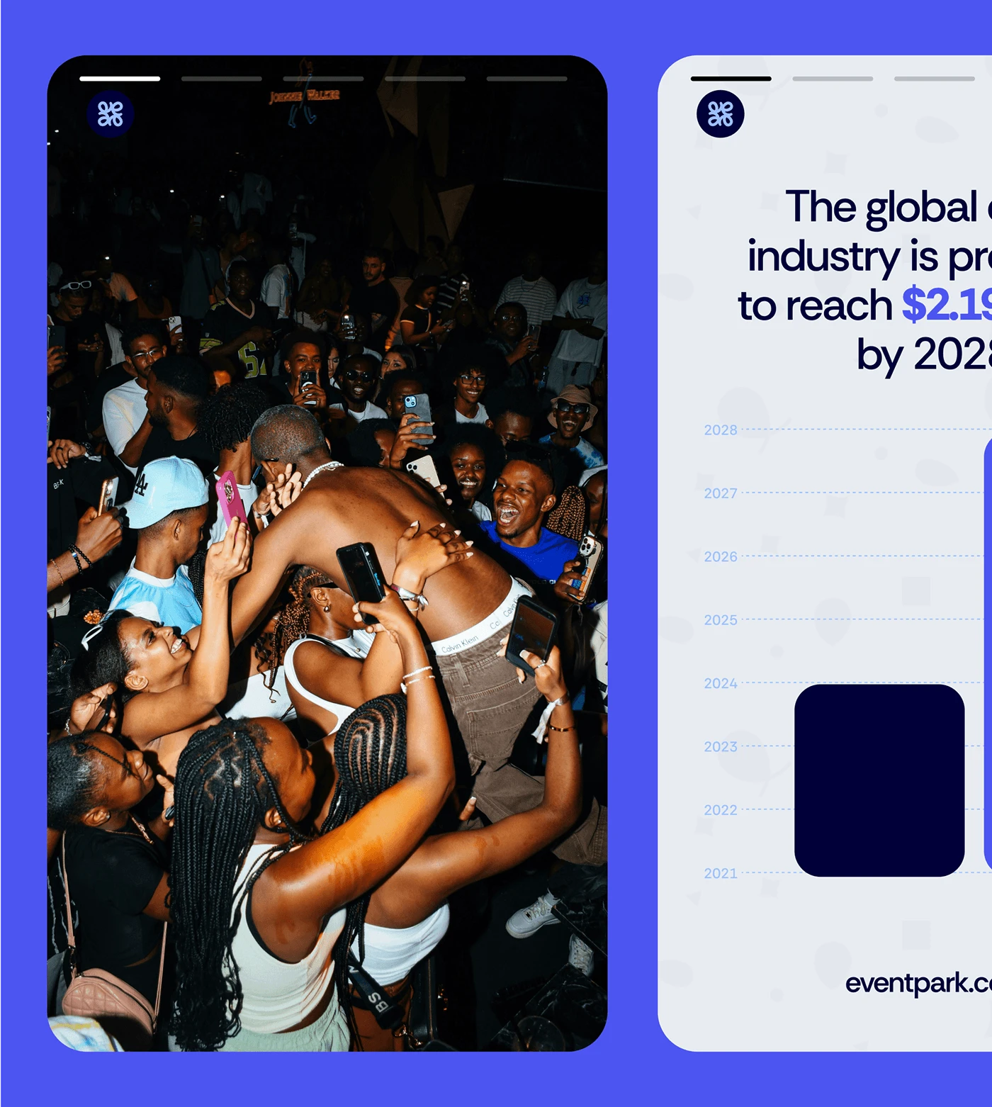
Ribbon Motif: a dynamic asset derived from the logo, representing connection and flow.
Confetti Pattern: abstract celebratory elements, adaptable across UI, print, and success states.
Color Palette: a balance of trustworthy blues with vibrant accents for energy and optimism.
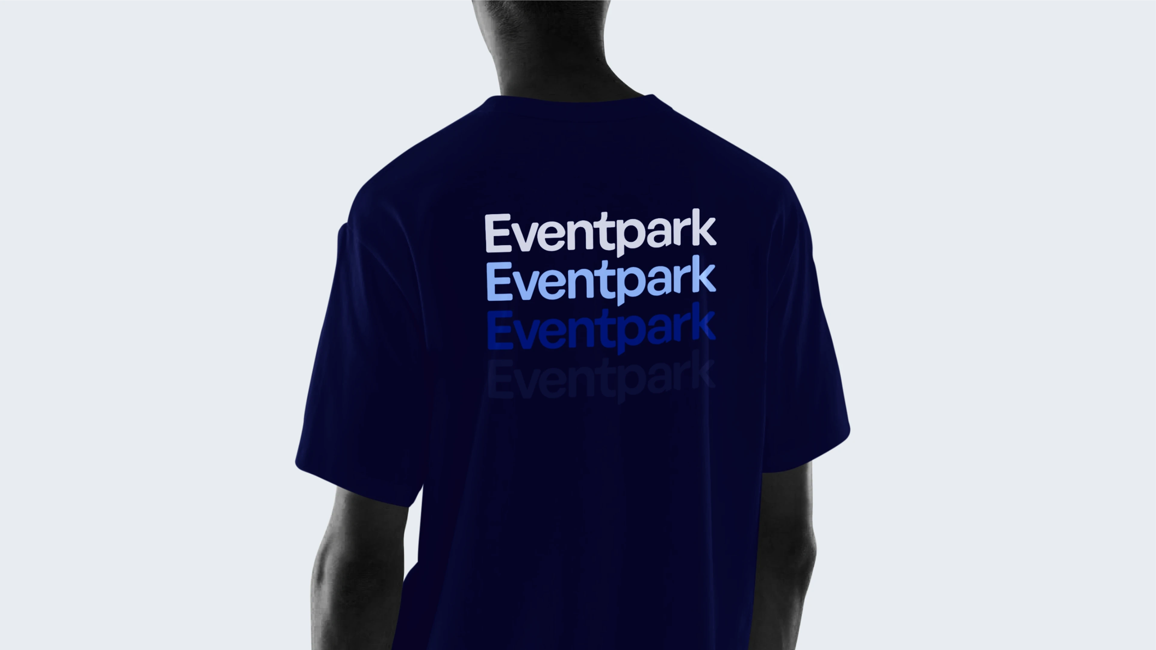
Typography: clean, modern sans-serif for legibility and approachability.
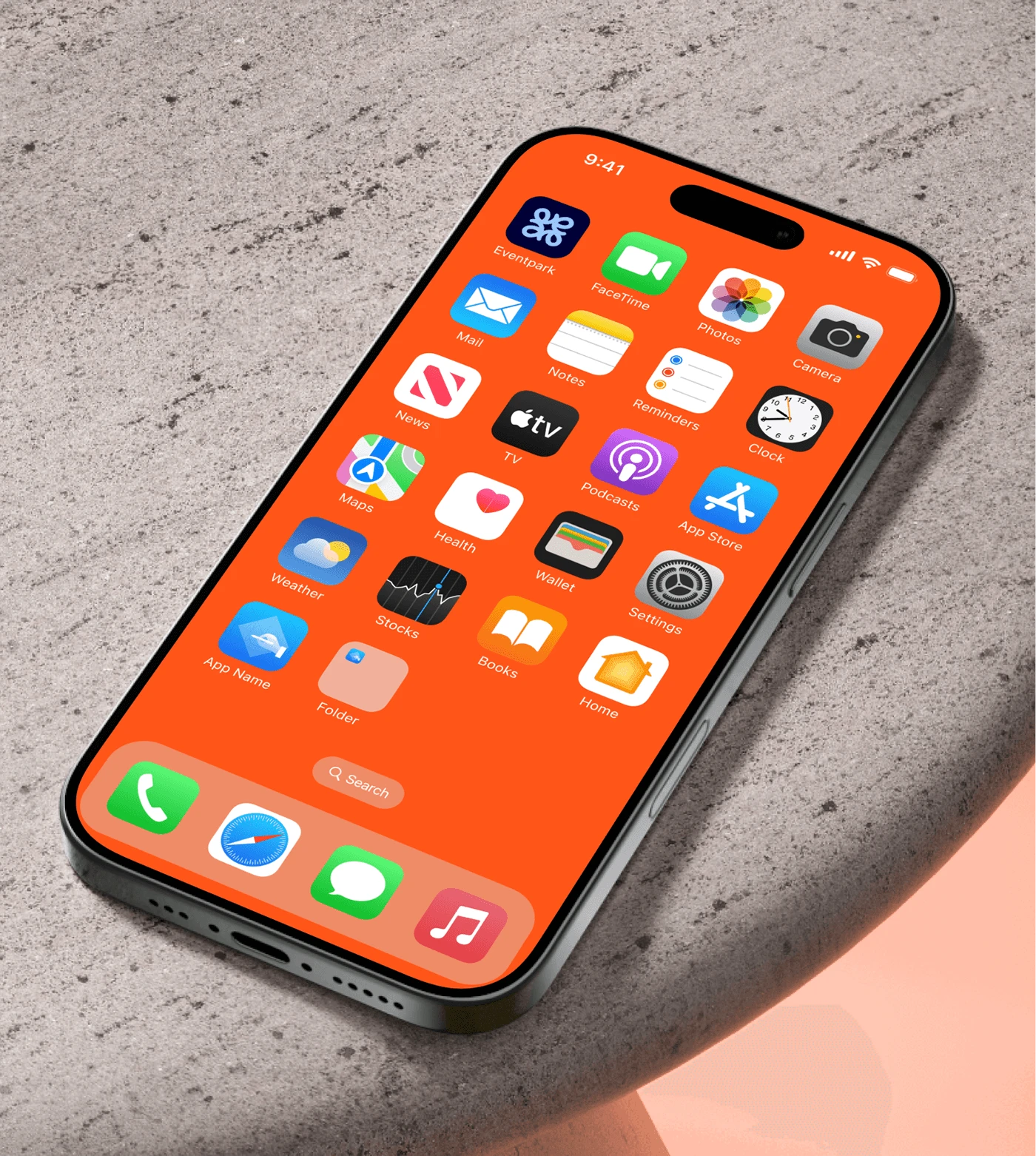
This flexible identity system works seamlessly across product UI, marketing, and community touchpoints.


Find. Book. Celebrate
Eventpark is an innovative platform designed to connect event organizers with trusted vendors. It simplifies event planning by offering tailored vendor recommendations, secure payment options, and a seamless booking experience.
Our goal is to become the go-to marketplace for event planning across all major cities.
Strategy
We approached Eventpark’s brand identity with a dual lens:
Trust & Professionalism: Establishing Eventpark as the go-to marketplace for serious event organizers, vendors, and enterprises.
Celebration & Community: Capturing the excitement, vibrancy, and humanity at the core of every event. This balance became the foundation of the identity system.
Design
At the heart of the system is a radial ‘E’, a gathering symbol inspired by community clusters and ribbons that tie gift boxes. This flexible mark became the brand's anchor.
Ribbon Motif: a dynamic asset derived from the logo, representing connection and flow.
Confetti Pattern: abstract celebratory elements, adaptable across UI, print, and success states.
Color Palette: a balance of trustworthy blues with vibrant accents for energy and optimism.
Typography: clean, modern sans-serif for legibility and approachability.
This flexible identity system works seamlessly across product UI, marketing, and community touchpoints.
Like this project
Posted Sep 30, 2025
Eventpark simplifies event planning by offering tailored vendor recommendations, secure payment options, and a seamless booking experience.