We’re experimenting with Apple-style “glass”
Swift Struck
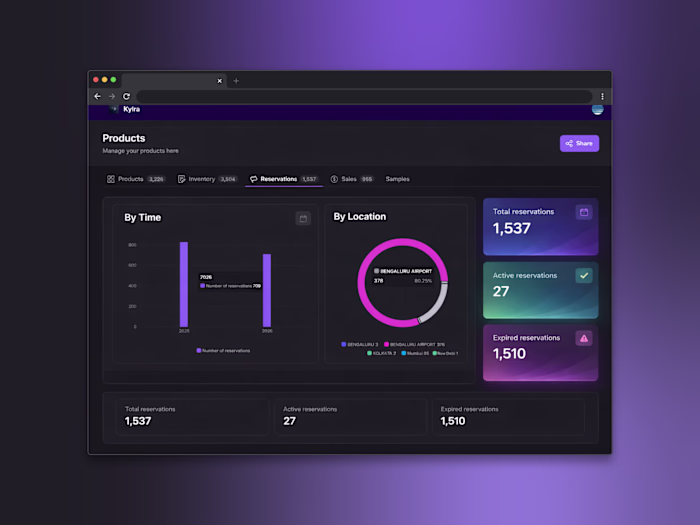
We’re experimenting with Apple-style “glass” to make our Glide (glideapps.com) calmer and easier to scan.
Not trying to be fancy.. just clearer.
What we’re learning about the glass look:
It’s not pure transparency. It’s a soft blur + a hint of tint so content stays readable.
Depth comes from three gentle layers: background blur, a thin highlight border, and a soft shadow.
Contrast matters. Text should pass accessibility checks, or the “wow” quickly turns to “where?”
How we’re doing it in Glide with a touch of custom CSS:
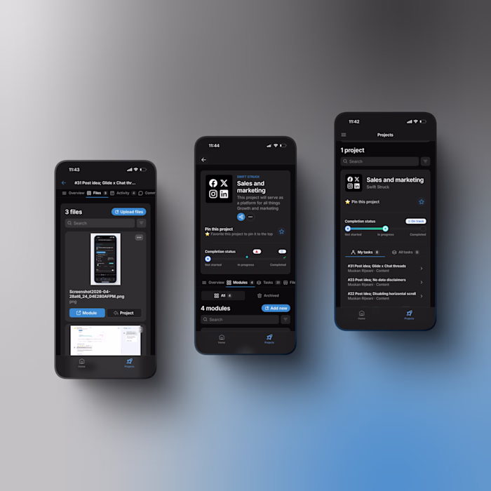
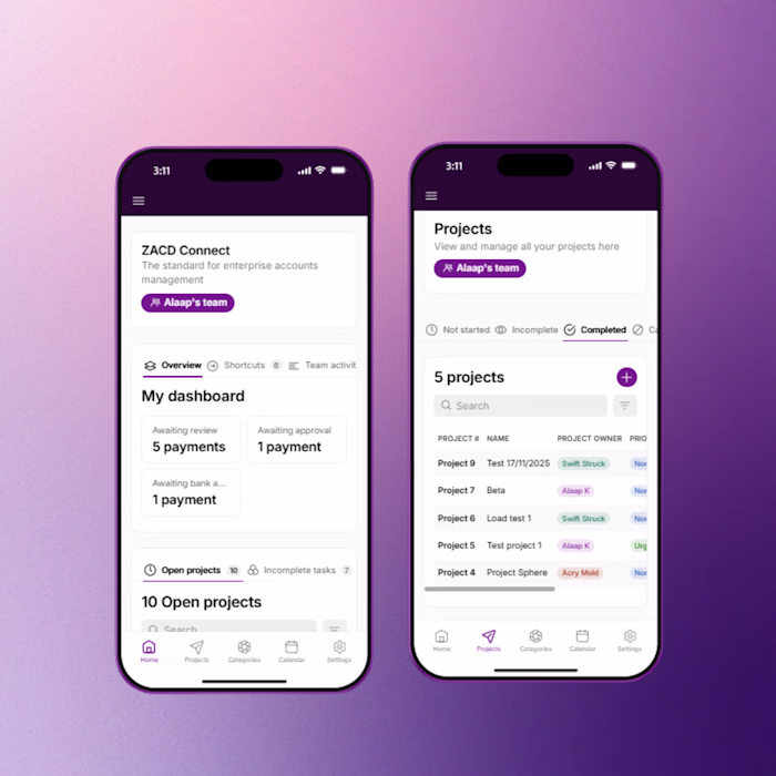
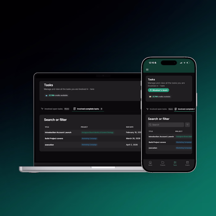
Frosted cards/nav: light translucent backgrounds, small blur.
Subtle borders: 1px, low-opacity, to define edges.
Rounded corners and roomy spacing to reduce visual noise.
Minimal motion so the content, not the chrome, gets attention.
Tiny snippet that powers a lot of the feel:
.glass {
background: rgba(255,255,255,.08);
backdrop-filter: blur(12px);
border: 1px solid rgba(255,255,255,.18);
border-radius: 16px;
box-shadow: 0 8px 24px rgba(0,0,0,.2);
}
Like this project
Posted May 6, 2026
We’re experimenting with Apple-style “glass” to make our Glide ( (https://www.linkedin.com/company/glideapps/)glideapps.com (http://glideapps.com)) (https://...