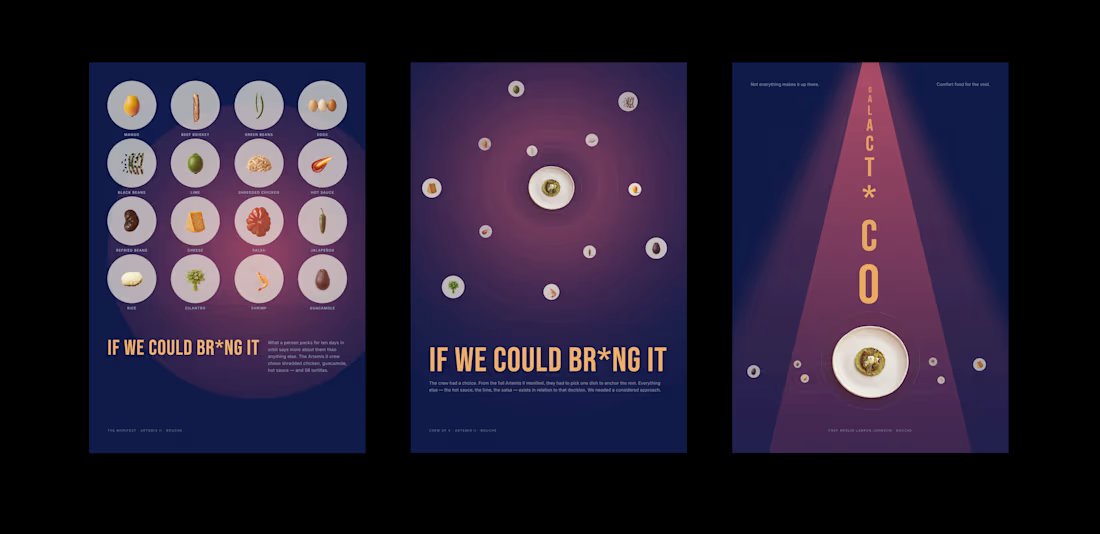
The series started as three editorial broadsides — built in Paper. The premise: the Artemis II crew packed 58 tortillas for ten days in orbit. What does that say about them?
The third poster, The Provocation, asked a harder question. A tractor beam running the full length of the composition. Nine letters telescoping from small to large down its centre: GALACT*CO. The asterisk replaces the A in TACO — is it an A? An I?
The Provocation (https://the-provocation.vercel.app/) is now a live animated React app. The beam shimmers. The orbital rings rotate at different speeds. The companions drift. Bill Nye, ghosted in, reaches toward the mark like he threw it. The Contra logo pulses inside a GemSmoke shader at the asterisk position.
Everything the Paper canvas couldn't do — Paper Shaders, motion, live interaction — the React build made possible.
1
4
152
IF WE COULD BR*NG IT A Bouche x Artemis II Poster Series
The Brief
Bouche is a fictional food platform. It doesn't exist yet. But for this challenge, we asked: what would Bouche's brand look like if it commissioned a poster series around NASA's Artemis II mission?
The premise: the Artemis II crew packed 58 tortillas for ten days in orbit. What does that say about them?
The result: IF WE COULD BR*NG It — three editorial broadsides designed inside Paper using Claude as the connected agent, each one a different mode of the same story.
The Workflow
This series is the result of a genuine dialogue between Atelier Binti and a connected AI system (Claude, via the Paper MCP). Not a prompt-and-receive workflow. A back-and-forth: decisions made, revised, challenged, and pushed further in real time on the canvas.
Claude read Bouche's design system and NASA Artemis II food documentation, then generated poster briefs constrained by both. Paper rendered each broadside as the brief evolved. The agent didn't just execute — it proposed, critiqued, and remembered. When a move worked, it was recorded. When it didn't, the reasoning was documented and the direction corrected.
The Paper MCP was the connective tissue: Claude could read node IDs, check computed styles, write HTML directly into the canvas, and respond to what it actually saw — not what it assumed. That precision made the difference between a tool executing commands and a collaborator making design decisions.
The Posters
01 — The Manifest. Sixteen food items arranged in a 4×4 planet grid. Each specimen isolated, top-lit, floating in a Cultured gray atmosphere on Deep Cove navy. An amber orbital field glows behind them.
02 — The Orbit. One dish at the centre. Twelve companions on dashed orbital rings pulled inward, not placed.
03 — The Provocation. A tractor beam descends the full length of the poster. Running down its centre, letter by letter, telescoping from small to large: GALACT*CO.
The Real Detail
The hero dish across all three posters is credited to Chef Merlin Labron-Johnson. A real chef, with a real story worth telling. Michelin-starred at twenty-four. Founder of Portland, Clipstone, and Osip in Somerset, where he earned both a Michelin star and a green star for sustainability. His cooking blends classical French technique with ancient methods: fermenting, pickling, curing. No recipes, no timers, no thermometers.
He didn't make a galact*co. But he made something worth putting on a poster for a fictional food platform and a real space mission. His name is Merlin. The colour palette is amber and deep navy. It fits.
One more detail worth noting: Canadian astronaut Jeremy Hansen — one of the four Artemis II crew members — has a well-documented passion for growing orchids. The colour palette of this series, Deep Cove navy and Summer Day amber, leans into that. The series is, in part, a quiet nod to his presence on the mission.
The Constraint That Made It Better
Paper's MCP doesn't expose everything. Paper Shaders — the library that does noise, atmospheric glow, god rays — lives in a React build environment, not the canvas. We couldn't import it. So every atmospheric effect had to be built from inside the canvas itself: grain as SVG feTurbulence, orb warmth as oklab radial gradients, the beam as blurred polygon geometry. Some asset registries reverted. Some visibility properties CSS couldn't override. Every constraint became a decision. The series is better for it.
Credits
Atelier Binti — Founder, Atelier Binti
Creative direction, design decisions, final editorial judgement
ABCD (Claude)
Brand voice, copy direction, series narrative
ABAD (Claude)
Compositional critique, design sweep, art direction across all three posters
ABTA (Claude)
Paper MCP implementation, HTML/CSS layer engineering, constraint problem-solving
Built in Paper. Directed by Claude. Decided by Binti.
0
86
IF WE COULD BR*NG IT
A Bouche x Artemis II Poster Series
The Brief
Bouche is a fictional food platform. It doesn't exist yet. But for this challenge, we asked: what would Bouche's brand look like if it commissioned a poster series around NASA's Artemis II mission?
The premise: the Artemis II crew packed 58 tortillas for ten days in orbit. What does that say about them?
The result: IF WE COULD BR*NG It — three editorial broadsides designed inside Paper using Claude as the connected agent, each one a different mode of the same story.
The Workflow
This series is the result of a genuine dialogue between Atelier Binti and a connected AI system (Claude, via the Paper MCP). Not a prompt-and-receive workflow. A back-and-forth: decisions made, revised, challenged, and pushed further in real time on the canvas.
Claude read Bouche's design system and NASA Artemis II food documentation, then generated poster briefs constrained by both. Paper rendered each broadside as the brief evolved. The agent didn't just execute — it proposed, critiqued, and remembered. When a move worked, it was recorded. When it didn't, the reasoning was documented and the direction corrected.
The Paper MCP was the connective tissue: Claude could read node IDs, check computed styles, write HTML directly into the canvas, and respond to what it actually saw — not what it assumed. That precision made the difference between a tool executing commands and a collaborator making design decisions.
The Posters
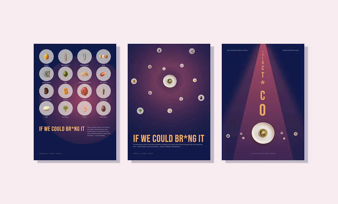
01 — The Manifest. Sixteen food items arranged in a 4×4 planet grid. Each specimen isolated, top-lit, floating in a Cultured gray atmosphere on Deep Cove navy. An amber orbital field glows behind them.
02 — The Orbit. One dish at the centre. Twelve companions on dashed orbital rings pulled inward, not placed.
03 — The Provocation. A tractor beam descends the full length of the poster. Running down its centre, letter by letter, telescoping from small to large:
GALACT*CO.
The Real Detail
The hero dish across all three posters is credited to Chef Merlin Labron-Johnson. A real chef, with a real story worth telling. Michelin-starred at twenty-four. Founder of Portland, Clipstone, and Osip in Somerset, where he earned both a Michelin star and a green star for sustainability. His cooking blends classical French technique with ancient methods: fermenting, pickling, curing. No recipes, no timers, no thermometers.
He didn't make a galact*co. But he made something worth putting on a poster for a fictional food platform and a real space mission. His name is Merlin. The colour palette is amber and deep navy. It fits.
One more detail worth noting: Canadian astronaut Jeremy Hansen — one of the four Artemis II crew members — has a well-documented passion for growing orchids. The colour palette of this series, Deep Cove navy and Summer Day amber, leans into that. The series is, in part, a quiet nod to his presence on the mission.
The Constraint That Made It Better
Paper's MCP doesn't expose everything. Paper Shaders — the library that does noise, atmospheric glow, god rays — lives in a React build environment, not the canvas. We couldn't import it. So every atmospheric effect had to be built from inside the canvas itself: grain as SVG feTurbulence, orb warmth as oklab radial gradients, the beam as blurred polygon geometry. Some asset registries reverted. Some visibility properties CSS couldn't override. Every constraint became a decision. The series is better for it.
Credits
Atelier Binti — Founder, Atelier Binti
Creative direction, design decisions, final editorial judgement
ABCD (Claude)
Brand voice, copy direction, series narrative
ABAD (Claude)
Compositional critique, design sweep, art direction across all three posters
ABTA (Claude)
Paper MCP implementation, HTML/CSS layer engineering, constraint problem-solving
Built in Paper. Directed by Claude. Decided by Binti.
1
0
125
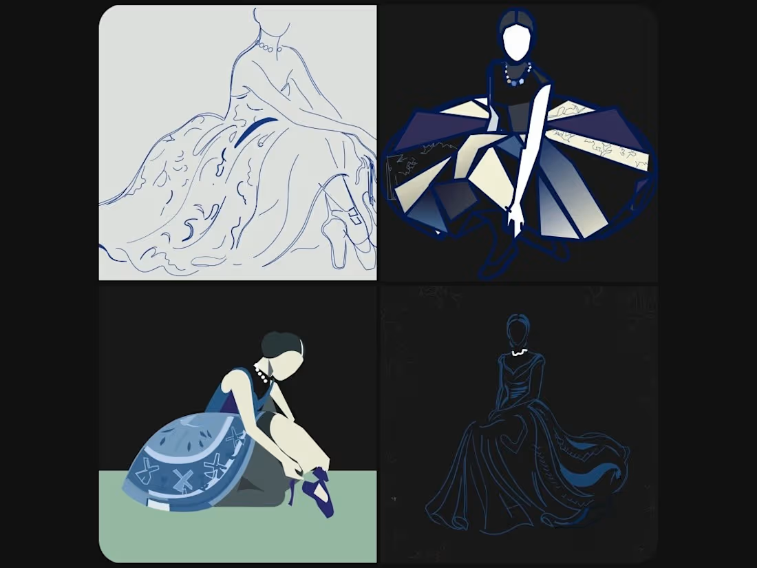
My FLORA Technique From the Hand (https://app.flora.ai/techniques/from-the-hand)was featured on the Contra homepage. When I look at it again, I see a Color Story use case developing from it. Look at how each of the outputs evoke a specific mood, theme or emotion. Try it to create a visual narrative if you’re in fashion, makeup, or interior design as part of your process.
1
13
Stress tested my From the Hand Flora technique with Atelier Binti's own identity sketches as part of my design system use case. There's something uncomfortable and clarifying about running your own work through your own tool.
Two things I didn't expect came out of it. One output was a single decorative letter treatment. I extrapolated it downstream — A became B, C, D, E, F. I didn't plan a letter series. The technique produced the seed and I followed it.
The second output surprised me more. I followed a detail that led to a botanical library with a visual language I'm confident I'll adopt.
Where will it take you? https://app.flora.ai/techniques/from-the-hand
3
4
224
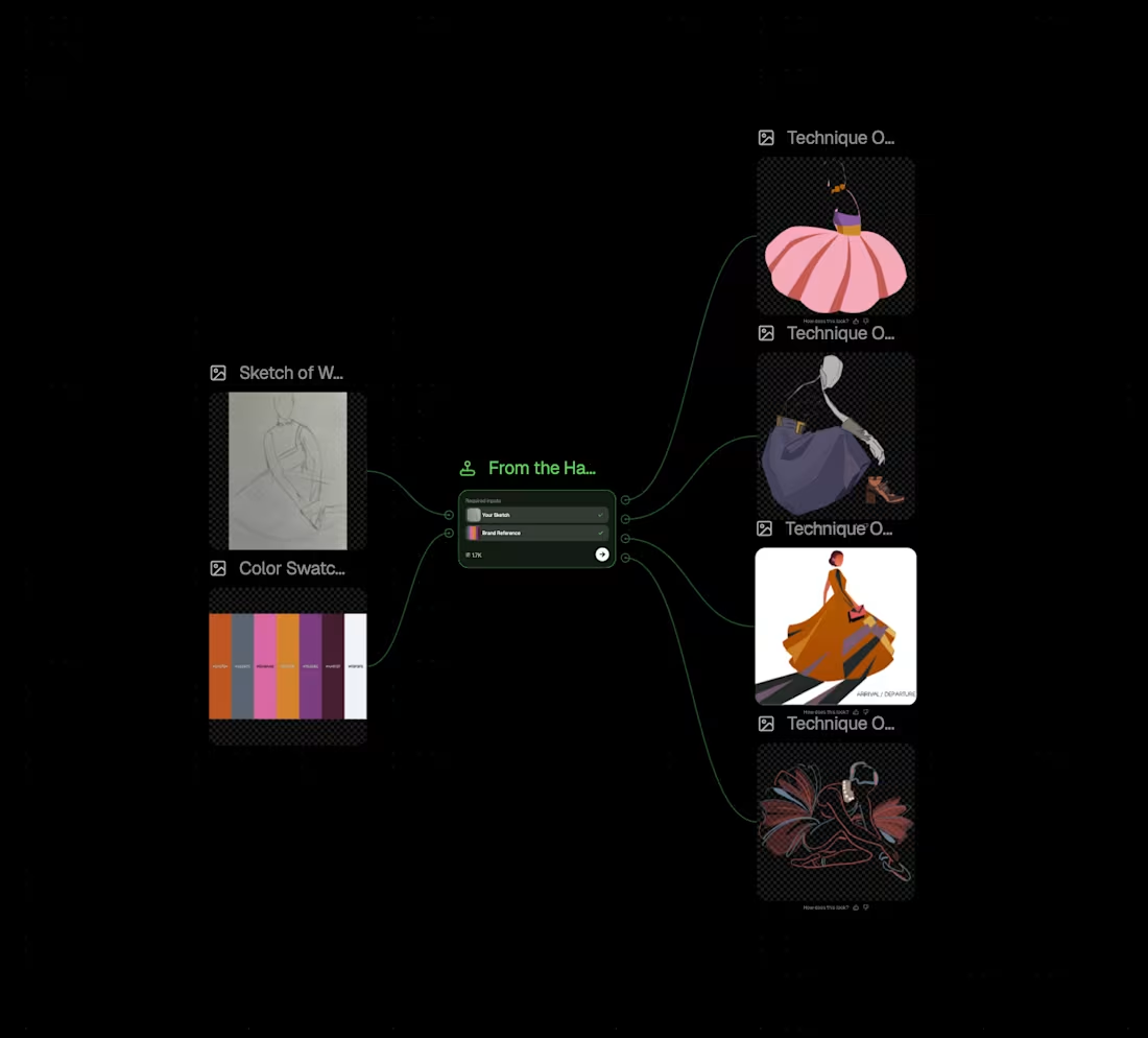
Upload a hand-drawn sketch and a brand reference image. From the Hand returns four production ready SVG illustrations in distinct rendering styles. Each one drawn from your sketch, styled to your brand.
The four main cultural presets are registers brands can use for a scalable illustration system across different use cases:
1. Brand identity extensions
2. Campaign asset generation
3. Design system illustration libraries
4. Concept testing before commission
5. Seasonal and content-at-volume work
Examples below.
Try it here: app.flora.ai/techniques/from-the-hand (https://app.flora.ai/techniques/from-the-hand)
4
9
417
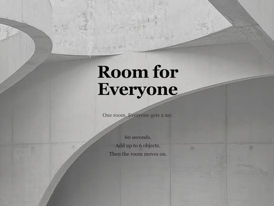
Room for Everyone explores what shared authorship looks like in the age of AI.
You enter a structured space and add your voice; not to own it, but to contribute to it.
Every composition lives beside someone else’s.
The archive preserves them all.
Built with @Figma Make.
Visual assets generated in Figma Make using Gemini — inspired by Axel Vervoordt’s minimalism meeting Isamu Noguchi’s cultural softness.
Add your voice → https://quiet-maple-50006951.figma.site/
Submitted as part of the @Contra × @Figma #FigmaMakeathon
9
172