
Orlerx Adewale
✦Framer and ✱Webflow website for SaaS and StartUp
- 5.0
- Rating
- 36
- Followers


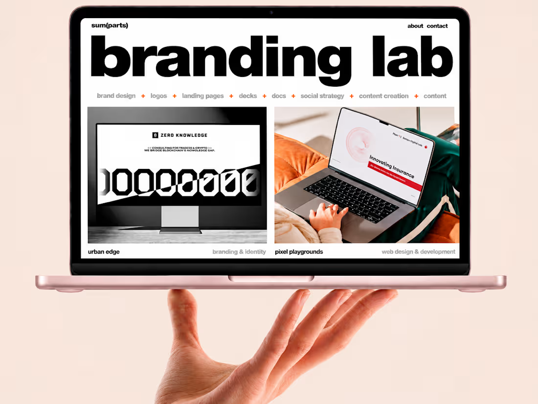
Sum of Parts Website Design
11
5

Intelineli Landing Page Design Project
13
7
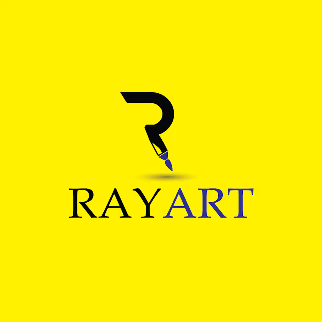
Introducing RAYART — A Creative Identity Rooted in Art ✍️.
I'm currently working on the RAYART logo, and while the design isn't finished yet, I'd love to share this work in progress and hear your honest thoughts. 💭
The goal is to create a visual identity that captures the creativity, originality, and artistic spirit behind RAYART. But before I take it further, I'd love to know if the concept is strong enough to catch your attention.
Now, we'd love to hear from you 👇
- 🎨 Does the logo catch your attention at first glance?
- ✍️ Does the concept communicate creativity and the art of drawing?
- 💡 What would you change, improve, or add to make it more memorable?
3
14
723
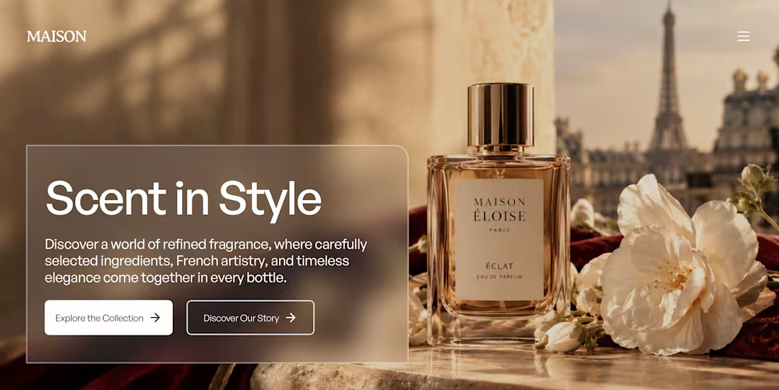
Maison Éloise — Luxury Fragrance Website Concept
Project type: Website Design · UI Design · Art Direction · Responsive Web Design
Industry: Luxury Beauty & Fragrance
Project status: Self-initiated concept project
Overview
Maison Éloise is a fictional luxury fragrance brand inspired by Parisian elegance, timeless perfumery, and the art of sensory storytelling.
For this project, I explored two distinct hero section concepts, each offering a different visual direction for the same brand. My goal was to create a premium digital experience that captures the emotion of fragrance through elegant typography, refined imagery, thoughtful composition, and a sophisticated color palette.
The Creative Direction
Rather than settling on a single approach, I explored two visual directions to see how different design decisions could shape the brand's personality and first impression.
Direction A — Warm & Romantic
A softer, editorial approach featuring warm neutrals, golden lighting, delicate florals, and understated luxury. The design creates an intimate atmosphere that feels timeless and inviting.
Direction B — Bold & Sophisticated
A more dramatic direction that explores richer tones, stronger visual contrast, and confident compositions to communicate exclusivity and modern luxury.
Design Approach
My focus was on creating a strong first impression while keeping the experience elegant and intuitive.
Typography: Refined serif headlines paired with clean supporting text.
Art direction: Premium fragrance imagery designed to evoke emotion and atmosphere.
Color palette: Warm ivory, champagne, rich burgundy, and complementary neutral tones.
Layout: Intentional whitespace, clear hierarchy, and balanced compositions.
User experience: Clear calls to action that guide visitors toward discovering the fragrance collection and learning about the brand.
The Challenge
How do you make a fragrance brand feel luxurious online when customers cannot physically experience the scent?
My approach was to use visual storytelling to suggest the feeling behind the product — from the lighting and textures to the bottle presentation and typography. Each design direction communicates a different interpretation of luxury while maintaining a consistent brand identity.
The Outcome
Two distinct hero section concepts for Maison Éloise, demonstrating how art direction, typography, imagery, and layout can influence a brand's digital presence.
This project allowed me to explore alternative creative directions, experiment with premium visual storytelling, and consider how design choices shape a visitor's first impression.
Your Turn
Two concepts. One brand.
Which direction would you choose for Maison Éloise — the warm and romantic approach or the bold and sophisticated one?
I'd love to hear your thoughts!
Maison Éloise is a fictional brand created as a self-initiated design concept for portfolio exploration.
15
564