
Emmanuel Ikwegbu Framer | Custom | Ai Visual Creator
Brand identity | Framer | Ai video | Product design
Ready for work
Emmanuel is ready for their next project!
Brand campaign studio, a complete brand launch workflow built on Morphic
Every brand launch has the same problem: too many moving parts, no unified system, content that looks like it came from five different people.
I built a workflow that solves that.
https://www.morphic.com/en/workflows/019da63b-164c-72fb-b9b8-c5417f0282a3/brand-campaign-studio
Brand campaign studio takes a logo, three photos, and a product description and produces a complete, multi-platform brand campaign. Brand identity locked from the logo first. Then a LinkedIn carousel, a two-person podcast video with lip sync and branded overlays, and a viral clip engineered around proven scroll-stopping mechanics all consistent, all on-brand.
Every step has an approval gate. Nothing moves forward without sign-off, which makes it work as a client-facing production process, not just a personal tool.
The model stack is deliberate. Seedance 2.0 for native 9:16 video with strong face consistency. Gemini Image Pro for all image work. Sync V3 for lip sync. Text overlays added in post via video-operations — no AI-generated text inside video prompts, which eliminates the most common quality failure in AI video production.
On the first run it builds a brand kit that uploads on future runs to skip all setup and maintain consistency across campaigns.
This is the process I'd use for a real client. Now it's a system anyone can run.
7
8
313
Flow box multi-mode switch is using the two-mode switch which is the light and dark plus two more mode from the brand palette, making them represent season too, this is made for client to have more control over there screen.
2
91
What if one sneaker could adapt to your entire lifestyle?
Whether you’re running errands, heading to a meeting, or stepping out with friends, Loopo fits the moment without compromise.
Using Kittl, I developed the full visual identity from scratch,Then I pushed it further with AI-powered content creation:
Generated high-quality product visuals
Produced brand-style video content optimized for social media
The result? A cohesive, modern sneaker brand that feels ready for market powered by creativity + AI.
This project shows how I help startups and brands:
Turn ideas into visual experiences that convert.
If you're building something and need branding, visuals, or high-converting content, let’s talk.
#SneakerBranding #AIContentCreation #BrandIdentityDesign #KittlDesign #ProductDesign #StartupBranding
0
92
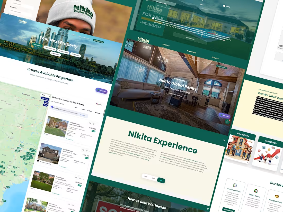
Nikita Global Realty Website Transformation
1
3
Stories sell. Visuals make people remember.
I create cinematic AI videos designed for brand campaigns and storytelling. Using AI visual tools and creative direction, I turn ideas into short film-style visuals that help brands communicate their message in a powerful way.
Perfect for:
• Brand campaigns
• Product storytelling
• Creative marketing visuals
• Short cinematic ads
If your brand needs visual storytelling that stands out, let’s create something memorable.
2
157
Roc nation Hero section, all made for the purpose with the intension of info and more browser, fast, and Seo optimized for all Music lovers
2
2
178
Just created a high-converting AI video ad for Apple iPod earbuds
Focused on highlighting the core feature immersive sound with powerful noise isolation that blocks out distractions and keeps you locked into your world.
Crafted entirely using AI tools, from concept to final visuals. Dm lets work on brand ads
2
3
167
Just launched the new Compatto Furniture website. Built it with clean code, full mobile responsiveness, and solid SEO fundamentals. Fast loading times, intuitive navigation, and optimized for search engines. Excited to see how it performs.
1
139
More explore in @capcut, Im done with my template but it seems capcut don't accept grey app as a payment, since you have to have to pay before your template can be saved .
16
353
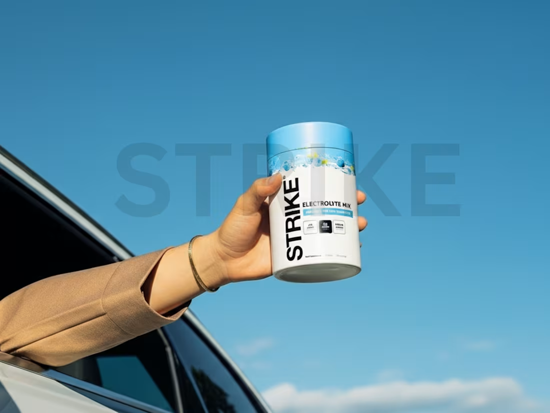
Photo manipulation for @strikenutrition a high-performance electrolyte mix. I enhanced product realism, refined lighting, and optimized brand visuals for modern e-commerce and social media marketing.
3
233
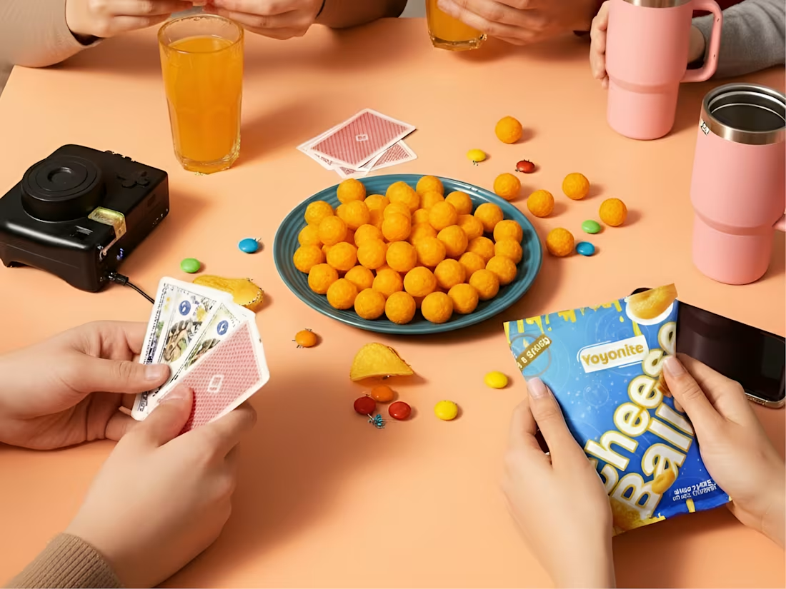
Cheese Balls Snack Packaging Design Project
0
7
Hey guys, check out this website I built using python, django and js for the frontend animation.
This is Nikita Global Realty website, here is the perfect site to get your property, be it US, Nigeria or Ghana, they are the one call to get you that property.
2
227
Brand Identity Design for Nexora (AI Automation App)
I led the brand identity design for Nexora, an AI automation app built to help businesses streamline workflows, reduce manual tasks, and scale efficiently using artificial intelligence.
Project Focus
The goal was to create a clear, modern, and trustworthy brand system that communicates innovation, speed, and intelligence—while staying simple and functional for a tech-driven product.
What I Delivered
Brand Strategy
Defined Nexora’s brand positioning in the AI automation space
Clarified brand values: efficiency, intelligence, reliability, and scalability
1
289
I reimagine iconic Pepsi campaign of two years ago ("All the Best Moments are Better With Pepsi (https://www.youtube.com/watch?v=7oBZ8sBjdyQ&pp=ygUeaWNvbmljIGJyYW5kIGhvbGlkYXkgY2FtcGFpZ25z0gcJCU0KAYcqIYzv)") which have 5.3 million views in YouTube, I use @Descript for the image, video and its voiceover, campaign is now in a whole new level.
1
3
345
Freelance OS
Streamlining the Future of Freelancing
The Modern Freelance OS is a sleek, Webflow-built workspace designed to help freelancers manage everything in one place — projects, proposals, clients, and payments.
Built for the Webflow Challenge, it blends minimal UI with powerful structure, creating an all-in-one ecosystem inspired by productivity tools like Notion and Contra.
From client dashboards to task timelines, every interaction is optimized for clarity, control, and modern workflow efficiency.
It took me just 2 days to design and build this project from scratch — and I’m genuinely proud of how it brought out the beast in my creativity. This project reminded me how limitless Webflow can be when creativity meets purpose..
check it out https://webflow-course-d1a81e.webflow.io/
2
2
372
@Lovart AI is really a powerful tool for brainstorming, it will help you align the Brand thread to it minimum for you to edit with a 100% focus. You just need to feed it your mood board, after the brand thread, then you make sure it understand the tone and the focus of the brand, if possible feed it your rough pen down and just like that it will take you in a smooth journey to a concentrated design.
2
262
Reel is a Paris-born coffee brand built around one idea — coffee connects humans.
Every cup is more than a drink; it’s a moment of shared energy, stories, and creativity.
Our brand identity reflects that: warm tones, minimal design, and typefaces that express movement and togetherness.
Reel’s mission is to pour more than coffee, we pour connection.
Designed and developed by me as a concept brand identity project blending French sophistication with modern social warmth.
#BrandIdentity #CoffeeBrand #ParisDesign #ContraCreative #LogoDesign #MinimalBranding #HumanConnection😍
2
3
363
Nikita Global Realty approached me after discovering my work on X (formerly Twitter). Initially, the project began as a website design request, but I quickly realized that the brand lacked a visual foundation — no identity, no consistency, and no voice.
As a newly established company operating from Texas, USA, with properties spanning Nigeria and Ghana, Nikita needed more than just a website. They needed a global identity — one that could communicate trust, sophistication, and cross-border accessibility to international investors and homeowners.
And this is what I turn her brand to.
1
283
Just wrapped up my latest illustrated book cover design — a mix of mood, story, and character brought to life through color and composition.
I love turning stories into visuals that make readers feel before they even open the book.
If you’re an author or publisher looking for a cover that truly represents your story, I’d love to collaborate.
4
2
317
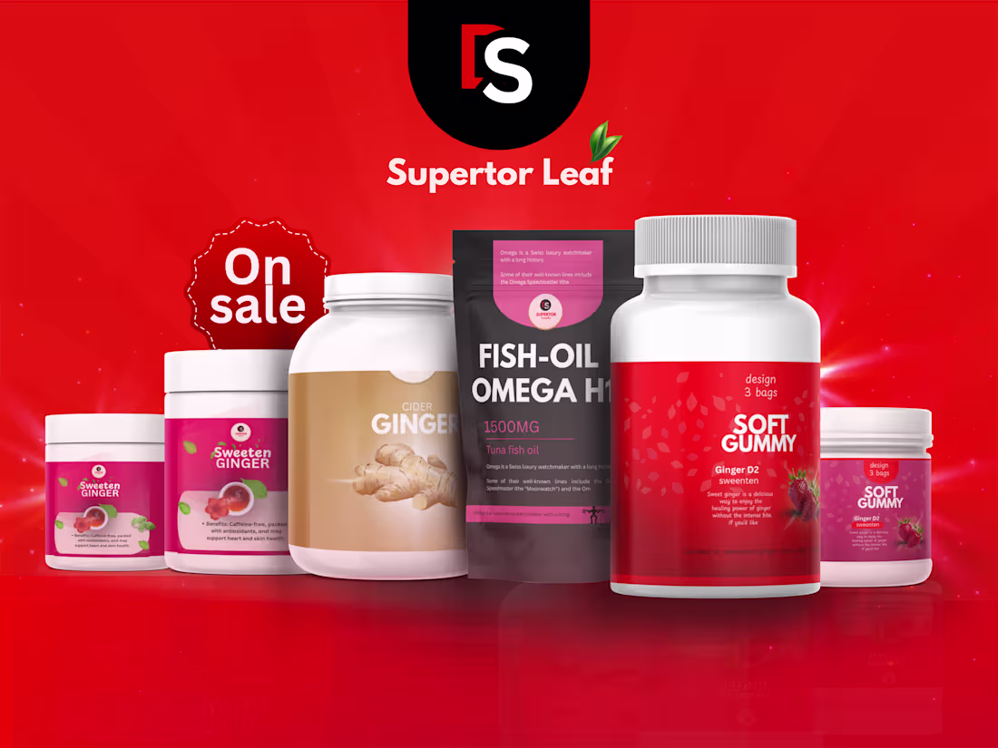
I designed the packaging for Supertor Leaf, a health care brand that blends the power of nature with modern wellness science.
My goal was to create a visual identity that feels clean, trustworthy, and refreshing, something that reflects the brand’s natural roots while standing strong on the shelf.
Every color, texture, and element was chosen to communicate purity, vitality, and balance, aligning with Supertor Leaf’s mission to make wellness simple and natural.
Packaging Design | Health & Wellness Branding | Modern Natural Aesthetic
1
269