
Victor Omolasoye
UI/UX & Brand Designer | Building Trust Through Design


Project Description
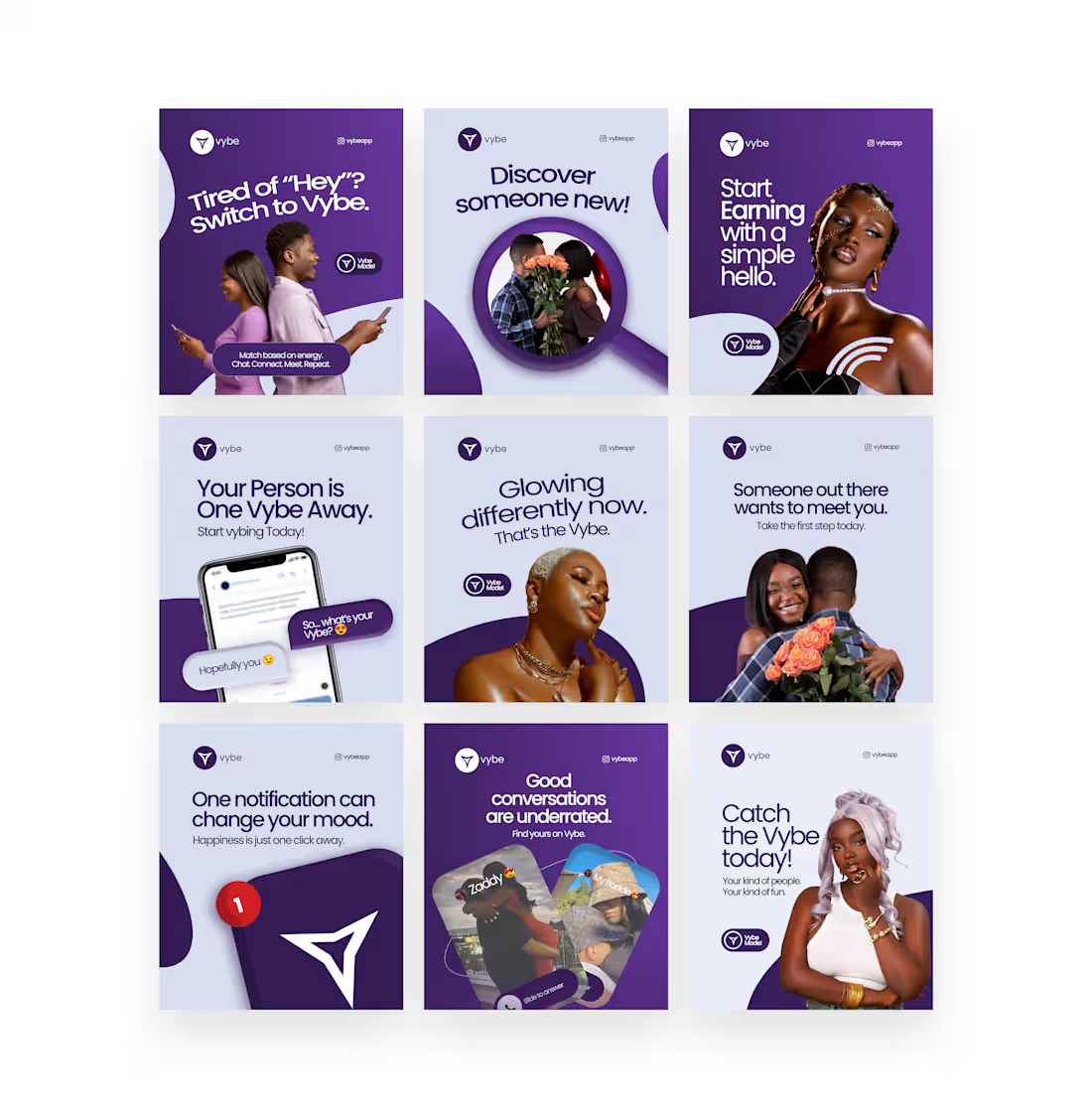
This project involved the creation of a 9-grid visual strategy for Vybe, a social networking application designed to foster meaningful connections through shared interests and "energy." The campaign focuses on moving past superficial digital interactions by highlighting the platform’s unique value proposition: matching based on "vibes" rather than just traditional profile metrics.
Key Features
Visual Identity: Leveraged a bold, monochromatic purple palette to establish a strong brand association with creativity, mystery, and modern social tech.
Narrative Design: Crafted a series of relatable "pain points" (e.g., being tired of generic "Hey" messages) and positioned Vybe as the solution for more intentional communication.
Key Design Elements:
Layered Imagery: Combined lifestyle photography with stylized graphic masks and 3D UI elements to bridge the gap between human connection and digital interface.
Typography: Utilized a clean, geometric sans-serif font for high impact and readability, paired with conversational copy to lower the barrier for new users.
Monetization & Incentives: Integrated specific messaging regarding "Start Earning," hinting at the app's creator or reward-based features within the ecosystem.
Strategic Layout: The grid is designed to be viewed both as individual posts and as a cohesive "brand wall," using consistent wave motifs and recurring "Vybe Model" badges to create visual rhythm.
0
38
Carthena Ledgers Brand Identity & Digital Marketing
Project Description
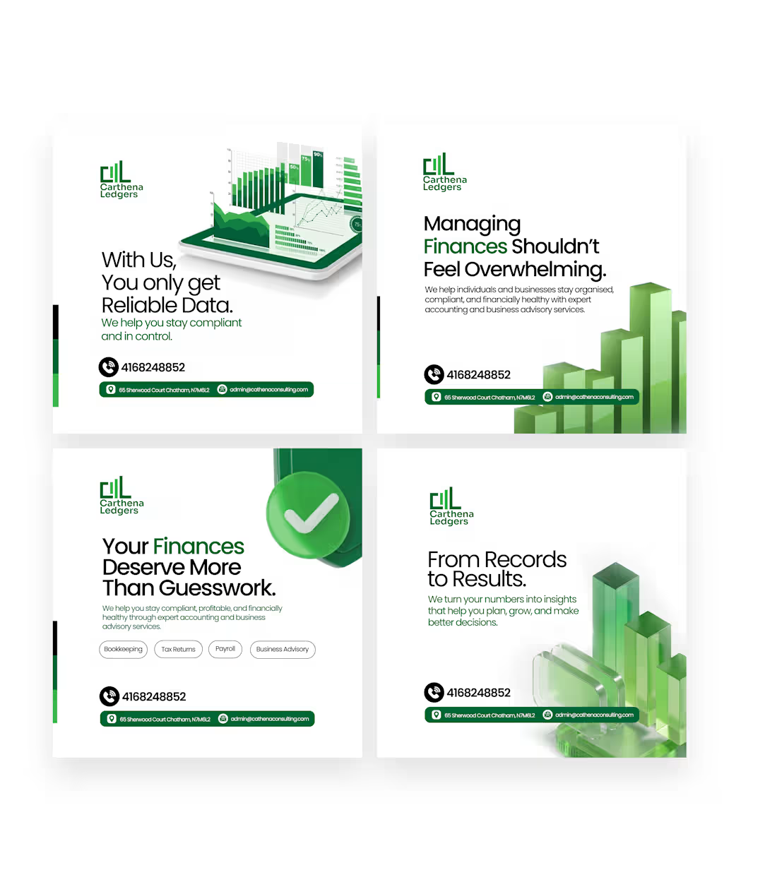
This project involved developing a cohesive social media visual system for Carthena Ledgers, a professional accounting and business advisory firm. The primary objective was to position the brand as a reliable partner that simplifies complex financial data into actionable insights. The campaign targets small to medium-sized enterprises (SMEs) and individuals seeking compliance, organization, and financial health.
Key Features
Corporate Visual Language: Utilized a sophisticated green-and-white color palette to symbolize growth, stability, and financial prosperity. The use of a subtle logo-patterned background adds a premium, "watermarked" feel to the assets.
Data Visualization Aesthetics: Incorporated high-quality 3D glass-textured charts and bar graphs to visually represent "results" and "growth," bridging the gap between abstract accounting and tangible business success.
Strategic Messaging: Focused on emotive copywriting that addresses common client pain points, such as feeling "overwhelmed" or relying on "guesswork," and offering "Reliable Data" as the solution.
Functional Layout Design:
Clarity: Maintained a clean, minimalist layout with generous white space to reflect the brand's promise of "organization."
Accessibility: Created a standardized footer for contact information, ensuring that phone numbers, addresses, and emails are consistently placed for immediate lead generation.
Service Tagging: Integrated pill-shaped tags (Bookkeeping, Tax Returns, Payroll, etc.) to quickly communicate the breadth of services without overwhelming the viewer.
0
35
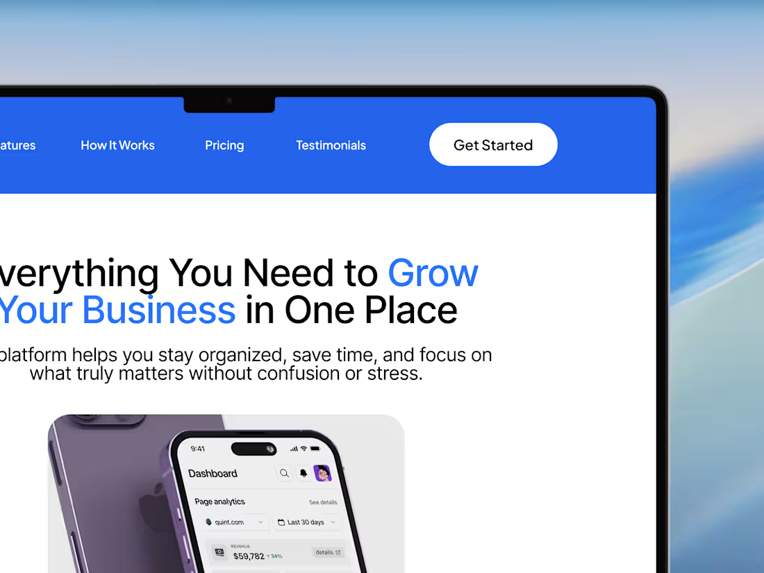
This project showcases a modern, conversion-focused landing page designed for a productivity and business management platform. The goal was to create a clean, intuitive interface that clearly communicates value while guiding users toward action.
The design emphasizes clarity, structure, and visual hierarchy—using bold typography, calming blue tones, and well-spaced sections to improve readability and engagement. From the hero section to pricing and testimonials, every element is crafted to build trust and drive conversions.
Key Highlights:
Clean and modern UI with strong visual hierarchy
User-centered layout focused on clarity and ease of navigation
Strategic use of color to highlight actions and key messages
Well-structured sections: Hero, Features, How It Works, Testimonials, and Pricing
Mobile-inspired visuals to reinforce product usability
This concept demonstrates how thoughtful design can simplify complex workflows and present them in a way that feels accessible, organized, and effective.
0
39
Social Media Design
0
0