Omkara raut
Skilled in turning ideas into professional visuals that conn
Ready for work
Omkara is ready for their next project!
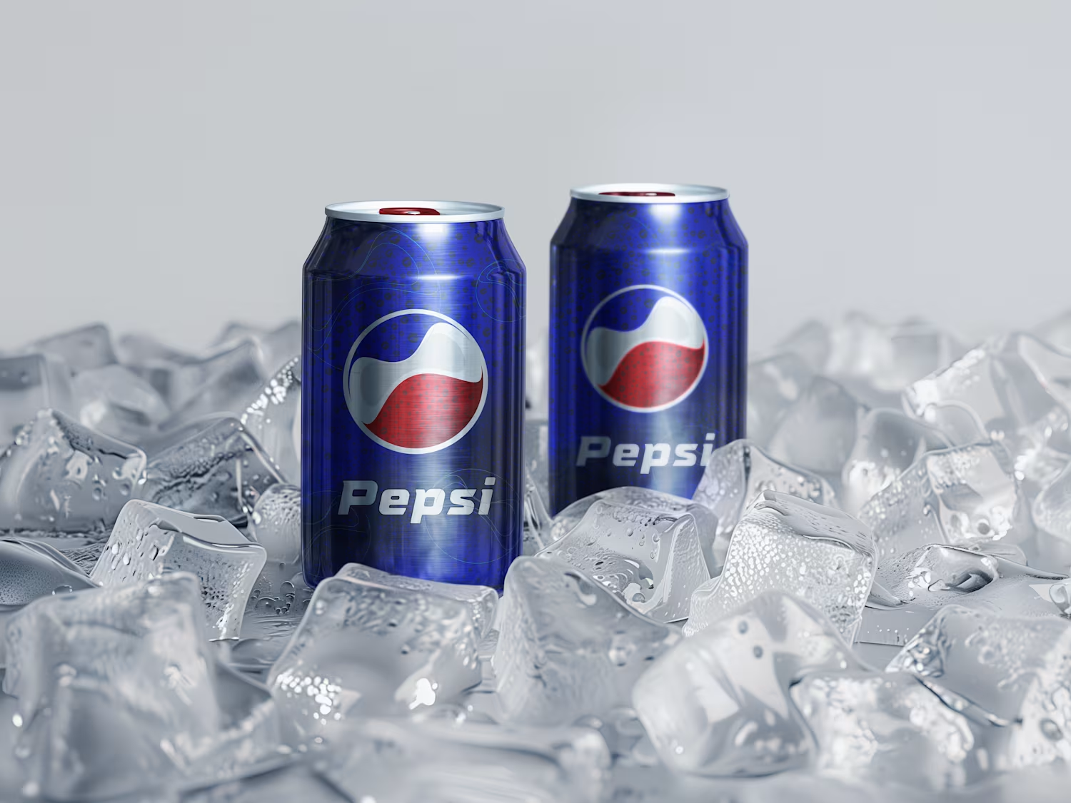
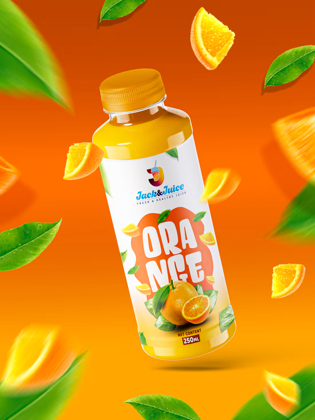
This is a vibrant and modern juice branding project for Jack & Juice, focused on creating a fresh, energetic, and premium visual identity.
The design uses bold, fruit-inspired color palettes—orange for the citrus flavor and purple for blueberry—to instantly communicate taste and freshness. The floating fruits, leaves, and dynamic bottle angles add motion and liveliness, making the product feel refreshing and natural. Clean typography and minimal label layout keep the branding modern and easy to read, while the logo placement ensures strong brand recall.
Overall, the project highlights a fresh, healthy, and eye-catching beverage brand that stands out on shelves and appeals to a young, energetic audience.
1
59
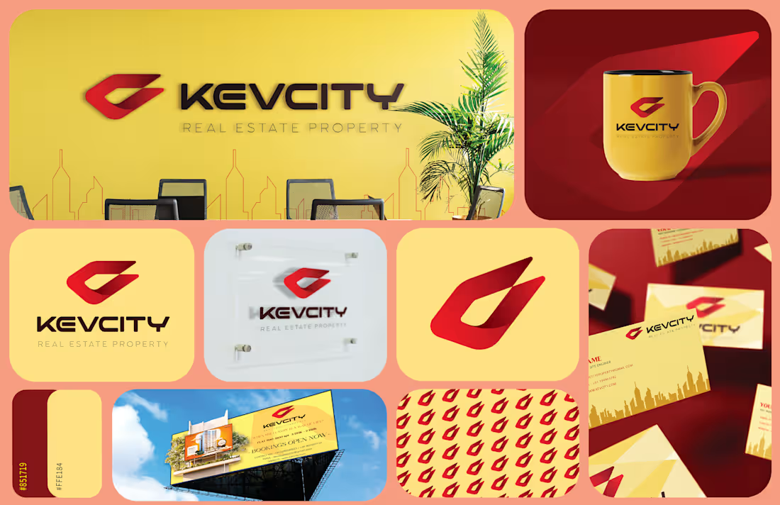
This project is a complete brand identity design for a real estate company called KEVCITY – Real Estate Property. It showcases how a brand is built visually and applied consistently across different touchpoints.
🔶 Concept & Branding
The core idea behind this project is modern, bold, and premium real estate branding.
The logo symbol (abstract “K” mark) feels dynamic and architectural, hinting at buildings, growth, and movement.
The sharp edges and forward-leaning shape communicate progress, trust, and development—key qualities in real estate.
🎨 Color Strategy
The color palette is very intentional:
Yellow/Gold → Represents prosperity, positivity, and investment value
Red/Orange Gradient → Adds energy, strength, and attention-grabbing appeal
Dark tones (brown/black) → Provide balance and professionalism
This combination makes the brand feel both approachable and premium, which is ideal for property marketing.
🧩 Brand Applications (What’s Included)
This project is not just a logo—it’s a full identity system:
Office Branding (wall logo, interior setup)
Merchandise Design (branded mug)
Stationery (business cards, letterheads)
Outdoor Advertising (billboard design)
Pattern Design (repeating logo for brand texture)
These mockups show how the brand works in real-world scenarios, ensuring consistency across all platforms.
🏙️ Visual Style
Clean typography with strong spacing → gives a corporate and trustworthy feel
Subtle skyline illustrations → reinforce the real estate theme
Minimal clutter → keeps focus on brand identity
💡 Overall Impression
This is a well-rounded branding project that demonstrates:
Strong logo concept
Consistent visual identity
Practical application across marketing materials🔥
0
50
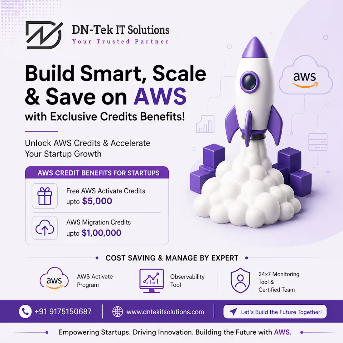
New Project Work with IT Solution Company is based in Londan, The Company Name is DN-Tek IT Solutions thanks to give me this amazing project😍
1
81
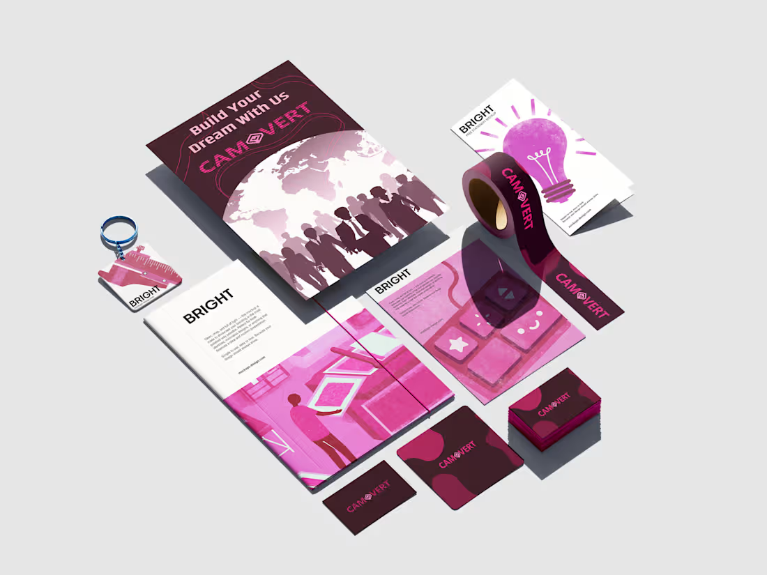
CAMOVERT communication BPO Company Brand Logo
Logo Format is shows minimalist +wordmark +symbolic formation in Pink combination with showcase in stationary mockup and client was so satisfied with this design😊
1
67