
Oleh Dennis | Brand Designer
Affordable, High-Quality Brand Identity & Marketing Designer
Ready for work
Oleh Dennis is ready for their next project!

Feed layout comparison 👀
Which one works better visually?
3 voted
33%
6 voted
67%

9 votes
Closed
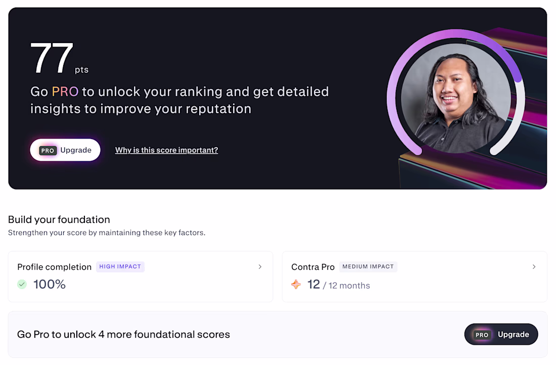
How’s your discovery score so far?
Mine is currently at 77 pts — curious if that’s considered normal here.
I’m still figuring out the best way to land my first client on Contra, especially given my current situation and positioning.
For those who’ve been around longer:
– Did...

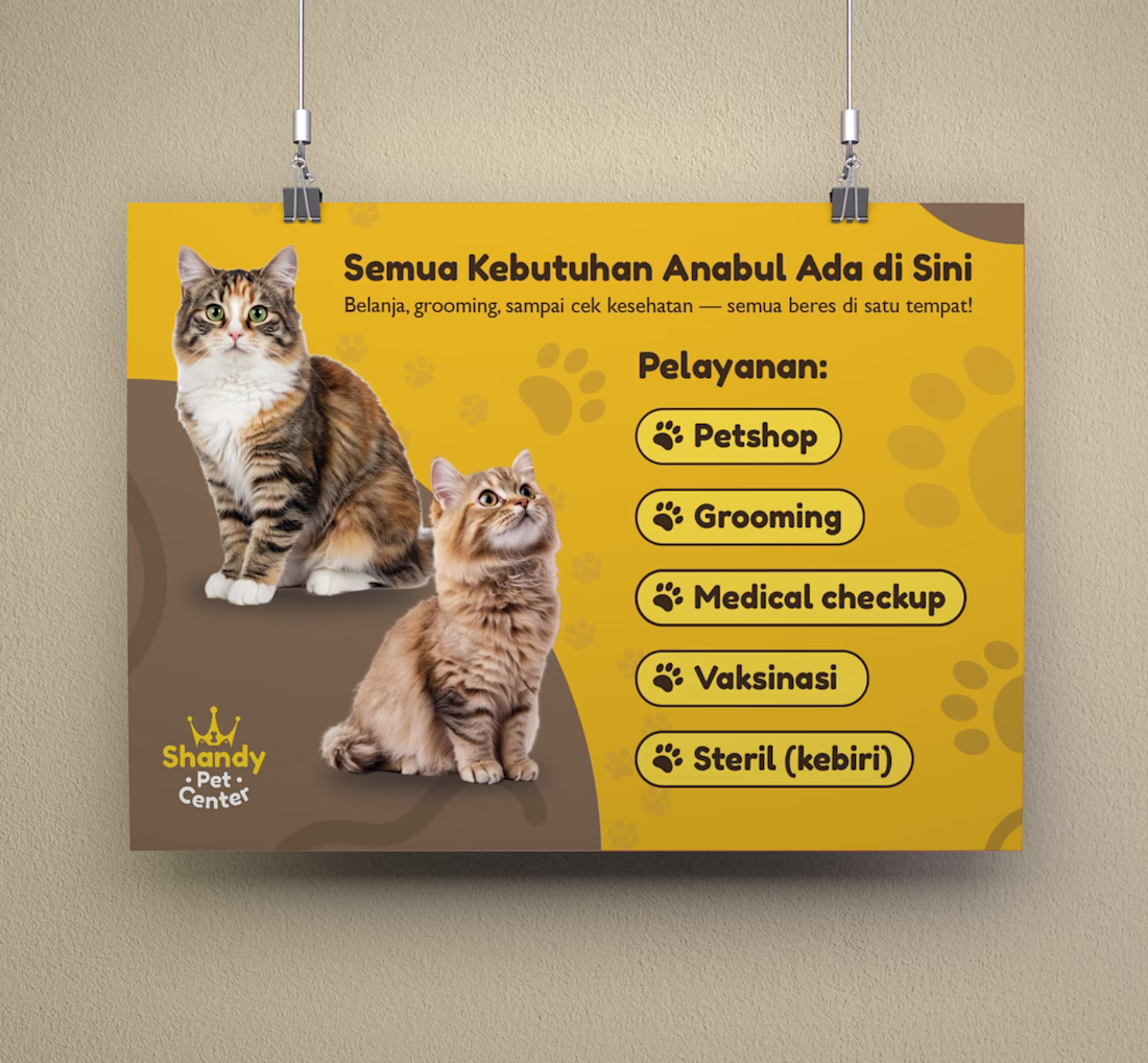
Service poster design for Shandy Pet Center.
Focused on clarity, layout hierarchy, and readability.
What part stands out to you the most?
Is there anything you would improve?


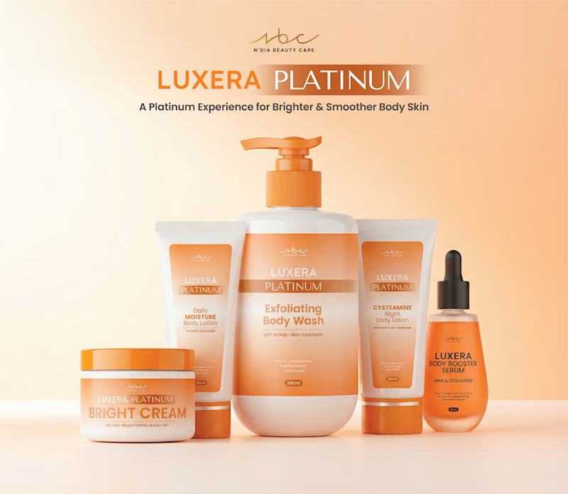
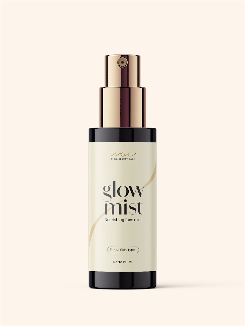
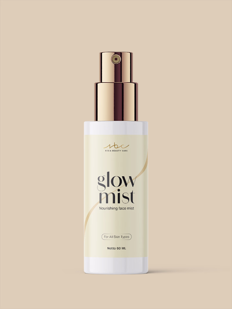
I’m exploring two visual directions for this concept. Same label applied to the same bottle, with two color options.
Which one works better for you — A or B?
Let me know why in the comments 👇
3 voted
75%
1 voted
25%
4 votes
Closed
First time using Jitter to add simple motion to bento grid brand identity design. The layout and design were created in Adobe Illustrator, then brought into Jitter for subtle motion.
This project showcases a Logo & Brand Identity design for Shandy Pet Center, presented in a...