Oleh Urazovskyi
Logo & Brand Identity Designer
New to Contra
Oleh is ready for their next project!
Ink | A Logo that breathes. 🌊
In this project, I explored the intersection of geometric precision and organic chaos. The bold serif logo acts as a solid anchor, while the fluid motion of the ink clouds adds volume and a sense of constant evolution.
My goal was to create a high-contrast brand logo and visual identity that feels both structured and limitless. This is where minimalist logo design meets the raw energy of the creative process.
3
28
My Personal Logo
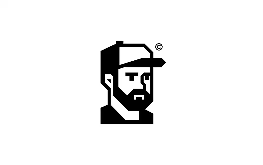
A personal mark built around geometry, reduction, and character.
The symbol transforms a portrait into a bold, structured icon. Every angle is intentional, reduced to the essential while keeping personality intact.
For me, strong identity design is not about decoration; it’s about recognition, confidence, and memorability. This mark reflects the same philosophy behind my work: simple forms, bold silhouettes, and timeless structure.
Minimal. Sharp. Recognizable.
0
33
JobRig Logo Design
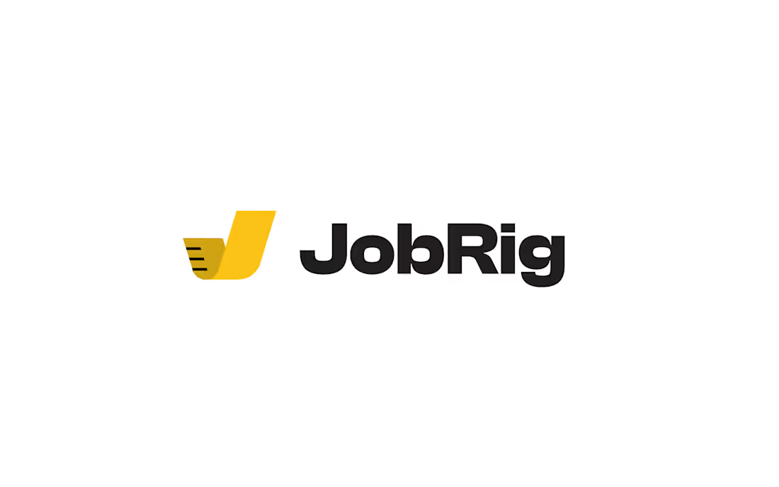
The symbol combines three ideas within a single simple form.
The primary shape is based on the letter J, creating a direct connection to the JobRig name.
The yellow element references a measuring tape, one of the most universal tools used across construction trades, representing accuracy, planning, and practical problem-solving.
The overall silhouette creates a subtle sense of forward movement and completion. Its dynamic upward form suggests progress from planning and measurement to finished work, while also hinting at a check mark: a quiet reference to confidence, reliability, and getting the job done right.
Together, these elements reflect JobRig’s mission: a simple, dependable tool that helps tradespeople stay organized, work efficiently, and complete jobs with confidence.
0
36
JobRig Logo Design
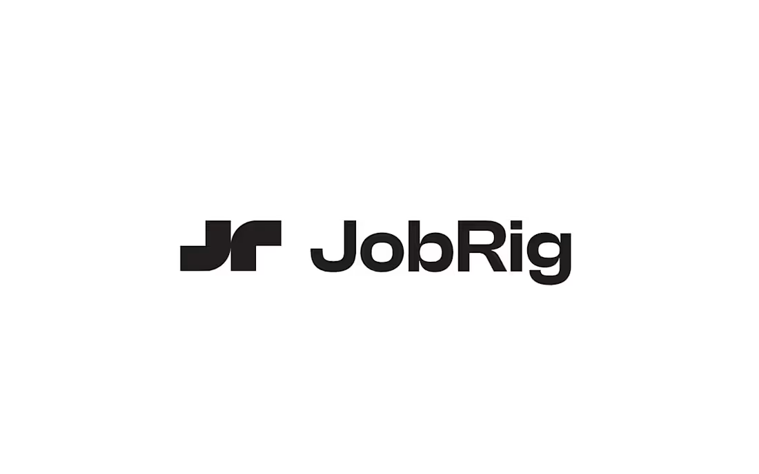
The symbol combines the initials J and R into a single, recognizable mark. Its interlocking forms reflect the connection between planning and execution: a core idea behind JobRig. The bold geometric construction creates a sense of structure, reliability, and organization while remaining simple, memorable, and highly effective as an app icon.
0
40
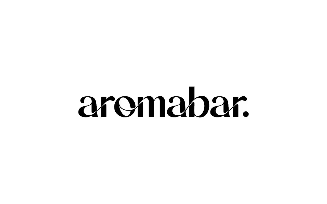
Aromabar Logo Design
A fragrance cannot be seen, but it can be felt. That is why it is represented in the logo as a flowing line that runs through the entire wordmark. It creates a sense of movement, lightness, and continuity, reinforcing the brand’s core idea—fragrance as an emotion that accompanies a person from the very first note to the lingering final trail.
0
45