
Emmanuel Olaleye
Detail-Oriented Designer, Wix, Wordpress, Squarespace expert


Project Title
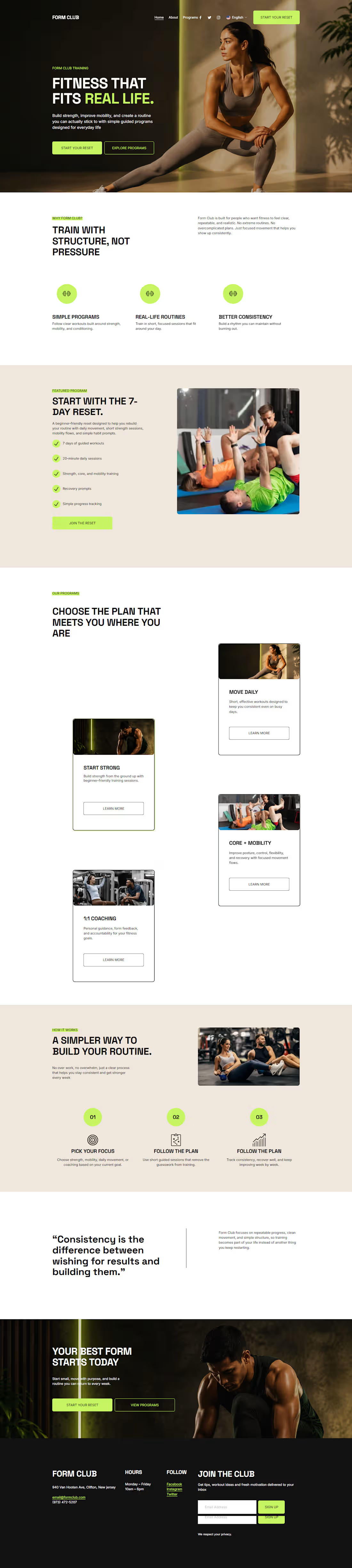
Form Club: Fitness That Fits Real Life
Website Link
Website URL: https://dodecahedron-pike-2p5h.squarespace.com/
(https://dodecahedron-pike-2p5h.squarespace.com/)password: Formclub2026
Social Post Link
https://www.instagram.com/p/DbKa1VtIeWQ/?igsh=MzhnbXI2a3ppc3g4
Project Description
Form Club is a modern fitness brand homepage built with Squarespace for the Make It Real Challenge. The concept is centered around one clear idea: fitness should fit real life.
The homepage introduces a clean, premium fitness experience for people who want simple, structured, and realistic training. It highlights the main offer, The 7-Day Reset, along with program previews like Start Strong, Move Daily, Core + Mobility, and 1:1 Coaching. The goal was to make the brand feel polished, approachable, and ready to launch from a single focused homepage experience.
The design uses a strong visual system with deep charcoal, warm off-white, energy lime accents, bold typography, premium fitness visuals, and clear calls to action. I also enabled multilingual support to make the site more accessible for a global audience.
Finish Layer / Squarespace Design Tools Used
I used Squarespace’s built-in design tools and Finish Layer features to make the homepage feel more custom and polished. This included:
Subtle block animations for key sections and calls to action
Layered visual elements in the hero and featured program areas
Transformed floating cards to create depth and movement
Mobile layout adjustments to keep the homepage responsive and readable
Consistent typography and color styling across the full page
These details helped turn the idea into a polished, functional, and globally accessible fitness brand homepage.
Key Design Decisions
The homepage was designed as a focused one-page brand experience. I used a clear structure so visitors can quickly understand the brand, explore the main program, and take action.
Key decisions included:
A bold hero section with the message “Fitness that fits real life.”
A featured program section for The 7-Day Reset
Program cards to make the brand feel complete and functional
A simple “How It Works” section to improve user experience
A final call-to-action section to guide visitors toward starting their reset
A multilingual setup to support a broader audience
Video Walkthrough Link
https://www.awesomescreenshot.com/video/54888659?key=3b86350c7dee6fa5ab8b9b563de33f32
(https://www.awesomescreenshot.com/video/54888659?key=3b86350c7dee6fa5ab8b9b563de33f32)
2
179
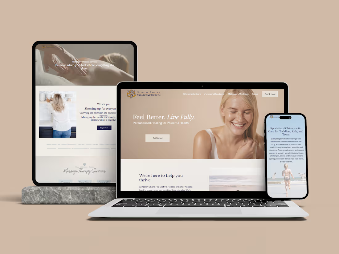
Chiropractic Health Clinic Website Redesign
1
10
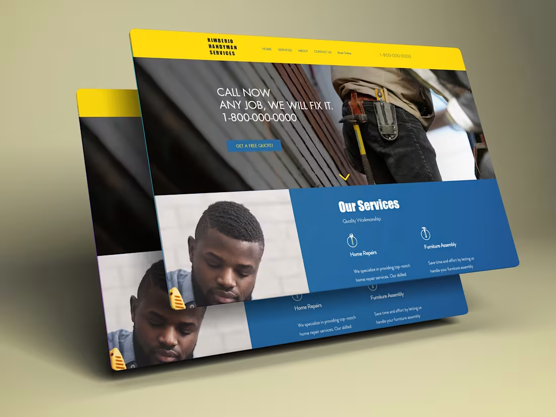
Wix Handyman website
0
5

Logistics website | Wordpress transport agency website
0
5