
Josephat Obare
Web designer & developer using Figma and Framer
Ready for work
Josephat is ready for their next project!
Day 5 🏗️ of #FramerBuild — Swiss/Grid Hero Section
The constraint was simple: no images, no decoration, no gradients. Typography only. Every element has to justify its presence on the grid.
The Swiss International Typographic Style is built on the idea that good design is...
Day 3 🏗️ of #FramerBuild — Pricing Card
Glassmorphism but not soft. Cold, surgical, neon-lit.
Three tiers. The featured card lifts off the grid with a scanline overlay and neon bloom. Toggle switches monthly to annual with a counting animation. HUD corner brackets reveal on hover.
Style: Glassmorphism × Neon Brutalist
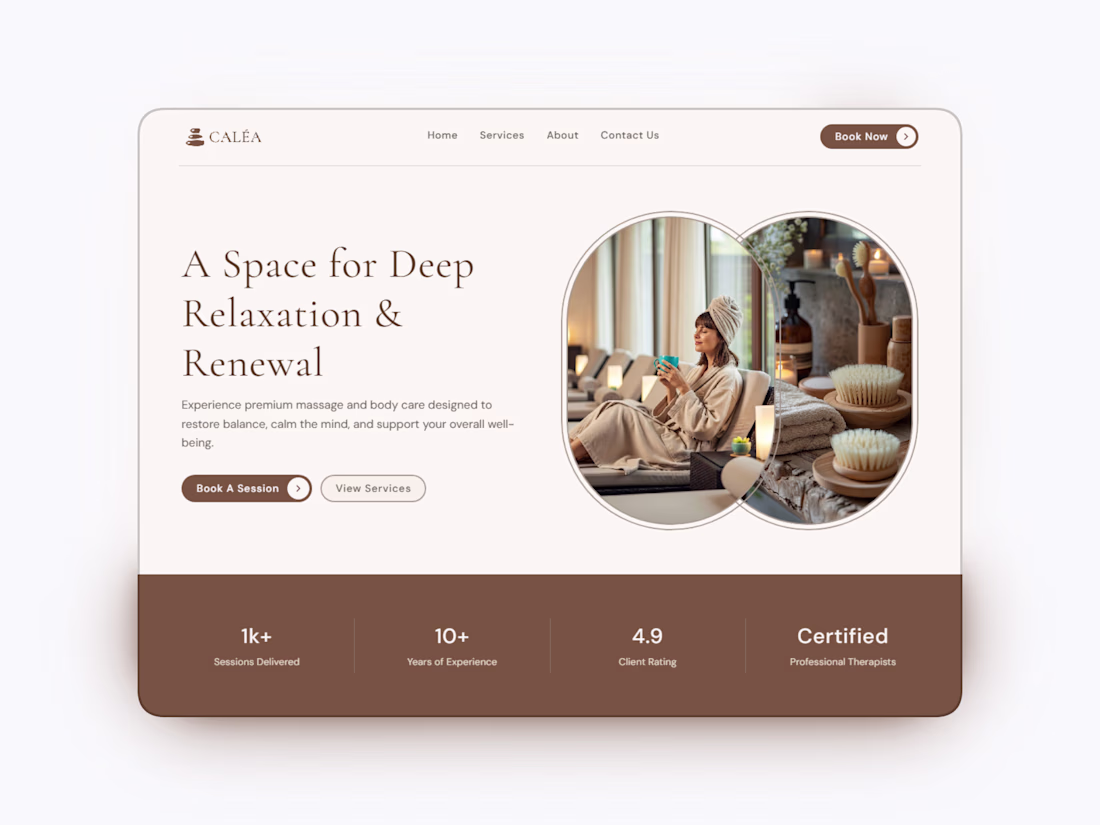
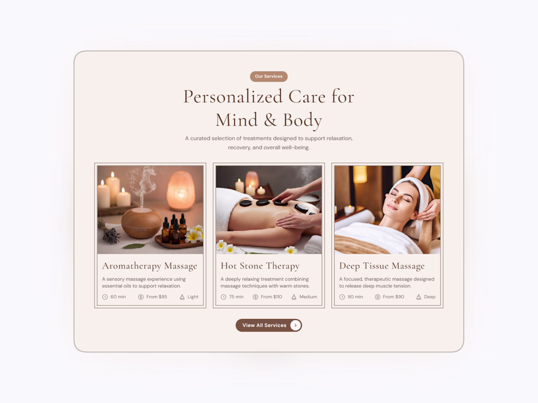
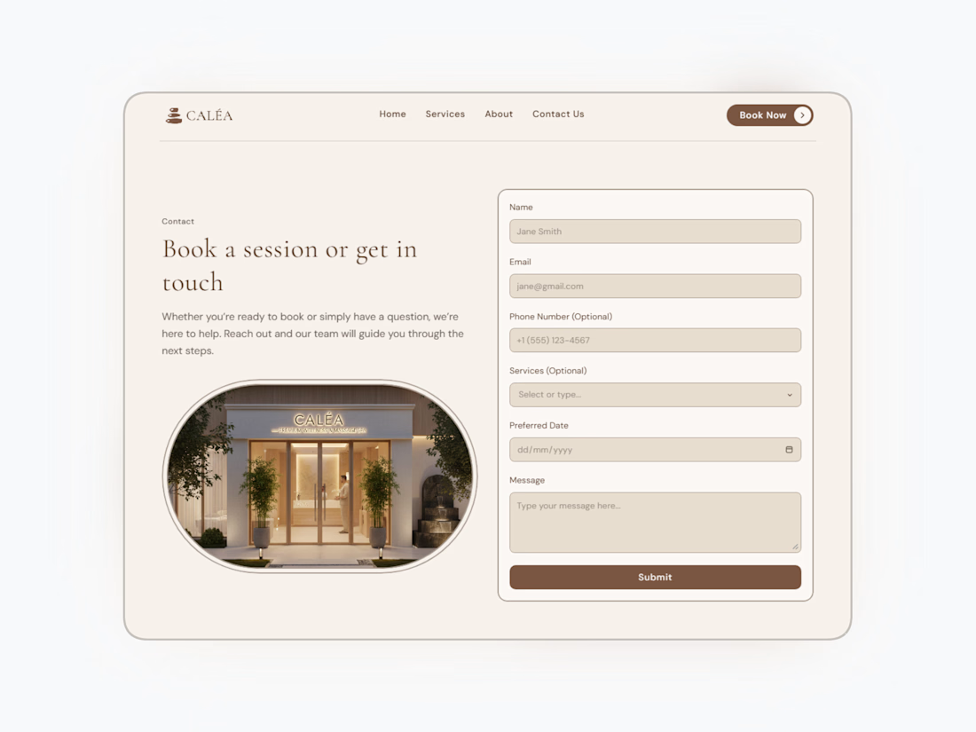
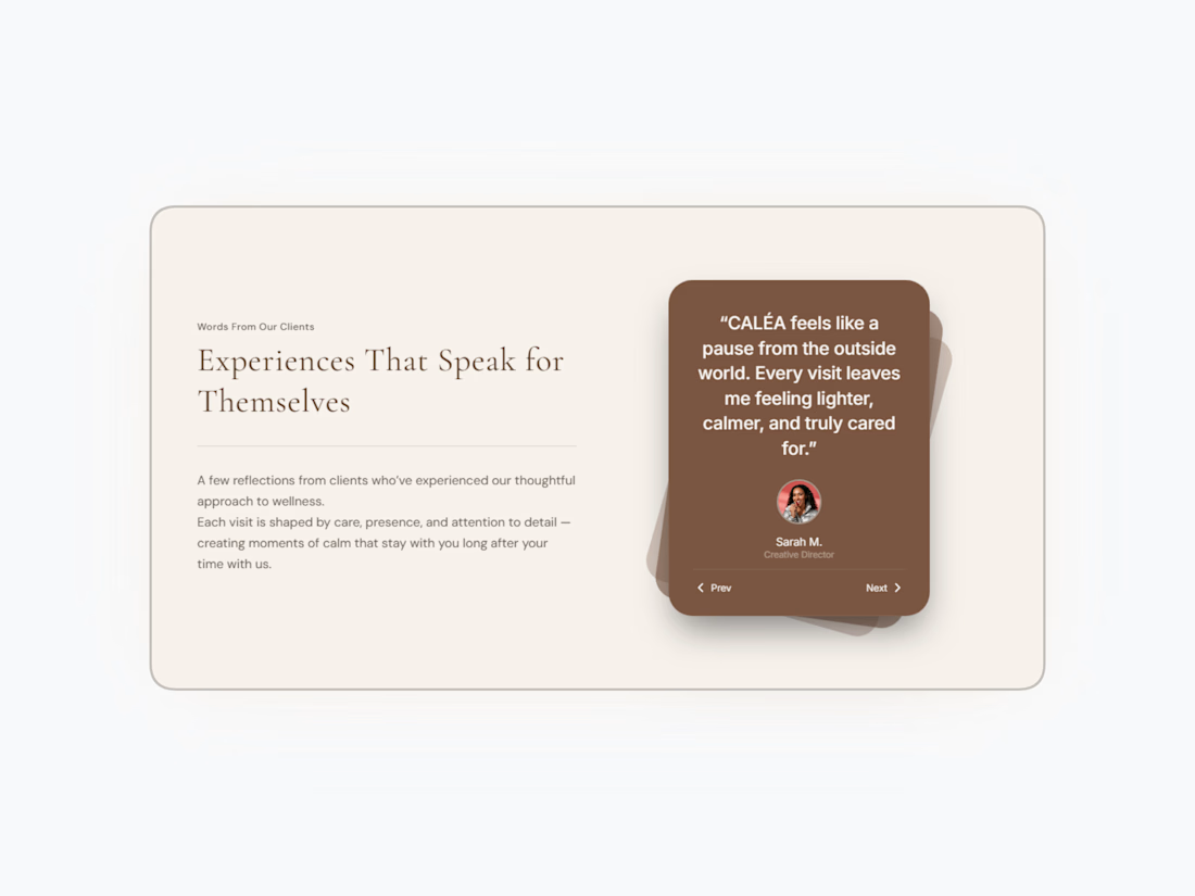
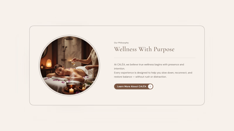
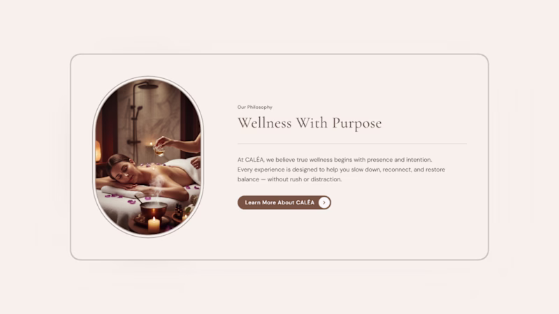
Preview of CALÉA — a wellness & spa website template I’ve been designing and building in Framer.
Focused on calm layouts, CMS-driven services, and easy customization. More coming soon ✨
🔗 Live preview: https://caleawellness.framer.website/
Refining a wellness brand's 'About' section in Framer. I'm torn between two image treatments for this feature card. Which layout feels more balanced and premium to you?
2 voted
67%
1 voted
33%
3 votes
Closed