
Felix Madaba
Brand identity designer. Bold visuals, lasting impact.
New to Contra
Felix is ready for their next project!
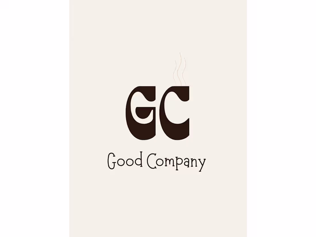
Brand identity for Good Company, a dog friendly lifestyle café concept. Developed a full visual system including logo mark, color palette, typography, and brand applications across print and merchandise. The mark integrates a hidden cup motif within the GC letter form warm, considered, and built to live on everything from a paper cup to a tote bag.
0
7
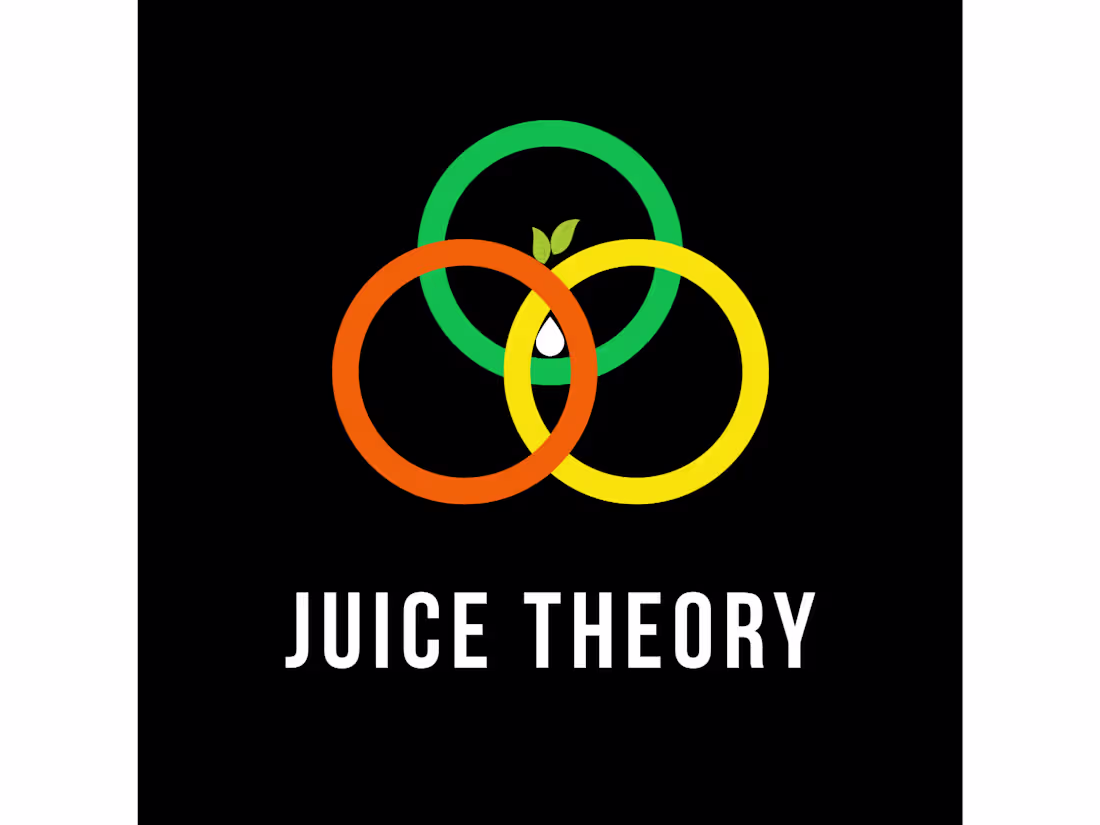
Juice Theory — Brand Identity
Juice Theory is a functional juice brand where every drink is built around a specific mood, benefit, or lifestyle a theory. The brief called for a complete brand identity that felt fun, bold, and health conscious without falling into the tired green and clean aesthetic that dominates the wellness space.
The Concept
The brand mark is built on three interlocking circles a Venn diagram representing the three ingredient blend philosophy at the core of every Juice Theory product. Where the circles meet, a leaf and water drop form the center mark organic life and pure liquid in one symbol. The theory isn't just a name. It's the logic behind every design decision.
Color System
The palette is split into brand colors and product colors. The main brand identity uses green, orange, and yellow energetic, warm, and fruit forward. Each of the four signature flavors carries its own three color system, visually distinguishing the range while staying within the brand's bold, saturated language.
Packaging
Four signature drinks. Four label systems. Each flavor Citrus Theory, Berry Theory, Tropical Theory, and Green Theory follows the same label architecture with swapped color stories. Dark background throughout, keeping the brand premium and the colors vivid.
Deliverables
Brand mark and logo system, color palette, four product labels, four bottle mockups, social media carousel, t-shirt and tote bag merch.
0
10
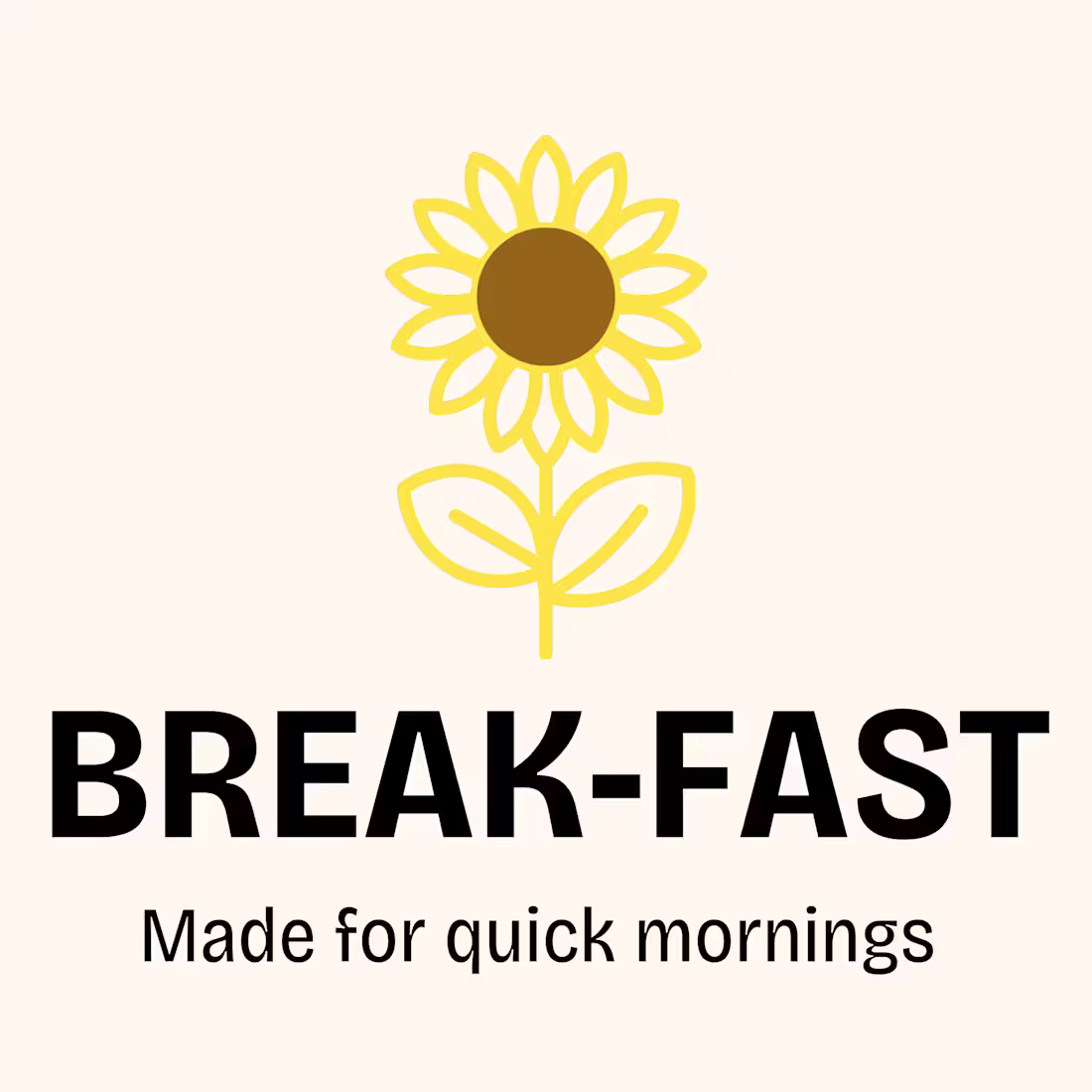
Developed a full brand identity for Break-fast, a yoghurt brand targeting Gen Z professionals who value aesthetics as much as flavour. Deliverables included a sunflower logo mark, custom wordmark in Bricolage Grotesque, and a three variant packaging label system spanning Strawberry, Mango, and Blueberry, each with a consistent cream base and unique flavour colour accent.
0
26
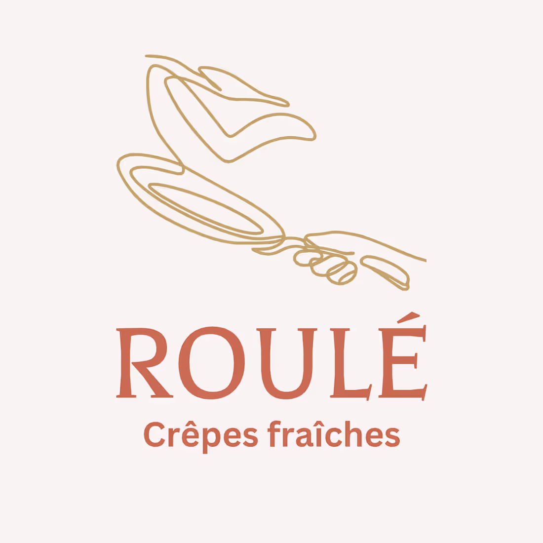
Starting with the brand brief, I developed a visual identity rooted in the core tension of ROULÉ, French heritage meets contemporary street food culture. The logo centres on a custom line art illustration of a hand tossing a crêpe, capturing the live craftsmanship experience that defines the brand. This was paired with a Balthazar serif wordmark in coral, with Crêpes fraîches as a supporting brand line in gold.
0
24
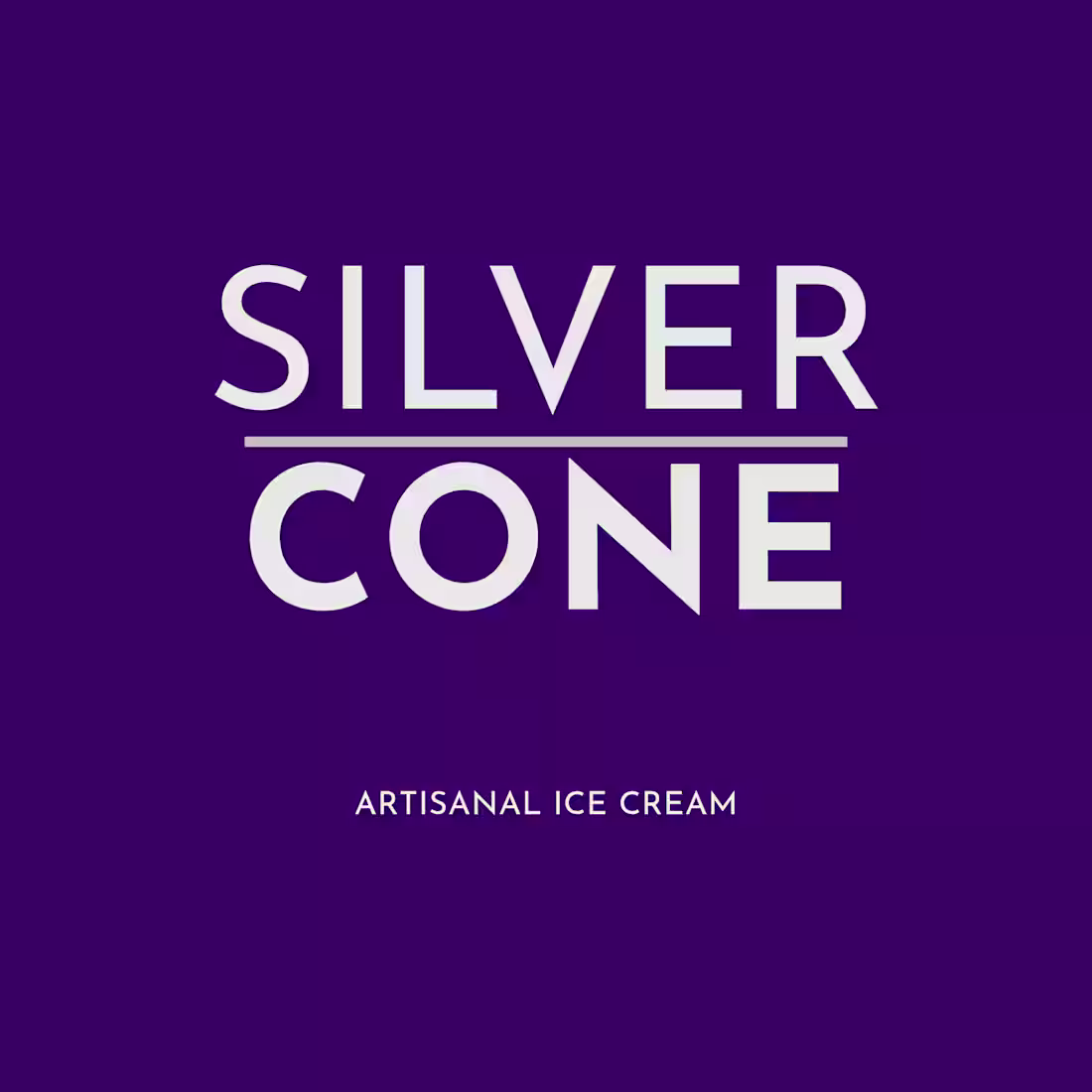
A modern artisanal ice cream brand built on indulgence and intention.
Imperial purple. Silver type. A name that earns its palette.
Wordmark · Brand Board · Packaging
0
18