
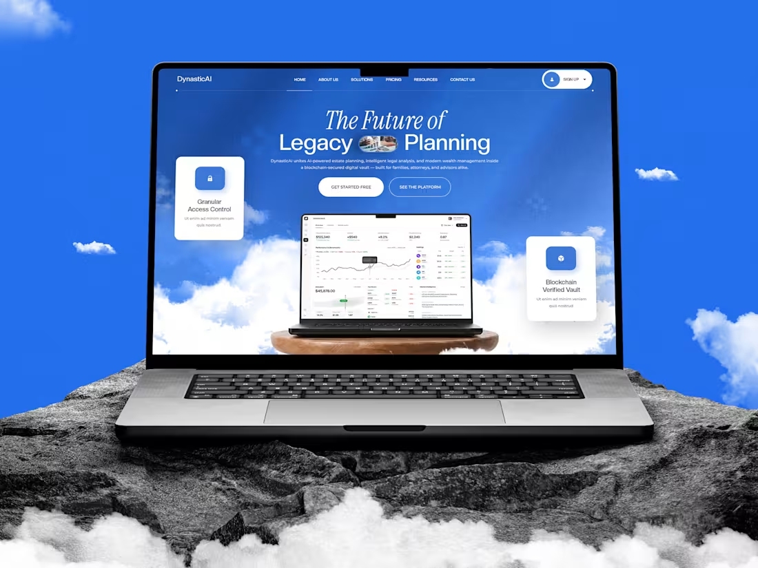
DynasticAI: FinTech Website Design Case Study
2
48
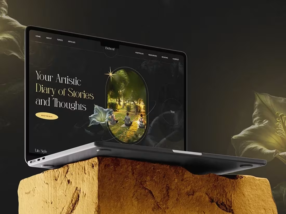
Behoof — Artistic Blog & Journal Website UI Design
Behoof is a UI design concept crafted for an artistic lifestyle and journaling blog — designed to feel like a moody, elegant "artistic diary" where stories, thoughts, and photography come together. The visual direction leans into a dark, cinematic theme with warm gold accents, elegant serif typography, and soft floral/nature textures that give the brand a poetic, editorial feel.
The homepage opens with a striking hero section pairing bold typography with a warm, glowing photo frame, followed by quick-access category tiles (Life Style, Mental Health, Advice). An About Behoof section builds a personal, storytelling connection, while a dedicated Authenticity block reinforces the brand's voice. A Latest Articles grid and an "Explore Thoughtful Pieces" section showcase content with rich editorial imagery, and a Photography & Cinematography showcase adds a strong visual/portfolio touch before closing with a newsletter sign-up and footer.
Design Highlights:
Dark, moody color palette with elegant gold highlights
Elegant serif + clean sans-serif typography pairing for an editorial feel
Strong use of circular/arched image framing for a artistic, gallery-like touch
Consistent grid system and defined color/font system for scalability
Fully designed mobile layout included
Clean, structured design ready for development handoff
Note: This is a UI/UX design deliverable only (design concept/mockup) — no development or coding included.
0
153
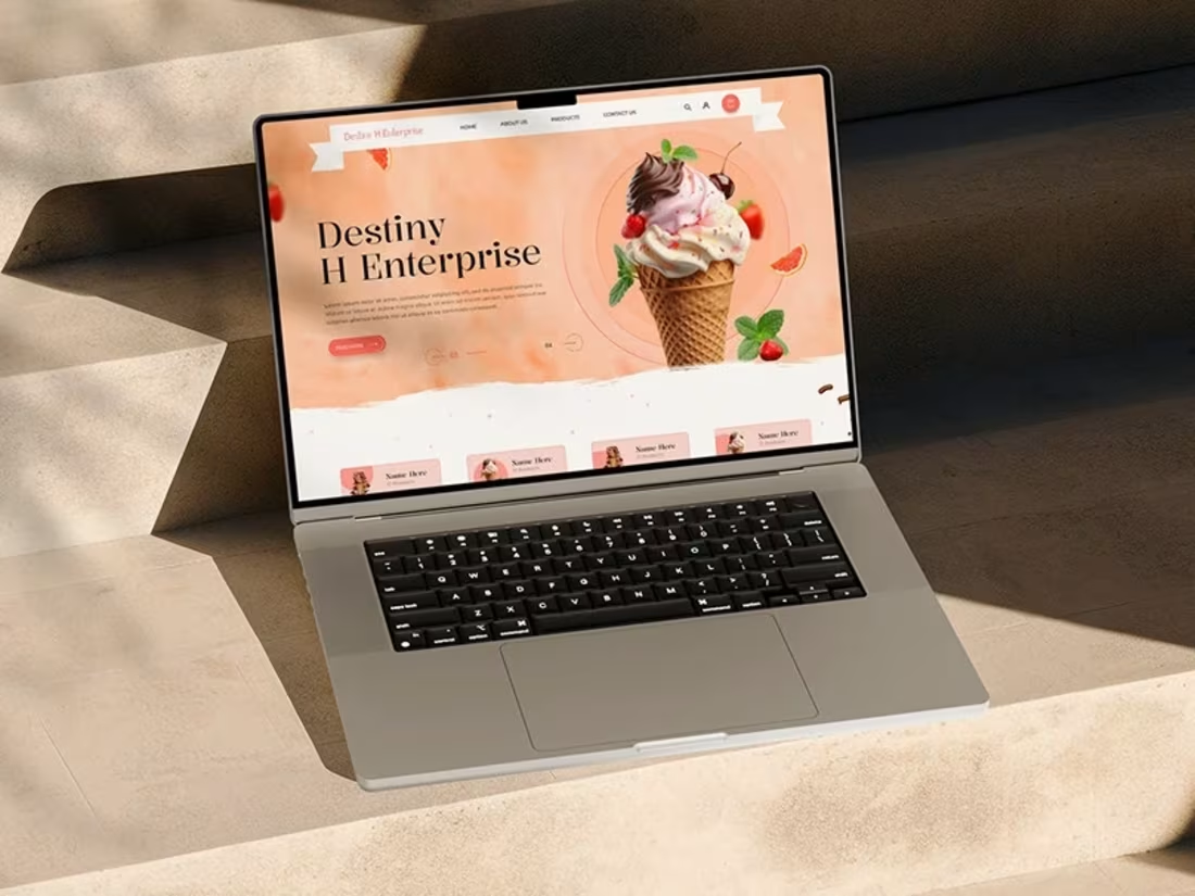
Ice Cream Website — UI Design
This is a UI design concept created for a fictional ice cream brand, Destiny H Enterprise. The project focuses purely on visual and interface design — layout, typography, color palette, and product presentation — crafted to give the brand a fun, warm, and appetizing online identity.
The homepage design includes a bold hero section with an eye-catching ice cream visual, category cards, a Featured Products showcase, and a full Our Products grid — each product card designed with image, price, rating, and quick-add icon for an easy browsing feel. An About Us section, a seasonal promotional banner, a Why Choose Us block, and a customer testimonial section were also designed to build a complete, trust-driven user journey down to the footer.
Design Highlights:
Warm, appetite-driven color palette (peach, cream, rich browns)
Consistent card-based layout across products and categories
Clear visual hierarchy from hero → products → trust → conversion
Clean, structured design ready for development handoff
Note: This is a UI/UX design deliverable only (design concept/mockup) — no development or coding included.
Thank you for viewing this project — feel free to connect with me on Contra for design collaborations and freelance work! 🍦
0
94
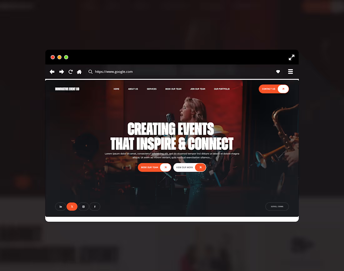
Event Agency Website UI/UX Design | Marketing & Staffing Company
0
93