
✨ Case Study: Giving a Local Spa a Digital Glow-Up
Most local spas still run on phone calls and DMs. So I rebuilt one — end to end.
Meet Séraya Spa → 🔗 https://seraya-spa-retreat.base44.app/
Built with @Base44 for the #GiveItAGlowchallenge. No code. Fully live.
Before: No website, no online booking — everything handled manually by phone.
After:
🌿 Luxury design — light + dark themes, cinematic scroll animations, mobile-first
📅 Real-time booking with live price configurator
🤖 AI Concierge — answers FAQs, recommends treatments, books them 24/7
📧 Automated confirmations, reminders & rebooking nudges
💬 One-tap WhatsApp flows
🗂️ Owner dashboard — every booking, lead & message lands in one place, ready to manage
Every automation replaces something the owner did manually.
🎥 Full walkthrough below (6 min) — the complete guest journey, how bookings flow into the dashboard in real time, the automations firing, and the full experience on tablet & mobile. Worth watching to the end.
Small businesses don't need bigger budgets — they need the systems big brands take for granted.
Run a spa, salon, or studio that deserves better? DMs open. ✨
#GiveItAGlow @Base44 #webdesign #freelance @Contra HQ @Contra
3
344
ONE MORNING. FIFTEEN SECONDS. NO SECOND CHANCES. @Renoise @Contra HQ
https://on.contra.com/zpJJLw
1
5
366
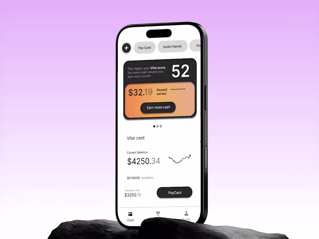
Design of Fynlo Fintech Rewards App
1
11
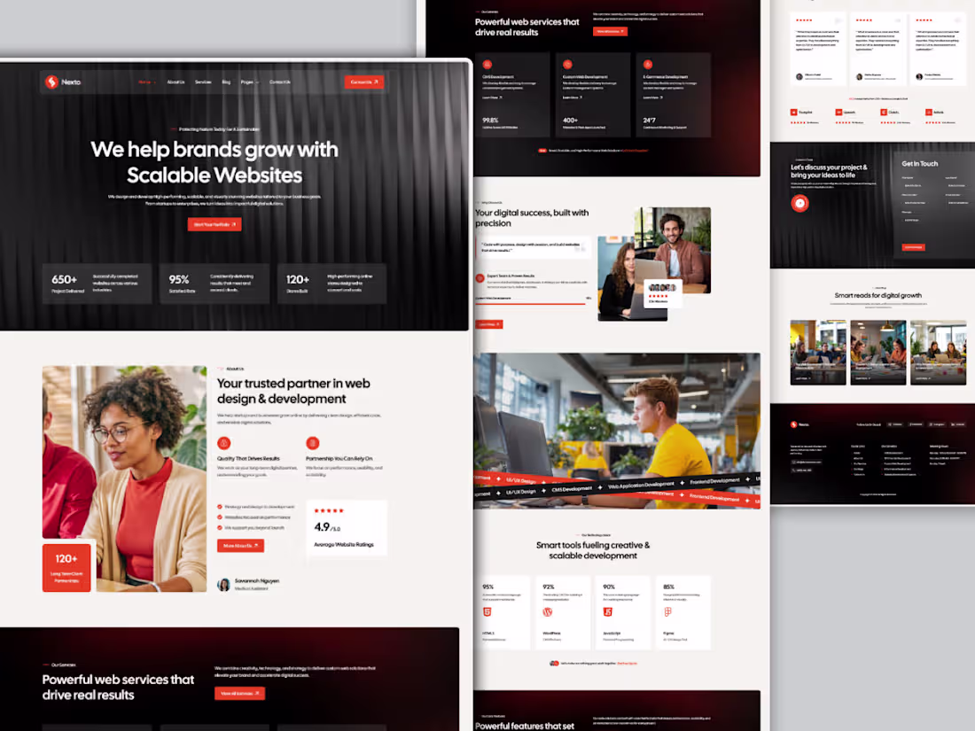
Nexto — Web Agency Landing Page🌐
Designing a bold, high-converting digital presence for a scalable web solutions brand
UI Design · Web · Agency · 2026
A web agency that helps brands grow with scalable websites — but the real challenge was making that promise feel credible the moment someone lands on the page. The design needed to do one job: turn visitors into clients, fast. 🎯
4
3
357
Proud to share my submission for the #configMakeathon 🦋
Design has one job — make people feel something before they think something.
For the #ConfigMakeathon, I built a complete digital campaign experience for Butterfly Conservation's "Britain's Favourite Butterfly" — taking a public vote and transforming it into something people actually want to be part of.
The challenge wasn't technical. It was human. How do you make someone genuinely care about a species they've never noticed? How do you turn conservation data into something personal? How do you design an experience that moves people from passive viewers to active participants?
The answer was architecture — three distinct experiences working as one:
🗳️ Results Explorer — A fully filterable species discovery system built around personality vibes, wing colours, and rarity. Not a leaderboard. A world worth exploring.
🧬 Personality Quiz — A matching experience that gives every user a butterfly identity rooted in real behavioural traits. Flashy. Feisty. Adventurous. Rare. When someone sees themselves in a species, the relationship changes entirely.
🌿 Conservation Narrative — A story-first approach to ecological data that earns its urgency rather than demanding it. The stakes land harder when you already have a favourite.
This is the kind of work I find most meaningful — where design isn't decoration, it's the strategy itself.
🔗 Prototype:Prototype (https://www.figma.com/proto/QYomw4hbRvnUu9D4gWN1hu/Untitled?node-id=1-668&t=7Qi822ZqT2xffB6I-0&scaling=min-zoom&content-scaling=fixed&page-id=0%3A1&starting-point-node-id=1%3A668)
Built with Figma · Figma Make · MCP
#ConfigMakeathon #Figma #UXDesign #ProductDesign #DesignForGood #ButterflyConservation @Figma @Contra @Contra HQ
337
405
17.5K
Your product launch, visualized like a NASA mission.
FlowCast is an AI-powered product launch command center built entirely with Google Stitch — designed for founders, growth operators, and startup teams who need real-time launch intelligence in one place.
5 fully animated, interactive pages:
Launch Dashboard — live metrics, animated score ring, momentum feed
Launch Countdown — cinematic timer with GO LIVE trigger
Audience Intel — world heatmap, persona breakdown, sentiment arc
Content Command — AI draft generator with viral score probability
Settings — profile, integrations, notification toggles
🔗 Live Prototype: https://flowcast-mission-control-507808598152.europe-west2.run.app/
How I used Stitch:
Started from a blank canvas. Used streaming generation to build all 5 pages, in-place AI edits to fix and animate components without breaking existing layouts, and native HTML canvas motion for all animations — arcs, count-ups, pulsing maps, ghost cursor, and ripple effects. Exported directly to a live deployment link.
What makes it different:
Every metric moves. Every number counts up. Every page breathes. FlowCast doesn't just show you launch data — it makes you feel the momentum.
47
99
10.4K
A sleek, futuristic landing page for PROP AI that visually represents human–AI collaboration through a cosmic-inspired design, emphasizing creativity, innovation, and limitless possibilities.
@Figma @Jitter
0
782
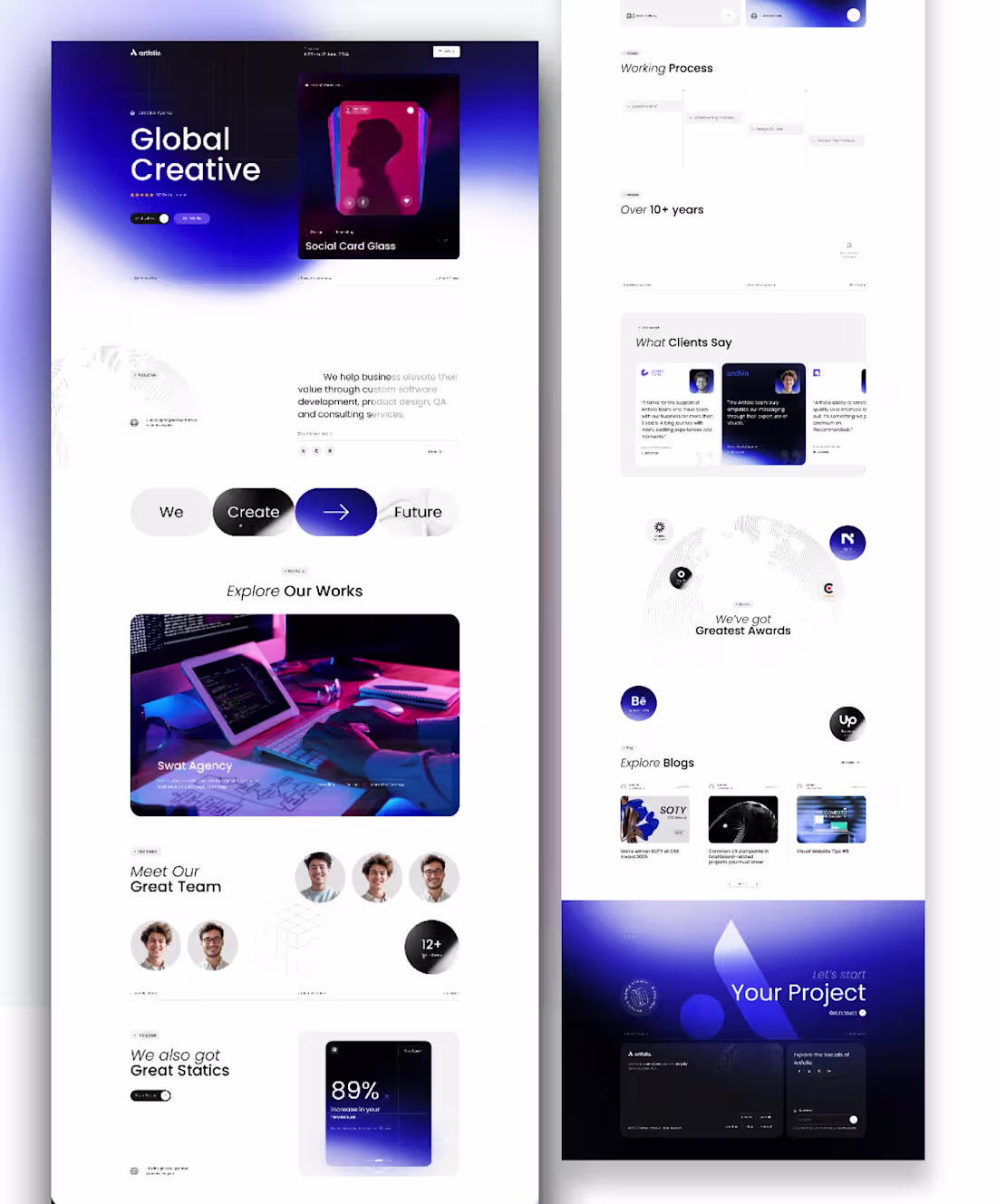
A Global Creative landing page - Portfolio
1
1
847
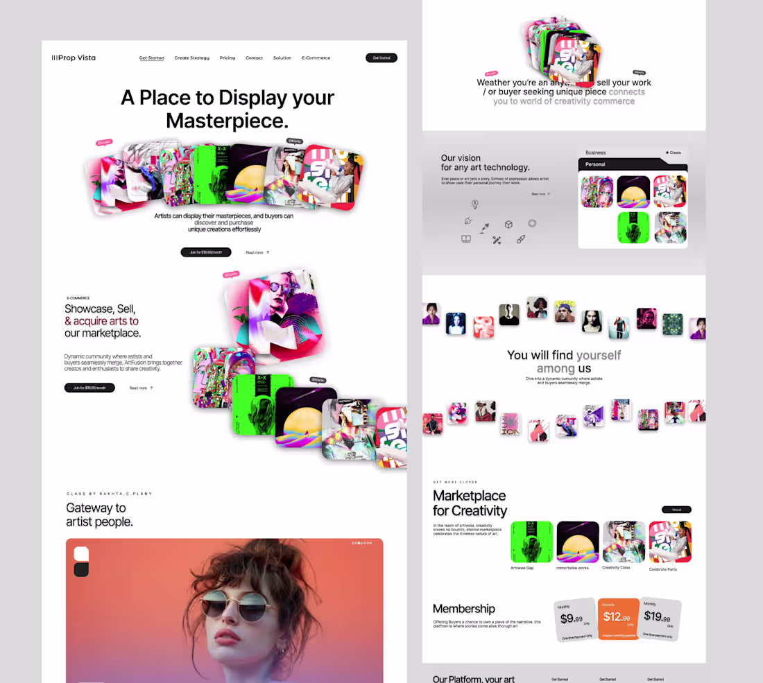
A Plance to Display your Masterpiece. Portfolio Site
1
1
787
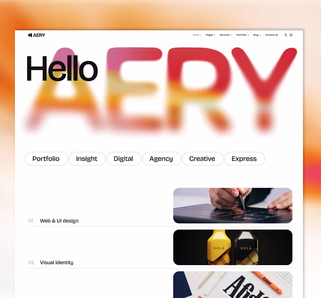
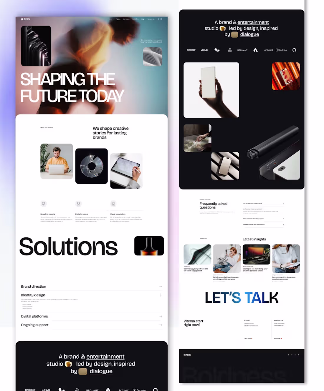
Shaping brands with bold ideas.
AERY is a creative studio at the intersection of Web & UI Design, Visual Identity, and Creative Content. We craft experiences that don't just communicate — they captivate. From expressive digital interfaces to full brand systems, every project is built with intention and vision.
What we do:
— Web & UI Design
— Visual Identity Systems
— Creative Content & Art Direction
We believe great design isn't just seen — it's felt. Whether you're launching a brand from scratch or elevating an established presence, AERY brings the bold thinking and refined execution your vision deserves.
Designs built for vision.
1
2
740
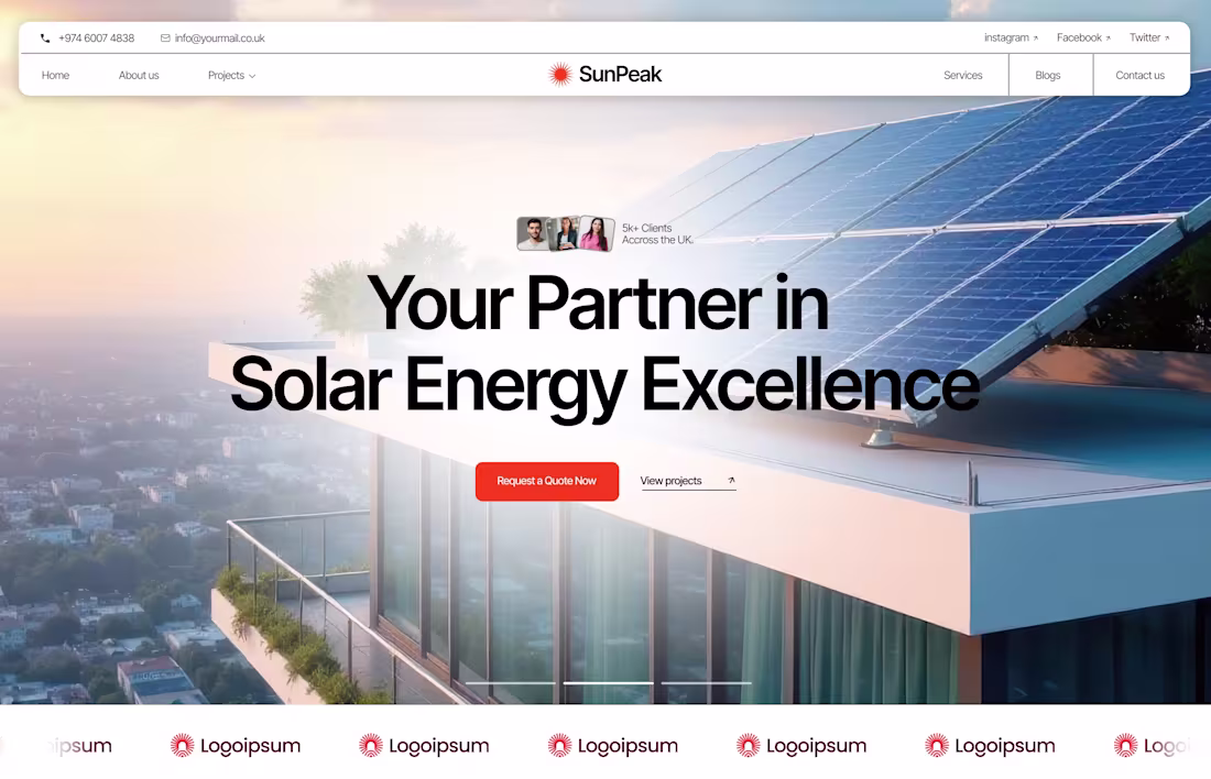
Sunpeak- Hero for solar panel installation company.
I’m available for design work—DM me for inquiries.
1
2
678
Mivoe — SaaS Task Management Landing Page
Dark-mode landing page for an AI-powered project management tool. Features a bold hero section, embedded dashboard UI preview, and a clean feature grid — designed to convert visitors from first glance to action.
1
1
601
End-to-end brand studio website — raw editorial aesthetic, collage photography, and a clean service architecture.
Designed to attract serious clients, not just impress designers.
#freelancerlife #figma
2
2
615
Design is problem-solving with aesthetics. I craft interfaces and brand systems that look sharp, feel smooth, and leave an impression."
#freelancerlife (https://contra.com/community/topic/freelancerlife) #portfolioreview (https://contra.com/community/topic/portfolioreview)
1
2
532
ARTEMIS - II Moon Mission
0
326
Advantages of 3D in Product design @Figma @Jitter
2
2
526
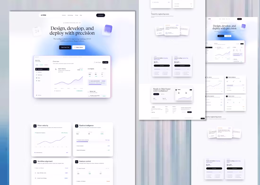
The UI features a sophisticated dashboard experience showcasing pipeline intelligence, workflow alignment, and real-time user signals.
Wrapped in a clean blue-purple gradient aesthetic, the design communicates technical credibility and enterprise-grade reliability.
Fully responsive with a conversion-optimized layout and tiered pricing structure targeted at high-performance dev teams and scaling startups.
2
497
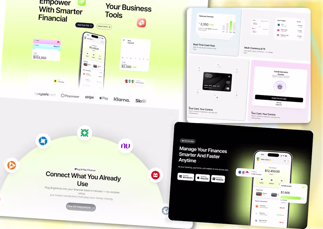
A conversion-optimized landing page for a B2B financial management platform, featuring real-time cash flow analytics, multi-currency & FX support, biometric card controls, and a plug-and-play integration ecosystem spanning Stripe, PayPal, Apple Pay, Klarna, and more.
The design delivers a dual-theme UI system — light and dark mode — with a clean, trust-driven layout structured to reduce friction, boost engagement, and drive sign-ups across desktop, tablet, and mobile viewports.
2
450
Your Money. On Autopilot.
Forget spreadsheets. Forget manual tracking. This platform thinks, moves, and grows your capital — while you sleep.
2
434
AI-Powered Platform That Automates Your Entire Engineering Workflow
Built with AI-powered precision — automating workflows, deployments, and team visibility in one seamless platform. The future of engineering is here.
1
420
Great visuals don’t just look good—they communicate.
This project focuses on narrative-first design and brand identity.
Crafted in @Figma @Jitter
2
3
428
Focused on creating a clean user flow, impactful hero section, and product-focused visuals to enhance engagement and drive conversions.
Focus: UI Design, SaaS, Conversion Optimization
1
2
461
Can AI do this?
What’s your take when you see someone using AI in the wrong way?
1
463
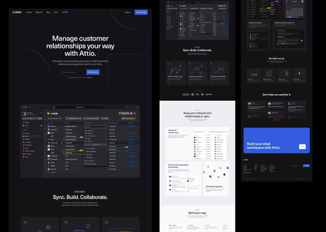
Designing modern CRM experiences with clarity and precision.
A clean, conversion-focused SaaS landing page inspired by tools like Attio CRM platform, built with strong emphasis on hierarchy, consistency, and usability.
Focused on scalable UI patterns, clear user flow, and a refined, high-contrast interface to support engagement and conversion.
Open to collaborations and UI/UX opportunities.
0
461
The goal was to create a visually compelling yet functional interface that communicates value instantly while maintaining usability.
Open to feedback and opportunities to collaborate on UI/UX projects.
0
402
PORP needed a design that matched the weight of an AI-driven platform, so nothing was left to chance.
Deep navy backgrounds, precision grid overlays, and radial glows that make the interface feel alive without ever feeling loud. The hero doesn't just introduce the product — it puts it in your hands immediately, with a live app mockup showing exactly what PORP does before you read a single feature.
Floating annotation cards. Staggered chat animations. A stats band that builds trust fast. Every section earns its place.
This is what a SaaS product deserves when the tech behind it is actually serious. 🖤
0
401
A high-converting hero experience built for an AI skincare platform that scans your face and delivers personalized skin improvement routines.
Designed with editorial-grade aesthetics — full-bleed photography, cinematic typography, and trust-building stat callouts (95% accuracy, 30+ skin concerns, 7-day routines) — every pixel is engineered to drive that first click.
Stack: HTML / CSS / React · Fully Responsive · Conversion-Optimized Layout
Clean nav, bold headline hierarchy, and a warm CTA that feels human — not clinical. The kind of landing page that makes users stop scrolling and start trusting.
2
3
437
Warm tones. Organic texture. Zero noise.
Built a landing page for an AI voice product that needed to feel human — not robotic. The brief was simple: make people trust the technology before they even try it.
Earth palette + waveform visual + clean type hierarchy. That's it. That's the whole mood.
Sometimes restraint is the loudest design choice.
Still can't stop staring at this hero. 🌾
Full case study dropping soon.
1
394
A landing page that doesn't just sell a product — it builds trust before the user even scrolls.
Soft gradients, bold type, and a floating dashboard mockup that makes the product speak for itself.
Every section was designed with one goal: turn a visitor into a signup.
This wasn't just a landing page. It was a first impression engineered to convert.
Still proud of how the hero came together. 👁️🗨️
Full case study dropping soon.
2
360
Some products don't need to speak — they just need to be felt.
HOVR was that kind of design challenge. I stripped the UI down to almost nothing — bare typography, invisible nav, pure editorial tension — and let the product carry the weight. The image bleeding across sections wasn't an accident. It was the whole idea.
When design gets out of the way, desire walks in. Built in Figma. Felt everywhere.
2
368
Designing for AI tools means earning trust fast — users arrive skeptical and leave either converted or gone.
For this AI voice SaaS project, I focused the entire design strategy on immediate value communication: bold headline typography, real product UI embedded directly into the hero, and social proof signals positioned exactly where doubt appears.
The light, minimal layout with organic line-work backgrounds keeps the interface feeling human despite the technical subject matter. Every section was wireframed, UX-tested, and refined in Figma before final visual execution.
1
1
368
This project was an exercise in designing trust — where the visual language, layout rhythm, and micro-copy all had to work together to make an AI-powered medical tool feel safe, credible, and effortless.
I handled the full design process: research, wireframing, visual system, animation direction, and high-fidelity delivery in Figma.
The dark cinematic aesthetic wasn't decorative — it was strategic, positioned to differentiate the brand in a space dominated by sterile, clinical UI patterns.
1
359
If AI can generate UI, flows, and ideas in seconds… what actually makes a product designer valuable today?
For this concept, I explored that shift.
PropVista is a SaaS landing page designed around AI-driven workflows—where speed, clarity, and structure matter more than decorative visuals. The focus was on turning product thinking into a clean, minimal interface that still feels purposeful and conversion-focused.
Designed in Figma with a product-first mindset—balancing usability, hierarchy, and scalability rather than just aesthetics.
1
381