
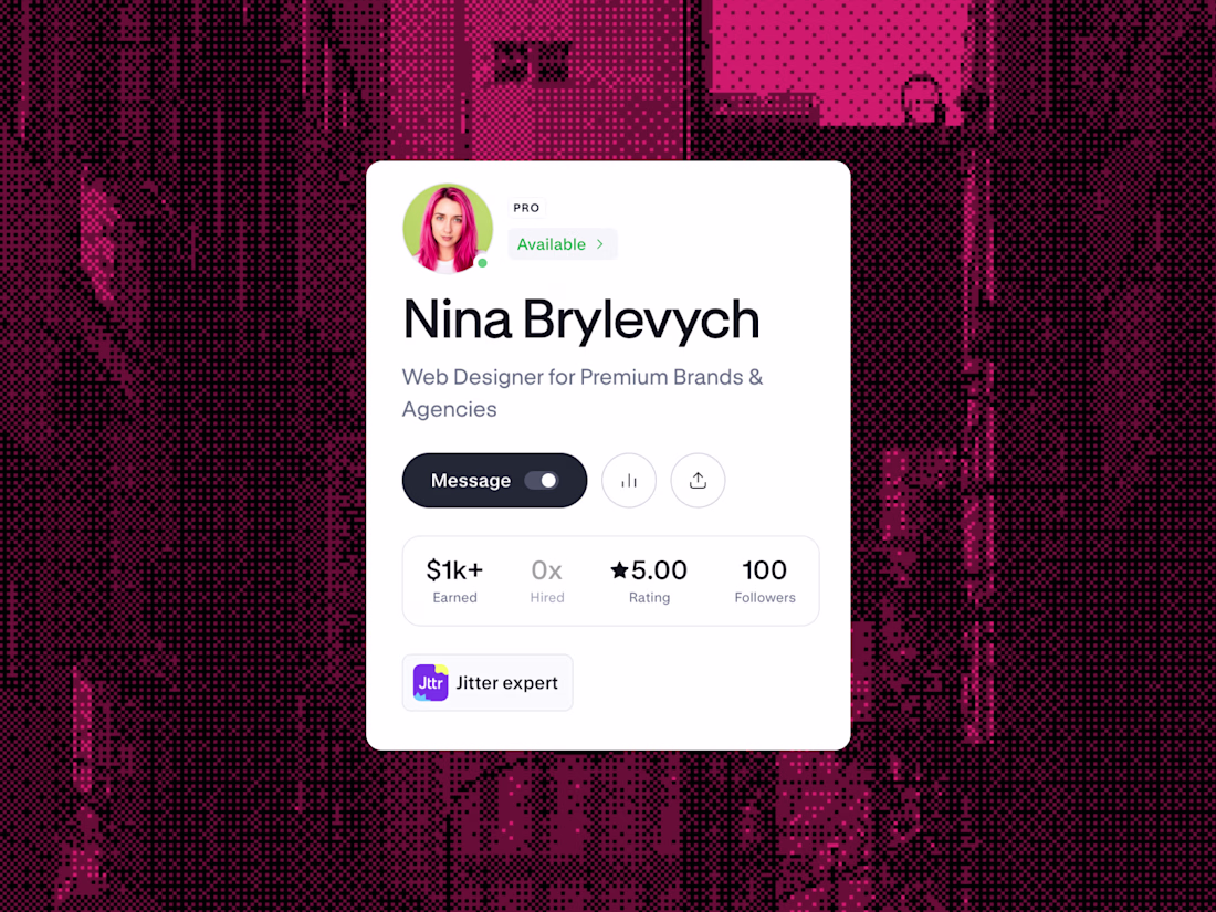
pro
Nina Brylevych
Web Designer for Premium Brands & Agencies
- $1k+
- Earned
- 1x
- Hired
- 5.00
- Rating
- 100
- Followers
Proud to be part of the team!
NEW PAID PROJECT
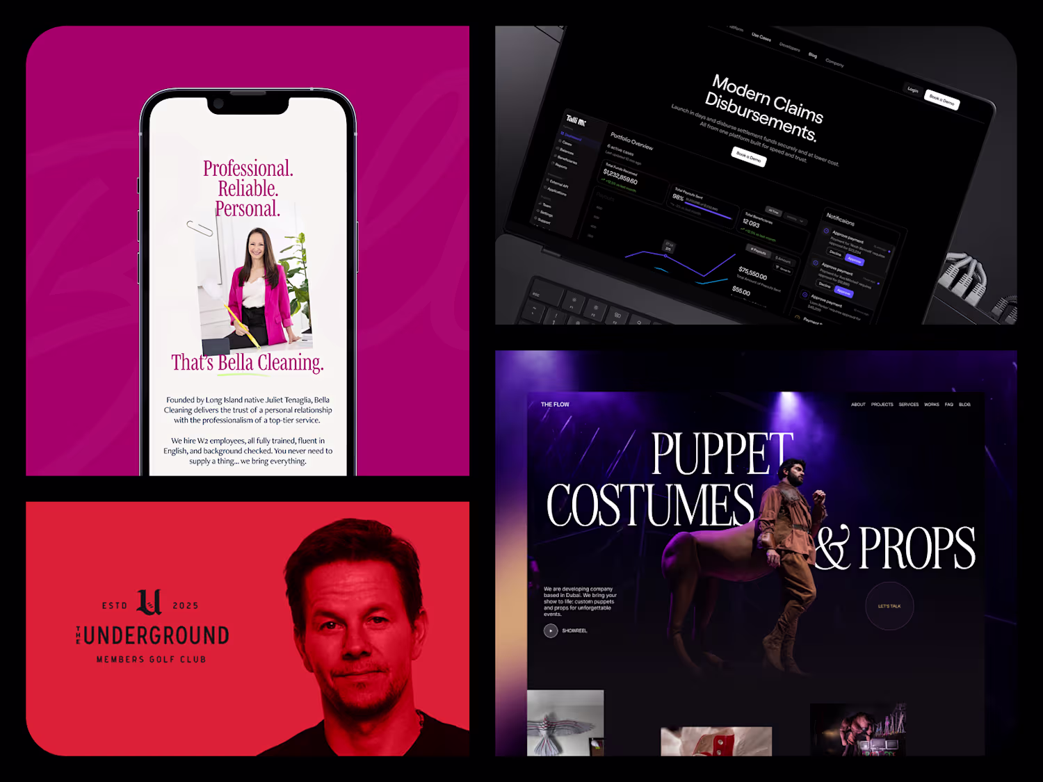
Nina Brylevychalchemy design
100 followers 🎉
A month and a half ago, on June 5, I got serious about Contra. And now there are a hundred of us.
A bit of context. I've got 3+ years on Upwork behind me: $70K earned, Top Rated Plus, 100% Job Success. But over the last six months something broke. Fewer invites,...

"You're not broken. You just need the right care." 🤍
Just published a new project — the website UI for Maison Cura, an integrated mental health & psychiatry clinic in New Smyrna Beach, FL.
Designing for healthcare is different. People land on these pages at a vulnerable moment —...