
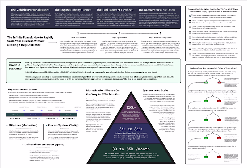
Nimra .
Powerpoint presentation design for Businesses & Startups.
Ready for work
Nimra is ready for their next project!

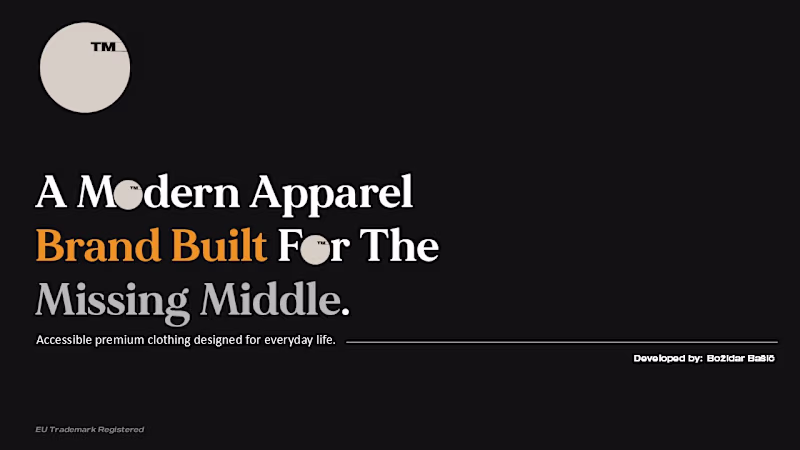
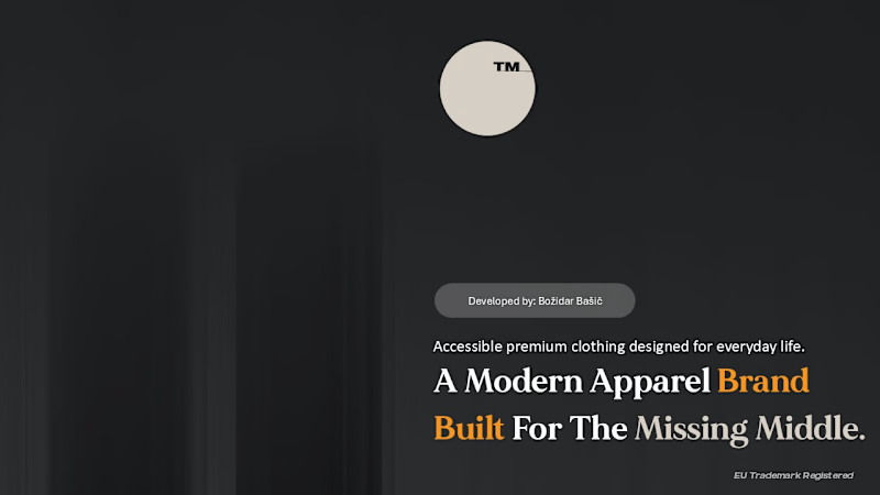
Here is another cover design for a presentation. Which one would you prefer?
2 voted
100%
0 voted
0%
2 votes
Closed
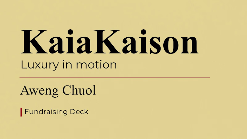
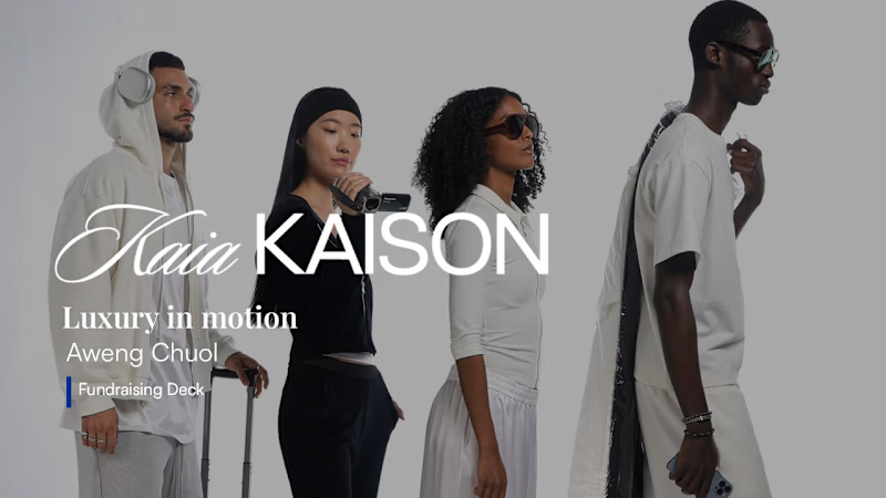
Here are the before and after coverdesigns for the pitch deck. Which one would you prefer?
0 voted
0%
3 voted
100%
3 votes
Closed
From basic to bespoke.✔️ The power of a premium facelift.
0 voted
0%
1 voted
100%
1 vote
Closed
This presentation design uses a playful yet professional style to explain a modern educational platform.


I designed two Presentation design concepts for the same gaming brand. Which one looks more appealing to you?
0 voted
0%
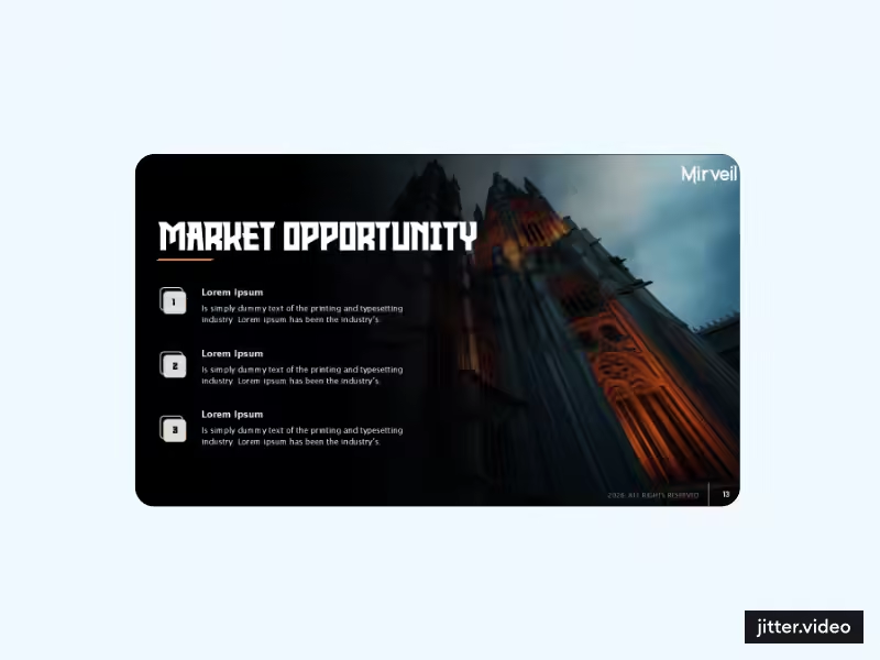
4 voted
100%
4 votes
Closed