Nikki Jennings
Packaging & brand systems for beauty, skincare and wellness
Ready for work
Nikki is ready for their next project!
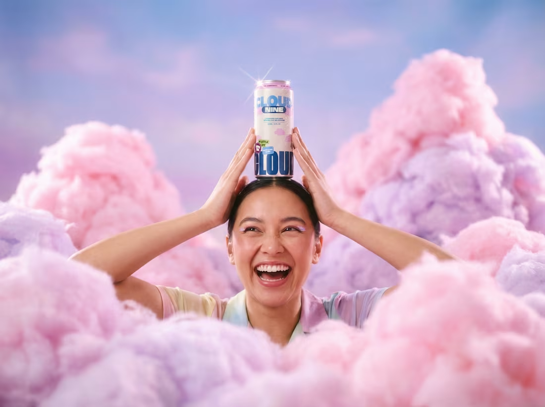
Cloud is a community-led cannabis brand built around inclusion, culture and education. They wanted an identity that felt bold and welcoming with loads of personality, but still trustworthy enough for something you're actually putting in your body.
That balance was the tricky bit. We didn't want it to feel too clinical, but it couldn't tip into novelty either.
So we leaned into big, confident type and a soft cloud world to give it warmth, then grounded everything with navy and clean layouts to keep it feeling grown up. The bright palette does the heavy lifting on the fun, community side.
It runs right across the range too, from tinctures to drinks to flower, so it always reads as Cloud no matter which product you pick up.
Brand identity, packaging and art direction.
74
252
22.4K
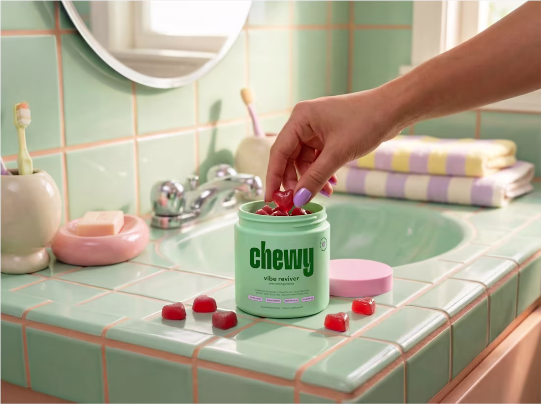
Chewy is an Australian daily vitamin brand that wants to make supplements feel simpler and actually enjoyable to take. They launched with Vibe Reviver, a PMS relief gummy, and the whole thing is about making functional health easy to understand and easy to fit into your day.
The category was the tricky part. Most supplement brands in Australia go really clinical, minimal logos, white packaging, sterile type. It looks trustworthy but it's all a bit cold and samey.
So we went the opposite way. A bold typography-led identity with a playful logo at the heart of it, and a bright colour palette to give it energy and personality. Then clean layouts and clear info design so it's all still easy to read, just nothing like the usual stuff on the shelf.
Brand identity and packaging.
4
11
891
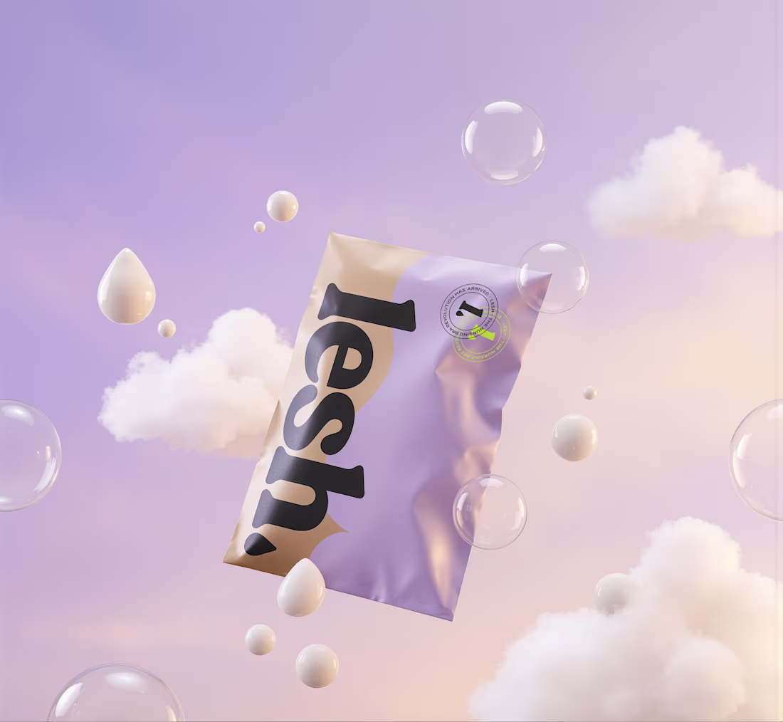
Lesh is a leakproof nursing bra brand that's basically trying to shake up the whole nursing bra category. The idea is to ditch those uncomfortable, wasteful breast pads and give breastfeeding mamas something more practical and a lot more sustainable instead.
We worked with them on a bold, empowering identity, some distinctive mailer packaging and a smooth Shopify build. The whole point was to make Lesh feel fresh and confident and a bit disruptive, because nursing is a world that's usually all soft, traditional maternity stuff and this needed to feel like the opposite of that.
Brand identity, packaging, web and social.
2
575
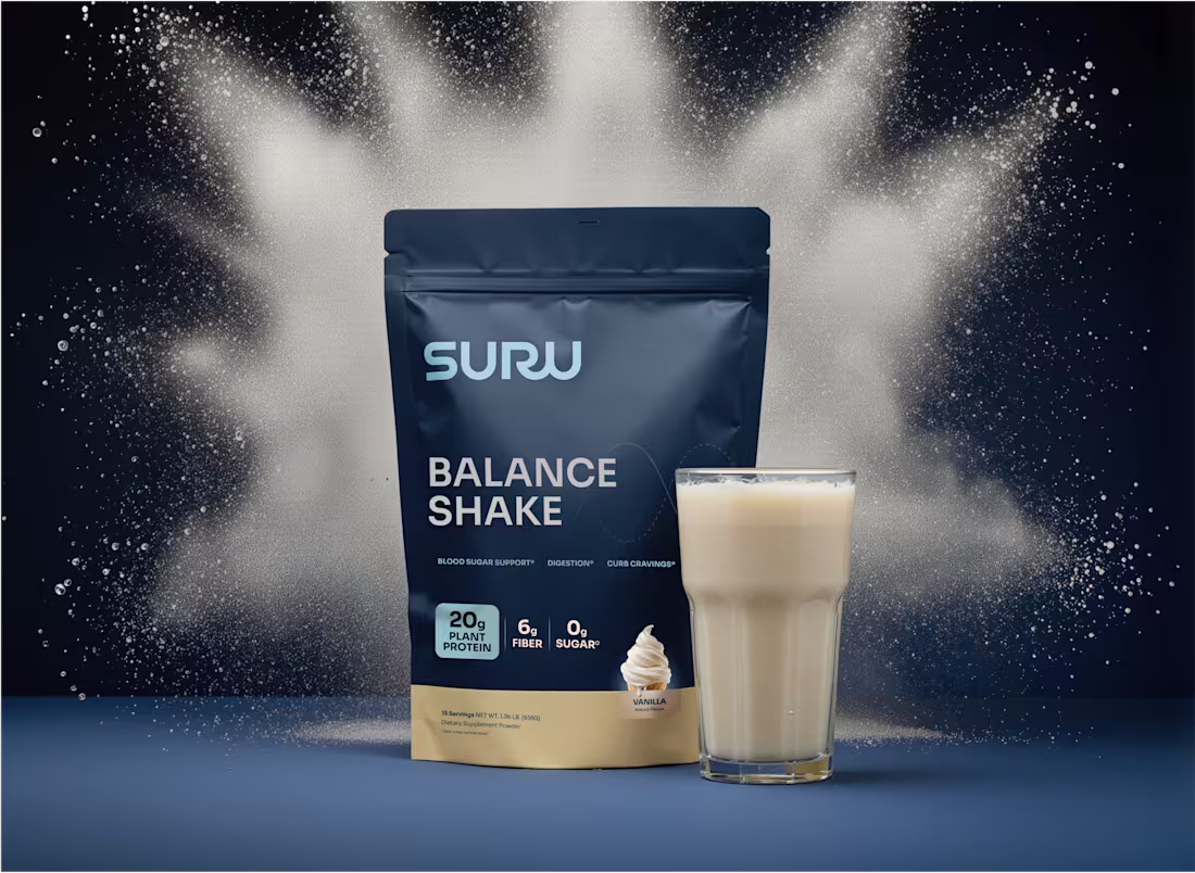
Suru is the brand behind the Balance Shake, a high-protein, high-fibre, zero-sugar shake made to support healthy blood sugar and steadier energy. We worked on packaging for their two launch flavours, across both pouches and single-serve sachets, and the brief was an identity that felt trustworthy and clear but still had a bit of life to it.
Then we took it into a full Shopify build too, so the site carried the same feel, strong and impactful visually but still really clear on the nutritional side, which matters a lot for this kind of product.
Packaging and web.
2
537
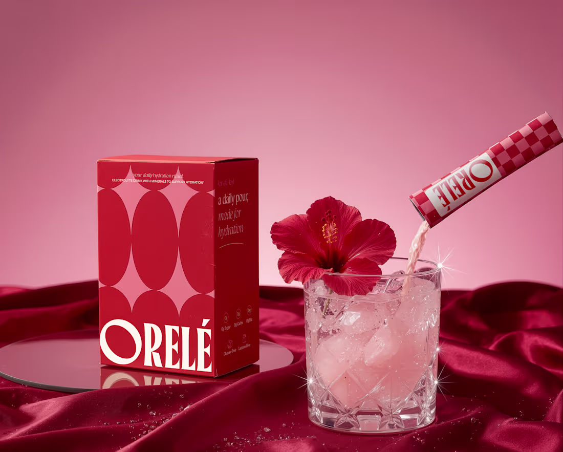
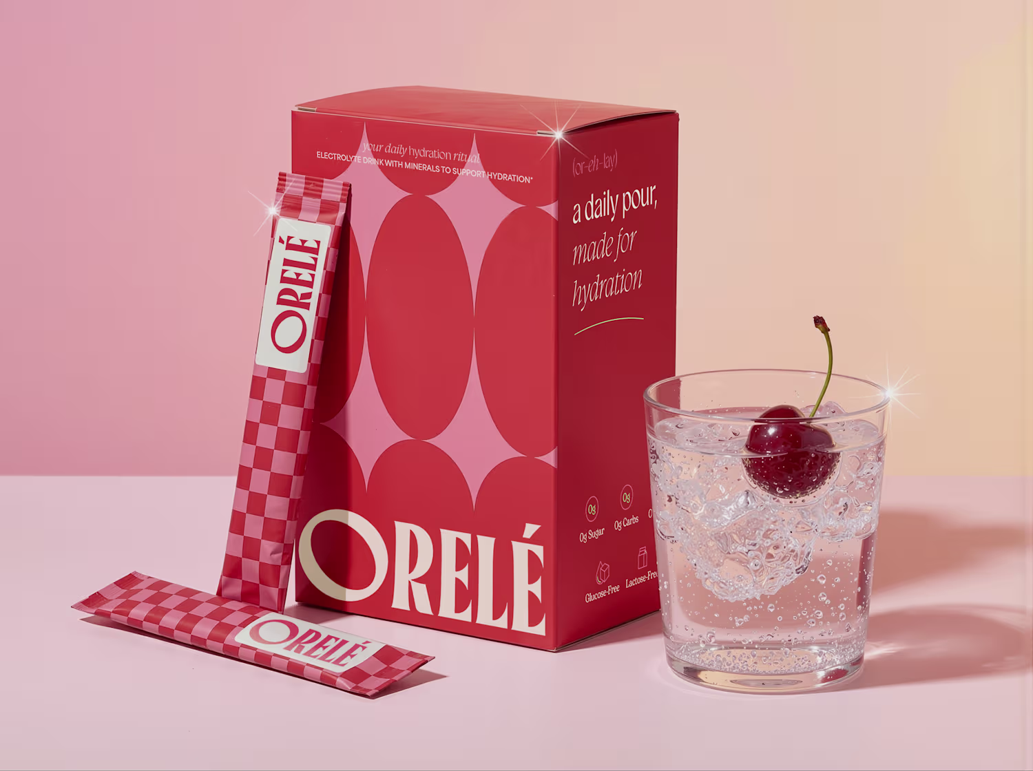
Orelé is a hydration ritual, basically a small daily habit that's meant to feel like a treat rather than a chore. They wanted to take functional wellness somewhere softer and more indulgent, so it needed to feel elevated but still easy enough that you'd actually reach for it every day.
The whole thing hangs off one line, "a daily pour, made for hydration." Something you look forward to, not just something that's good for you.
So we built the identity and packaging around that. A bold checkerboard, a strong logotype and a rich red palette to give it a sense of occasion, then kept the styling soft so it still feels a bit luxurious. It honestly looks more like a beauty product than a sachet of electrolytes, which was the goal.
Brand identity, packaging and art direction.
1
6
496