
Nikhil Mishra
Data analyst building Excel and Power BI dashboards
New to Contra
Nikhil is building their profile!
Just built an interactive Workforce Analytics Dashboard in Excel
This project focuses on analyzing employee distribution, compensation trends, and hiring patterns (2015–2025) — all inside Excel.
Key highlights:
• Connected to a SQL database for dynamic data handling
• Used Power Query + Pivot Tables for transformation & modeling
• Implemented VBA Macros for automation (refresh, navigation, insights)
• Designed an intuitive UI with drill-down insights
What it delivers:
✔ Salary distribution & employee segmentation
✔ Department-wise workforce trends
✔ Hiring trend analysis over time
✔ Automated employee insights (highest paid, tenure, etc.)
This project pushed me to go beyond basic Excel and treat it like a full analytics tool instead of just a spreadsheet.
Still improving — next step is taking this level of analysis into Power BI & Python.
#Excel #DataAnalytics #Dashboard #SQL #DataScience #BusinessIntelligence #Automation
3
2
87
🚀 Excited to share that my personal portfolio is now live!
Built from scratch to showcase my work in Data Analytics & Visualization, this project reflects my journey of turning raw data into meaningful insights.
🔗 Explore here: https://nk-folio.backends.online/
Open to feedback, collaborations, and opportunities. Let’s connect!
#Portfolio #DataAnalytics #PowerBI #Excel #WebDevelopment
2
78
Built this Service Performance Dashboard in Power BI ⚡
Transformed raw data into actionable insights on:
• Revenue & profit trends
• Cost optimization opportunities
• Technician performance
• Regional performance analysis
Used interactive visuals, filters, and KPIs to make decision-making faster and clearer.
Key takeaway? A dashboard isn’t about visuals—it’s about driving decisions.
More projects dropping soon 🚀
0
23
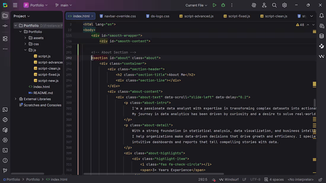
🚀 Excited to share that I’ve been working on my personal portfolio from scratch.
Built with a focus on clean design, smooth interactions, and real-world data projects.
Going live tomorrow. Stay tuned. 👀
1
44
Built a Sales Dashboard focused on one thing:
clarity over clutter.
Instead of dumping charts, this answers:
→ Which categories actually drive revenue
→ Where profit is strong vs misleading
→ City-level performance differences
→ Monthly trends that impact decisions
Key insight:
High sales don’t always mean high profit — margin tells the real story.
Designed with a dark UI to keep focus on data, not distractions.
If your dashboard looks good but doesn’t guide decisions, it’s just decoration.
1
2
81
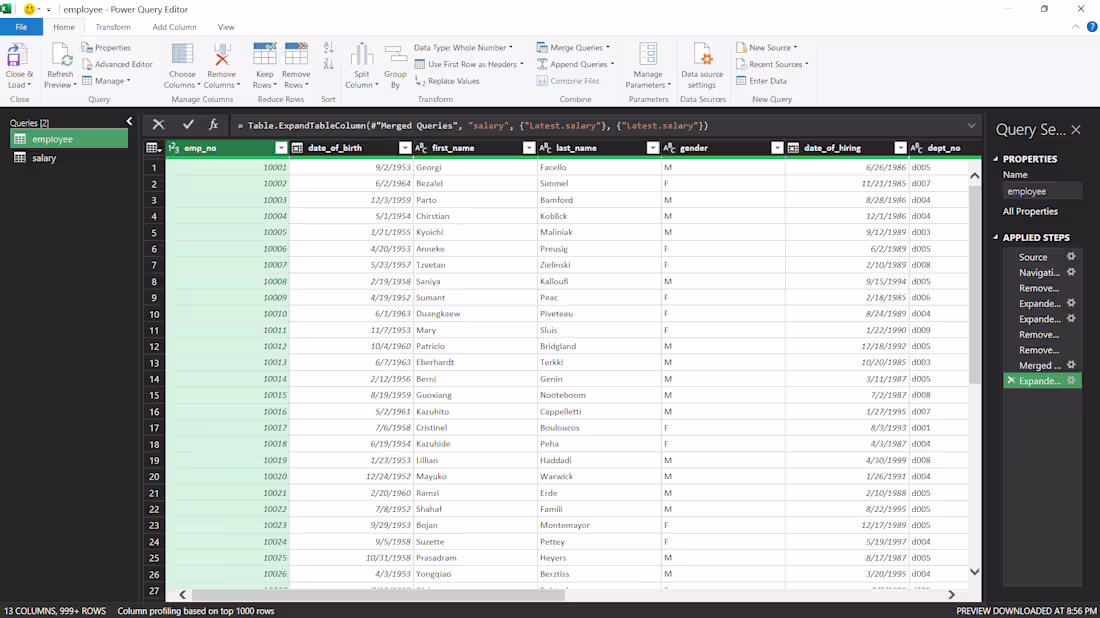
Currently building an employee salary dashboard
Right now I’m deep into the data preparation stage—cleaning and merging multiple tables using Power Query.
The biggest challenge so far has been structuring the data correctly so it actually supports meaningful analysis (not just visuals).
So far I’ve:
• Cleaned and transformed raw data
• Started merging tables & building relationships
• Begun shaping the data model
Next step: turning this into a dashboard that clearly shows salary trends and employee insights.
Sharing the process as I build—final version coming soon. 👀
Open to feedback or suggestions.
3
3
96
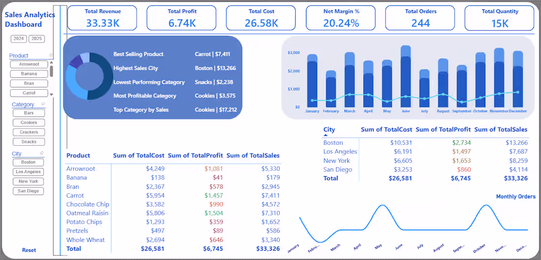
Sales Analytics Dashboard (Power BI)
Interactive sales analytics dashboard built in Microsoft Power BI to monitor revenue performance, profitability, and product trends.
Key insights included:
• Total revenue, profit, cost, and margin KPI tracking
• Monthly sales performance and trend analysis
• Best-selling products and most profitable categories
• Sales performance by city
• Interactive filtering by product, category, and location
This dashboard enables businesses to quickly identify top products, evaluate profitability, and monitor sales trends across regions.
Tools used: Microsoft Power BI, data modeling, and data visualization.
3
109
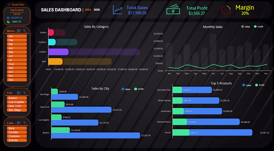
Sales Performance Dashboard (Excel)
Interactive Excel dashboard built to analyze sales performance, product profitability, and regional trends.
Key features:
• Total sales, total profit, and margin KPI tracking
• Monthly sales and profit trend analysis
• Sales performance by product category
• City-level sales comparison
• Top performing products analysis
• Interactive filtering by month, city, and category
This dashboard helps businesses quickly understand revenue performance, identify profitable products, and monitor sales trends.
Tools used: Microsoft Excel, pivot tables, and data visualization.
4
7
237
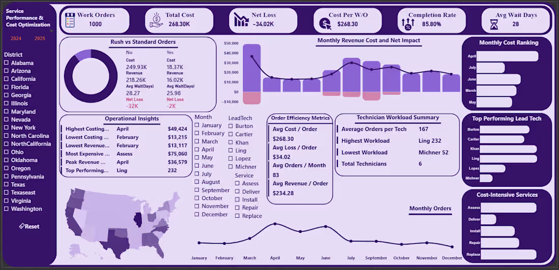
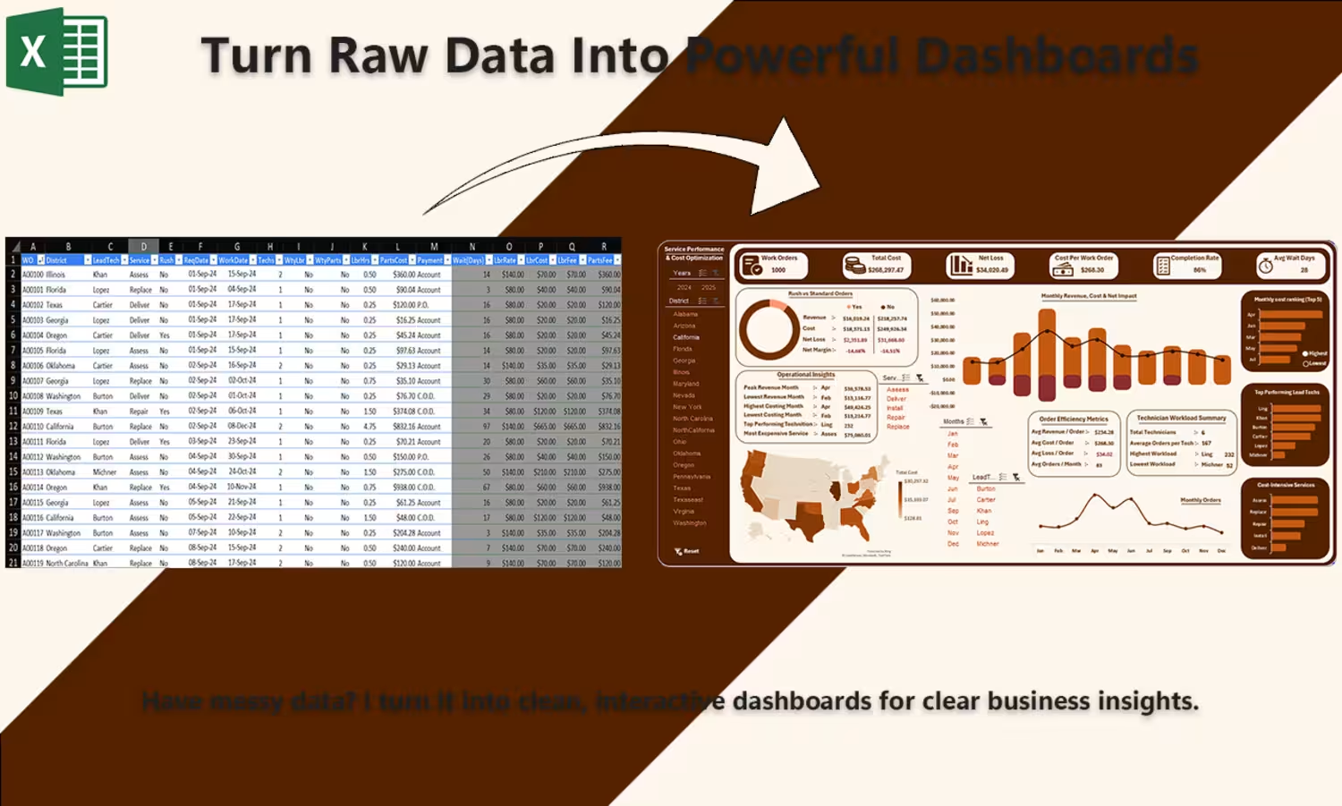
Service Performance & Cost Optimization Dashboard (Power BI)
Built an interactive dashboard in Microsoft Power BI to analyze service operations, costs, and performance trends.
Key insights included:
• Work order tracking and completion performance
• Total cost, net loss, and cost per work order analysis
• Monthly revenue vs cost trends
• Technician workload distribution
• Geographic performance visualization across districts
This dashboard helps businesses quickly identify operational inefficiencies, cost drivers, and performance patterns to support better decision-making.
Tools used: Microsoft Power BI, data modeling, and data visualization techniques.
5
172
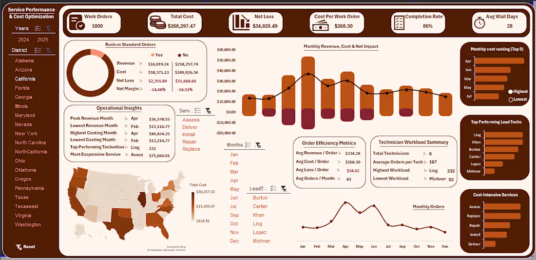
Service Performance & Cost Optimization Dashboard
This dashboard analyzes service performance, operational costs, and revenue trends to help businesses understand profitability and efficiency.
Key features:
• KPI overview including total cost, net loss, and work orders
• Monthly revenue and cost trend analysis
• Service efficiency and order performance metrics
• Geographic insights through a US performance map
• Technician workload and top performer tracking
Tools used:
Excel for data processing and dashboard design.
Purpose:
This dashboard helps businesses quickly identify cost drivers, performance trends, and operational inefficiencies.
6
6
228