
Nicolaus Sherrill
Creating brand worlds people want to belong to.
New to Contra
Nicolaus is ready for their next project!
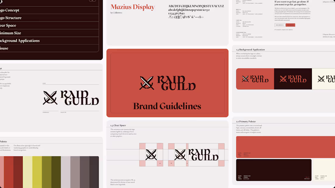
Raid Guild is the first freelancer DAO — composed of designers, strategists, engineers, artists, and business leaders — positioned with a very heavy metal, contrarian point of view on work.
Without a clear design leader guiding their visual direction, the nature of their decentralized operations was that over time their visual fingerprint had drifted beyond any one concept they could claim as their source of truth.
Their team asked me to refresh their identity and set up some guard rails to keep their team rowing in the same direction as they prepared to overhaul their website, socials, and marketing communications. We took inspiration from old school tabletop RPGs and focused on the visual essence of the brand to give them a much stronger foundation that still felt like a group of digital mercenaries but unified their vision and voice.
0
23
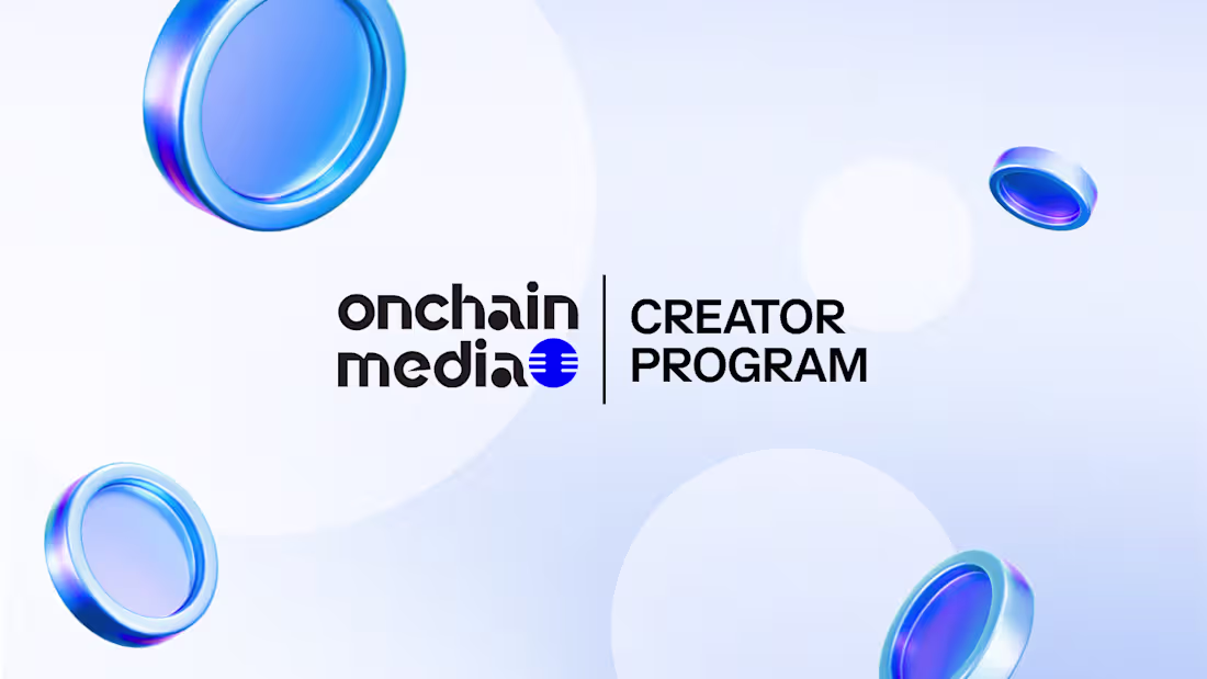
Onchain Media is a video & podcast content creation company centering the human stories of the onchain world. Their founder needed help systemizing their design outputs so they could improve the consistency of their visual quality and spend less time designing themselves to get more content out the door each week and grow their business.
I used their existing brand to create a series of templates for their main content pillars, across X livestreams, Telegram calls, YouTube shows, partnership/client announcements and other general posts.
Their founder also wanted to begin maturing their identity system so we have used every new graphic as an opportunity to make adjustments and experiment with new patterns to establish an identity that's lived in without stopping production.
In the background I also set up a brand kit in Canva, where they do most of their graphic production, organized their brand assets, and re-exported their logo variants to provide a system they could actually use.
0
21
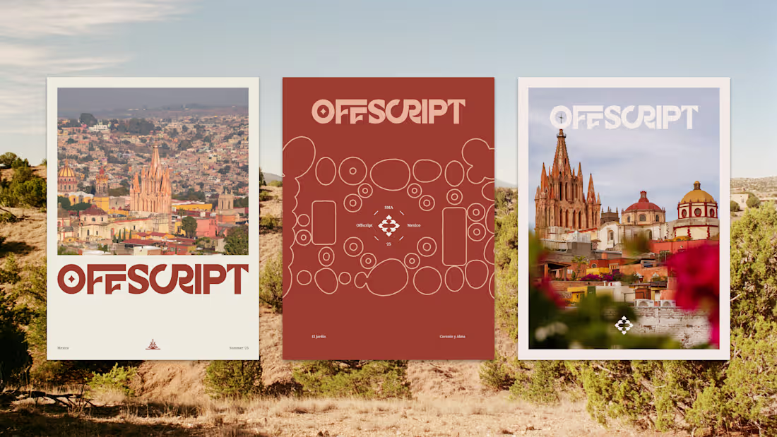
Offscript Was a design conference for web 3 creative professionals and designers. The team had asked me to create a brand treatment for their conference that reflected the locale that they were hosting the conference in, which was San Miguel de Allende, Mexico. So I created an icon system and color palette that was featured colors, patterns and symbols seen around the city itself, and provided creative direction & templates for their marketing efforts. The conference was designed to be an intentional space to slow down, unplug, and connect with other professionals who were typically underrepresented in a pretty technical field. So the creative direction was built to amplify that sense of being immersed in a beautiful place.
3
2
44
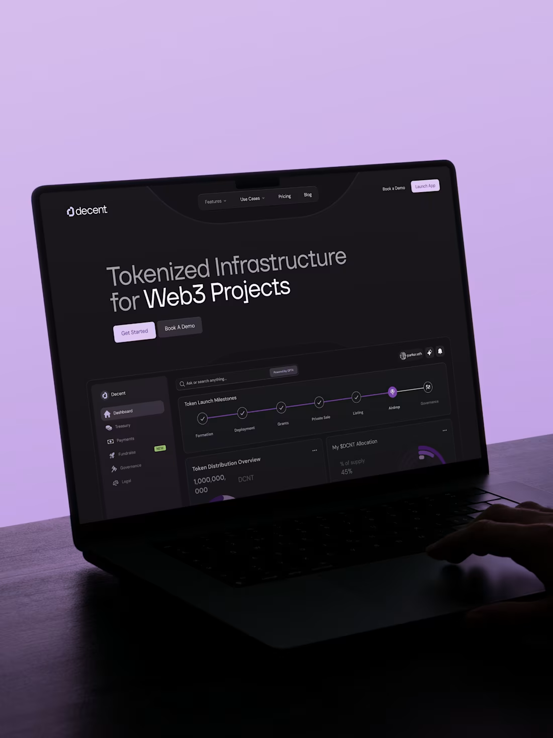
I lead design at Decent, an ops platform for onchain organizations, for the past 5 years. In my time there I guided the business through 2 significant rebrands and company pivots as it both grew and shrank in operating size. In the last pivot we had consolidated the business into a singular product and I had to rebuild its identity and product design systems from the ground up in order to position our product correctly for founders who are naturally more skeptical toward the complex gray areas of operating onchain.
My team and I built an identity centered around trust, transparency and privacy-protection with a futurist approach that used flat design techniques in a clever way to create texture and depth.
0
33