
Neha Madrala
Power BI Data Analyst turning data into insights
New to Contra
Neha is ready for their next project!
BizPulse — AI-Powered Business Analytics Dashboard
Built for the Anything Ship & Sell Remixathon on Contra.
What is BizPulse?
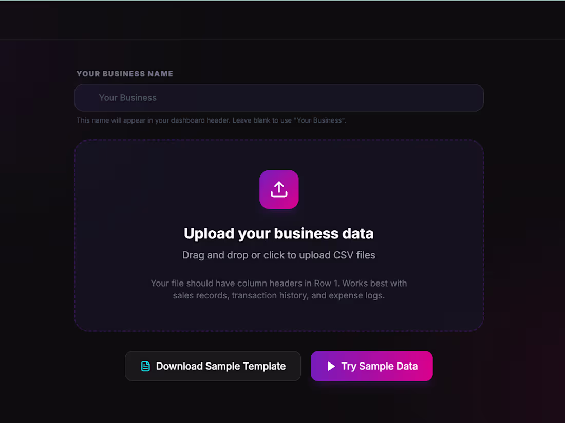
An AI-powered business analytics tool that transforms messy, raw sales data into a clean professional dashboard instantly — no coding or spreadsheet skills needed.
How it works:
Upload any messy CSV or Excel file
BizPulse auto-cleans your data and maps your columns
Get a full analytics dashboard with KPIs, charts and AI insights
Key Features:
Business Health Score out of 100
KPI scorecards — Revenue, Expenses, Profit Margin, Customers
6 interactive charts with hover tooltips
5 AI-generated plain English business insights
Revenue Goal Tracker with live progress bar
Export as PDF and CSV
No dataset? No problem!
Click "Try Sample Data" on the upload screen to instantly load a realistic fictional dataset and explore the full dashboard.
@Anything
Try it here: https://bizpulse-879.created.app/
LinkedIn post: https://www.linkedin.com/posts/neha-madrala_anythingremixathon-buildinpublic-nocode-ugcPost-7453420153456762882-P2ve
Demo Video: https://www.loom.com/share/3574386d73924ac59076493b055570c1
4
7
783

The biggest shift in my learning hasn’t been technical it’s been mindset.
I used to think good analysts are the ones who know more tools.
Now I realize they’re the ones who understand the business better.
Anyone can create charts.
Not everyone can explain why it matters.
That’s what I’m working on every day.
0
41
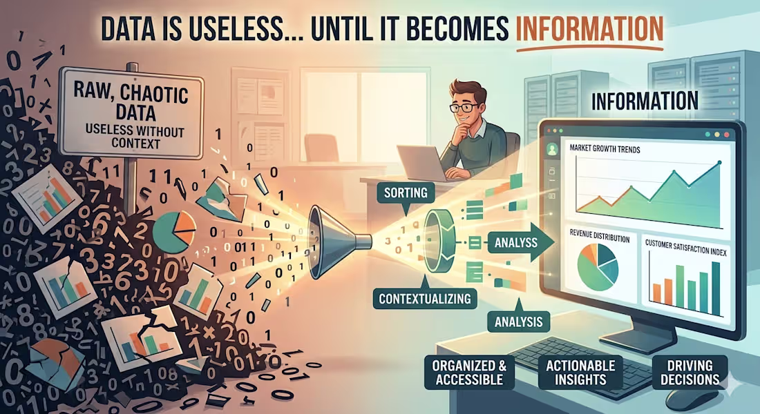
Data is useless. Yes, it is.
Because on its own, it doesn’t say much.
It’s just numbers, rows, and columns.
The real value comes when that data is understood —
when it answers a question, shows a pattern, or drives a decision.
That’s what turns data into information.
And that’s what businesses actually need.
0
106
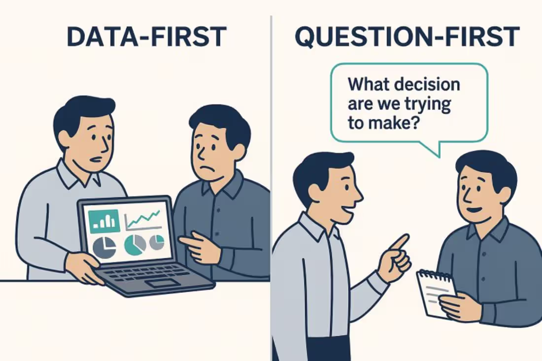
While working on a project, one question always comes first:
Do we need data first… or a clear understanding of the requirement?
It’s easy to jump into dashboards, charts, and analysis.
But without clarity, even the best data can lead in the wrong direction.
So the real focus is asking the right questions:
👉 What exactly is the goal?
👉 What decision needs to be made?
👉 What does success look like?
When the requirement is clear, the data becomes powerful.
That’s how analysis turns into real business impact.
0
114
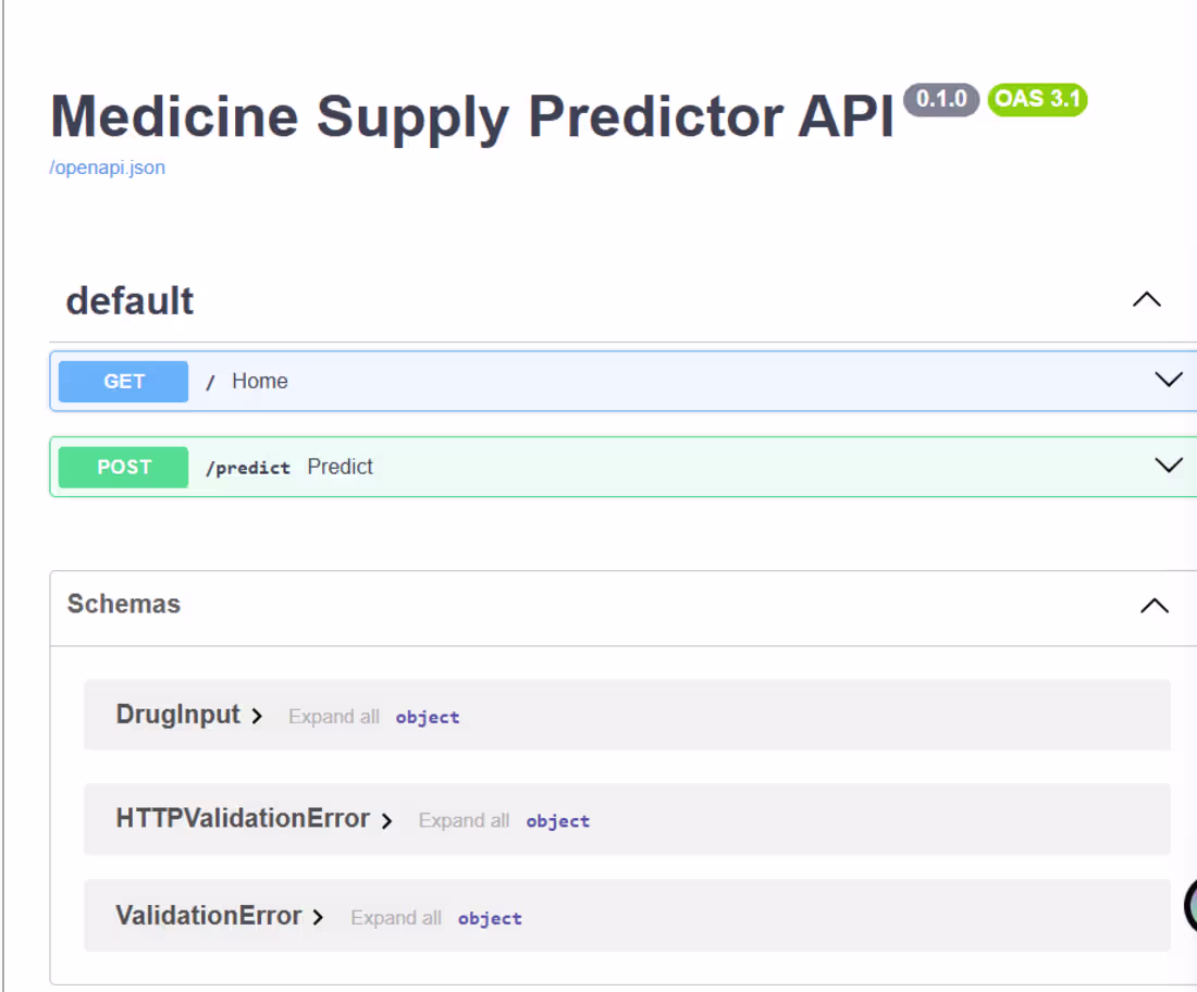
Medicine Supply Chain Disruption Predictor
Built a production-ready ML system that predicts drug shortage risk using real FDA data. Collected and cleaned 1703 real drug shortage records, trained an XGBoost model, and deployed it as a live REST API — accessible to anyone worldwide.
The biggest challenge was identifying and removing 6 sources of data leakage that were causing fake 100% accuracy. After fixing this, the model delivers honest, generalisable predictions.
The entire system is containerised with Docker, automatically rebuilt and redeployed via a Jenkins CI/CD pipeline on every code push, and visualised through an interactive Power BI dashboard.
Result: A complete ML + DevOps project — from raw data to live deployed API — built independently in under 2 weeks.
Live API: https://medicine-supply-predictor.onrender.com/docs
GitHub: https://github.com/nehaM906/medicine-supply-predictor
4
2
245
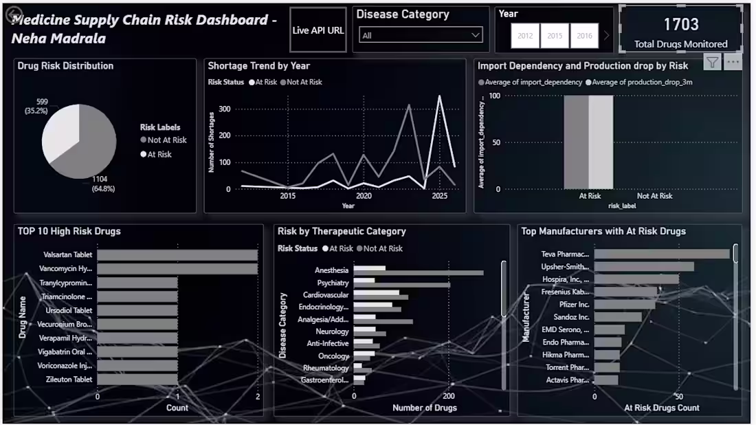
Medicine Supply Chain Risk Dashboard
An interactive dashboard built on 1703 real FDA drug shortage records, visualising ML model predictions across 6 dynamic charts.
Key findings: 35.2% of monitored drugs are at risk, 2025 recorded the highest shortages in history, and Anesthesia and Cardiovascular drugs are the most vulnerable categories. Features year and disease category filters for drill-down analysis enabling hospital procurement teams to take preventive action before shortages occur.
2
194
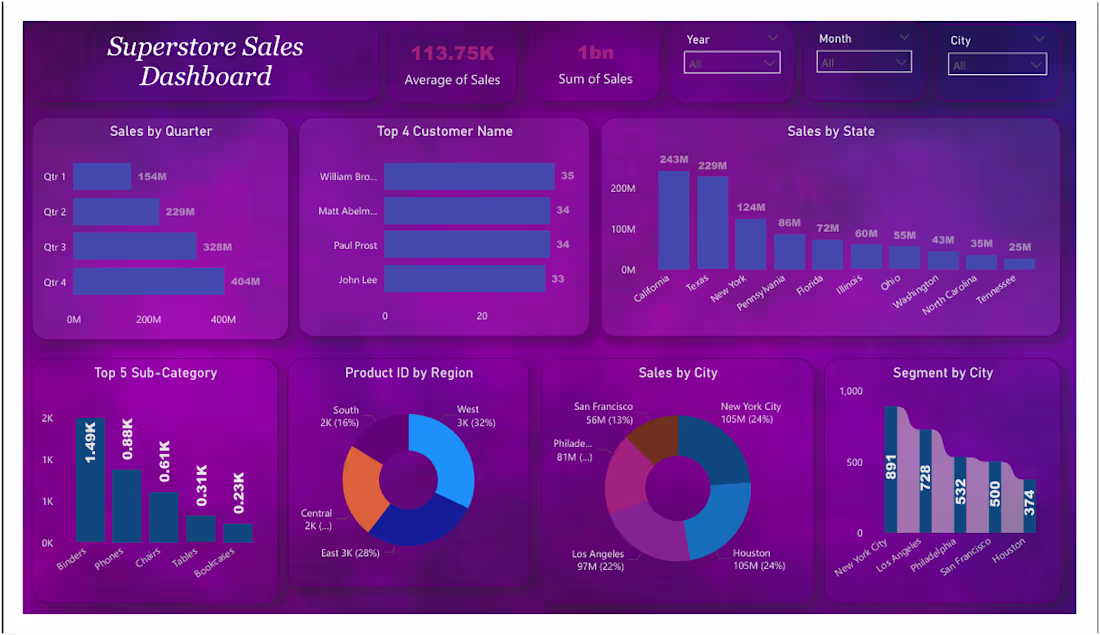
This Superstore Sales Dashboard gives an overview of sales performance across time, regions, customers, and products. Total sales are 1bn, with peak performance in Q4, showing strong seasonal trends. California and Texas are the top-performing states, while New York and Houston lead at the city level. Binders and Phones are the best-selling sub-categories. The dashboard also highlights key customers contributing to revenue and includes filters for deeper analysis. Overall, it helps in identifying trends and making data-driven decisions.
10
6
454
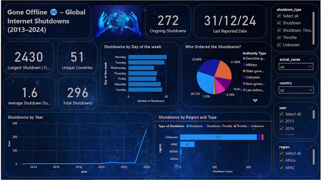
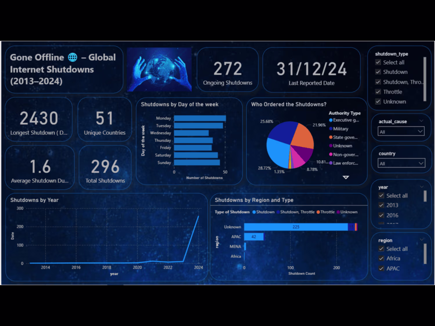
Global Internet Shutdown Analysis
What the project was about:
I analyzed global internet shutdown data to understand where, when, and why shutdowns happen. The goal was to uncover patterns across countries and time periods and highlight their impact on digital access.
What I did:
Collected and cleaned real-world dataset
Performed EDA (Exploratory Data Analysis)
Analyzed shutdowns by:
Country
Year/month
Reasons (political, security, protests, etc.)
Built Power BI dashboards to visualize trends
Identified high-risk regions and frequent shutdown patterns
Key Findings:
Certain countries showed repeated shutdown patterns over time
Most shutdowns were linked to:
Political instability
Government control during protests/elections
Some regions experienced long-duration shutdowns, affecting communication and businesses
There was a rise in shutdown frequency during specific global events
Challenges I faced:
Data cleaning issues
Missing values, inconsistent country names
Unstructured reasons
Different formats for shutdown causes → needed standardization
Time-based analysis
Converting dates and extracting meaningful trends
Visualization complexity
Making dashboards simple yet insightful
How I solved them:
Cleaned and standardized data using Python (Pandas)
Grouped and categorized shutdown reasons
Used time-series analysis for trends
Designed clear and interactive Power BI dashboards
Impact / Outcome:
Provided a clear view of global digital disruptions
Helped identify high-risk regions and key causes
Created dashboards that make complex data easy to understand
2
3
206