Creatvnest Studio
Framer Designer/Developer. Building compelling websites



Navigation, but a little different.
Built this floating side nav from scratch and designed a hero to match it.
Offset.


Built this navbar with a bit of personality. 👀
Designed & developed with a playful style for creative studios.
This is how the loader and hero section should animate!!
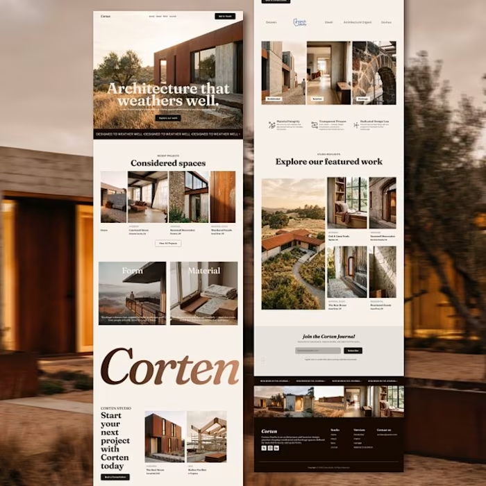
What a $1,200 Architecture studio landing page could look like.
A complete landing page designed around the studio’s work, story, and visual identity.
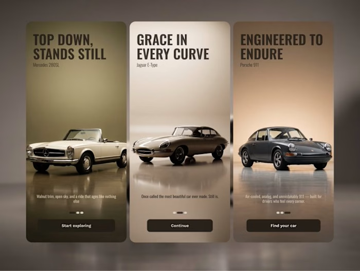
Your car rental app should always feel premium.
Designed this onboarding screen around the cars themselves, matching each card to its own palette with subtle gradients and a minimal feel.