

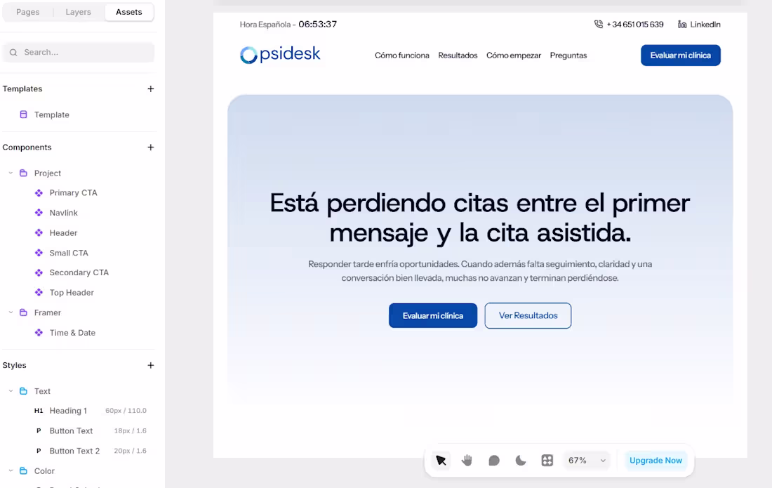
The image shows a digital workspace, specifically the **Framer** design interface, displaying a landing page for a brand called **Opsidesk**.
0
27
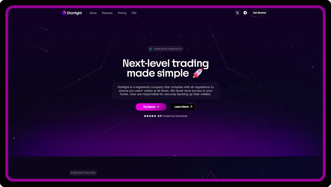
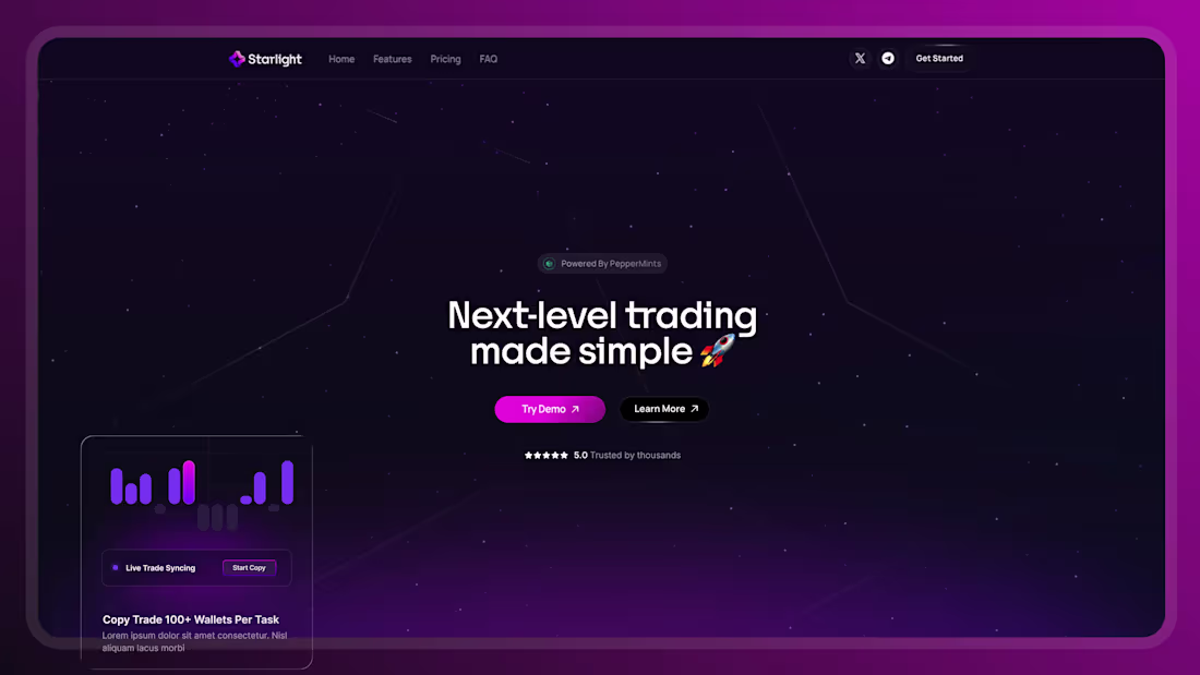
The Starlight landing page employs a sleek, high-contrast dark mode aesthetic that perfectly aligns with its futuristic trading bot theme. By utilizing a deep, space-like dark background, the design allows bright, illuminated UI components, glowing accents, and stark white typography to sharply stand out. This intense light-on-dark contrast is strategically applied to highlight key feature blocks—such as the LP Sniper and Copy Trading tools—ensuring these critical elements pop off the screen for easy reading. Additionally, vibrant contrasting colors are used for the primary "Get Started" and "Try Demo" call-to-action buttons, creating sharp visual focal points that guide the user’s eye directly toward conversion against the moody canvas.
0
54
Gemini said
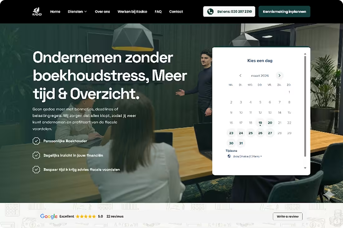
This design utilizes stark light-on-dark contrast to immediately draw the eye, prominently featuring bright white, floating UI cards layered over dark, moody photographic backgrounds in both the hero and bottom sections. This high-contrast strategy continues down the page through bold, alternating color bands—shifting abruptly between clean white sections with dark text, a deep forest green block highlighting bright white service cards, and a solid black footer. These sharp visual breaks rhythmically guide the user's attention and make key actions and information blocks impossible to miss.
0
53
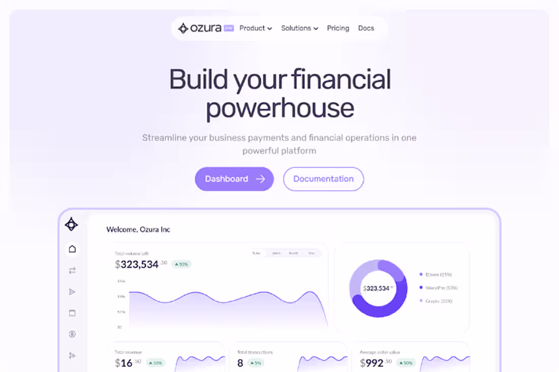
The design strategically employs contrast to guide the user's attention, most notably through a striking dark-themed block positioned about two-thirds down the page. Against the otherwise airy backdrop of white and pale lavender, this deep charcoal section creates a sharp visual break that instantly draws the eye to its core message: "Build and customize your payment platform." This high-contrast area acts as a powerful focal point, breaking the scrolling rhythm to emphasize a key secondary call-to-action. Beyond this large dark block, the design also utilizes vibrant purple buttons throughout the lighter sections, providing sharp, localized contrast that makes the primary interactive elements pop and clearly signals where the user should click next.
0
57
Diverse Landing Page Designs for Various Clients
0
0