
pro
Bitzone Tech
Professional software Engineers
New to Contra
Bitzone is ready for their next project!
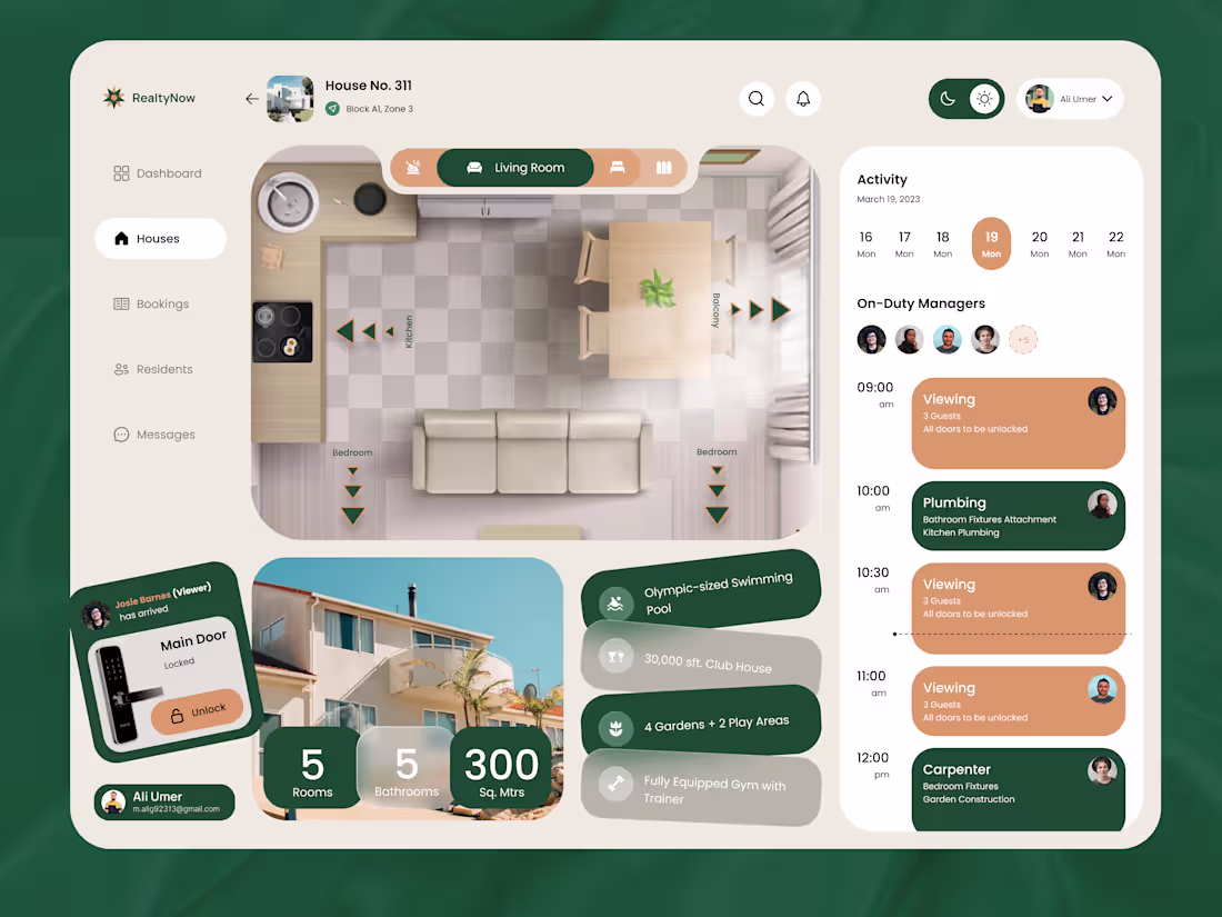
Solving the Complexity of Real Estate Management through UI.
One of the biggest challenges in Real Estate UX is balancing a massive amount of data without overwhelming the user. For RealtyNow, I focused on a "functional clarity" approach.
The Challenge:
How do you show a 2D floor plan, a 7-day schedule, resident messages, and property features on a single screen without it feeling crowded?
My Solution:
Invisible Design Principles: I prioritized the floor plan as the focal point, using a neutral "sand" background to let the property layout breathe.
Task-Oriented Sidebar: The "Activity" feed on the right uses a vertical timeline, allowing managers to see their "On-Duty" team and upcoming viewings in seconds.
Micro-Interactions: Included a "Main Door" status card with a clear "Unlock" CTA, bringing smart-home functionality directly into the management flow.
By using a grounded palette and the clean geometry of Poppins, I turned a complex data set into a calm, high-end experience.
Design is more than how it looks—it’s about how it works.
2
32
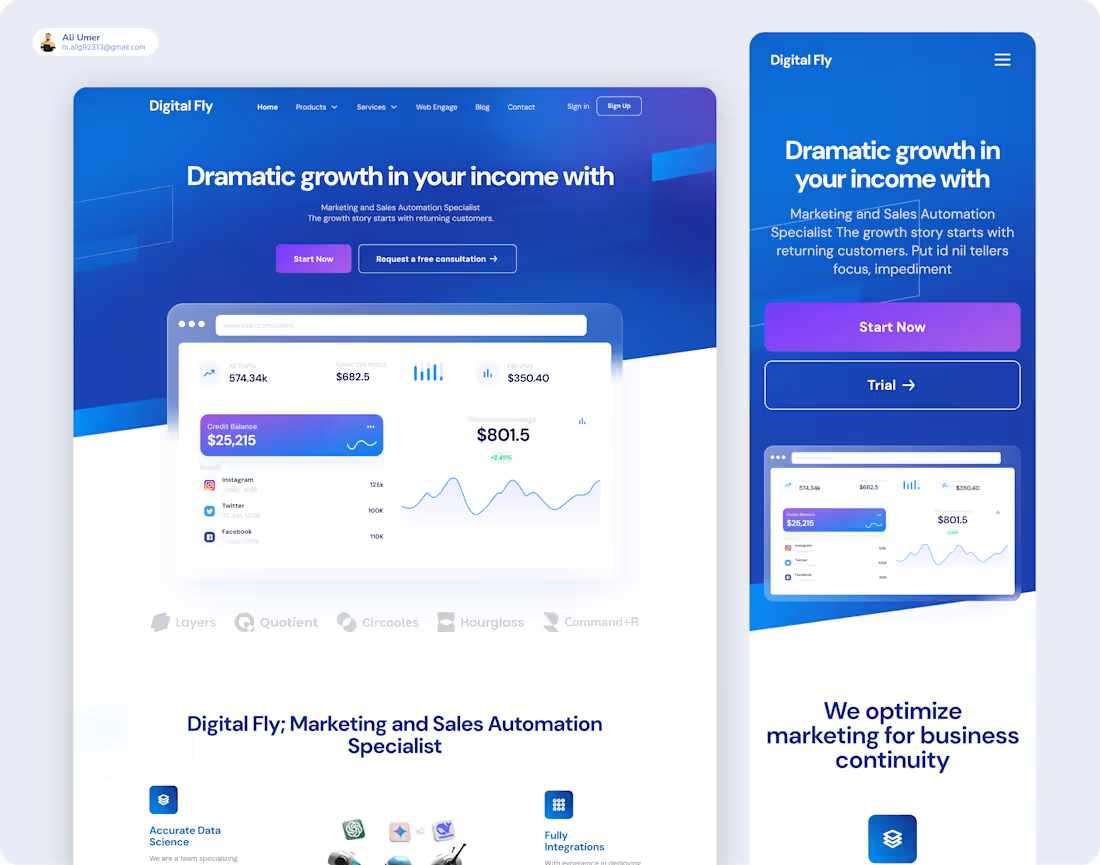
Project Case Study: Digital Fly Automation Platform
I'm excited to share a comprehensive design project for Digital Fly, a platform dedicated to Marketing and Sales Automation. This project showcases a cohesive visual identity across both desktop and mobile environments, ensuring a seamless user journey regardless of the device.
Responsive Design Focus
A core requirement for this project was a mobile-first approach. I developed a fully responsive mobile version of the site that retains the "clean" and "sharp" aesthetic of the desktop experience while optimizing for smaller touchpoints.
Adapted Layouts: Streamlined complex data dashboards for mobile viewing without losing critical information.
Touch-Friendly Navigation: Implemented a mobile-specific menu and high-contrast call-to-action buttons like "Start Now" and "Trial" for easier interaction.
Visual Consistency: Carried over the signature "glassmorphism" style and vibrant blue gradients to the mobile interface to maintain brand integrity.
Key Features & Aesthetic
High-Fidelity UI: Designed a modern, tech-forward landing page featuring soft glows and sleek card layouts.
Data Science Visualization: Created intuitive interfaces for tracking ad traffic, monthly earnings, and growth trends.
AI Ecosystem: Built sections that visually highlight integrations with major AI models including OpenAI, Gemini, and Meta AI.
Integrated Social Media: Designed dedicated modules for tracking performance across Instagram, Twitter, and Facebook.
The Philosophy Behind the Work
Good design is about more than just looks; it’s about how it functions. Throughout this project, I focused on avoiding common UX pitfalls such as:
Prioritizing Mobile Users: Ensuring that responsive design was a primary focus rather than an afterthought.
Performance Optimization: Balancing high-quality "heavy" visuals with efficient load times.
Visual Clarity: Maintaining a consistent typographic hierarchy to avoid clashing styles.
Looking to elevate your SaaS or Fintech platform with a responsive, modern design? Let’s collaborate on your next project!
#UIUXDesign #MobileDesign #ResponsiveDesign #Fintech #SaaS #DigitalFly #ContraDesigner #AutomationDesign
2
3
51
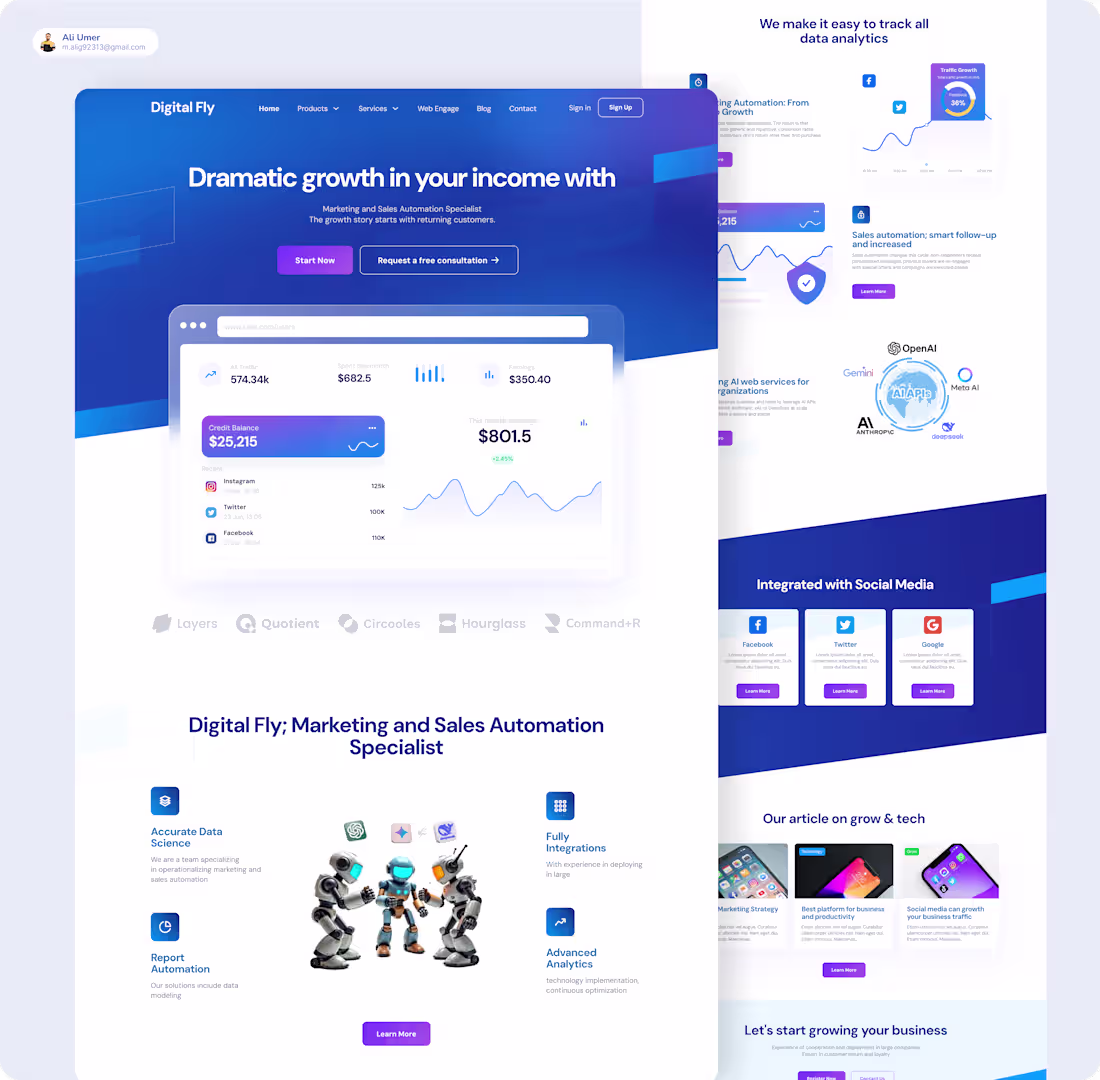
Project Showcase: Digital Fly Branding & Landing Page Design
I recently completed the end-to-end design for Digital Fly, a platform specializing in Marketing and Sales Automation. The goal was to create a high-converting, "clean," and "sharp" visual identity that communicates growth and technological sophistication.
Design Highlights
Modern Aesthetic: Implemented a "glassmorphism" inspired UI with vibrant blue gradients and sleek card layouts to maintain a professional, tech-forward feel.
Data Visualization: Designed intuitive dashboards to help users easily track income growth, ad traffic, and monthly earnings at a glance.
AI Integration: Visually showcased the platform's ability to integrate with leading AI models like OpenAI, Gemini, and Meta AI.
Social & Analytics: Created dedicated sections for social media integration (Instagram, Twitter, Facebook) and advanced data science reporting.
The Process
As a UI/UX Designer, I focused on building a seamless flow that guides potential clients from the "Dramatic growth" hero section down to the final call-to-action. The project involved:
Wireframing & High-Fidelity Design: Crafting a responsive landing page optimized for conversion.
Visual Identity: Selecting a bold, corporate color palette and typography that stands out in the fintech and automation space.
Asset Creation: Customizing icons and layout elements for features like "Report Automation" and "Advanced Analytics".
Are you looking for a UI/UX Designer to bring your fintech or SaaS platform to life? Let's connect and build something modern together!
1
51
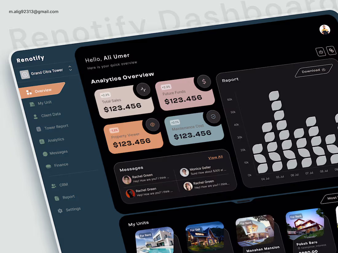
𝗝𝘂𝘀𝘁 𝘄𝗿𝗮𝗽𝗽𝗲𝗱 𝘂𝗽 𝗱𝗲𝘀𝗶𝗴𝗻𝗶𝗻𝗴 𝘁𝗵𝗶𝘀 𝗺𝗼𝗱𝗲𝗿𝗻 𝗿𝗲𝗮𝗹 𝗲𝘀𝘁𝗮𝘁𝗲 𝗮𝗻𝗮𝗹𝘆𝘁𝗶𝗰𝘀 𝗱𝗮𝘀𝗵𝗯𝗼𝗮𝗿𝗱
This one started as a challenge, not just to make something visually appealing, but to fix a real problem: dashboards that look good but feel overwhelming to use.
𝗧𝗵𝗲 𝗴𝗼𝗮𝗹 𝘄𝗮𝘀 𝘀𝗶𝗺𝗽𝗹𝗲: 𝗺𝗮𝗸𝗲 𝗰𝗼𝗺𝗽𝗹𝗲𝘅 𝗱𝗮𝘁𝗮 𝗳𝗲𝗲𝗹 𝗲𝗳𝗳𝗼𝗿𝘁𝗹𝗲𝘀𝘀 𝗮𝗻𝗱 𝗶𝗻𝘁𝘂𝗶𝘁𝗶𝘃𝗲... 𝗯𝘂𝘁 𝗴𝗲𝘁𝘁𝗶𝗻𝗴 𝘁𝗵𝗲𝗿𝗲 𝘄𝗮𝘀𝗻’𝘁 𝗲𝗮𝘀𝘆.
𝗖𝗵𝗮𝗹𝗹𝗲𝗻𝗴𝗲𝘀 𝗜 𝗳𝗮𝗰𝗲𝗱:
• Too much data competing for attention
• Balancing analytics with property listings without clutter
• Making a dark UI feel clean, not heavy
• Creating clear hierarchy without over-designing
• Ensuring quick scanning for busy users
𝗦𝗼 𝗜 𝗿𝗲𝘁𝗵𝗼𝘂𝗴𝗵𝘁 𝘁𝗵𝗲 𝗲𝘅𝗽𝗲𝗿𝗶𝗲𝗻𝗰𝗲 𝗳𝗿𝗼𝗺 𝘁𝗵𝗲 𝗴𝗿𝗼𝘂𝗻𝗱 𝘂𝗽.
𝗪𝗵𝗮𝘁 𝗜 𝗲𝘅𝗽𝗹𝗼𝗿𝗲𝗱:
• Minimal dark UI to improve focus and reduce noise
• Soft, muted color palette for better data differentiation
• Clean typography (Clash Display + Inter combo )
• Card-based layout to break down complex information
• Smart spacing and alignment for visual breathing room
• A balanced layout that connects analytics with real-world context (properties)
𝗘𝘃𝗲𝗿𝘆 𝗱𝗲𝗰𝗶𝘀𝗶𝗼𝗻 𝘄𝗮𝘀 𝗮𝗯𝗼𝘂𝘁 𝗰𝗹𝗮𝗿𝗶𝘁𝘆 𝗼𝘃𝗲𝗿 𝗱𝗲𝗰𝗼𝗿𝗮𝘁𝗶𝗼𝗻.
Because at the end of the day, design isn’t just about making things look good it’s about making them work better.
𝗖𝘂𝗿𝗶𝗼𝘂𝘀 𝘁𝗼 𝗵𝗲𝗮𝗿 𝘆𝗼𝘂𝗿 𝘁𝗵𝗼𝘂𝗴𝗵𝘁𝘀 👇
0
18
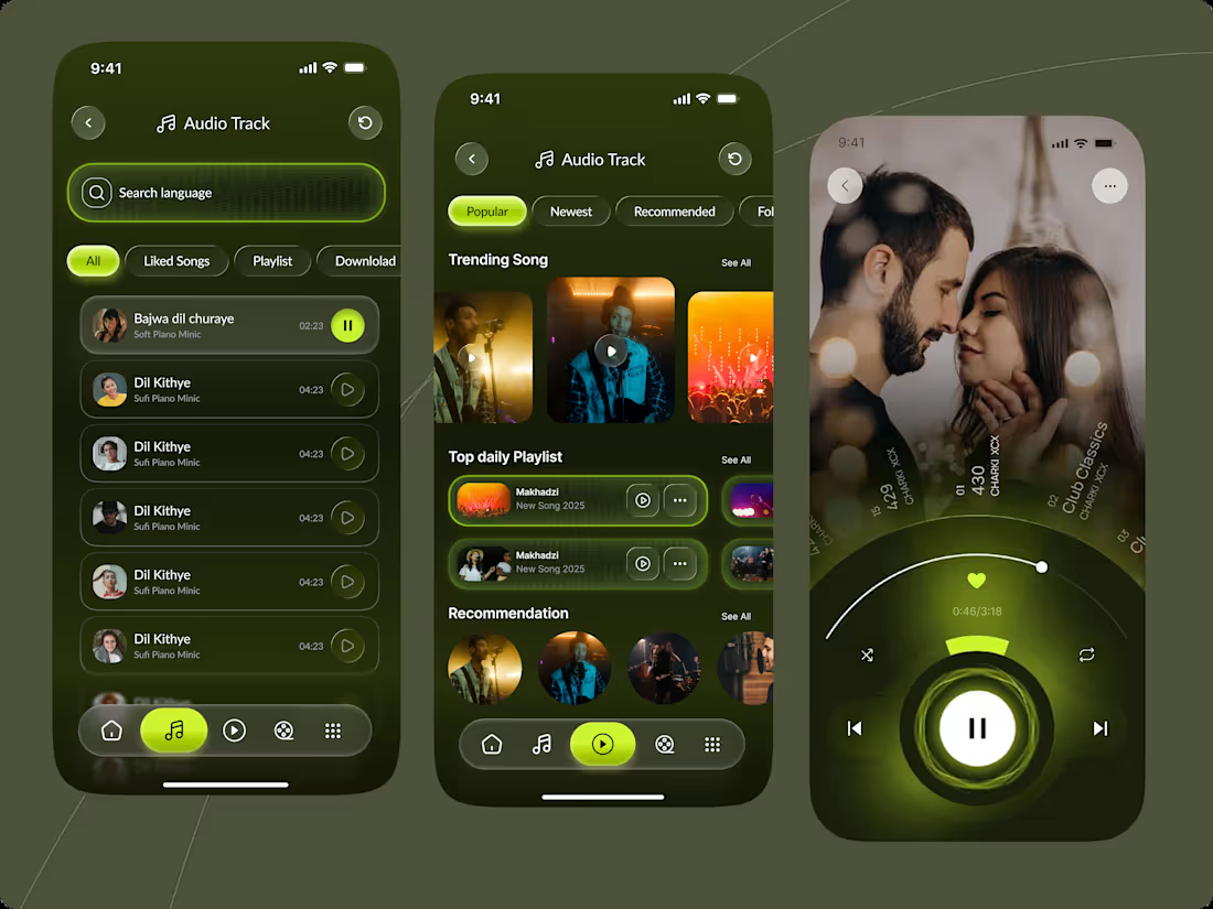
Designing for Immersion: A Cinematic Music Experience
How do you balance high-energy visuals with a functional, intuitive interface? My latest project explores the intersection of dark-mode aesthetics and fluid navigation.
Key Features:
Cognitive Load Reduction: Integrated a clean, high-contrast search and filter system to keep the user focused on the music.
Invisible Design: Utilized subtle neon glowing accents and glassmorphism to guide the eye toward playback controls without distracting from the album art.
Adaptive Layouts: Focused on building a modular design system that scales from detailed tracklists to immersive, full-screen player views.
2
3
84
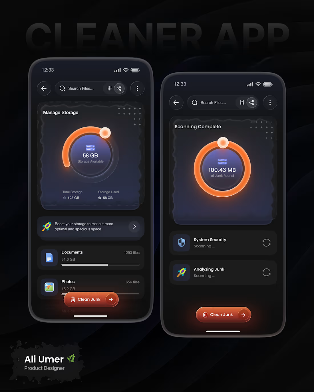
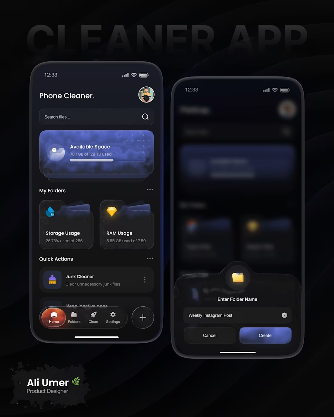
𝗖𝗹𝗲𝗮𝗻𝗲𝗿 𝗔𝗽𝗽 𝗨𝗜/𝗨𝗫 𝗖𝗮𝘀𝗲 𝗦𝘁𝘂𝗱𝘆, 𝗗𝗲𝘀𝗶𝗴𝗻𝗲𝗱 𝗯𝘆 𝗠𝗲
Excited to share my latest Cleaner App UI/UX design, where I focused on creating a clean, modern, and performance-driven experience for users who want better control over their phone storage.
𝗪𝗵𝗮𝘁 𝗜 𝗗𝗲𝘀𝗶𝗴𝗻𝗲𝗱?
*Phone Cleaner dashboard
*Storage & RAM usage visualization
*Junk scanning & cleaning flow
*Folder management & quick actions
*Dark-mode focused UI for a premium feel
𝗖𝗵𝗮𝗹𝗹𝗲𝗻𝗴𝗲𝘀 𝗜 𝗙𝗮𝗰𝗲𝗱
*Complex data visualization (storage, RAM, junk files) without overwhelming users
*Making technical processes like scanning feel simple and understandable
*Maintaining clarity in dark UI while keeping contrast and readability
Would love to hear your feedback. What do you think about the interaction flow or visual style?
4
1
89
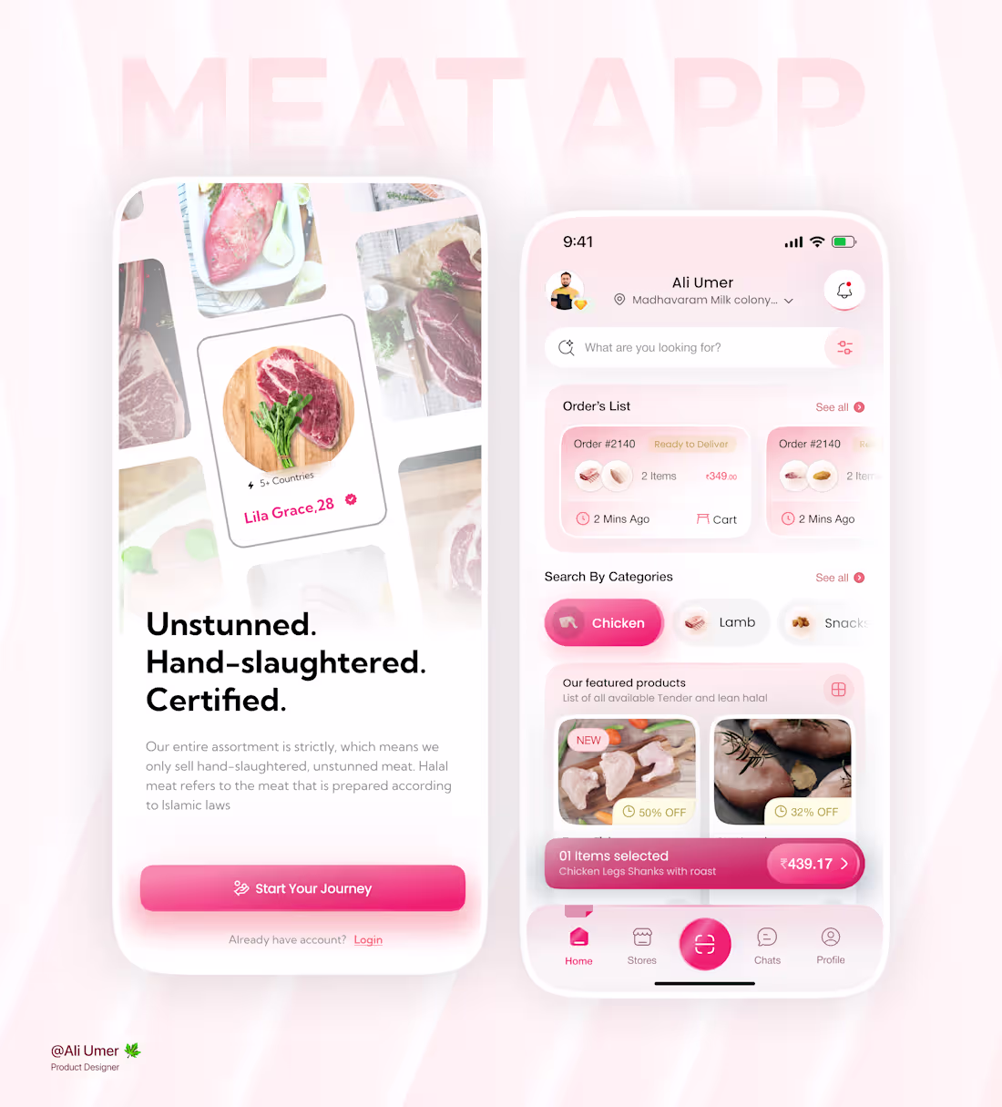
𝗨𝗜/𝗨𝗫 𝗖𝗮𝘀𝗲 𝗦𝘁𝘂𝗱𝘆 – 𝗠𝗲𝗮𝘁 𝗗𝗲𝗹𝗶𝘃𝗲𝗿𝘆 𝗔𝗽𝗽 𝗗𝗲𝘀𝗶𝗴𝗻𝗲𝗱
𝗖𝗵𝗮𝗹𝗹𝗲𝗻𝗴𝗲𝘀 𝗜 𝗙𝗮𝗰𝗲𝗱:
• Displaying multiple product options without overwhelming the user
• Building trust for halal authenticity in a digital experience
• Maintaining a clean UI while showing prices, discounts, ratings, and details
• Creating a smooth flow from browsing to checkout
This project helped me sharpen my skills in user-centered design, visual hierarchy, and problem solving.
𝗜’𝗱 𝗿𝗲𝗮𝗹𝗹𝘆 𝗮𝗽𝗽𝗿𝗲𝗰𝗶𝗮𝘁𝗲 𝘆𝗼𝘂𝗿 𝗳𝗲𝗲𝗱𝗯𝗮𝗰𝗸 𝗼𝗿 𝘁𝗵𝗼𝘂𝗴𝗵𝘁𝘀 🙌
𝗢𝗽𝗲𝗻 𝘁𝗼 𝗰𝗼𝗹𝗹𝗮𝗯𝗼𝗿𝗮𝘁𝗶𝗼𝗻 𝗮𝗻𝗱 𝗻𝗲𝘄 𝗼𝗽𝗽𝗼𝗿𝘁𝘂𝗻𝗶𝘁𝗶𝗲𝘀
3
3
72
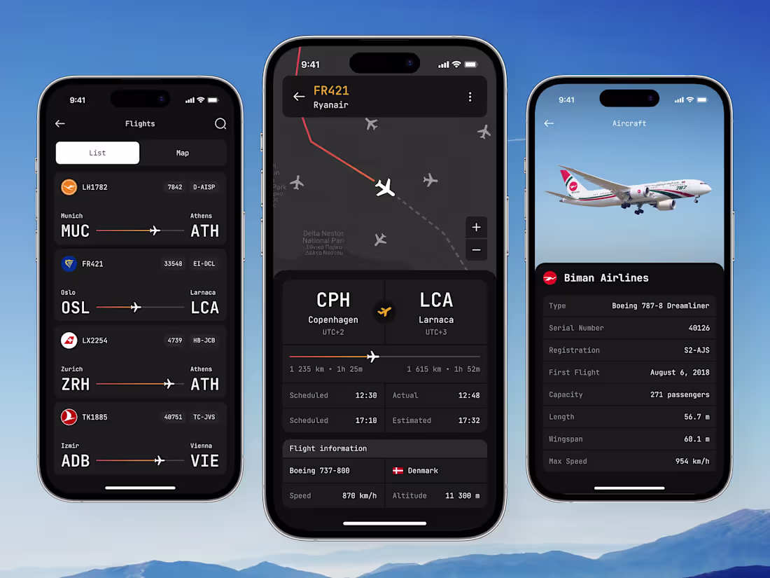
Flight Tracking Mobile App UI Design
0
66
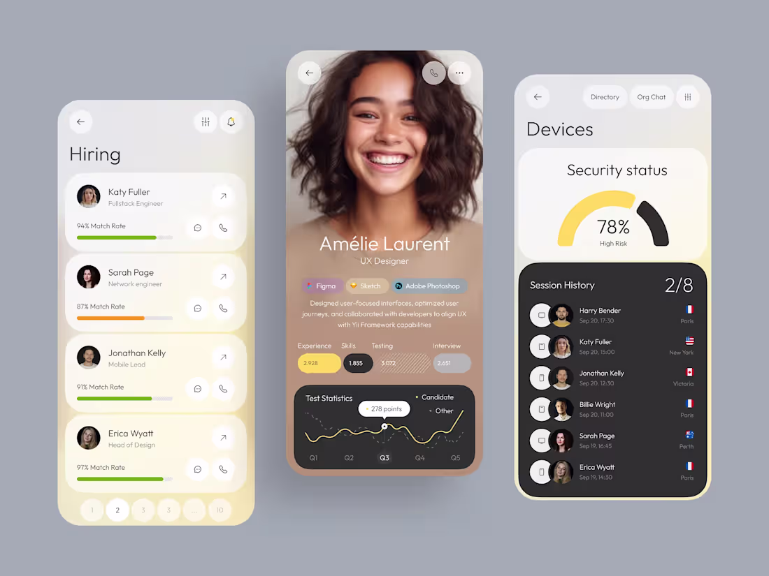
Mobile App UI — HR & Hiring Platform Design
3
97
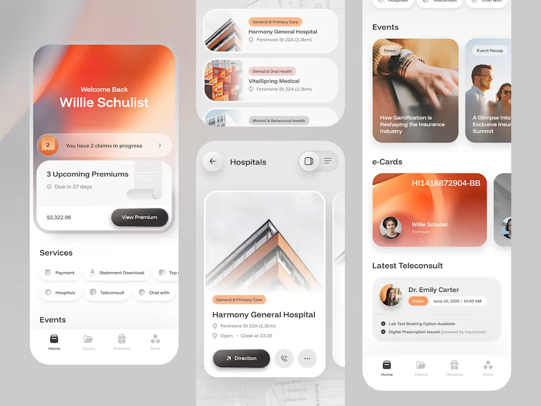
Insurance Mobile App UI Design
0
60
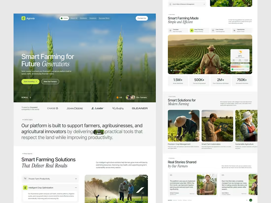
Farming Landing Page
0
52
Cleaner App UI/UX
0
0

Crypto Dashboard
0
0
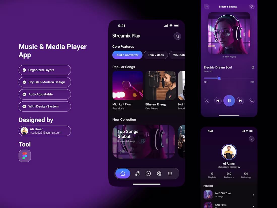
Music & Media Player App
0
0
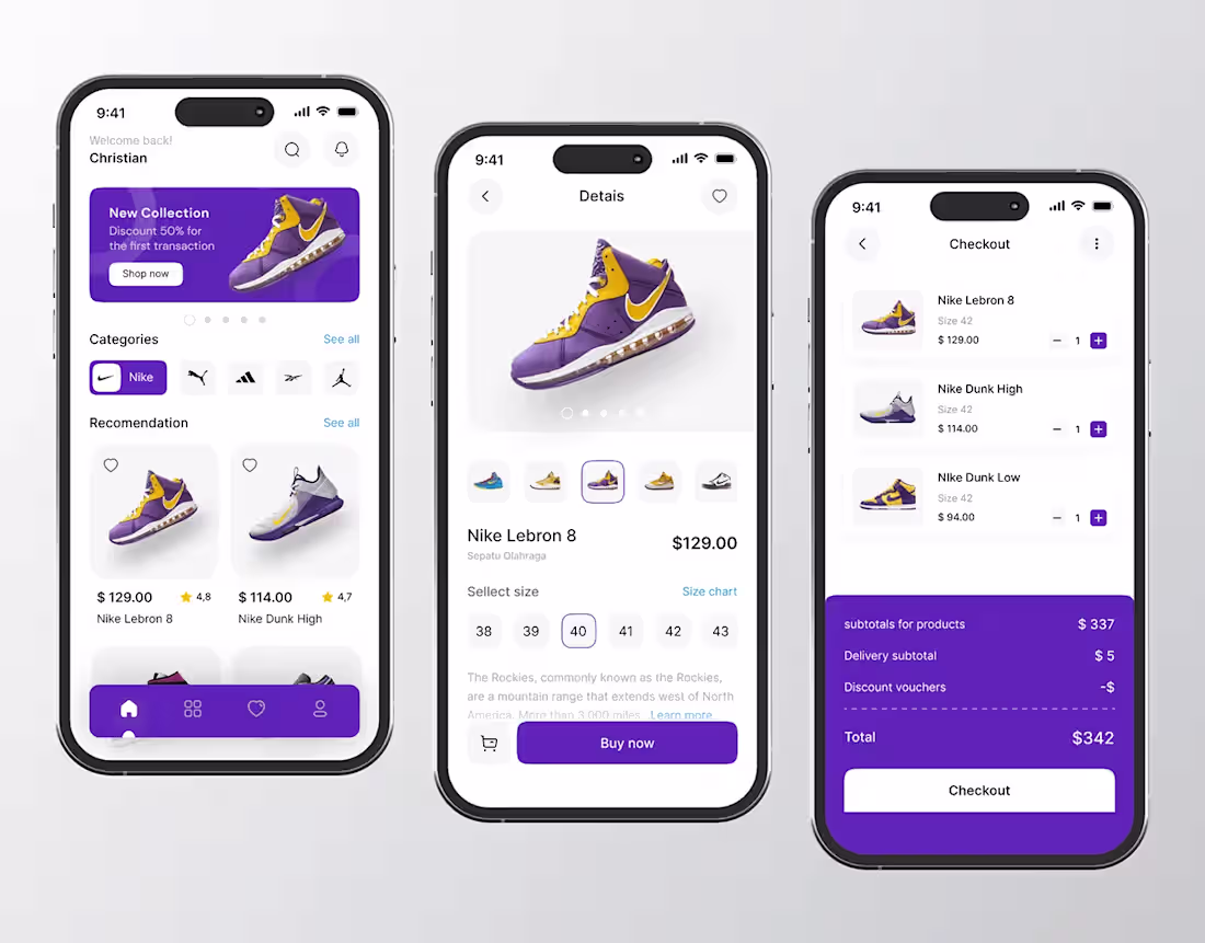
Shoes App
0
0
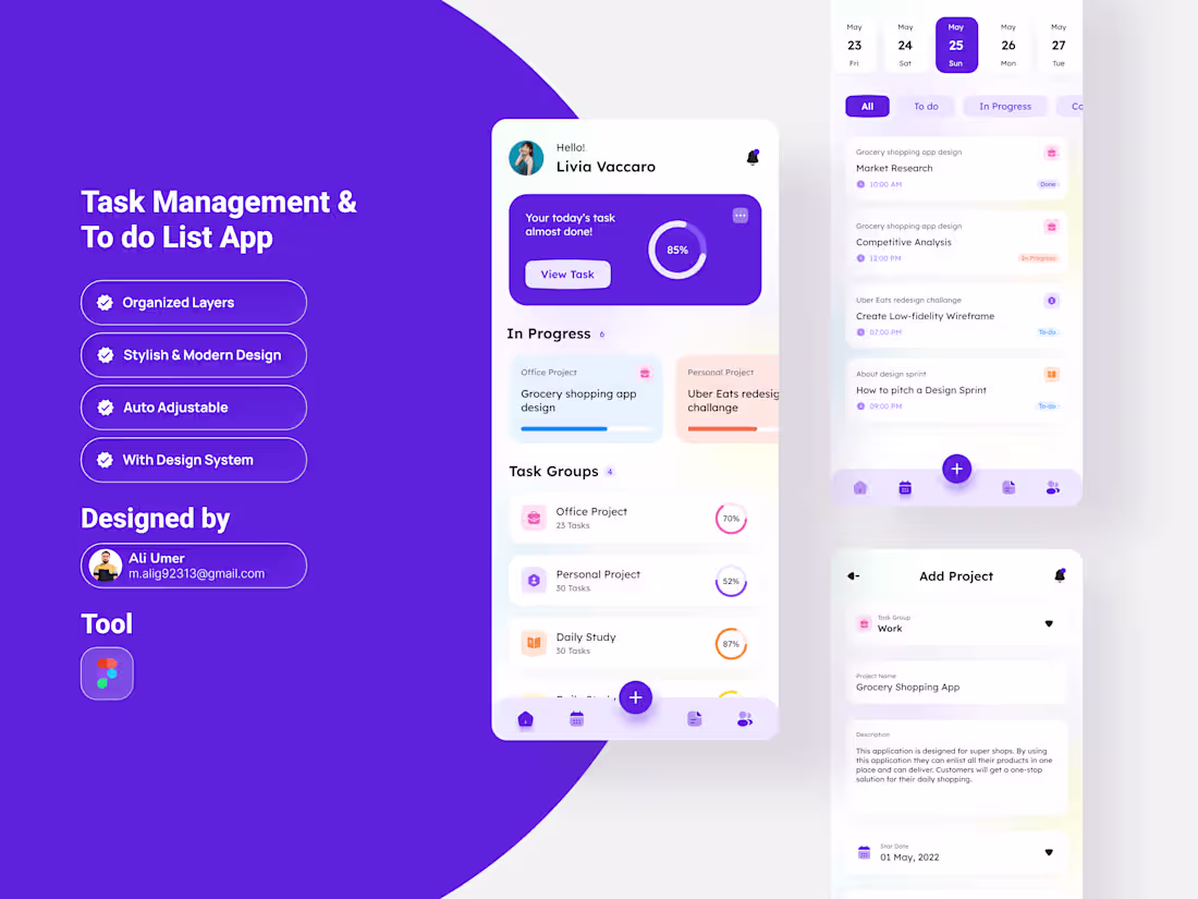
Task Management App
0
0
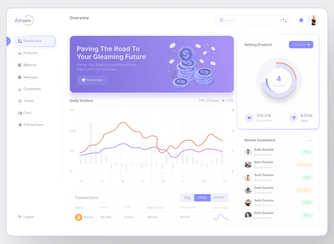
A.Crypto Dashboard Design
0
0
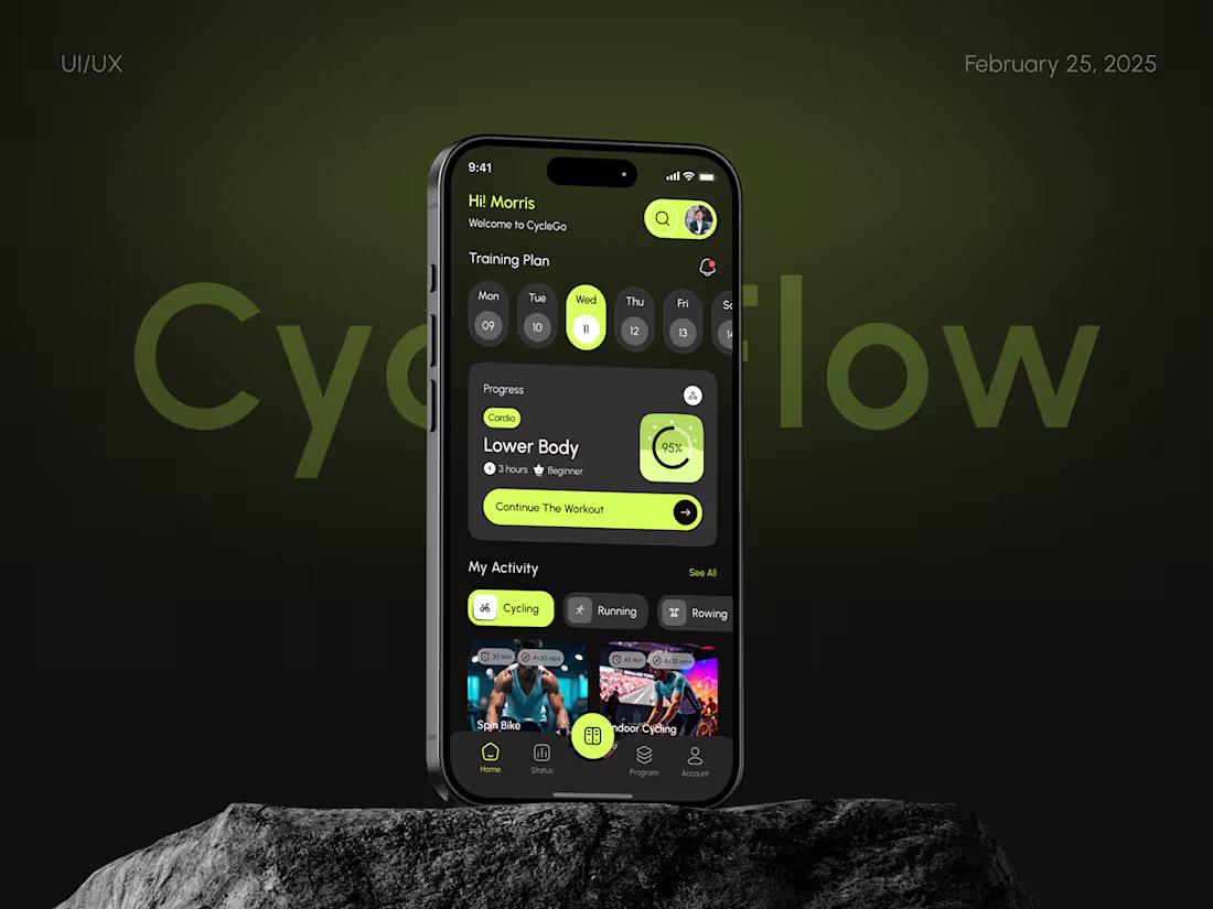
Fitness Mobile App Design
0
0
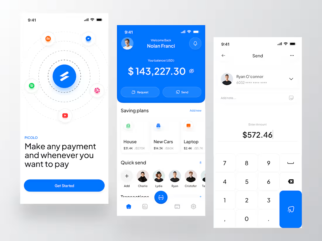
Finance Mobile app
0
0
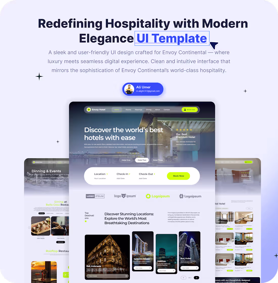
Hotel Website UI Desigin
0
0
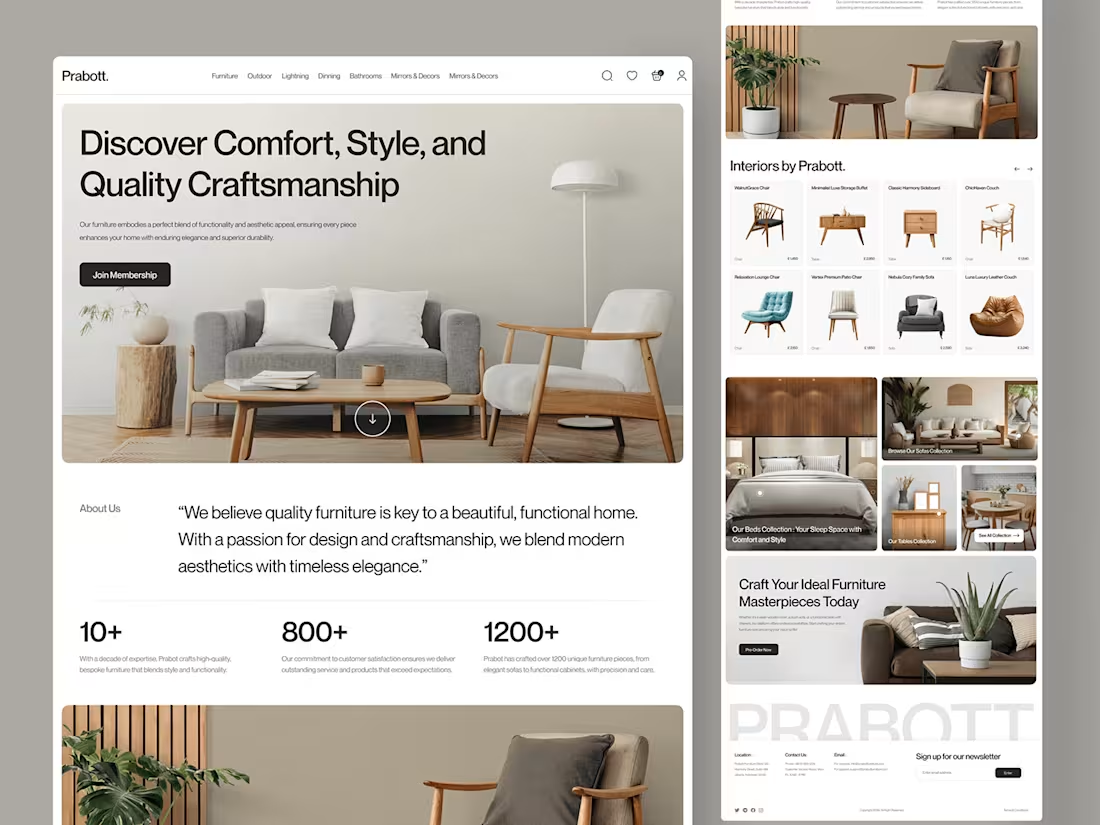
Furniture Landing page Design
0
1
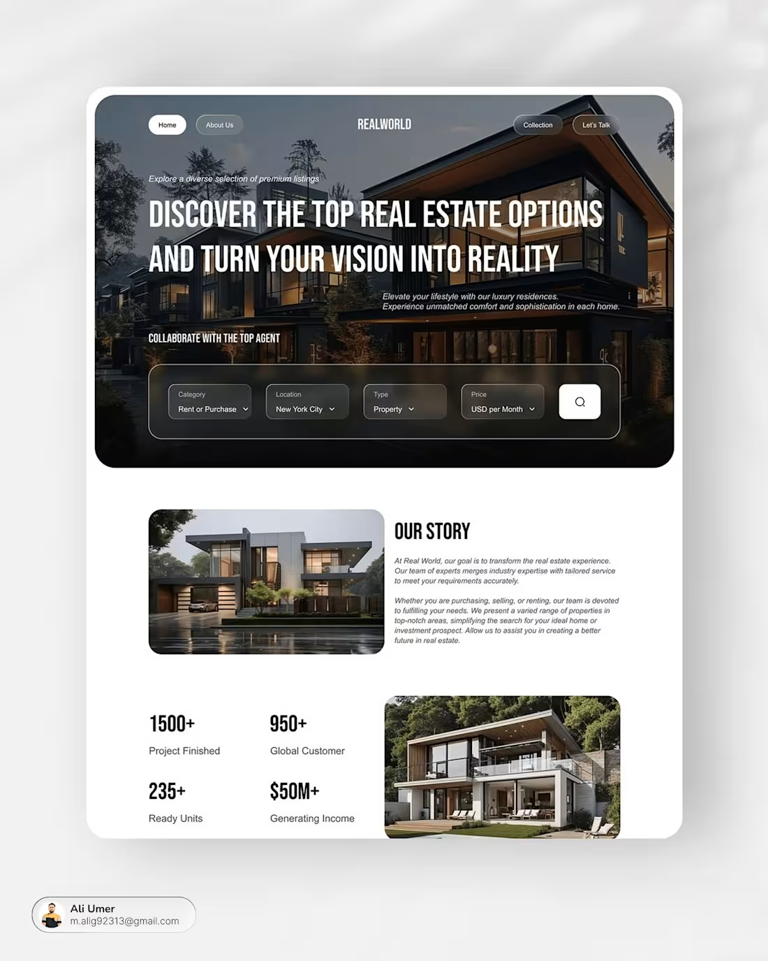
Real State Website
0
0
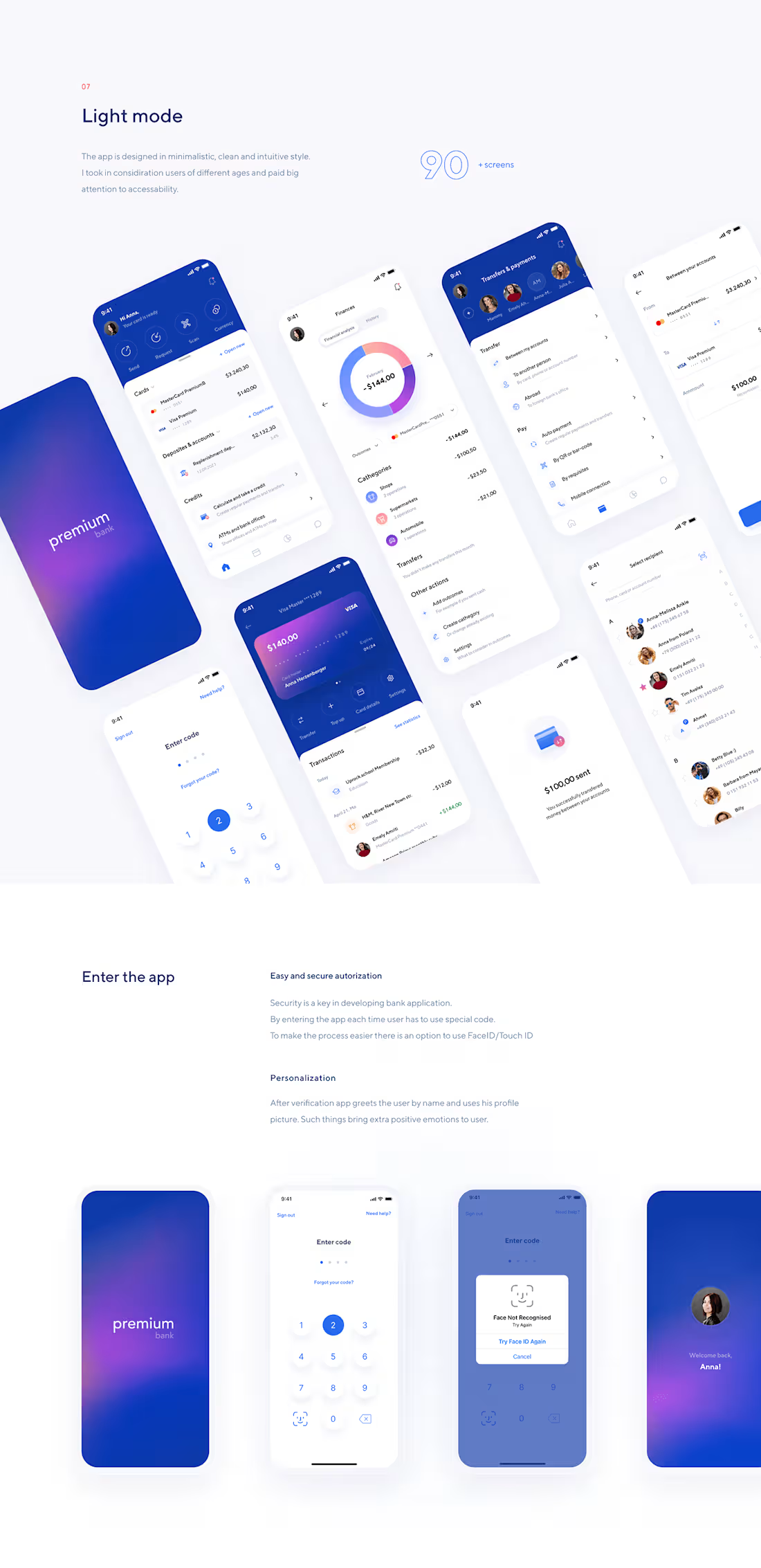
Bank App
0
0
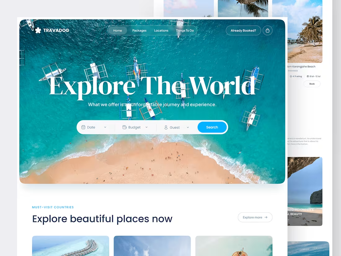
Travel Website Landing page
0
0
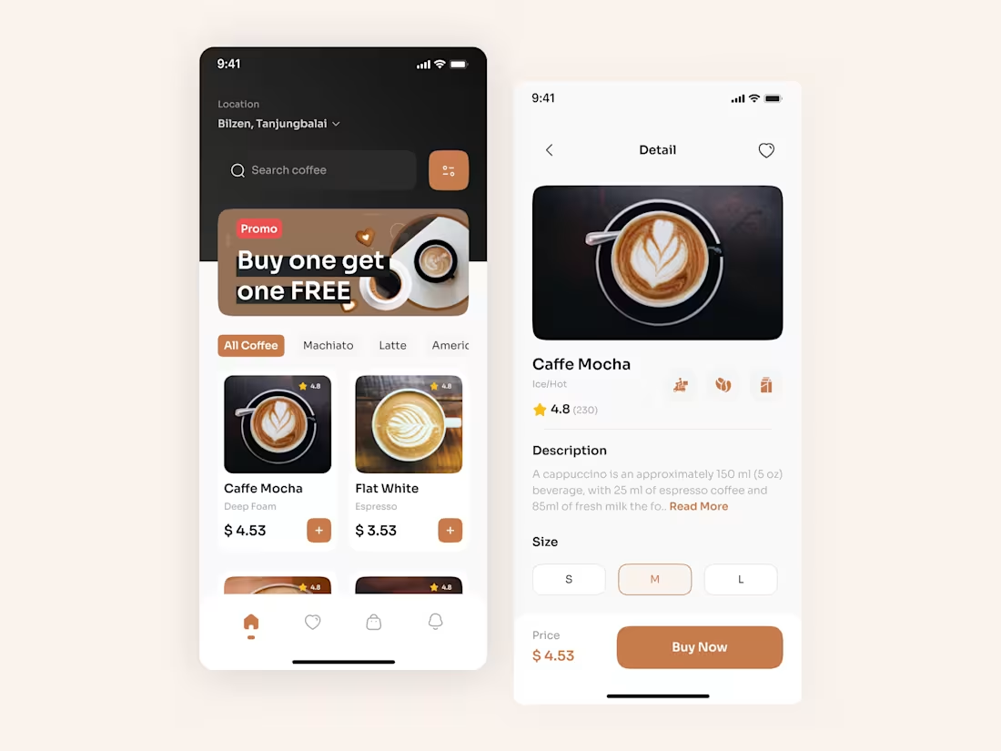
Coffee App design
0
0
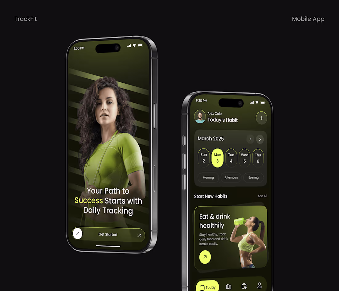
Habit & Fitness Tracker App
0
0
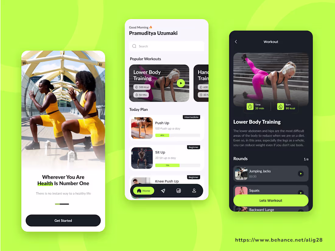
Fitness App Design
0
0
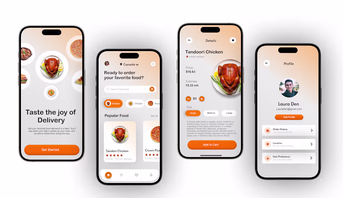
Food App
0
0